I normally don't post here because I'm just a lurker, but I'd like to touch on some things that I personally like:
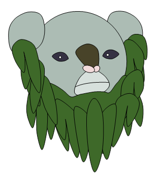
@mayatraese: Many pages back, I fell in love with your first concept (the angel-like lily). I think it's a great concept of the two that you've provided, and I encourage you to go with it. Perhaps can you show us some supporting art for it, or perhaps some updated art for it? It's really charming, in a sad way.
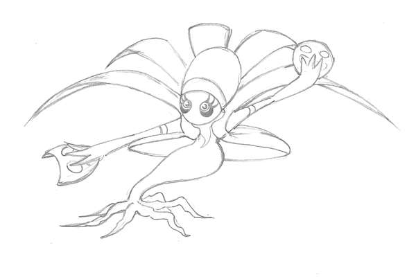
@Yilx: I've been a fan of the flytrap miko from the start. What really does it for me is the supporting art showing her performing some "sketches", which I can really see her doing. It seems very natural. I think the color choices you made work as well. The emotion art is very appealing, and I like how the vine on her head also "emotes" and isn't just fake eyes. If you have any more ideas, I'd love to see her performing more moves. Oh, and actually, is it supposed to be just female (ala Lilligant), or can it be male as well? I'm just curious.
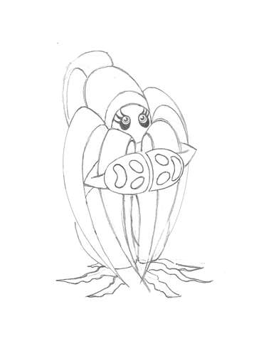
@Mos-Quixote: When you first posted your concept, I was stunned. It is creative and different from the many enchanted plant-tree/scarecrow/jack-o-lantern entries (not that they're bad, just overdone) floating around. I could really picture it being a pokemon. What really turned me on towards the concept was the supporting art--and I love seeing it fold into various forms for different move (the bird, sailboat, fan). It gives it more character than many other art on here. I did get the "Japanese feel" of the plain red and white of the original art, and I liked that.
Regarding color: I've kept my mouth shut on color here because I'm just a lurker, but I'd just like to say with some current posts that certain colors don't define typing. Sure, most grass-types in the game are green in some way, but have you seen Amoongus, or even one of the oldest grass pokemon, Tangela? There's not a drop of green on them. The same goes with ghosts; while most are purple, check out Rotom, Golurk, or Jellicent.
On that note, I don't think you need to justify the concept to the typing, either. You've explained its origin, and I hope that stays if and when it goes to the polls. I mean, paper being dead tree matter isn't too much of a stretch, and honestly, nobody can say that an enchanted origami than can refold itself into different shapes isn't ghost-like.
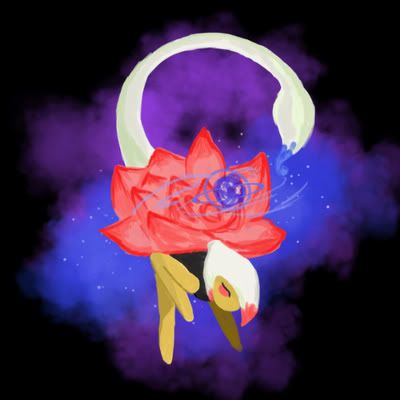
What I suggest to you is to go with whatever you think best defines the information already defined for CAP-2. What do you think looks best, fits the concept best? Do you like the red or green? Does the cherry blossom patterns enhance the design, or does it make it too busy? That's just my thought.
What I'd like to see is whenever you decide upon something, and if you feel like it/have the time for it, try making some more additional art. The first ones were a a lot of fun to view. I really like your concept--it embodies a character that I haven't seen since Cartoons' entry for CAP10 way back when. I just hope you don't give in to the pressure/people telling you what's best and you follow your own intuition for your CAP-2 design.