Critique:
@Cheeno One of my favourite entries, has a childish charm about it yet still looks professional. You've really nailed the colours, and the background is perfect, not only does it complement the image but suits the theme. To improve, there's just a tad which could be touched upon regarding shading, e.g. why is there some random grey line on his ball?
@TheKnightsOfWarioLand Still struggling to see quite how you were attempting to capture the theme here, however, it is a difficult theme and one I don't fully understand myself so fair enough. It's a sweet piece, brush up a nice background and remove some of the overlapping lineart and it'd be great. I'm not going to say neaten the lineart because I think it suits the whole style of the picture.
@ium Another of my favourite pieces, this one is sadly and undeservedly being ignored in the polls.
Flawless lineart, unique style, great interpretation of the theme, lovely colours. Those flowers really stand out well! I can't really fault this piece, and it was so close to winning my vote.
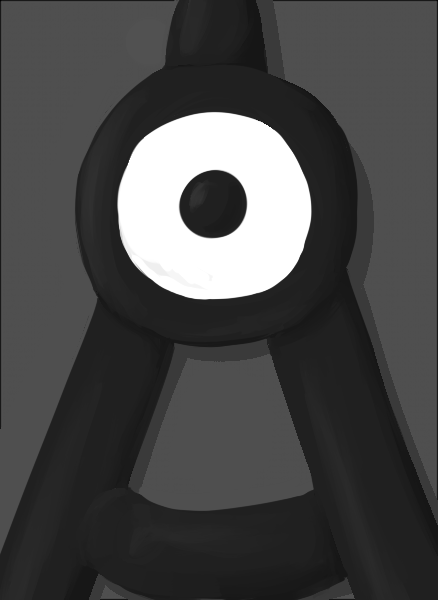
@Zapdraws Again, another flawless display of lineart- albeit with a simply shape. That's really what let you down in my oppinion, yes the theme is minimalism, yes voltorb is about as simple as it gets. I would've liked to have seen you attempt to draw a more challenging pokemon in a minimalistic style, but what you have drawn is fantastic.
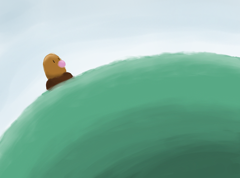
@Saeglopur A nice enough piece, yes it's simplistic, yes the colours are ok. But it just lacks something to stand out about it, there's no creative use of the theme, or particularly impressive drawing shown. One of the casualties of minimalism I guess. I think your choice of Diglett let you down, there's really not a lot you can do to repose something which is essentially a head in the ground.
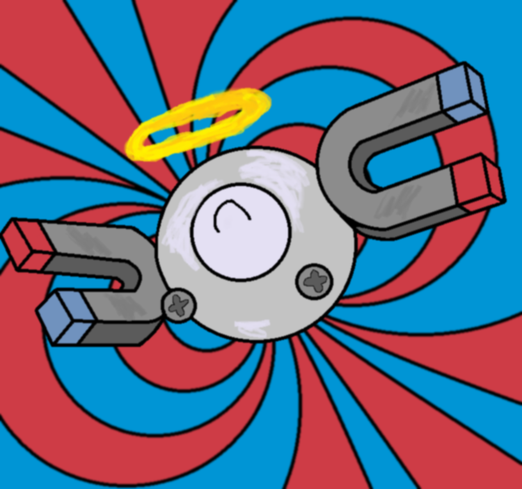
@Andrew3391 Lineart's relatively clean, all drawn nicely in proportion, I'm a bit disappointed that you haven't even attempted to repose magnemite, its quite obvious where you drew your
reference from really. Your shading as well, you really shouldn't leave gaps of colour in your shading, that's just not how light works, it should all come as a block if you're doing that style. Nice use of colours and background though.
@JuicyFruit Go home you're drunk.
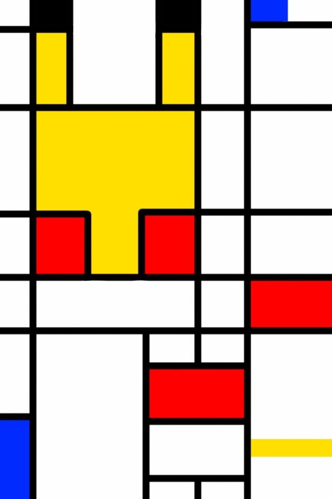
@Rittercat One of the more interesting uses of the theme and certainly one of the most unique. My only problem being that there are also some other entries with some really great creative ideas, which have required a lot more effort in terms of the art, whereas yours is just rectangles coloured in - no offence, I guess it's just my bias against minimalism really.
@Eagle4 Try and work on your proportion in drawing, one of pikachu's feet looks bigger than the other, as does one side of his torso. It looks like his head is turned one way, his body another, and then his feet another again. Try using some reference photos to help you out. I'd also work on trying to clear up your lineart, especially on that lamp.
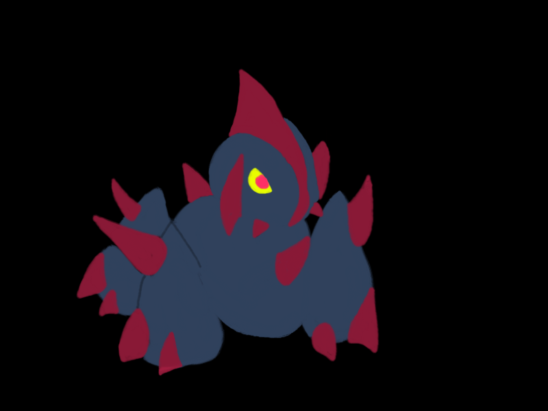
@Bluehoundoom I actually like your MAC entry quite a lot, except for that blue line which shows the outline of the front leg. I don't think its necessary and it clashes with the style of the piece. Either remove it and fill it with the base blue colour (people will assume the leg is there anyway from the position of the spike) or erase the line and let the black background fill the outline. It's also not terribly original, as I've seen something very similar to
this style before. However what you've drawn is clean and well proportioned, so good stuff.
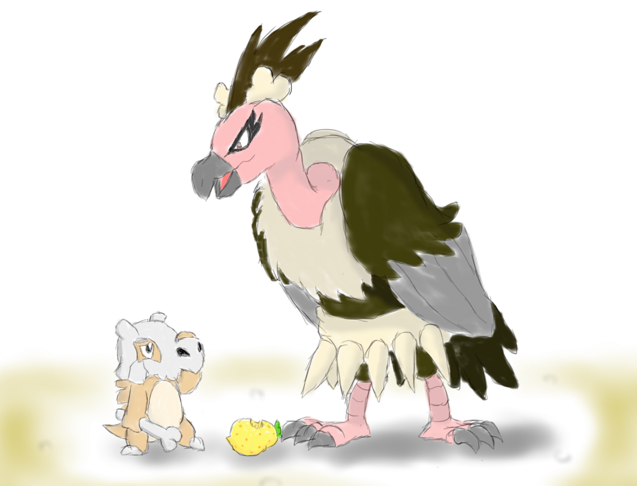
@CBMeadow Another of my favourite entries which I find hard to fault, my only problem being that his tail appears to go through his wing. Other than that, this is really original, really clean lineart and really well thought out. Great stuff.
@Quanyails Unfortunately I cannot award you the same originality as CBMeadow since although you both posted very close together, his was first by a time long enough for you to replicate a piece in similar style. Its a nice drawing, but the lineart is very jagged which I'm guessing is something to do with your programme or brush settings. But I can see that underneath you actually have quite a nice shape, I'd have liked to have seen more colour though.
@Domoz Another nice enough piece, but again lacking colour - the background is especiallly bland. In general though, your lighting and your lines are well drawn, and it does suit the theme. Good stuff.
@Eol Not a bad piece, but It feels like a clash of styles to me. The black background, bright colours and jagged lines speak more grunge than minimalism. I think if you'd opted for thick, clean lineart it would've worked better.
@Zcx @NMx13 Both are reasonably well drawn, but again it's a style I've seen before
here and
here, so I can't really credit you guys for originality. Nevertheless what you've both drawn is good, and although your shapes could do with a little smoothing you're getting towards some really solid performances.
@Edacosis Definitely one of the most unique and original, and for me it's so close to working really well. But I think you've just lost a bit too much of which pokemon it is (I'm hoping empoleon), and it could do with being a little more easily recognisable as a pokemon. I do like it though.
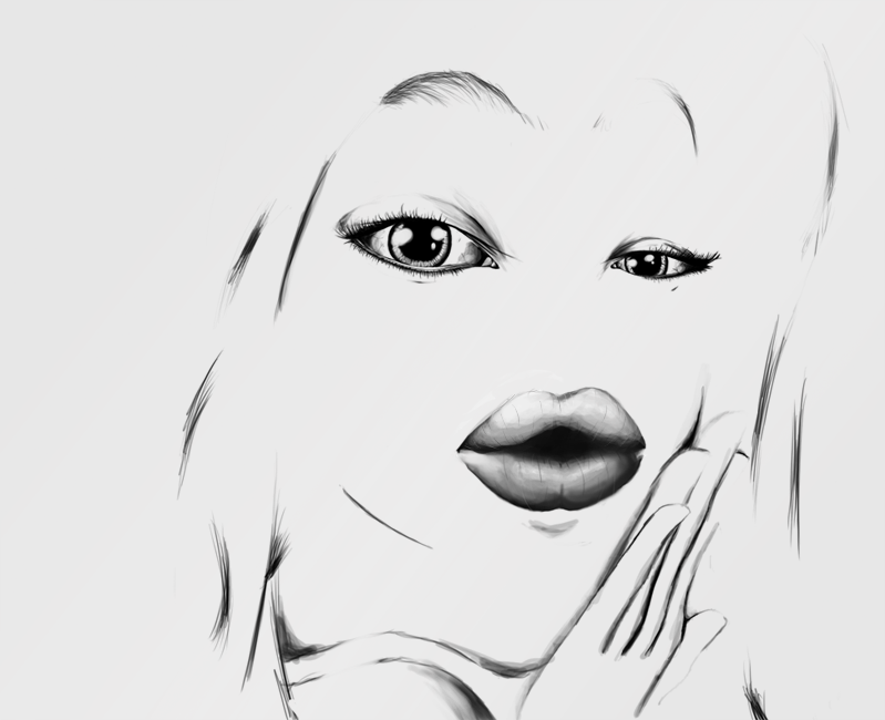
@Defno16 My winning vote. Just an all round incredible entry really, deserving of a win for the detail to the eyes and the lips, if you want a lesson in realism - look no further. Again it follows the theme well, you can tell what pokemon it is (Jynx) despite most of the face being blank white. I love the monocolour effect as well, makes it look very professional. The lineart is clean, the shading is fantastic. Once again, notice the sharpness of detail around the eye, immediately it draws your focus to the most impressive part of the painting. I know from experience - and I'm sure many more here do as well- how hard it is to paint an eye and make it look realistic, which only adds to the impressiveness of this piece. For these reasons, it gets my vote.
The standards of art this round are incredible, hopefully the next one will be as good.

