For your logos, I think you should work on your proportions/anatomy a bit; especially for the Sawsbuck logo. If you added a forth leg besides the hind leg that it make the Sawsbuck look more natural (so it doesn't look like it has only three legs). Also I noticed a minor error it that piece too, I see the lower belly flat while the other side is round. They don't connect to each other and it makes the belly overall wonky. I would have those two lines connecting better to each other.
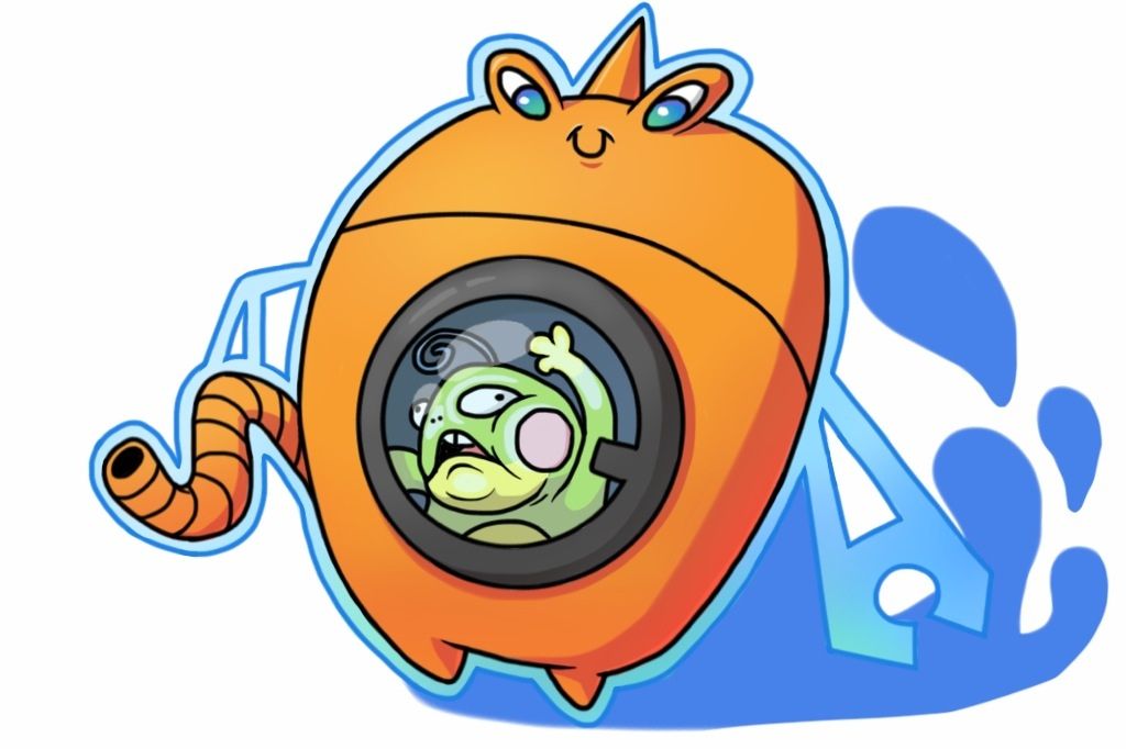
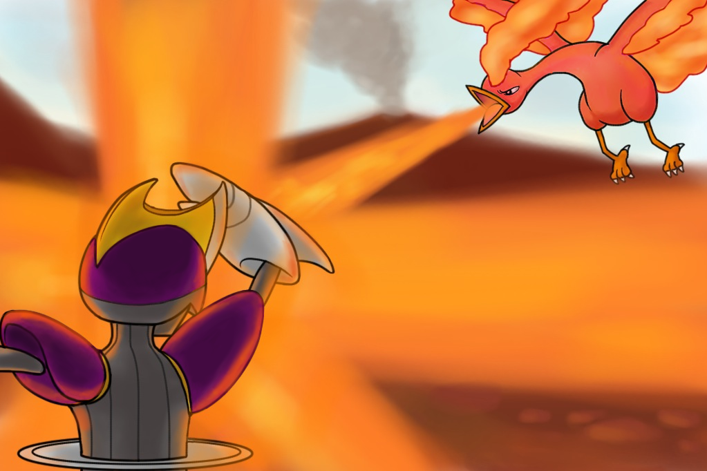
As for Camerupt, I find some lines overlapping. If you cleaned them up a bit then it will make the piece much more cleaner. Speaking of line overlap, I see some of them with Dewgong.
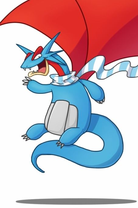
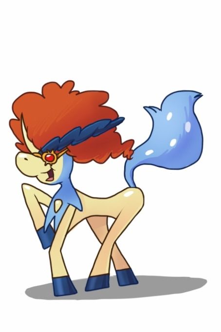
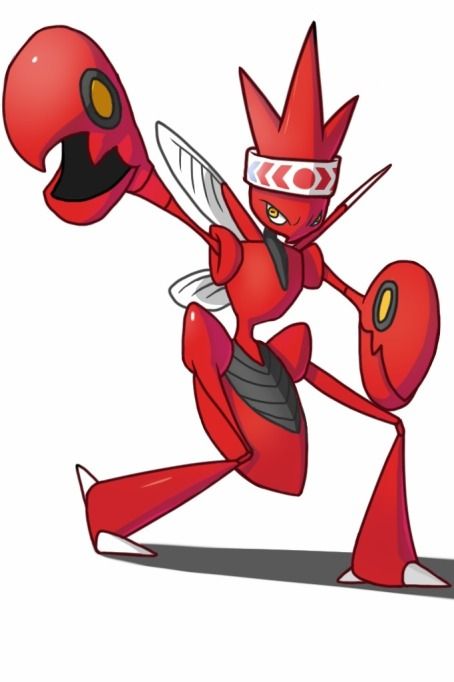
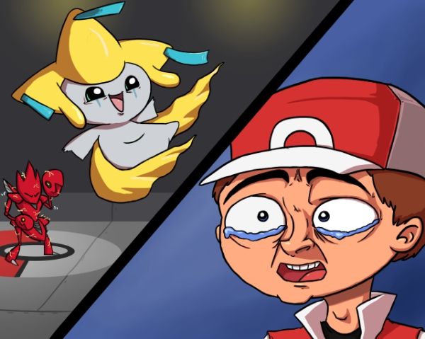
But, I've always enjoyed your coloring, it's bold and smooth and your lineart is getting better as well (it's still a bit jagged but lineart is difficult to master so don't stress about it). So, I'm looking forward to seeing more! Also, grats on mod!
As for Camerupt, I find some lines overlapping. If you cleaned them up a bit then it will make the piece much more cleaner. Speaking of line overlap, I see some of them with Dewgong.
But, I've always enjoyed your coloring, it's bold and smooth and your lineart is getting better as well (it's still a bit jagged but lineart is difficult to master so don't stress about it). So, I'm looking forward to seeing more! Also, grats on mod!