
-
Welcome to Smeargle's Studio! Please be sure to review the studio rules. Feel also free to check out our hub to learn more about this place!Welcome to Smogon! Take a moment to read the Introduction to Smogon for a run-down on everything Smogon, and make sure you take some time to read the global rules.Congrats to the winners of the 2023 Smog Awards!
Super Spriting/Trainer Card/other art nonsense thread
- Thread starter DM
- Start date
- Status
- Not open for further replies.
New Fusion with a TINY bit of scratch work lol. I did the tails, where the head used to be in the way, and the flames. And where the neck connects to the skull. I think that's it though. Nothing major.

Edit: Xeorr: It's ok, but the shading could be improved. It's almost nonexistant right now, and makes the object look flat in places. For example, next to the ear, on the gray part of the shell. Your lightening is from the left, but the shows no shading on the right parts of the body, like the arm and shell, which is blocked by its torso. Then the leg on the right needs a light spot, it looks flat right now.
Paint's acting funny, so I cann't point out the areas that need work as well, but I'll try. The tail is cut off right now, for starters. It would look better if it was lower down like in the OS, since that would give it more space. The area underneath the Sprite's left cannon chould be black/gray. The last thing I can find is that some of the claws look a little blocky, and the top claw of the right hand is tiny and could be bigger. Not sure if this can be fixed easily. I hope this is helpful, since I know how vague I sound w/out a pic.okay thanks for the great comments, ill go back and fix that left leg.
edit: i fixed the shading and the left leg, if anythings still wrong dont hesitate to point it out.
 @Pink: the main problem here is that this sprite is too small. There just isn't enough room to add details like shading, hence the "flat" appearance. The eyes are also way to big and give it a creepy cuteness. Use Nintendo sprites as your reference when your trying to decide how big to make your sprite. And don't forget the golden rule of shading pokemon sprites: the light source is high up and slightly to the left (the sun!).
On the topic of pixel-over vs scratch, it is my opinion that if a majority of your sprite was scratched, than it's a scratch. So say you used a picture as a reference to create your outline, then filled in the coloring and shading on your own, that would be a scratch, even if you took the "easy" route and just traced the outline from your reference art. If you trace everything from your resized reference art, including shading, then you have a pixel-over. I say this because all of my scratch sprites start in my sketchbook. I've only made one sprite without tracing the outline from my sketchbook, and even then I still had to hand draw certain parts of it so I could see what it was supposed to look like. Simply-put, you need reference art if you want to make good scratches.Thanks again TVboyCanti! I didn't think of the side to put the sun on lol. Maybe it's setting for this sprite? Anyways, I did find the sprite to be rather small, but it's only a couple pixels shorter than the actually Piplup sprite. I made it smaller because it was sitting xD. Was the shading better this time? Like obsering the boundary rules and such? I tried to improve on the criticism you gave me last time.OK, now I see what it is that makes the sprite look odd. Make the head 2 pixels bigger, and make the eyes one pixel shorter and one pixel thinner. The shading looks good, although you colored one of the pixels on the foot blue instead of yellow. The outline shading looks good too, although the bottom left of the sprites body should be black since it's farthest from the light.
Thank you. I now have learned how to make an outline. Outlines alone are the only things that give me trouble whenever I try scratching, and, for some reason, I never thought about simply tracing them. I simply cannot describe in words how much this one concept will aid my Spriting skills. Thank you.On the topic of pixel-over vs scratch, it is my opinion that if a majority of your sprite was scratched, than it's a scratch. So say you used a picture as a reference to create your outline, then filled in the coloring and shading on your own, that would be a scratch, even if you took the "easy" route and just traced the outline from your reference art. If you trace everything from your resized reference art, including shading, then you have a pixel-over. I say this because all of my scratch sprites start in my sketchbook. I've only made one sprite without tracing the outline from my sketchbook, and even then I still had to hand draw certain parts of it so I could see what it was supposed to look like. Simply-put, you need reference art if you want to make good scratches.i'm bored so i'll make a random request


these two.
i want the blaziken re colored to the fusions colors and can some one a back sprite for the fusion?
any requests that i can handle?
While this is actually quite good for a first full scratch, there are a few things in addition to what TV pointed out that I would like to add.Pink said:My first full scratch!
Ok, for this sprite, I took a picture off of Deviant Art and traced it in Paint.Net. I then scaled it down to sprite size, and filled everything in myself, blah blah blah. I dunno if it counts as a true scratch, since I just traced someone else's art and used that as my base, instead of starting from scratch.
What I need though, is super criticism. Go crazy. Tear me apart. The tail needs work, and the (left) eye on the right needs help too. Let me know...
How's my shading? Hows the general shape? Does it adhere to the anatomy of the original sprite? And anything else you can think of. Thanks!!!

TV has you pretty well-covered on the head, but just remember to make all of your lines appear smooth. In some places on the head's outline, there appears to be a near-straight line instead of a curve.
In the lineart, the bottoms of Piplup's feet were obstructed by the wave, but in your scratch, you made the feet look the same way even though there is no wave. Try finishing out the curves on its feet instead of making them end abruptly.
There is a spacing issue on your scratch's stomach. Look at your Piplup's white stomach spots and the ones on the Piplup in the lineart. Notice how your Piplup's left wing does not cover any part of it's left dot, but the lineart Piplup's left wing does? Try moving your left spot a few pixels to the right and making your Piplup's left wing cover part of it.
The lineart for your scratch's tail feathers needs some work. What immediately caught my eye is that you used primarily straight lines for the feathers' outlines. In case you couldn't tell already, straight lines (where there shouldn't be any) are one of my biggest pet peeves when it comes to scratching because of how inorganic they appear. Try smoothing them out so the feathers look more like they do in the lineart.
I have to agree with TV - this sprite is very small, but I saw no sizing issues because of how small I already knew Piplup's sprite is. Small sprites are inherently harder to work with, and I would encourage you to pick larger subject matter next time. It's both easier to scratch and more fun to look at (in my opinion). All of the criticism can be misleading, though - you really did do a good job.Thanks Headpunch! I'll try to pick something a little bigger next time. I was making this for my girlfriend, so yeah lol. I might try fixing these up when I get home to make it look better. OR might just start something knew... Any requests? Try not to make it ridiculous!
I can do fusions, or basic scratch stuff!
Any opinions of the Pertales or w/e fusion I did? I like made a random wall crush basic animation for no real reason other than to make one. A friend requested it for his game so i was like whatevs. 4 colors used.
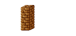
I made a skinner version too for like pillars or something, also made the scatter less profound:

Oh, I forgot to mention to ya'll that much like I did with my handdrawn art and CG style, I am on a spriting sabbath as well. I won't really be too public about my work just yet, but in due time all will be revealed.
I always do this after every CaP... :\Did somebody ask for a suicune sprite a while back?KoA, the only thing I noticed is that on the big wall, some bricks are falling, then go up for a frame or two. It's on the right side of the wall. It's the two bricks that land in a pile smack dab in the middle of the fallen bricks. When they are falling, they are going down, then suddenly go up. It just looks weird.
I can't show you though, no software that lets me go frame by frame, sorry. It looks good otherwise though.
I had asked for a darkrai colored suicune, but it was already fulfilled, but if you want to try, go for it.Did somebody ask for a suicune sprite a while back?
I'm on it. =D I love doing trainer sprites.Can some one make a sprite where this traineris recolored as shiny metagross ( gold and gray) and stand next to a shiny metang
similar to this?
I would be grateful and will of course give you credit :)
Cool! Can't wait :)I'm on it. =D I love doing trainer sprites.
Wow, that's looks good! The only (tiny :P) issue is that the metang is behind him. If you would put the metang next to him, to our left, then it would be perfect :)Here you go:

I can't do transparency, so you might have to fix that yourself. =/ Sorry, Paint can be a bitch.
Anything that needs fixing?Project RBYDex is the comprehensive redrawing of every Pokemon sprite as though it would have appeared in Pokemon Red and Blue. As of now, the plan is to do Hoenn and Sinnoh Pokemon, as the Johto sprites are already on par with the originals.
Here are a few I've done already.


For more, visit http://project-rbydex.deviantart.com/.
Mmm, I tried that first. It doesn't look nearly as good. But if that's what you're looking for, sure.Wow, that's looks good! The only (tiny :P) issue is that the metang is behind him. If you would put the metang next to him, to our left, then it would be perfect :)
EDIT:
Here goes. Is this more what you were looking for?

I vastly prefer the original, but this fits your bill better. ^_^ Here you go.I'm back from my two-day absence, and in said absence, I've made another fusion.

I am also happy to announce that I am finally going to seriously atempt scratching. I'm going to be starting on my first full scratch next week, after another long absence. It will be an evolution for Scizor named Rapior that is actually what I based the black Scizor fusion off of. (Click my sig.)
Wish me luck!- Status
- Not open for further replies.
Users Who Are Viewing This Thread (Users: 1, Guests: 1)
- ... and 1 more.


