

Proto-Suicune. The other two were dogs so I suppose this one is supposed to be as well, maybe combined with a kelpie.<- what is that? A pony? a Dog?

-
Welcome to Smogon! Take a moment to read the Introduction to Smogon for a run-down on everything Smogon, and make sure you take some time to read the global rules.
-
Congrats to the winners of the 2023 Smog Awards!
Worst Pokemon Sprites?
- Thread starter Rankumander
- Start date

Yellow looks like Tierno's Blastoise busting a dance moveSomething that bothers me everytime I play Pokemon Emeralds battle frontier
View attachment 322471
I really don't like the Blastoise sprite in this game. It looks like a kid put something inside it's cheeks and opens its mouth.
Compare that to FRLG sprite. It's not as noticable. Also the way Blastoise poses feels more intimidating.
View attachment 322472
I really love the sprite from DPP and am glad BW and B2W2 animated it.
View attachment 322473
What I don't like is probably the worst sprite I have seen from Blastoise
View attachment 322474
Yeah, that one is terribe too, but I mean this one actually:
View attachment 322475
It looks like a fat kid instead of a large blue turtle with cannons on it's shell.
Also
Personally not a fan of this pose of...moving claws like some cat. You're a golem! And of course they picked this one for the gen 5 games.
Last edited:
This is probably the sprite that disturbs me the most (not including gen 1 since it's not a fair comparison). It just looks like it's too thin and fish-like to be a Vaporeon, and something about that tail just bothers me lol.View attachment 311068
Vaporeon is hard to get right in sprites, it seems, but HG/SS went the extra mile to make it look really wrong.
Speaking of this, to me, Onix has looked weird as far as I can remember.

The Pokémon Yellow sprite has a weird pose, Onix almost looks like a worm, and not the actual huge rock snake it is supposed to be. The upper jaw also feels too big.


The Red and Green sprite's mouth looks weird, and so does the back sprite for Red, Blue, Green and Yellow. The back sprite almost looks like its jaw was dislocated.

I find the mouth of the Silver sprite pretty weird too, and Onix looks like it's smugly staring down at you, giving it a somewhat derpy expression.


I feel like the gen 3 games made Onix's head too disproportionately big for its body, and the problem stays in the Diamond and Pearl and Platinum sprites:


Also, the Platinum Onix sprite (on the right) just looks posed horribly wrong, and the Sinnoh games make it look kinda retarded to me. The size of the lower jow also feels inconsistent. Gen 5 just reused the Diamond and Pearl sprite, but at least I'm glad the gen 6 and 7 sprite fixed both the head size and jaw size problems.

Although it seems the Sword and Shield sprite make its head look weird yet again, especially by how flat and square-ish it looks.

The Pokémon Yellow sprite has a weird pose, Onix almost looks like a worm, and not the actual huge rock snake it is supposed to be. The upper jaw also feels too big.
The Red and Green sprite's mouth looks weird, and so does the back sprite for Red, Blue, Green and Yellow. The back sprite almost looks like its jaw was dislocated.
I find the mouth of the Silver sprite pretty weird too, and Onix looks like it's smugly staring down at you, giving it a somewhat derpy expression.
I feel like the gen 3 games made Onix's head too disproportionately big for its body, and the problem stays in the Diamond and Pearl and Platinum sprites:
Also, the Platinum Onix sprite (on the right) just looks posed horribly wrong, and the Sinnoh games make it look kinda retarded to me. The size of the lower jow also feels inconsistent. Gen 5 just reused the Diamond and Pearl sprite, but at least I'm glad the gen 6 and 7 sprite fixed both the head size and jaw size problems.
Although it seems the Sword and Shield sprite make its head look weird yet again, especially by how flat and square-ish it looks.
Well, part of the matter with Onix's sprites is that it's depicted as leaning towards the screen, so when the head looks bigger, it's that it's closer. But it seems they did not make that perspective well.Speaking of this, to me, Onix has looked weird as far as I can remember.
The Pokémon Yellow sprite has a weird pose, Onix almost looks like a worm, and not the actual huge rock snake it is supposed to be. The upper jaw also feels too big.
The Red and Green sprite's mouth looks weird, and so does the back sprite for Red, Blue, Green and Yellow. The back sprite almost looks like its jaw was dislocated.
I find the mouth of the Silver sprite pretty weird too, and Onix looks like it's smugly staring down at you, giving it a somewhat derpy expression.
I feel like the gen 3 games made Onix's head too disproportionately big for its body, and the problem stays in the Diamond and Pearl and Platinum sprites:
Also, the Platinum Onix sprite (on the right) just looks posed horribly wrong, and the Sinnoh games make it look kinda retarded to me. The size of the lower jow also feels inconsistent. Gen 5 just reused the Diamond and Pearl sprite, but at least I'm glad the gen 6 and 7 sprite fixed both the head size and jaw size problems.
Although it seems the Sword and Shield sprite make its head look weird yet again, especially by how flat and square-ish it looks.
A few of those (mainly the later ones) look fine to me. Maybe you just don't like Onix?Speaking of this, to me, Onix has looked weird as far as I can remember.
No, man, I like Onix very much in fact, all the more as a Little Cup player, I just personally find these to look weird (well, except the XY&SMUSM one I stated as fine on my post).A few of those (mainly the later ones) look fine to me. Maybe you just don't like Onix?
This reminds me how I feel for Golduck and PsyduckNo, man, I like Onix very much in fact, all the more as a Little Cup player, I just personally find these to look weird (well, except the XY&SMUSM one I stated as fine on my post).
Gen 1, Yellow, and GSC I found Psyduck cute
Post 3 his eyes look way too spaced out, and post 4 it got worse
Golduck is worse. I only like the Yellow and GSC sprites. Everything before and after has awkward proportions for face and body for front, despite typically good backsprites
I was pretty accepting of XY models as a result where the head no longer looked weirdly small or doofy. Though the pose and bill shape took a dive
You're right! And oh god, I never noticed how weird HGSS Psyduck especially looked lmao!This reminds me how I feel for Golduck and Psyduck
Gen 1, Yellow, and GSC I found Psyduck cute
View attachment 336176
Post 3 his eyes look way too spaced out, and post 4 it got worse
View attachment 336177
Golduck is worse. I only like the Yellow and GSC sprites. Everything before and after has awkward proportions for face and body for front, despite typically good backsprites
View attachment 336175
View attachment 336181
I was pretty accepting of XY models as a result where the head no longer looked weirdly small or doofy. Though the pose and bill shape took a dive
That's because Sonikku A caught it in mid-animation:I never noticed how weird HGSS Psyduck especially looked lmao!

It's better than DPs, but I still don't like the eyes

Cheryl.
Celesteela is Life
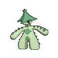
Lets talk about Cacturne. Very underrated mon, and I love it’s design. But other than it’s Gen 3 sprite, I don’t think it’s design has been put to good use in any form, sprite or model.

this is pretty solid. Standard pose, but it looks good.

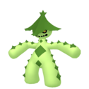
Now we have Gen 4 Cacturne. I’ll admit that I’m being rather not picky on this one but I’m not a huge fan of the weird dancing pose it’s going for. However the colors are an improvement, and it’s got that subtle smirk on its face.

Gen 5 is where it starts to really go downhill. Couldn’t get the animated sprite unfortunately but it’s literally just moving from side to side and while I get that it’s supposed to be cactus movements, it looks really bad in motion LOL. I’ll give it one thing though, going back to the Gen 3 pose is better.
Yeah I hate everything about the 3D model Cacturnes. The animations look too stiff, the colors get drastically worse with each variation of the model, it’s just bad here. Seriously what did they do with Gen 8’s model?!
this is pretty solid. Standard pose, but it looks good.
Now we have Gen 4 Cacturne. I’ll admit that I’m being rather not picky on this one but I’m not a huge fan of the weird dancing pose it’s going for. However the colors are an improvement, and it’s got that subtle smirk on its face.
Gen 5 is where it starts to really go downhill. Couldn’t get the animated sprite unfortunately but it’s literally just moving from side to side and while I get that it’s supposed to be cactus movements, it looks really bad in motion LOL. I’ll give it one thing though, going back to the Gen 3 pose is better.
Yeah I hate everything about the 3D model Cacturnes. The animations look too stiff, the colors get drastically worse with each variation of the model, it’s just bad here. Seriously what did they do with Gen 8’s model?!

The HOME render are weird because it's actually their 2d drawing stock pose recreated in 3D. When posing the model I imagine they may have had to do some wonky squashing and stretching as well as getting the lighting just right enough to recreate the 2d's image shading effect/bright spot effects. It's a very strange decision.gen 8's 'model" there is the render from home which are all...........exceptionally stiff and have some odd lighting going on.
more than anything hurting i think it really is the lighting model they chose combined with the shading style they choseThe HOME render are weird because it's actually their 2d drawing stock pose recreated in 3D. When posing the model I imagine they may have had to do some wonky squashing and stretching as well as getting the lighting just right enough to recreate the 2d's image shading effect/bright spot effects. It's a very strange decision.
It just results in really sterile renders. Go & Let's Go have similar aesthetics, it's bad, but Home's are a step worse I feel. Except the g-max renders, those are actually not bad at all.


Floatzel & Luxray (Pt)


These two. Which especially sucks because it's one of the few areas I believe Platinum was somewhat flawed, in taking a step back from DP with respect to some of its sprite work (though luckily not with Infernape).
Compare the above to DP:


Floatzel looks cool, calm and collected in DP, ready for battle. He looks like he's derpily jumping for joy in Platinum. Luxray looks badass, regal and dignified in DP. He looks like he's bowing his head in submission in Platinum.
As I said, Platinum got some of the sprite work right. For example Infernape's revamped sprite is one of the best in the series in my opinion. But they missed the mark on some. Not surprisingly, BW used the DP sprites to animate for Floatzel and Luxray, not their goofy Platinum counterparts.
These two. Which especially sucks because it's one of the few areas I believe Platinum was somewhat flawed, in taking a step back from DP with respect to some of its sprite work (though luckily not with Infernape).
Compare the above to DP:
Floatzel looks cool, calm and collected in DP, ready for battle. He looks like he's derpily jumping for joy in Platinum. Luxray looks badass, regal and dignified in DP. He looks like he's bowing his head in submission in Platinum.
As I said, Platinum got some of the sprite work right. For example Infernape's revamped sprite is one of the best in the series in my opinion. But they missed the mark on some. Not surprisingly, BW used the DP sprites to animate for Floatzel and Luxray, not their goofy Platinum counterparts.
Last edited:
I can see what they were trying to do with Luxray's Platinum sprite. Lowering its head to ram into the opponent, ala Skull Bash. But I think they lowered its head too much to the point where it does look like it's bowing. However, its tail raised is a sign of aggressiveness I'll give you that. Still the DP sprite has a proud, regal lion vibe which fits Luxray much better I think.Luxray's fur is raised and so is its tail, it always read not as submissiveness but as pumping itself up/agressive.
I also like Floatzel's PT more but that's just a matter of taste, I guess.
Floatzel's Platinum sprite just looks silly in my opinion. It undercuts what I think should be a tough battler and turns it into a derpy circus animal. I can almost picture it laughing like Mickey Mouse.
To each their own I suppose.
Last edited:

QuentinQuonce
formerly green_typhlosion
Big disagree on both of these. Re Luxray, the DP sprite is flat as hell, it's not looking in your direction so it comes off as not quite right, and the position of the legs and tail just looks lifeless. If it was in the same position but facing you properly it'd look much better. The Plat one has a little more depth and looks like it's ready to pounce. Big improvement imo.Floatzel & Luxray (Pt)
View attachment 357863View attachment 357865
These two. Which especially sucks because it's one of the few areas I believe Platinum was somewhat flawed, in taking a step back from DP with respect to some of its sprite work (though luckily not with Infernape).
Compare the above to DP:
View attachment 357874View attachment 357875
Floatzel looks cool, calm and collected in DP, ready for battle. He looks like he's derpily jumping for joy in Platinum. Luxray looks badass, regal and dignified in DP. He looks like he's bowing his head in submission in Platinum.
As I said, Platinum got some of the sprite work right. For example Infernape's revamped sprite is one of the best in the series in my opinion. But they missed the mark on some. Not surprisingly, BW used the DP sprites to animate for Floatzel and Luxray, not their goofy Platinum counterparts.
Re Floatzel, DP's sprite is alright - nothing special, but not awful. The Plat one again has more depth and adds some character. Floatzel always comes off to me as a little bit derpy so I don't think it's out of character.
so I sent a bunch of Timid Persian from Emerald to Platinum in the hopes 1 of them has Technician (non of them had) and had to witness this awful sprite:

A neck? Wut dat? And the front feet look very goofy. All the improvement it went through to make these


To these


A neck? Wut dat? And the front feet look very goofy. All the improvement it went through to make these
To these
Probably cuz...it didn't have a long neck until laterso I sent a bunch of Timid Persian from Emerald to Platinum in the hopes 1 of them has Technician (non of them had) and had to witness this awful sprite:
A neck? Wut dat? And the front feet look very goofy. All the improvement it went through to make these
To these
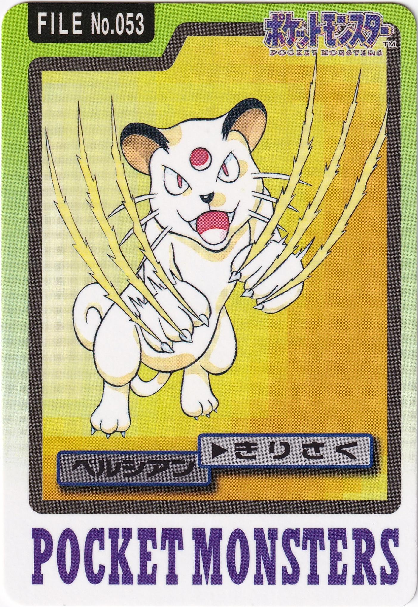
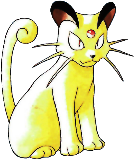
For whatever reason Persian got a stupidly long neck after FRLG for art. Before it was more like a well fed cat, not a dog like panther for body
The sprites were slow to update that change. A similar thing happened for some mons Gen 3 RSE sprites, where "outdated" designs were still used
XY's model is weird. The head seems undersized, while still lacking a long neck
Last edited:
We can agree that Gen 1 (Pokemon Red and Blue) had the worst Sprites of all of Pokemon and created by Game Freak lolol
http://pkmn.net/?action=content&page=viewpage&id=8544
Like almost every Gen 1 Sprite had something weird about it..
Probably why my Friend doesn't like RBY so much, I don't blame him tho

Discord: 00Crystal#7683
http://pkmn.net/?action=content&page=viewpage&id=8544
Like almost every Gen 1 Sprite had something weird about it..
Probably why my Friend doesn't like RBY so much, I don't blame him tho
Discord: 00Crystal#7683