
Kirlia's backsprite in Gen 3 and 4. That's just....wrong.

-
Welcome to Smogon! Take a moment to read the Introduction to Smogon for a run-down on everything Smogon, and make sure you take some time to read the global rules.
-
Congrats to the winners of the 2023 Smog Awards!
Worst Pokemon Sprites?
- Thread starter Rankumander
- Start date
HG/SS somehow managed to screw up the sprites for several Pokémon that looked pretty good in D/P/P and previous games. I think the most notable are the following:


These look just plain messy. What did these poor guys do to deserve this treatment?

Vaporeon is hard to get right in sprites, it seems, but HG/SS went the extra mile to make it look really wrong.

Cloyster looks like it has been flattened a bit here in comparison to its other sprites and artwork.

I think Scyther looks strange here. It doesn't really look like it should, somehow.

I remember from many years ago on Serebiiforums, there was a member who made a thread about how Moltres was a chicken. After seeing this sprite, I can totally see where he was coming from.
These look just plain messy. What did these poor guys do to deserve this treatment?
Vaporeon is hard to get right in sprites, it seems, but HG/SS went the extra mile to make it look really wrong.
Cloyster looks like it has been flattened a bit here in comparison to its other sprites and artwork.
I think Scyther looks strange here. It doesn't really look like it should, somehow.
I remember from many years ago on Serebiiforums, there was a member who made a thread about how Moltres was a chicken. After seeing this sprite, I can totally see where he was coming from.
Last edited:


Hmm, well let's see if we can't figure it out...Mew in R/G is nightmare fuel and so is Dragonite. Mewtwo's Yellow sprite enrages me for some reason, maybe because it looks too graceful. Same with its HG/SS sprite if I'm being blunt.


didls
formerly Besom
Cloyster edition. No I am not including the RB sprite because no one cares.

The RSE sprite is properly shaded.

The FRLG sprite uses dark grey for shading instead of a darker purple. It looks like a GSC sprite (think how Pokémon like Arbok are shaded with pink because of the limited color palette).

Very similar to RSE's in terms of style, except that it uses Cloyster's new design with the purple body.

The shading on the body is worse, and the horn is just awful; minimal shading and it's not angled correctly; if you zoom in, the top part of the horn is literally a straight line of pixels.

The shell is WAY too round and the gap between the outer and inner shell is way too wide. At this point, Cloyster isn't even purple anymore, it's blue.
The RSE sprite is properly shaded.
The FRLG sprite uses dark grey for shading instead of a darker purple. It looks like a GSC sprite (think how Pokémon like Arbok are shaded with pink because of the limited color palette).
Very similar to RSE's in terms of style, except that it uses Cloyster's new design with the purple body.
The shading on the body is worse, and the horn is just awful; minimal shading and it's not angled correctly; if you zoom in, the top part of the horn is literally a straight line of pixels.
The shell is WAY too round and the gap between the outer and inner shell is way too wide. At this point, Cloyster isn't even purple anymore, it's blue.
RSE love indeedCloyster edition. No I am not including the RB sprite because no one cares.
View attachment 319402
The RSE sprite is properly shaded.
View attachment 319404
The FRLG sprite uses dark grey for shading instead of a darker purple. It looks like a GSC sprite (think how Pokémon like Arbok are shaded with pink because of the limited color palette).
View attachment 319442
Very similar to RSE's in terms of style, except that it uses Cloyster's new design with the purple body.
View attachment 319443
The shading on the body is worse, and the horn is just awful; minimal shading and it's not angled correctly; if you zoom in, the top part of the horn is literally a straight line of pixels.
View attachment 319444
The shell is WAY too round and the gap between the outer and inner shell is way too wide. At this point, Cloyster isn't even purple anymore, it's blue.
It seems common HGSS sprites are worse shaded compared to DPPT
....which were worse shaded than RSE
Hate the blue shell now though. SwSh and LetsGo is still purpler than that thankfully
A lot of Platinum sprites feel like they were changed for the sake of it, when they looked just fine in Diamond and Pearl. For example:
 Piplup's head is too big. What's weird is that the second frame is the same as Diamond and Pearl, so it looks even more jarring.
 Buizel looks like it's about to fall over.
 Quagsire is too dark.
 Marill's soul was sucked out.
 Piplup's head is too big. What's weird is that the second frame is the same as Diamond and Pearl, so it looks even more jarring.


Last edited:
Well the "enhanced" versions of the sprite games changed up the Regional Dex Pokemon sprites in some way. One reason for Japanese Blue was to have better looking sprites, Yellow sprites was made to more match the official artwork, most of Crystal's sprites were either from Gold or Silver BUT given a small animation hence sort of making them new, Emerald followed suit with the RS sprites being animated, Platinum updated most of their front sprites (though the major sprite feature was not the back sprites did a quick animation when sent out), & B2W2 Pokemon got some more animation frames (though it's major sprite feature was TRAINERS were animated). Wish was something they kept doing in the 3d era *takes a look at ORAS, USUM and SwSh DLC*A lot of Platinum sprites feel like they were changed for the sake of it, when they looked just fine in Diamond and Pearl.
(If you're wondering why I mentioned ORAS, remakes regional dex Pokemon were also usually given new sprites)
I know that, but the point was that the DP sprites for these Pokémon were fine. Also, the Bulbagarden Archive embeds broke, and I can't figure out what the sprite command for Platinum is. :pt/piplup: doesn't give me an image.
As a kid I was wondering "What is so beautiful about Milotic?" and that is because of this sprite

Doesn't look bad, but it doesn't look like anything I would consider beautiful. Until I saw the DP sprite and likely how it was meant to be

Those red eyebrowns? looked like weird in RSE. Kinda reminded me of those tired girls that wear all black on school enterances at weekends. I know I do a horrible job at describing what I mean.
Similarity I didn't think Salamence debut sprite looked impressive either. Maybe something I expect from a Pokemon that has no evolutions and is just backfiller like Drampa

But the updated new gen sprites which are more dynamic made if feel more like it's a pseudo legendary at it's most powerful state.


Yes, even the 3D model, while not dynamic, feels more like what Salamence should have been.
Doesn't look bad, but it doesn't look like anything I would consider beautiful. Until I saw the DP sprite and likely how it was meant to be
Those red eyebrowns? looked like weird in RSE. Kinda reminded me of those tired girls that wear all black on school enterances at weekends. I know I do a horrible job at describing what I mean.
Similarity I didn't think Salamence debut sprite looked impressive either. Maybe something I expect from a Pokemon that has no evolutions and is just backfiller like Drampa
But the updated new gen sprites which are more dynamic made if feel more like it's a pseudo legendary at it's most powerful state.
Yes, even the 3D model, while not dynamic, feels more like what Salamence should have been.
Yung Dramps
awesome gaming
Say that again, say that to my fucking face. square up brother, square upMaybe something I expect from a Pokemon that has no evolutions and is just backfiller like Drampa
ok so to ensure this post isn't just a one-liner haha funny
Why does its head look so crumpled up and uneven, like it's made of paper mache?
DPP sprite for comparison.
While we're on the subject of Gen 3 Pokémon, Grovyle is a dull shade of greenish-grey in Rescue Team for some reason. Thankfully they fixed it in Explorers, but Treecko and Sceptile were always coloured correctly, so what went wrong?
I totally agree that salamence got a better sprite post-gen 3, but I gotta say, I like his gen 3 color palette way better. That blueish and red-orange looks way better imo. Also his 3D model makes him look very unintimidating and chonky, especially since he’s just kinda floating. 3D models seemed to do that for a lot of Pokémon unfortunately:/As a kid I was wondering "What is so beautiful about Milotic?" and that is because of this sprite
View attachment 322060
Doesn't look bad, but it doesn't look like anything I would consider beautiful. Until I saw the DP sprite and likely how it was meant to be
View attachment 322061
Those red eyebrowns? looked like weird in RSE. Kinda reminded me of those tired girls that wear all black on school enterances at weekends. I know I do a horrible job at describing what I mean.
Similarity I didn't think Salamence debut sprite looked impressive either. Maybe something I expect from a Pokemon that has no evolutions and is just backfiller like Drampa
View attachment 322062
But the updated new gen sprites which are more dynamic made if feel more like it's a pseudo legendary at it's most powerful state.
View attachment 322063View attachment 322064View attachment 322065
Yes, even the 3D model, while not dynamic, feels more like what Salamence should have been.
Thanks for noticing, will tweak in my hackSay that again, say that to my fucking face. square up brother, square up
ok so to ensure this post isn't just a one-liner haha funny
View attachment 322075
Why does its head look so crumpled up and uneven, like it's made of paper mache?
View attachment 322077
DPP sprite for comparison.
The issue is Gen 3 had many beta concept leftovers littered despite starting the model sheet
In fact, here's a couple I can mention
-Delcatty spot on head for front
-Electrike missing spikes for back
-Zangoose purple claws
-skink blue tongues Rayquaza
And then others such as -a notorious lack of black in outlines (Claydol suffers) since early dev didn't consider outlining. Heck, most berry sprites for the pokeblock minigame are remnants from that era
Rescue TeamWhile we're on the subject of Gen 3 Pokémon, Grovyle is a dull shade of greenish-grey in Rescue Team for some reason. Thankfully they fixed it in Explorers, but Treecko and Sceptile were always coloured correctly, so what went wrong?
Explorers
It is really strange indeed. The Rescue Team body palette for Grovyle makes it look more like it's shiny than anything else, feather and belly colors notwithstanding.
Something that bothers me everytime I play Pokemon Emeralds battle frontier

I really don't like the Blastoise sprite in this game. It looks like a kid put something inside it's cheeks and opens its mouth.
Compare that to FRLG sprite. It's not as noticable. Also the way Blastoise poses feels more intimidating.

I really love the sprite from DPP and am glad BW and B2W2 animated it.

What I don't like is probably the worst sprite I have seen from Blastoise

Yeah, that one is terribe too, but I mean this one actually:

It looks like a fat kid instead of a large blue turtle with cannons on it's shell.
I really don't like the Blastoise sprite in this game. It looks like a kid put something inside it's cheeks and opens its mouth.
Compare that to FRLG sprite. It's not as noticable. Also the way Blastoise poses feels more intimidating.
I really love the sprite from DPP and am glad BW and B2W2 animated it.
What I don't like is probably the worst sprite I have seen from Blastoise
Yeah, that one is terribe too, but I mean this one actually:
It looks like a fat kid instead of a large blue turtle with cannons on it's shell.
It has been a while since I last played Emerald, but I remember that there was one thing about Blastoise's sprite in that game which I always disliked. It was nothing about the sprite itself or about the animation, but rather the fact that the sprite animation seemed to be delayed. It happens for a second or two after Blastoise has been sent out on the battlefield, which I always found annoying. In comparison, the animation for every other Pokémon in Emerald seemed to happen directly after they were sent out. At least that's how I remember it.
I really don't like the Blastoise sprite in this game. It looks like a kid put something inside it's cheeks and opens its mouth.
While I'm here, I might as well post some more sprites I'm not too fond of. No more from HG/SS though.
Gold Lugia has always looked derpy to me, I find it hard to take it seriously. I think it looks much better in Silver. I really don't understand why they used the Gold sprite as the basis for the Crystal sprite, though they did at least make it look a little better in Crystal.
Not a big fan of D/P Goldeen, it looks fake or fan-made to me. When I saw this sprite again after not having played D/P for a while, I almost couldn't believe this was a real sprite used in an actual game.
I love Gen 5 and Dragonite... but I have never been too fond of Dragonite's sprite in the Gen 5 games. Especially since it came directly after its amazing sprite in HG/SS, this is one of the extremely few things I think HG/SS got right but Gen 5 failed at. While I have grown a bit more fond of Dragonite's Gen 5 sprite recently, I still have several issues with it.
It just wants a hug.View attachment 322491
Gold Lugia has always looked derpy to me, I find it hard to take it seriously. I think it looks much better in Silver. I really don't understand why they used the Gold sprite as the basis for the Crystal sprite, though did at least make it look a little better in Crystal.
Honestly it's more the issue of Blastoise being drawn inconsistently outside sprites for Gen 1-3. Him having a jaw that can unhinge doesn't help, and spriters don't know if he's supposed to have a mean/stoic streak or not as a resultSomething that bothers me everytime I play Pokemon Emeralds battle frontier
View attachment 322471
I really don't like the Blastoise sprite in this game. It looks like a kid put something inside it's cheeks and opens its mouth.
Compare that to FRLG sprite. It's not as noticable. Also the way Blastoise poses feels more intimidating.
View attachment 322472
I really love the sprite from DPP and am glad BW and B2W2 animated it.
View attachment 322473
What I don't like is probably the worst sprite I have seen from Blastoise
View attachment 322474
Yeah, that one is terribe too, but I mean this one actually:
View attachment 322475
It looks like a fat kid instead of a large blue turtle with cannons on it's shell.


Honestly probably the most inconsistent of Gen 1 mons for proportions and character


Machop's sprite in Ruby and Sapphire. Who thought this was okay? Why is one of its arm disconnected from its body? This one definitely should have been redone imho.
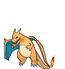
I want to show some other sprites I forgot earlier. First some Charizard Sprites
Gen 1: The awful Trio


I could tolerate the last two because it's still better what they did with Charmeleon. But the Japanese RG sprites... oh no...
Glad Yellow fixed it. I like it because Charizard looks like he had a fine meal

Then we have Gen 2 with a pretty Gold/Crystal Sprite

But the Silver and back sprite...


I can kinda tolerate the back sprite but the mouth of the front sprite of the Silver version is awful. But can you imagine it could have been even worse?
Look at the Gold Spaceworld 97 Demo sprites


From here on it can only get better...
Gen 3
RSE...


Backsprite looks kinda better. But the front sprite looks like Charizard is giggling to a joke "Tehehe, oh stop it."
Meanwhile CHAD FRLG Charizard.

At first I thought it was pretty good because it had an intimidating face. But now seeing the handsight, it looks like he is... shrugging? Maybe he is cornered by a bunch of enemies and saying to all of them "Come at me." at both direction.
Gen 4 and 5 did Charizard justice


They give me a "Do you really want to do this? You can still run." vibe. Gen 4 backsprite looks still weird but overall it's fine.
Gen 6...
I have seen a lot of cut Pokemon content sprite. There are some I wish we have gotten like these:


 likeaboss


 <- Majestic
 Iwasexpectingyou
But there are still thse I'm glad we don't have to see
 icanseeyou


 wontstopscreeming
 itsafreakinggun

 <- what is that? A pony? a Dog?

 ryatalkintome?
 what'supwithmyarm?
 cantopenmyzipper
 *sadonixnoices*
 What it looks like: Get out of here
 What he meant to say: Good job
Gen 1: The awful Trio
I could tolerate the last two because it's still better what they did with Charmeleon. But the Japanese RG sprites... oh no...
Glad Yellow fixed it. I like it because Charizard looks like he had a fine meal
Then we have Gen 2 with a pretty Gold/Crystal Sprite
But the Silver and back sprite...
I can kinda tolerate the back sprite but the mouth of the front sprite of the Silver version is awful. But can you imagine it could have been even worse?
Look at the Gold Spaceworld 97 Demo sprites
From here on it can only get better...
Gen 3
RSE...
Backsprite looks kinda better. But the front sprite looks like Charizard is giggling to a joke "Tehehe, oh stop it."
Meanwhile CHAD FRLG Charizard.
At first I thought it was pretty good because it had an intimidating face. But now seeing the handsight, it looks like he is... shrugging? Maybe he is cornered by a bunch of enemies and saying to all of them "Come at me." at both direction.
Gen 4 and 5 did Charizard justice
They give me a "Do you really want to do this? You can still run." vibe. Gen 4 backsprite looks still weird but overall it's fine.
Gen 6...
I have seen a lot of cut Pokemon content sprite. There are some I wish we have gotten like these:
But there are still thse I'm glad we don't have to see
Attachments
-
 1.7 KB Views: 99

POGGERS EKANSHere's another Red and Green sprite that is terrible:

What is wrong with the mouth on that Ekans?
They didn't give a fuck about cuteness? Did you forget about Pikachu?

That's its original sprite from Red and Green. Fucking. Adorable.
Also, there is a difference between looking monstrous and just having a crappy sprite.


Just a clarification on the back sprite, and that it's just the Red/Green front sprite seen from the back. The angle works a little better in this case, though.Gen 1: The awful Trio
View attachment 322498View attachment 322499View attachment 322500
I could tolerate the last two because it's still better what they did with Charmeleon. But the Japanese RG sprites... oh no...