

Plague von Karma
Banned deucer.
Yeah, some are actually really good, people just see Mew and go EWWWW. Here are some of my favourites.Personally I'm half half of what sprites I like from RG and B
Part of the reason some look bad is due to some being resized during development, usually due to an evolution being added. Venonat is a good example of it. In the Tajiri Manga, you can see Venonat with a much larger sprite, but once Venomoth was added, it was downsized significantly. I think they did an amazing job tbh.


.jpeg")

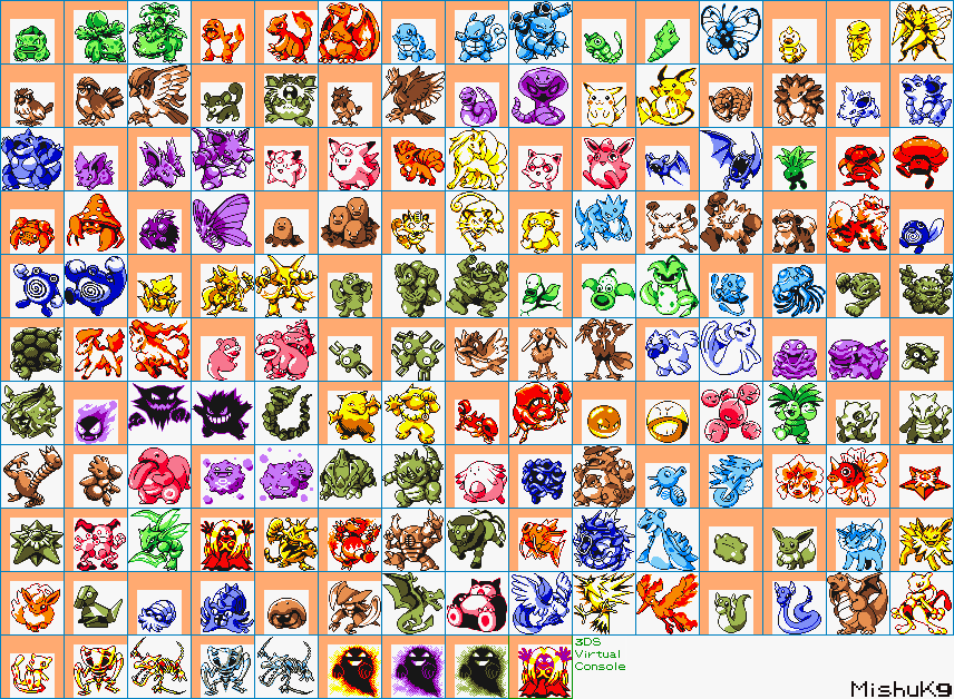
 me I know but I like the simis (simisear,simipour and simisage)
 i done it but I don't know how


 I think is GOOD
 ,
,  and
and 


