QC Time post!
Mega Scizor
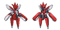
Let's start with a simple edit to Mega Scizor, because this thing just won't stay down. I added a bit of white under the Left Claw on the front sprite, since that seemed to be the main complaint I was getting about it. So yeah, that's been taken care of.
Amaura
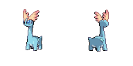
Did a very minor touchup on the frontsprite here, literally changed the color of four pixels in regards to pom's concern that the sails were covering too much of the eye. I just changed a bit of the sail's outline color where it met with the left eye to correct the issue. If you meant Amaura's right eye, I could maybe fix that, but it's pretty accurate atm, so not sure how necessary it is. Also, according to the spreadsheet, Amaura still hasn't been updated yet, so that should probably be fixed.
Now, onto the main attraction.
Skiddo (gotta 'do fast)
-Old-


-New-
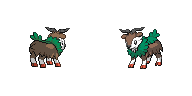
Skiddo! This little tyke was pretty fun to QC all in all. A lot of minor changes went into this one, so let's try to sum up the main points.
-Colors editted to either have a few extra shades/higher contrast/be more accurate
-General shading and QC around the hoof areas of both sprites, backsprite kegs no longer as parallel as they used to look.
-Horns cleaned up, now has a notable division between the two instead of being one split horn.
-Fur made to look more rugged and less rounded, as it should be. (I thought about this edit long and hard before doing it, eventually coming to the conclusion that the fur looked too blunt for Pokemon. I compared it to Stoutland's sprite for reference, as it has similar fur to Skiddo, and realized that ours looked more cloud-y than fur-y)
-Generally cleaned up the head, complete with more accurate smile and clearer eyes.
-Made the leaf coverage more accurate, as backsprite had too little around the neck and too much on the back, and just generally tidied up the frontsprite's mane.
-Added Skiddo's tail to the backsprite.
Also, I figured you guys would probably prefer the shading style listed above, but I did create a somewhat different shading of Skiddo's mane based more directly off of the ingame model. Alternate shading is on the left, with the light ending in a more leaf-like pattern instead of just abruptly ending. Not sure if you guys would like it, but I do think it looks a tad bit better. You guys can decide among yourselves which is better, as per usual.


As always, toss any comments or criticisms you guys have my way. +)
Next up on the chopping block is going to be finishing Gogoat's QC, which I've been working on at home whenever I get back from school. I also plan on playing around a bit with Dragalge to see if I can create a better head, because I can definitely see where you're coming from with that, pom. It's in the current position primarily because I wanted to preserve the angles of the frontsprite, which required a bit more of a backview. So this is anatomically correct in the current version, but I feel that Dragalge could probably get away with breaking proportions a bit, considering. After that, I should begin work on Aurorus, so stay tuned for that.
Sláinte!
EDIT: Oh yeah, and I'm k with your edits to Doublade, pom. Looks pretty cool, even if you did de-aXl the sprite lol.
EDIT 2: Wow, this is unusual. No posts since my last one. Well, here's an update on
Gogoat's Front Sprite
-Old-

-New-

Here's a quick run-down of the changes:
-it's 2AM I have school tomorrow I'll do the backsprite later goodnight
Mega Scizor
Let's start with a simple edit to Mega Scizor, because this thing just won't stay down. I added a bit of white under the Left Claw on the front sprite, since that seemed to be the main complaint I was getting about it. So yeah, that's been taken care of.
Amaura

Did a very minor touchup on the frontsprite here, literally changed the color of four pixels in regards to pom's concern that the sails were covering too much of the eye. I just changed a bit of the sail's outline color where it met with the left eye to correct the issue. If you meant Amaura's right eye, I could maybe fix that, but it's pretty accurate atm, so not sure how necessary it is. Also, according to the spreadsheet, Amaura still hasn't been updated yet, so that should probably be fixed.
Now, onto the main attraction.
Skiddo (gotta 'do fast)
-Old-
-New-

Skiddo! This little tyke was pretty fun to QC all in all. A lot of minor changes went into this one, so let's try to sum up the main points.
-Colors editted to either have a few extra shades/higher contrast/be more accurate
-General shading and QC around the hoof areas of both sprites, backsprite kegs no longer as parallel as they used to look.
-Horns cleaned up, now has a notable division between the two instead of being one split horn.
-Fur made to look more rugged and less rounded, as it should be. (I thought about this edit long and hard before doing it, eventually coming to the conclusion that the fur looked too blunt for Pokemon. I compared it to Stoutland's sprite for reference, as it has similar fur to Skiddo, and realized that ours looked more cloud-y than fur-y)
-Generally cleaned up the head, complete with more accurate smile and clearer eyes.
-Made the leaf coverage more accurate, as backsprite had too little around the neck and too much on the back, and just generally tidied up the frontsprite's mane.
-Added Skiddo's tail to the backsprite.
Also, I figured you guys would probably prefer the shading style listed above, but I did create a somewhat different shading of Skiddo's mane based more directly off of the ingame model. Alternate shading is on the left, with the light ending in a more leaf-like pattern instead of just abruptly ending. Not sure if you guys would like it, but I do think it looks a tad bit better. You guys can decide among yourselves which is better, as per usual.


As always, toss any comments or criticisms you guys have my way. +)
Next up on the chopping block is going to be finishing Gogoat's QC, which I've been working on at home whenever I get back from school. I also plan on playing around a bit with Dragalge to see if I can create a better head, because I can definitely see where you're coming from with that, pom. It's in the current position primarily because I wanted to preserve the angles of the frontsprite, which required a bit more of a backview. So this is anatomically correct in the current version, but I feel that Dragalge could probably get away with breaking proportions a bit, considering. After that, I should begin work on Aurorus, so stay tuned for that.
Sláinte!
EDIT: Oh yeah, and I'm k with your edits to Doublade, pom. Looks pretty cool, even if you did de-aXl the sprite lol.
EDIT 2: Wow, this is unusual. No posts since my last one. Well, here's an update on
Gogoat's Front Sprite
-Old-
-New-

-it's 2AM I have school tomorrow I'll do the backsprite later goodnight
Last edited: