
-
Follow our Instagram!
-
The moderators of this forum can be found in the CAP forum staff directory.
-
Welcome to Smogon! Take a moment to read the Introduction to Smogon for a run-down on everything Smogon, and make sure you take some time to read the global rules.
You are using an out of date browser. It may not display this or other websites correctly.
You should upgrade or use an alternative browser.
You should upgrade or use an alternative browser.
CAP 3 CAP 3 Sprite Submission Thread
- Thread starter Gothic Togekiss
- Start date
- Status
- Not open for further replies.


nice KoA. Probably the best but you've got some serious competition this time. Anyway agreeing that the colors are a bit dull (everyone else's is duller, but yours could be a bit brighter) , the outlines are a bit hard to see, and it could do with some fire in its hands.
Maybe the sprites are too detailed? I had that feeling with Syclant and Revenankh, and in this case, it's the same. In the games, pokémon use very plain and contrasted colours: Bright green, red and yellow in the case of Sceptile, Brown bright green and white in the case of Shiftry (the only pokémon to feature wood prominently), etc.


Wow, that is great KoA! The only thing would be some acknowledgment that it has fire in its cannons. But otherwise the best sprite here along with Flygon's.Ok, it took me longer to do than the other two past sprites, but I believe I settled on a sprite I'm happy with.
It was a bit of a toughie but I followed the 16 color limit. This is final version barring a palette change:
:doom:
Damn u alway removing the wordsfrom my mouth..... but the sprites are getting better
KoA... i dont like the head
Maybe the sprites are too detailed? I had that feeling with Syclant and Revenankh, and in this case, it's the same. In the games, pokémon use very plain and contrasted colours: Bright green, red and yellow in the case of Sceptile, Brown bright green and white in the case of Shiftry (the only pokémon to feature wood prominently), etc.
Damn u alway removing the wordsfrom my mouth..... but the sprites are getting better
KoA... i dont like the head

Wow, great work everyone. I think so far, Nopie's new brighter sprite is the best. I think it fits the best as a Pokemon sprite, and if we put it next to the sprites of the other CAPs I think that's clear. None of the others come close enough, for me at least. KoA's and Flygon's are close second's, but Nopie's is clearly the best.


KoA is clearly the best, it has the best pose, colour and size.
The others are just too small and theres some thing on them that i dont like
The others are just too small and theres some thing on them that i dont like
Hahaha I've never noticed before but Rev looks SO much more like a pokemon than Syclant.
Great designs but I don't know, something about the level of detail and the dullness of the colours makes none of them look Really like a pokemon.
KoA's looks closest but I think it would benefit hugely from brighter colours.
Great designs but I don't know, something about the level of detail and the dullness of the colours makes none of them look Really like a pokemon.
KoA's looks closest but I think it would benefit hugely from brighter colours.
KoA is clearly the best, it has the best pose, colour and size.
I'm going to have to disagree.
Things I don't like:
- The open mouth, it doesn't seem to fit well
- The tail, it's too thick
- The colors, they're too dull and there's not a high enough amount of contrast
- The toes, they're too big
- No fire element in the sprite
I like the fact that it is a little bit bigger than the others, but it seems like it's been crammed into the 80 x 80 frame. I looks really cluttered in there, and doesn't look like it has a good, flowing line of action.
To me, KoA's looks more like Donkey Kong in barrel armor than a pokemon. No disrespect to KoA at all, it's an excellent sprite, but it just doesn't seem Pokemon-ish enough.

I've been meaning to reply to this earlier, but Gloom and Time Mage and everyone else is right on the money. From day one I knew the problems with being overshaded and undersaturated (especially saturation- it's really really important in pokemon), but I was curious to see whether anyone would bring it up. Making the sprites more "pokemon-ish" is waaay harder than it sounds, though. Namely, with woodman the wood texture really fights with the "simple-shading" schema.
So sorry, you'll have to endure more of me fiddling with my sprite. Hopefully people aren't sick of it yet :p This is important, though.

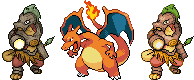
I made a Charizard sandwhich so you can see how more pokemon-ish this revision is and how it (hopefully...) looks much better this way... still not perfect, though. Old sprite is on the left.
So sorry, you'll have to endure more of me fiddling with my sprite. Hopefully people aren't sick of it yet :p This is important, though.
I made a Charizard sandwhich so you can see how more pokemon-ish this revision is and how it (hopefully...) looks much better this way... still not perfect, though. Old sprite is on the left.

^ I don't think that sprite is very pokemonish at all.
The sprites need to be in a less crammed up pose, and above all, they need to have very bright colors.
I'm not a very experienced spriter myself but maybe I'm going to try to make a sprite and see how it goes, don't expect it to be nearly as good as, say, KoA's though.
The sprites need to be in a less crammed up pose, and above all, they need to have very bright colors.
I'm not a very experienced spriter myself but maybe I'm going to try to make a sprite and see how it goes, don't expect it to be nearly as good as, say, KoA's though.


I was hoping KOA would save us, but none of these sprites are going to work. KOA's comes closest, but somehow still misses the mark. The design is simply too complicated. Somebody should take what this pokemon really is, a Sceptile re-color with armor and sprite that. I'm having trouble seeing any of the sprites working.


Agreeing with gaudetjaja for the most part, i'm neither too experienced when it comes to spriting but from mostly looking at them you can tell that none of these current sprites really have a pokemon(ish) feel to them although omnitarian's does come pretty close.
Personally i like Cartoon's pose the best.
 [/QUOTE]
It actually seems to fit the pokemon more than the other sprites. I really wish we could have seen it sprited.
To KOA and omnitarian I think something just feels wrong with the snout in the sprites, in omnitarians it looks too long and similar to a duck in comparison to the original image and KOAs seems to be the opposite with it being too blunt and short in comparison.
I don't know what it takes to make a sprite but if these problems can be remedied i'm sure it would greatly improve the artwork.
Personally i like Cartoon's pose the best.
It actually seems to fit the pokemon more than the other sprites. I really wish we could have seen it sprited.
To KOA and omnitarian I think something just feels wrong with the snout in the sprites, in omnitarians it looks too long and similar to a duck in comparison to the original image and KOAs seems to be the opposite with it being too blunt and short in comparison.
I don't know what it takes to make a sprite but if these problems can be remedied i'm sure it would greatly improve the artwork.

Just realized something KoA, what's going on below his waist? Below his right leg and above his left knee... looks like his standard skin color but it's weird. Hard to describe it, but it looks like either his right leg has no armor and there's a coconut above his left, or something horrible happened to make him scream.
Are they the upper parts of his legs? If so, it makes it seem as if he's REALLY tall when standing straight up.
Are they the upper parts of his legs? If so, it makes it seem as if he's REALLY tall when standing straight up.
He is asking what the red bulge is on the top part of its left leg. BTW, I like the re coloration a lot:D!!I am confused by your wording. :(
- Status
- Not open for further replies.