Sorry but this deosn't look rock at all. infact it looks like a Steel type.
Let us agree to disagree. There may be others who think it looks like a Rock-Type.
Such as this one.

Sorry but this deosn't look rock at all. infact it looks like a Steel type.

I... I think I had a dream where I came up with the concept for Cactuar's design?! XD "This vauge circle with another circle inside of it, yes that was my original intent and below it, are codes for what different types of rock each color would suggest." I wish I remembered what that list is XD
anyways, I think what makes it look steel is it's SHINY. *shing sparkle sparkle* The highlights on its body make it look smooth, without defects, which is what many steel-type pokemon are - smooth, round bodys that look perfectly like metal. I think if you re-did the coloring to making it less shiny and more imperfect, then more people would see it coming across as a rock-type vs. a steel-type. Perhaps dulling the colors down, making them less primary; I'd also try to get at least some kind of rock-tint (read: tan/brown) to the colors. I'm sure with a little fidgeting around it can be made to less more rock less steel :)
Artistic critique aside, while I think it's a great and nifty design, I seem to have trouble thinking of it going very fast. Anyone else have this same problem?
My design gets inside your braaaaaaain... Maybe it is Psychic. :P
But yeah, maybe I should've roughed it up a bit. I thought if I kept it smooth it'd come off as looking a bit faster, but I guess that didn't quite work. As for the steel-grey coloring, I tried a couple different colors, but anything more brown on the central three rings ended up blending into the red too much. It just looked muddy, and a good deal less striking.
But anyway, I'm glad people liked it. Thanks for the feedback, all. ^^
I can already see it:
Z: "Get those Power Rangers"
*exaggerated body movements*
Easter Island: "Righto boss"
*Easter Island grows 100X its normal size and fights a giant robot and when struck with a sword, sparks fly*

This is for you Constructive criticism??
___________________________
Anyway... I have another pose for Easter Island Pokemon [EIP] xD
I improved the eyes, and the legs....Also, is using Ancient Power, in a offensive pose.
Can anyone paint it?... I really like this pose and I want this for the final submission.
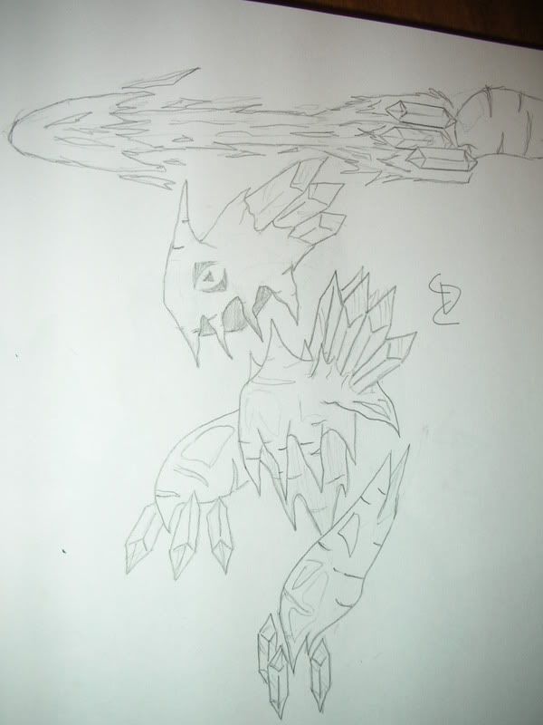
Someone mentioned a stalagtite/mite themed pokemon at the begining of the thread and no one jumped on the idea so I thought I would give it a try. Here it is:
Above is an example of how it would use its floating crystal-like fingers to do some sort of blast attack. Hope you guys like it.
Anyway... I have another pose for Easter Island Pokemon [EIP] xD
I improved the eyes, and the legs....Also, is using Ancient Power, in a offensive pose.
Can anyone paint it?... I really like this pose and I want this for the final submission.
[/SIZE]


