


-snip-
Not going to bother colouring it until I get some feedback >>
The shoulder pads are way too big, I liked the small ones. Getting better imo, but I liked the "Cut-off shorts" look better than the Medicham legs.

-snip-
Not going to bother colouring it until I get some feedback >>
I like it. It looks plenty tough as is.Hi, people!
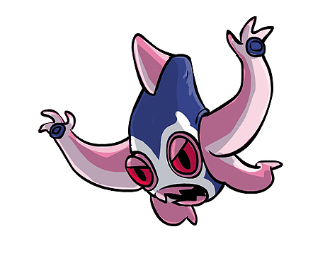
Here is Atlantimon colored. It isn't blue! [Like others Water type: Krabby, Kingler, Psyduck, Politoed, Staryu, Octillery, Pink Shellos, Slowbro, etc]
-Image-
Any comments?
Sketched up a slightly different design with different colours.
Seriously. He's gonna beat you up.
Sketched up a slightly different design with different colours.
Seriously. He's gonna beat you up.
Hey Cartoons! I have an idea for you. Make the head like a Luchador Mask, or "Mascara de Luchador Mexicano"...
You can add some details.
It is already like a Luchador mask already, no? o.o

For some reason, Atyroki's reminds me of Medicham.... O_O
Yeah, but, I think it needs more details like a real mask.
For some reason, Atyroki's reminds me of Medicham.... O_O
This really stood out to me. Making the shape of the head look like a pirate's hat was quite clever and it looks great. I'd like to see you work with this more and color it in, because I think it'll go far. :)Well, SOMEBODY needs to do a pirate Pokemon. After all, pirates are the first things to come to mind when you think of a warrior of the sea.

A squid's head makes a wonderful base for a pirate's hat, without actually being a hat. With multiple arms, it can pull off Fighting attacks quite easily. Of course, you'll need the trademark cutlass and hook. The front two arms can be used as fist for punching moves.
Blacking out an eye can give it the effect of an eyepatch, although whether it's necessary is the question. A skull shaped design can carry make the pirate hat look more obvious, although it may be too heavy handed.


