CAP 7 CAP 7 - Part 14 - Sprite Submissions

Status
Not open for further replies.
Here is my Outline (ignore the colors at the top).
NewerPHOX.png

And the results.
This isn't the final entry, and I would appreciate any suggestions on what I could do with this further....
Phox1.png
 
cap7spritedraft-1.jpg


WIP for me as well...Canti, nice one for your first scratch-this is my first scratch one as well...>< I used paint for mine as well, but I have only the luxury of my lonely mouse to draw. Wish I had a tablet...*cries*

It seems a bit thin though...should I make it more "plump"?

Protip: It's generally better to do each pixel individually.

The pose is interesting, and this is the most unique entry so far imo. I like the more ghostly interpretation, but the sprite still needs a lot of work, particularly with the outlines. You might want to establish more around the waist as well, it looks too thin.
 
Eh, I'm having a damnest time thinking of a good pose for this guy.

I'm trying to convey a sense of scoutiness in the pose rather than a "I'm gonna rip your throat out" kinda pose I'm noticing.

Here's a couple shittily drawn poses I've done thus far. I'll do more tomorrow:

pose1.png


pose2.png


ps: lol I suck at quadropeds. :P
 
Atyroki's is my favourite so far. I'm not a big fan of the sprites that are just mini concept arts, i'd like to see some more creativity with poses.
 
phox-1.png

Okay, finished shading and fixed some of the pixeling. Still don't know how to make a transparent background. I really want to hear what everyone thinks, since this is my first. I'm very open to criticism (constructive) and advice from the pros and spectators.


Kalyst: if you save as a PNG it will look a lot crisper and less blurry, JPEG distorts the colors of pixel art.
 
I definitely like Aty's and Cartoons' the best (morseo Aty's at the moment). Personally though, I don't think the front mask should have a mouth (i.e. revert to the old design!)
 
steel-ghostsprite2.png

Meh
I have no idea why I attempted to sprite this at all. I am a pretty mediocre spriter first of all, and I cannot draw quadrupeds for the life of me -_-. Oh well, gave it a shot, etc. Might not finish it like the other CaP sprites I've attempted.


First attempt.
I liked the original mask more so I used it instead. I'll add more detail later on since this is still a pretty simplistic design.
 
cap7sprite3.png

I tried to make the tuffs/wisps seem to fade out a bit more, and changed the form of the feet and some leg positioning, as well as reshading most of it. I'm not sure if I'm going use the lighter colors or the dark one.
 
I'd like to remind all spriters to follow the "outline rule":

CAP Sprite Rules said:
3) All sprites (front and back) must have a complete, unbroken, distinguishable outline. It does not need to be a black outline, but it must be clearly distinguishable from the adjacent interior colors of the sprite. Look at the ingame sprites for examples.

Ingame sprites have a few exceptions to the outline rule. For example, almost all sprites that have fire effects (e.g. the Charizard line) do not have outlines around the fire. But those sprites are few and far between. The vast majority of ingame sprites are completely outlined. Outlined sprites are able to be easily displayed on a variety of background colors without losing their shape, which is the main reason for the outline rule.

However, the rule has the added side-effect of imposing a certain stylistic limitation on the sprite as well. Most spriters will attest that it is easier to create a "cool" sprite, if you don't have to use outlines. Without an outline, you can make a sprite that looks like a miniature painting. Pokemon sprites are not miniature paintings, they are miniature cartoon pictures. The outline rule somewhat enforces this, although that is not the reason for the rule. Since there are no "spriting standards" published by Game Freak, we have no idea what stylistic rules exist, if any.

Most spriters that have participated in CAP sprite contests, will likely agree that you need to make CAP sprites "cooler" than ingame sprites, if you want to win. I know Wyverii and I have specifically discussed this point. Many CAP spriters intentionally or unintentionally make sprites that utilize more advanced coloring techniques than most ingame sprites. But, since there are no defined coloring rules, it is acceptable to do this in a CAP sprite inside the outlines.

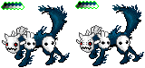
Regardless of what EoE's design looks like, it does not override the "outline rule" for this sprite.

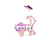
We actually have an outline rule for art designs as well. And EoE's design breaks that rule. His early WIP designs broke the rule horribly. His final submission only broke the rule by a little, so I let it go. His design has several small wisps that were intentionally blurred in Photoshop. Those wisps are the exact opposite of an outline. I probably should have put my foot down then, but it seemed to have minor impact on the overall design. Now that we have come to the spriting phase, it could be a bigger issue.

We can't have ambiguity in the outline rule for sprites. If the rule is ambiguous, then some spriter will abuse the ambiguity and make a little painting, that isn't usable for our display needs on the battle simulator and elsewhere.

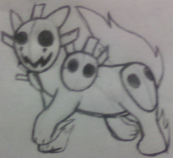
Most spriters have followed the outline rule for their CAP7 sprites, but there are some sprite submissions in this thread that do not follow the rule as stated in the OP. So just to be clear to everyone -- Any sprite that does not follow the OP outline rule will be disqualified.
 
fair warning.

Taken further steps to solidify the body.
phoxdo4.png
phoxalt1.png

I'm going to keep the blue light, as my darker version presents a strong contrast to regular Pokemon sprites. Even Pokemon we tend to perceive as black, like Umbreon or Banette, are really lighter shades of grey.

TvboyCanti, I like how you've done the upper body, but right now the legs strike me as kind of soft and 'noodle-y'. Try to imagine the two solid bones that make up the leg and wrap the muscles around that, not as perfect cylinders, but as shapes that taper at the joints. Currently, the second leg from the left strikes me as the most ideal.

Aragorn's outline looks great, and I'm looking forward to his submission, not to mention our trio of titans; Wyv, Doug, and KoA.


edit: Hey, is anyone else having this problem?! All the sprites in this thread seem to have a sort of blurry outline, like a shrunken down jpg, but then look significantly better when you click View Image and view them separately. Is this my browser, or a setting on the forums? I don't recall such blur occurring in previous sprite threads.
 
Hey, is anyone else having this problem?! All the sprites in this thread seem to have a sort of blurry outline, like a shrunken down jpg, but then look significantly better when you click View Image and view them separately. Is this my browser, or a setting on the forums? I don't recall such blur occurring in previous sprite threads.
Huh, same here. I noticed that after I posted my sprite. That's why I added a link to my sprite to my post as well. It's really odd. I wonder what's causing that?
 
CAP7sprite.png

Artistic license used and abused. Tell me what you think.

I love this sprite and pose. It looks lively and nimble. Very well-rendered sprite.


I liked the bigger mask version better. That sprite looks like the pokemon is lifting its head up, and looks a little more dynamic.

Okay, I'll enter this. Only a rough outline so far.
fox1.png

I know it's just an outline, but it looks like a great pose! Knowing your prodigious spriting skills, I expect this to turn into an amazing sprite.


Another good action-packed sprite. This is one of my favorites.


This is a very good sprite rendering, but your choice of pose is bland. A sitting pose could work, if the face could convey more expression. But, the mask makes it very difficult to do that.


I think this is a nice sprite, but for whatever reason, it doesn't stand out from some of the others. I can't give you any specific critiques, since your spriting technique is very competent and clean.


Another exciting sprite from you, Atyroki! I love the big dramatic tail, and the crouching pose. This is clearly a contender.

Taken further steps to solidify the body.
phoxdo4.png
phoxalt1.png

One of the most innovative poses so far. The shading and coloring is wonderful. I expect this sprite to have many fans -- including me.
 
Some advice for chaosscrippler: I feel like the head is too high. In EoE's art, it seems like the neck connects more towards the top of the mask than the bottom. This gives it a creeping look, like a bobcat or jaguar stalking its prey. I know it's a matter of artistic license, but I think a slightly lower head would very much increase the amount that it feels like EoE's art. Besides, while animals like cats, dogs, and foxes may hold they're heads high to check their surroundings, they always lower them to stalk, or when facing off a foe.

Some advice for Atryoki: I like this pose a lot but one thing jumps out at me - he seems to have a big, caveman-like forehead. It might be an issue of shading, or of how swept back the spikes are, but to me it completely changes the perceived personality of scoutmon. The original art has the mask being creepy, but in a cute way (think banette, or Coraline). Your sprite looks genuinely mean. Also, it kind of makes it look like a skull, rather than a mask.

To both of you: awesome sprites! I think this will end up being one of the best looking CAPs. If any of my nitpicks offend your sense of artistic license, by all means disregard them. Hopefully they've been helpful, though.
 
Phox.png


Well, no matter if I lose or not, I still come happy out of this, because this is the second sprite I've ever done, and I'm rather pleased with it.

Obviously, it isn't finished - the whole outline (pretty much) is still in the darkes shade, which I will have to work on, and the shading of the fur isn't to my liking, so I'll experiment with that.
 
edit: Hey, is anyone else having this problem?! All the sprites in this thread seem to have a sort of blurry outline, like a shrunken down jpg, but then look significantly better when you click View Image and view them separately. Is this my browser, or a setting on the forums? I don't recall such blur occurring in previous sprite threads.

Huh, same here. I noticed that after I posted my sprite. That's why I added a link to my sprite to my post as well. It's really odd. I wonder what's causing that?

I think it's because Smogon's vBulletin theme has light blue backgrounds for posts. Since many of these sprites have blue outlines, the outlines appear to "bleed" with the post background. When you click View Image, it displays on a clean white background and loses the "bleed".

This is the reason we have the outline rule, to minimize this effect in most cases. But a small effect is unavoidable in some cases depending on the colors of the sprite and the colors of the background.
 
Status
Not open for further replies.
Back
Top