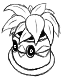
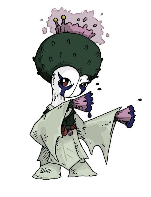
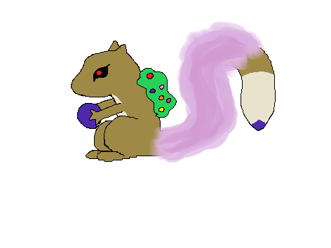
@DougJustDoug: For what it's worth, I prefer the version with the see-through mask holes. I can sort of understand how it might make the design appear a bit busier, but I think that it's worth it because it's sort of a glaring inconsistency in the original design, at least to me. Some things to consider might be:
a) darkening the masks? Somebody else mentioned this already too. If they're supposed to appear as awards and this pokemon is supposed to represent faded beauty, then it might make sense for the awards to have lost their shine and become dull.
b) thickening the masks? This might not make any sense, but I have a bit of a hunch that part of the reason that the version with the see-through mask holes looks a little funny now is because the masks appear to be paper-thin.
Other than that, I think that the coloring and eyes are perfect the way that they are, and I love reading about all of the thought that you've put into the design story-wise. While a lot of other cool designs have come up in this thread, I think that Weeping Willow is still my favorite.
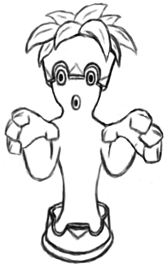
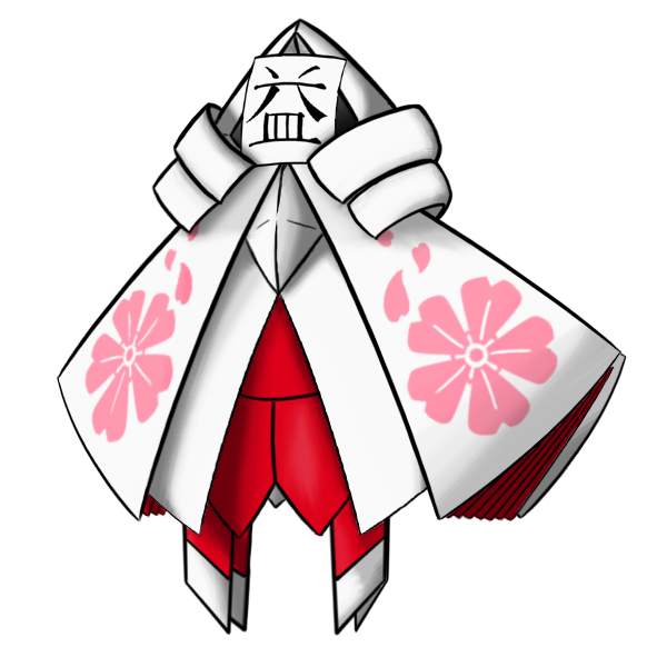
@SoIheardyoulikeSENTRET: I do like this shirt a lot better than the military jacket. It alleviates a good deal of the weird "Pokemon wearing clothes" issue by drawing less attention. I'm of two minds about the leg(s), though. On the one hand, I like the two-legged version better conceptually for purposes of actually picturing the Pokemon moving, and I'm even totally fine with the legs bending the way that you had them bend. On the other hand, I like how this new version's single leg is crooked and warped and more obviously wooden. Would it be possible to try two more crooked-looking legs? Then it might even be easier for people not to be bothered by their bending.
@paintseagull: I much prefer being able to see the crop circle design on the creature's back, so I really like it in that regard. However, other parts of the design seem to have lost some of what I thought made the initial version look so cool, and after comparing back and forth, I think that the issue for me with this version is that it looks noticeably less bulky, specifically its body and upper arms. It looks longer and sleeker now, and that change, along with the change from claws to fingers, isn't one that I'm a fan of. It might help to see more of it though, different angles and action shots and so on. I still really like the general design, and your concept is definitely one of my favorites.


