Art for Articles

Status
Not open for further replies.
I did a thing for the LC Speed Tiers article

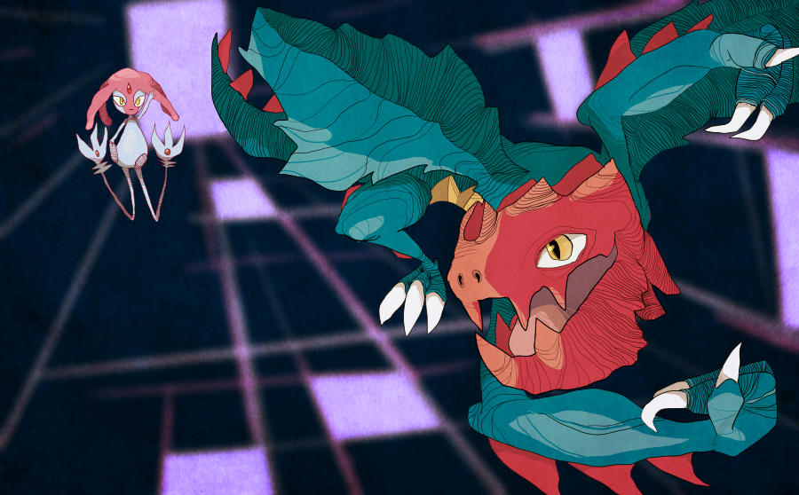
First off, I really like your color choices and expressions. You did a really good job in that.
But, I feel that you could make it a bit neater; I feel like it has been rushed almost. First off, your lineart doesn't seem to touch each other and I feel it gives this piece a rather unclean look. So, I would probably connect those lines to each other. Also, I would pay attention the "solidifying" the coloring a bit more for your figures so the background color doesn't show through them. If you do, then the piece would be tidier. Speaking of background, it seems a bit too scribbly for my liking so may I suggest putting the lines facing downward left? By having that, it will make your piece more dynamic. Furthermore, Zorua and Sandile seem to have abnormally large forearms and it doesn't seem natural to me so maybe shorten them a bit. Finally, your lineart in generally could use work and I would pay attention to line overlaps (i.e. I see some here) and take your time to erase them if you find any because if you leave them, they will make your pieces unclean.
Hope this helps and as for the Uber Stall, I shall work on that ASAP! :)
 

Andrew

beep boop
is a Top Artist Alumnus
this thread needs new links or something
tl;dr I'm too lazy to figure out what they all say beneath the mountains of code
 

Bummer

Jamming to the beat
is a Top Artist Alumnusis a Senior Staff Member Alumnusis a Community Contributor Alumnusis a Top Smogon Media Contributor Alumnus
I'll always vouch for text-less images, so I'd suggest removing "Argh, almost had it", and possible the "Boink" too. And unless the Ultra ball is shot out of its chest, you might want to connect another line to the impact point to indicate from what direction it was thrown.
 

Blue Frog

It's lucidity. So clear!
is a Top Artist Alumnus
I'll always vouch for text-less images, so I'd suggest removing "Argh, almost had it", and possible the "Boink" too. And unless the Ultra ball is shot out of its chest, you might want to connect another line to the impact point to indicate from what direction it was thrown.
ok, included a version with the "boink" still there, because I'm not quite sure about the completely text-free version just yet


which one looks better?
 

Regime

the party is December 18th
is an Artist Alumnus
Hi. I found that there was even a Psychological Warfare Article. Even if I don't get anything out of it, I would like to submit this piece for that article, despite it not being up there:

Edit: Put Alakazam's Mustache on XD
And if nothing has been done for it yet I would like to reserve LC speed tiers.

I did the piece anyways:

 
Last edited:

Regime

the party is December 18th
is an Artist Alumnus
i like the first one but the second one is kinda iffy. elekid's body shape is messed up
So you can do what you want with the first one. I can completely redo the second in the same theme but in a different position? But then can you put me down on the list to reserve?
 

Bummer

Jamming to the beat
is a Top Artist Alumnusis a Senior Staff Member Alumnusis a Community Contributor Alumnusis a Top Smogon Media Contributor Alumnus
My biggest concern with that last image is how even though all three are vastly different in shape and physique, they're virtually pictured moving the same, almost appearing stationarye apart from those white motion lines. Voltorb could have been shown rolling, Diglett could have pieces of ground spraying directly behind it along with a ditch created in its path, and Elekid wouldn't have both of its legs in front of it if it were running. So if you want to make things easier for you, I'd suggest drawing each of them on a winner pedestal to illustrate the difference in speed.
 
Status
Not open for further replies.

Users Who Are Viewing This Thread (Users: 1, Guests: 1)

Top