Sprite Rules
Final Submission Post
All spriters must make a final submission post conforming to the sprite rules (listed above) and the following:
All legal final submissions will be included in the sprite poll.
Advice for Spriters
There are 8 possible sprites:
Main Design

---
CAP20 so far:
Leadership Team:
Concept:
Abilities: Water Veil / Heatproof
Stats: 103 HP / 110 Atk / 90 Def / 95 SpA / 65 SpD / 97 Spe
- Sprites should be inspired by the winning design from the Art Poll. It does not need to be an exact rendition of every detail of the design; "artistic license" is granted to all spriters. However, drastic deviation from the selected art design is discouraged.
- All sprites (front and back) can have a maximum size of 96x96.
- All sprites (front and back) must have a complete, unbroken, distinguishable outline. It does not need to be a black outline, but it must be clearly distinguishable from the adjacent interior colors of the sprite
- No action effects, move effects, environment effects or additional objects can be rendered on or around the pokemon.
- Sprites must be in PNG format.
- Use 8-bit truecolor (aka 8-bit RGB) or less. This does NOT mean 256 color mode.
- Use transparent backgrounds.
- All sprites must be scratch sprites that are completely original works by the spriter. Fusions of other sprites or pixel-overs of other artist's lineart (including the main design) are not allowed.
- Do not alter, fuse, recolor or otherwise modify another spriter's submission unless the original artist explicitly gives permission.
- All sprites (front and back) must use roughly the same size and pose when compared to each other.
Final Submission Post
All spriters must make a final submission post conforming to the sprite rules (listed above) and the following:
- The post must have "Final Submission" (in bold) as the first line, with the sprites at the top, and any additional description or comments (if applicable) below them.
- Final submissions must contain a minimum of 4 sprites - Front Normal, Front Shiny, Back Normal, Back Shiny. If spriters choose to include gender differences (Male and Female versions of each) then 8 sprites must be submitted. Gender differences are NOT required.
- Only submit ONE PNG that contains all the submitted sprites. Please do not submit separate images for every sprite. One "cutsheet" makes it easier for mods to track submissions and ensure each complete set of sprites stay intact.
- Only make one (1) final submission post.
All legal final submissions will be included in the sprite poll.
Advice for Spriters
There are 8 possible sprites:
- Front Normal Male
- Front Normal Female
- Front Shiny Male
- Front Shiny Female
- Back Normal Male
- Back Normal Female
- Back Shiny Male
- Back Shiny Female
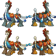
Main Design
---
CAP20 so far:
Leadership Team:
nyttyn - Topic Leader
Ununhexium - Typing Leader
trc - Abilities Leader
HeaLnDeaL - Stats Leader
Snobalt - Movepool Leader
Ununhexium - Typing Leader
trc - Abilities Leader
HeaLnDeaL - Stats Leader
Snobalt - Movepool Leader
Concept:
Type: Water / SteelName: Use the Boost to Get Through!
General Description: A sweeper with several boosting options that result in completely different checks and counters. While each set should be viable in its own right, the unpredictability of this Pokemon should make it much better than any one set alone.
Justification: In the early days of Pokemon X and Y, we experienced the first Pokemon that could (viably) boost and sweep from either the physical or special side: Mega Lucario. While it was clear his unpredictability could have a devastating effect (having your Chansey eat a Close Combat, Will-O-Wisping on the Nasty Plot, etc.) the true extent to which this could make a Pokemon better was masked by the fact that Lucario's sets were both already amazing. The purpose of this concept would therefore be to explore the impact of unpredictability in sweepers by creating a Pokemon that can run several boosting sets, none of which are dominant in their own right, but that when combined can result in an extremely dangerous threat.
Questions To Be Answered:
- Is there a limit to how much unpredictability can make a Pokemon better? Can it make a decent Pokemon great? Or can it only make them usable?
- How does being unpredictable with boosting options compare to other forms of unpredictability (such as uncommon coverage moves or trying to speed creep certain threats)? Is unpredictability in sweepers inherently more dangerous because of how easily they can win a game?
- For a Pokemon that is already unpredictable, will we see the use of strange coverage moves (as many sweepers tend to run) or will it tend to stick to standard sets because it already has the element of surprise?
- Which boosting moves are distinct enough to completely change a Pokemon's checks/counters? Are Swords Dance, Nasty Plot, and Agility the only ones that can fit this concept? Or is there a way to incorporate moves such as Dragon Dance without giving the Pokemon "the best of both worlds".
- How effective will double boosting sets be on this Pokemon? Will the ability to "pick your counters" on a Pokemon already designed to bypass its counters be too good? Or can it be designed so that the loss of coverage will still leave it with several checks and counters on any set?
- To what extent will teams have to prepare for this Pokemon? Will they have to pack several checks/counters like for M-Lucario? Or will they be able to just use a standard team so long as they can identify the set early?
Abilities: Water Veil / Heatproof
Stats: 103 HP / 110 Atk / 90 Def / 95 SpA / 65 SpD / 97 Spe