CAP 25 - Part 6 - CAP 25g Art Submissions

Status
Not open for further replies.
WIP


So many great ideas on here... I'll throw mine in!

Loads of different inspirations went into this one. First, bioluminescent mushrooms, giving off an electric-like glow. Then, okapis, because okapis. Cows also play in, since they are often prone to alien abduction, lending to the last element of the design. The antenna are reminiscent of those headbands you get as a kid that look like alien antenna, 'cept these ones can shoot lightning.

I like the idea of the mushrooms since a lot of utility moves are related to fungi, such as the ever coveted Spore.

Palette-wise, I'm stuck somewhere between 2 or 3. Any suggestions?
 

Sunfished

fisch
is a Top Artistis a Community Contributoris a Forum Moderator Alumnus
WIP

oni pangolin! electric is taking backseat on the design, hoping that the oni theme is enough to pull it.

BlueberryBlanket I prefer palette 2, but id love to see what 2 would look like with 3's green color!
 
Final Submission


So just decided to redo my lineart and mess around a bit with my colours for my final sub and this is what came of it. To reiterate, its based on a porcupine as well as static build up, grass, bushes etc. Its not the most clear cut lift of the base animal and is more a stylised kind of mish mash of beasties more akin to gen 1 or more gen 2 style designs. But the base idea is a porcupine,

Might be planning to do some shading, I dont know, im quite a fan of flat colour styles but people probably prefer shading so I might.

Supporting Art: https://imgur.com/a/umNZIKI.
 
Last edited:
WIP

Revised colors after some suggestions from Discord! I may touch up the tail and head sprout things a bit, but I think I'm almost done.
I like the design but it looks like a grass type, not a grass/electric type (actually the pose and the mask make it look a bit like a grass/dark type; maybe change the pose a little)

mind you, a design doesn't have to just scream "heylookatmytype" Swampert doesn't look ground, Venusaur doesn't look poison and Greninja only looks like a ninja (and thus dark) cause of the way it's posed, tongue-scarf or no tongue-scarf

so yeah, good design but the shifty eyes, grin and the way the arms are posed make it seem malicious enough to be a dark type
WIP

So many great ideas on here... I'll throw mine in!

Loads of different inspirations went into this one. First, bioluminescent mushrooms, giving off an electric-like glow. Then, okapis, because okapis. Cows also play in, since they are often prone to alien abduction, lending to the last element of the design. The antenna are reminiscent of those headbands you get as a kid that look like alien antenna, 'cept these ones can shoot lightning.

I like the idea of the mushrooms since a lot of utility moves are related to fungi, such as the ever coveted Spore.

Palette-wise, I'm stuck somewhere between 2 or 3. Any suggestions?
3, definetly 3
awesome design overall, please keep palette 1 as a shiny
WIP
Added some color! Hopefully the typing gets through lol
:O great design
normally I hate, hate, hate super pointy feet since they make the whole design seem unbalanced, but they work here really well since they're thorns and all
also it's a dryad, it walks by *magic* (also the "ponytails" make it seem more balanced somehow)
 
Last edited:

Reiga

im dying squirtle
is a Top Artist
WIP

While I was almost sure I'd try my best to continue doing a pterosaur design, the great Sunfished poked me the other day telling me how I could go with the same concept but with a velociraptor or the like, while avoiding any Flying elements evoked through having flight-capable wings.


In the end, I like both designs, so I'd really like to know which design the general userbase here thinks is the best for this CAP. I you can respond, then thanks in advanced b

EDIT: heres a poll heh https://www.strawpoll.me/16246326
 
Last edited:

BP

Upper Decky Lip Mints
is a Contributor to Smogon
WIP
While I was almost sure I'd try my best to continue doing a pterosaur design, the great Sunfished poked me the other day telling me how I could go with the same concept but with a velociraptor or the like, while avoiding any Flying elements evoked through having flight-capable wings.
In the end, I like both designs, so I'd really like to know which design the general userbase here thinks is the best for this CAP. I you can respond, then thanks in advanced b
EDIT: heres a poll heh https://www.strawpoll.me/16246326
If you do go with the velociraptor you should make sure it has a more Electric-type concept to it. I don't believe the yellow stripes do it any justice for its electric typing.
 
WIP

Back again with a huge update to coffee cat. Now fully digital and colored!

I am still super unsure on the color palette and would love to hear people's thoughts on what could be improved. Also, all criticism is welcome!


BlueberryBlanket - I really love your design. Bio luminescence is a fantastic idea, in fact I was thinking about having the coffee cherries on my design glow as well. Regarding palette, I like #3 the best. I think the snout should be the same green as in #2 though. I think the darker color is generally better because of the glowing theme. Great design, keep it up!
 
WIP


So I decided to go with the design based on the Flatwoods Monster. It's pretty much finished, but I'm probably going to add smaller details and use a different pose for the final submission so it doesn't look so plain. I used a different brush on the metal and the leaves for texture, but I think I might need to change it so that it is more consistent with the rest of the design? Let me know what you think. Here's a better quality version.
 
WIP


My first thought for Grass/Electric was a tree that had been struck by lightning, then that idea kind of morphed into a wand, smoking after just firing off a magic lightning bolt. In the end he became an ancient bearded wizard from deep in the cypress swamps. His shape is meant to imply both a wand and a wizard's hat, whichever is more immediately apparent to the viewer.
 
Gunna try and offer some feedback to people! Im liking a lot of the designs!

SuessMD a porcupine is an ideal animal for grass/electric starter that doesnt need too much in terms of smart design, but I think you can take it a lot further since right now it feels like a pretty realistic, simple porcupine standing on hind legs. Try and maybe think about some sort of cool proportions that really say "this is my final form" as if the evolution line has fully progressed as far as possible.

StephXPM monkey is coming along well- the tail changes are much better for me. Something about the yellow and lime elements dont sit quiiite right for me, the lime fully overpowers the yellow as a highlight color and I feel one of them might be better changing for a contrasting color. Not sure tho!

BlueberryBlanket The third and second iterations are looking very nice so far. I would love to see this pushed all the way into the most evolved this pokemon can possibly be- make it specialized and not just a simple deer. Is it fast? Powerful? Elegant? Its pulling out a few of these qualities at 60%-ish, if that makes sense, and itd feel very fully evolved and satisfying as a final starter evo if it can take one or two and take them to 90 or 100%. I hope that makes sense!

Sunfished this is interesting but its hard to critique at this point, i know u will do a good design regardless altho i wanna say similar to the above critique to push a quality of the design to 100% rather than making it just an all-rounder, even if the quality is coolness or making it a fan-favourite biped

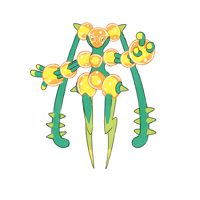
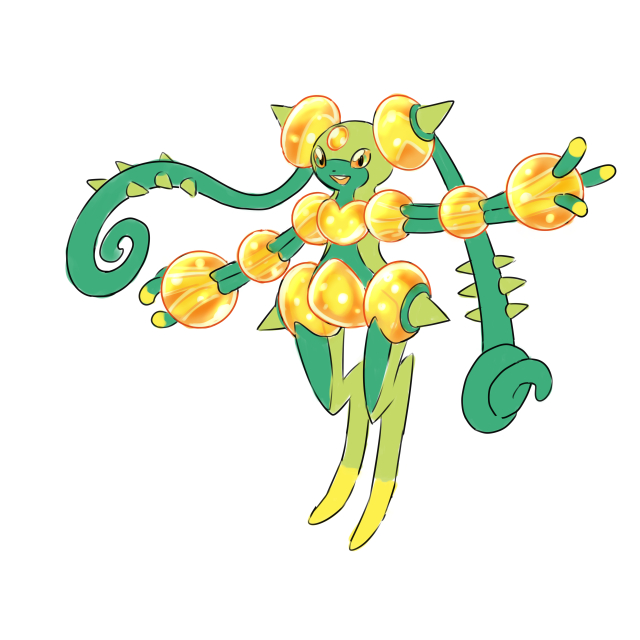
Golurkyourself Well this is definitely the most interesting design ive seen so far in the thread. its very risky to go this route, the design is amazing but i dont know if its giving me a starter vibe. It would be an amazing UB, and i guess that means it feels a bit alien and i wonder if you can find a good way to bring it down to earth without losing its uniqueness.

Reiga , the velociraptor doesnt have a unique or interesting silhouette on the same level as the pterodactyl. id def stick with the pterodactyl because it feels quite cool and fitting.

YourFavDalmatian When i saw your design first, what I thought it was was a corn themed pokemon because of the yellow on top- is that coffee beans also? i think maybe make those more clear, and its not generally a good idea to paste things along the body when its not replacing a feature thats already there or else itll look a bit stuck on. i think you have a generally good starting point trying to work with Hawaiian dancer foot wraps, the cat's mane, and adding something running down its back and tail, but try and find something more interesting for the body than the coffee spots :)

SunriseInBlue interesting design-i think its lack of animal connection hurts its feel as a starter pokemon since every single starter is an animal. also, you could add some more complexity to the face because its easy to notice it as a simple circle right now. its cool to have an inspiration, but i would advise trying to find a connection between the flatwoods monster and an animal and merging them together to make it perfect- thatll solve the face shape also!

Harle cool start- the design makes sense and fits typing nicely. similarly to the last critique, not being an animal is hurting its starter vibe because every starter is an animal without exception. id try and tie an animal inspiration into this also, and itll be a strong submission!

thats all i can do for tonight X_X
 

Quanyails

On sabbatical!
is a Top Artist Alumnusis a Community Leader Alumnusis a Community Contributor Alumnus
Bit of a change from the last sketch:


I was playing around with the giraffe a lot--fixing its anatomy, changing its pose, changing the art style... but I kept feeling like it was missing something. When I looked at starters, I realized I needed another theme to the design. After some humming and hawing over some Ability discussion in Discord, I ended up with the idea of an spiky electric guitar and the fashion from the music that comes with. I still need to figure out what to do with the legs and back. This is a really really rough sketch. I know it needs more Grass-type cues. (And I'm about to fall asleep.)

I ended up with a very whimsical, goofy giraffe because one of the hooves on a sketch looked like something Dr. Seuss would draw. XD So I did a drawing exercise and drew a giraffe in the fantastic style of Dr. Seuss. Unfortunately, the other elements I wanted in the design didn't fit the style, and I wanted to fit another theme, so I went back to the drawing board. Here are some sketches.
 
WIP (Looking for suggestions)


I cannot for the life of me get this entry into a shape that I actually like. Partially because changing my lineart is hard after it's scanned in because I don't have my tablet. I'm going to need to find another way to work with that on Photoshop, I'm just not used to doing it. I'm glad there are so many cool entries, including Kyrads who has made an excellent (superior) porcupine submission. Porcupines represent.
 
SuessMD I feel like what you are missing here is personality. If he had a cartoon-y and more expressive face, it would look more Pokemon and less generic monster. Also some kind of pattern on its fur could help.


Some concept art from the side. Tried to alter the size of the paws a bit, and I’m currently questioning whether the dewclaws can be left out.
 

Jackii

pyukumukumukuyp
is a Top Artist Alumnus
WIP

snap..rabbit? :"J

edit: thanks warren for the feedback (so fast!), yeah there’s parts of the ears that trail down the back but i forgot to add those in. i’ll try changing some of the red to bright yellow to see if that brings out the electric more?

2nd edit: i have an odd fascination with trapping plants aha, the flytrap doesnt naturally push it’s arms forward but it does flare out similar to the frilled neck lizard?? •v•)9
 
Last edited:

Quanyails

On sabbatical!
is a Top Artist Alumnusis a Community Leader Alumnusis a Community Contributor Alumnus
Giraffe iteration umpteen:


After working on the last giraffe, I ended up removing a lot of the artificial parts from it, which pretty much meant the whole electric guitar theme. Instead, its horns are now Angel's Trumpets, and it's got more stars. :) I think it works better for the personality I want in the design!
 
It's a bunny's world out here.
Awesome work! It definitely looks more like a starter now, with the more rounded shapes and approachable face. In particular it seems to fit the trend of more recent starters, having a lot of personality and a slightly more cartoonish look. My one question is about the bunny nose and teeth. Do you think they take it too far? They definitely seems more cutesy and animal-like than the rest of the design. I would try the new design without them and see if you can still capture the starter feel in the face. Anyway, you're an amazing artist and this is just a thought.


I tried a new pose showcasing another angle of the railgun horn's position and some lightning hooves as many comments suggest I show the electric typing more. Also here's an image showing how these updates look on the old pose.
You've done a really good job making a Grass-type deer that stands out from Sawsbuck (one of my favorite mons). It it a very elegant design, and it manages to look bulky and possibly someone defensive without turning into a moose. If Sawsbuck is Pokemon's deer, and Stantler is their reindeer, then your design looks like it could be their elk! lol. My only suggestion is that in the final piece of art you might want to do a better job detailing exactly what is the texture of the green material on its back, and to a lesser extent on its legs. Is it supposed to be clean, smooth spikes like Jolteon or is it supposed to be more brushy like an Evergreen tree? I can't really tell.
 
Status
Not open for further replies.

Users Who Are Viewing This Thread (Users: 1, Guests: 0)

Top