I'm not really commending them, this is something that should've been around since fuckin Red and Blue, and as Merritt says it's still more cumbersome in its current state than actually having multiple save files in-game.I'd hardly commend gamefreak and swsh over something literally every switch game not named animal crossing can do....instead imagine a situation in which the developers fking lock the save file with a patch lol.
-
Smogon Premier League is here and the team collection is now available. Support your team!
-
Welcome to Smogon! Take a moment to read the Introduction to Smogon for a run-down on everything Smogon, and make sure you take some time to read the global rules.
-
Congrats to the winners of the 2025 Smog Awards!
You are using an out of date browser. It may not display this or other websites correctly.
You should upgrade or use an alternative browser.
You should upgrade or use an alternative browser.
Unpopular opinions
- Thread starter antemortem
- Start date
This is frankly more of an indictment against the older games, but something this major alone puts SWSH higher than all of them technically in my eyes
So, SnS can use a base Switch feature to actually have multiple save files...
Really? That's the bar you're setting?

So, SnS can use a base Switch feature to actually have multiple save files...
View attachment 245526
Really? That's the bar you're setting?
I'm not really commending them, this is something that should've been around since fuckin Red and Blue, and as Merritt says it's still more cumbersome in its current state than actually having multiple save files in-game.
The bar is "well, better late and clumsy than never".Really? That's the bar you're setting?
The fact that pokemon games have glaring flaws doesn't magically make the few forward steps they do disappear.
Of course, it's GF and they tend to do 1 step forward and 7 backwards, I suppose... :P
Here's another take: As nice as the QoL improvements for competitive prep in Gen 8 are, they still are not enough. They'll never be enough until the following 2 things happen:
-IVs are scrapped. There is no compromise, no other solution, they have to disappear and never return. Genuinely worthless mechanic that only makes an artificial barrier to competitive and nothing more.
-EVs are fine as a mechanic but need some tweaks. More specifically they need to toss out the antiquated specific EVs for specific stats thing and just make them more like skill points in any other RPG where you get a set amount for a "bank" and can re-arrange them how you like.
Here's another take: As nice as the QoL improvements for competitive prep in Gen 8 are, they still are not enough. They'll never be enough until the following 2 things happen:
-IVs are scrapped. There is no compromise, no other solution, they have to disappear and never return. Genuinely worthless mechanic that only makes an artificial barrier to competitive and nothing more.
-EVs are fine as a mechanic but need some tweaks. More specifically they need to toss out the antiquated specific EVs for specific stats thing and just make them more like skill points in any other RPG where you get a set amount for a "bank" and can re-arrange them how you like.
I agree with the first one, but for the second I'd just make both Vitamins and EV-reducing berries much more easily accessible. Which is funny in that both are easily accessible... but not in the same games (Vitamins being dirt-cheap on Sword and Shield, and EV-reducing berries being farmable like crazy in Gen VII).
That's true, the "worst" games in the series XY and SwSh did give us better streamlined options for breeding and natures (mints). That I can appreciate, because geez, breeding and soft-reseting isn't easy for hours. Stuff like that makes stuff like PkHex a lot more appealing.
I do wish these features were available earlier though. If mints and bottle caps were viable for in-game runs, I'd pretty much never use PkHex again.
No, seriously, that's how lucky I am.
Here's a hot take. Gen V's Animated Pokémon Sprites weren't really that good.
Let's take a look at Snivy. I'm picking Snivy because as a starter, it's one of the first mons you'll ever see.

While I recognize that some mons in Gen V have very expressive animations, Snivy represents some of the issues I have with the moving sprites.
Look at just how much it moves. Ironically, despite the new 3D models having bad idle animations because they're pretty much statues. (Shoutouts to Machoke)
Snivy's sprite is always contorting, moving, squishing, and stretching until it reaches its unique animation, which makes the loop very obvious and that's horrible in animation. And to make things worse, most mons are like this. A lot of them just look like they drank a whole bottle of coffee and can't stay still no matter what.
Now let's take an example of a good, expressive idle animation.

Yep. This is an animation straight out of Sword and Shield. Ironic, isn't it?
You'll immediately notice one thing, Mr. Rime doesn't stand still either. But in its case, it actually works in its favor and it's not constantly tap-dancing, because its attack animations provide a clear break from its idle animation.
What I want to focus on here is how expressive it is. This animation embodies Mr. Rime as a character.
I could've taken animations from the other 3D games like Stadium and PBR, but I actually wanted to bring a SnS animation because GF still has the potential of making high-quality animations and they made a lot of them in those games.
My biggest issue with SnS animation-wise is how underused they are. They could have done so much more, especially if they used a PBR-style camera, which would help immensely on the stadiums to really portray the scale of Dynamax/Gigantamax. But they went with the terrible, classic-style emulation camera they used on the 3DS games. It's nice on small screens like the 3DS, but on the Switch?
Yet more wasted potential.
Let's take a look at Snivy. I'm picking Snivy because as a starter, it's one of the first mons you'll ever see.
While I recognize that some mons in Gen V have very expressive animations, Snivy represents some of the issues I have with the moving sprites.
Look at just how much it moves. Ironically, despite the new 3D models having bad idle animations because they're pretty much statues. (Shoutouts to Machoke)
Snivy's sprite is always contorting, moving, squishing, and stretching until it reaches its unique animation, which makes the loop very obvious and that's horrible in animation. And to make things worse, most mons are like this. A lot of them just look like they drank a whole bottle of coffee and can't stay still no matter what.
Now let's take an example of a good, expressive idle animation.
Yep. This is an animation straight out of Sword and Shield. Ironic, isn't it?
You'll immediately notice one thing, Mr. Rime doesn't stand still either. But in its case, it actually works in its favor and it's not constantly tap-dancing, because its attack animations provide a clear break from its idle animation.
What I want to focus on here is how expressive it is. This animation embodies Mr. Rime as a character.
I could've taken animations from the other 3D games like Stadium and PBR, but I actually wanted to bring a SnS animation because GF still has the potential of making high-quality animations and they made a lot of them in those games.
My biggest issue with SnS animation-wise is how underused they are. They could have done so much more, especially if they used a PBR-style camera, which would help immensely on the stadiums to really portray the scale of Dynamax/Gigantamax. But they went with the terrible, classic-style emulation camera they used on the 3DS games. It's nice on small screens like the 3DS, but on the Switch?
Yet more wasted potential.
In addition to this (and the amateur look of over-reliance on directly manipulating the sprites of body parts instead drawing new poses for those body parts) (and the horrible graininess that results for directly manipulating something pixelated while adhering to the pixels' limits) the moving 3D camera does these battle no favors.Here's a hot take. Gen V's Animated Pokémon Sprites weren't really that good.
Let's take a look at Snivy. I'm picking Snivy because as a starter, it's one of the first mons you'll ever see.
View attachment 245622
While I recognize that some mons in Gen V have very expressive animations, Snivy represents some of the issues I have with the moving sprites.
Look at just how much it moves. Ironically, despite the new 3D models having bad idle animations because they're pretty much statues. (Shoutouts to Machoke)
Snivy's sprite is always contorting, moving, squishing, and stretching until it reaches its unique animation, which makes the loop very obvious and that's horrible in animation. And to make things worse, most mons are like this. A lot of them just look like they drank a whole bottle of coffee and can't stay still no matter what.
Now let's take an example of a good, expressive idle animation.
View attachment 245626
Yep. This is an animation straight out of Sword and Shield. Ironic, isn't it?
You'll immediately notice one thing, Mr. Rime doesn't stand still either. But in its case, it actually works in its favor and it's not constantly tap-dancing, because its attack animations provide a clear break from its idle animation.
What I want to focus on here is how expressive it is. This animation embodies Mr. Rime as a character.
I could've taken animations from the other 3D games like Stadium and PBR, but I actually wanted to bring a SnS animation because GF still has the potential of making high-quality animations and they made a lot of them in those games.
My biggest issue with SnS animation-wise is how underused they are. They could have done so much more, especially if they used a PBR-style camera, which would help immensely on the stadiums to really portray the scale of Dynamax/Gigantamax. But they went with the terrible, classic-style emulation camera they used on the 3DS games. It's nice on small screens like the 3DS, but on the Switch?
Yet more wasted potential.
The battles before gen 5 worked because they were very obviously a representation of what's happening in-universe, rather than being actual "footage" of what's happening. The Pokemon assumed wildly impractical mid-action poses, but because they were completely stationary aside from an occasional intro animation that just temporarily played out that same action, you knew that the Pokemon weren't actually holding these poses. You knew that you're basically looking at cardboard cutouts that represent the Pokemon. Similarly, the camera was completely fixed and the arena looked almost completely flat (there was some illusion of depth, but without the parallax of a moving camera, there's not a whole lot of depth that can be inferred from two Pokemon standing on similar-sized ovals floating in a void), making it obvious that what you're seeing isn't a real event; you're seeing picture-on-a-stick puppets in front of a flat backdrop. And as you do with any puppet show, you subconsciously fill in the details.
Compare this to gen 5. The Pokemon are constantly in motion like a real thing would be, but their motions are incredibly unnatural for the reasons you described, and also because they don't really react to anything (the only time the animations change is when they pause for some attack animations). Likewise, the camera moving around in 3D space makes it harder to see the arena as representational; these Pokemon really are fighting in the middle of a void. In short, battles in gen 5 fall deep into the uncanny valley. While the 3D games (both mainline and spinoff) aren't perfect, they do a lot of things better than gen 5 that help pull them out of the other side of the uncanny valley. During inaction, most Pokemon move in believable ways. Pokemon react to action, even if the animations for attacking and getting hit don't always pair well with the attack being used (this is the closest these games usually get to being uncanny). And the arenas usually take measures to not look like voids.
The saddest part is that the 3D arenas of gen 5 could have worked. Golden Sun and Pokemon's own intros showed it was possible to use 2D sprites to create fight scenes that read as real events instead of puppet shows. These animations use similar design philosophies as Pokemon's 3D animations (subdued idle pose, reactionary attacking/defending animations) and already create an illusion of depth, so they would look much better if plopped into gen 5's 3D arenas than the old stationary sprites and gen 5's own jittery sprites.
To be fair, I think the grainy animations and reliance on manipulation is fair enough considering the sheer number of them that had to be done, and I think they made the right call with prioritizing resources in Generation V. Making more distinct key frames and properly spriting several different poses for each one is several times the amount of work they had to do here, and they were a significantly smaller team then than now - not to mention that high-quality sprites take a lot of time and a lot of money - so under the circumstances, I think they actually did pretty well with the sprites themselves, and I find most of their animations to be pretty cute and expressive in themselves even if they're not the highest in quality.
That said, I totally agree that both of your alternative examples are much better - in particular, I've never understood the issues people have with the 3D models and animations (and many of them were controversial even before the ridiculous and overblown #GameFreakLied thing), and even as a massive Gen V fan, I'm inclined to agree that some parts of the community seriously overrate the animated sprites at the expense of the models'. I especially agree with the point that a lot of it comes down to how the sprites are used on the battlefield as much as the actual quality of the animations in isolation - their placement and the use of a 3D space isn't really doing them many favors, and I think animating different a wider variety of actions of the fight scenes like DrPumpkinz's Golden Sun and RBY intro examples, even with fewer frames and without being as smooth, would likely have been a better approach in hindsight.
I think my opinion of Gen V's graphics is a bit higher than yours overall, but I think both of you raise some good points about viable alternatives and that the new models (especially the ones from Generations VII and VIII) deserve waaay more credit than they get.
On that note, model appreciation time: a lot of Generation VIII Pokémon I didn't really like from the leaks grew on me very easily when I saw them in motion - and even the ones I already liked and the ones I had planned to use on my team in the first place were very pleasantly surprising at times. Nickit's animations are so incredibly charming!
Last edited:
We obviously need the "Badly Burned" status.

Honestly I more think Poison should half a Pokemon's Special Attack.
On the same note, why can't Water-types be completely immune to being burnt? If it is logical that Electric pokemon can not be paralyzed, Fire types can not be burned, and Steel types can not be poisoned under normal circumstances, why not for Water types? It's not like you can burn water, you boil it.
Can't burn water but can certainly burn/cook aquatic creatures. ;)
I find art important, and decided to put some effort into doing an art critique.
Wasn't saying this wasn't the place to discuss this, I just wasn't so sure about your approach. I certainly have some issues with Zamazenta's design which you address later, but I would have started with that so you could later use it to show off what you think a stronger silhouette would be and more appealing color scheme. In comparison silhouette feels like a minor detail most wouldn't even see/consider and the color scheme look to most people serviceable.
People were cringed by (...), Urshifu's major jump in design from Kubfu, Urshifu's so-so color schemes, and excessive ornate details that do not really contribute meanfully.
Actually a lot of people like Urshifu more than Kubfu so have no problem with the design jump. Also don't consider it too much of a jump, all it did was grow bigger and thicker monochrome fur. We've seen more drastic (Magikarp to Gyarados, Remoraid to Octillery, many the butterfly/moth Bug-types).
Wynebgwrthucher
Gesundheit. (Yes, I know this is the name of King Arthur's shield)
Urshifu = royal archbishop/head of Christianity in the medieval era/performed rituals/sacrements to purge evil)
Wait, it is? I thought it was just a fancy looking martial arts uniform using the markings of an Asian Black Bear? Like if I would relate it to any religious figure it would at most be a Shaolin Monk (though looking it up Wushu uniforms are pretty intricate).
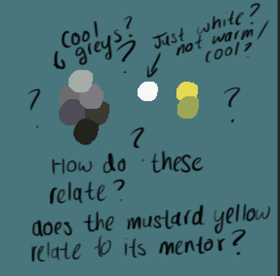 (
(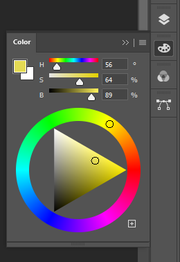 (my images; were they trying to aim for a monochromatic cool-grey design with purple undertones and for contrast/complimentary colors, they added yellow-mustard accents? Where's the color differences for Urshifu's formes?)
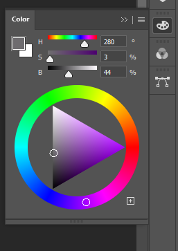
It's a very dull gray purple, like maybe isolated I could see a bit of purple but when fully blended in the design it looks black & white monochromatic to the casual eye.
The yellow-mustard though is a legitimate complaint. Interesting thought it could be a reference to Master Mustard, though I think they wanted a skin tone color that was noticeable. Like I did color it with a more realistic skin tone and found the Caucasian skin tone it was trying to replicate was either too light it might as well have been white or too dark it looked yellow anyway.
As for the different colors gotta wait for them to go
Which leads to to my next subpoint: Zamazenta-Crowned can be designed better and retain the faithfulness of its theme. I'l give it a shot:
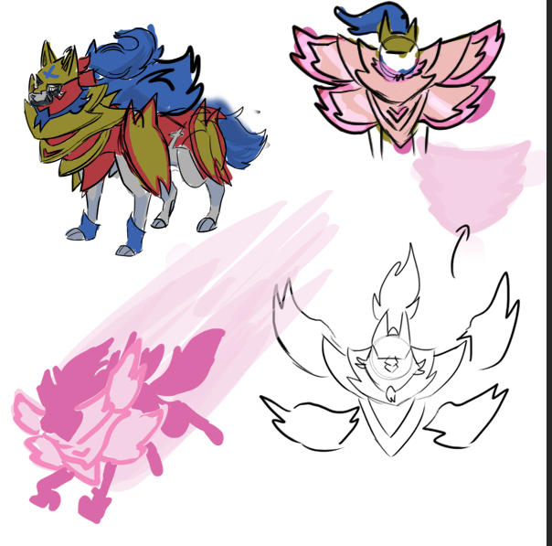
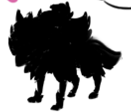
I did this in 45 minutes, and in lower quality in which I usually draw. Having a shorter cape, relocating the side shield parts, lightening the blues, simplfying some of the decoration on the shield, and darkening the yellows for improving the color scheme, and actually making the Behemoth Bash actually magneta (not orange) like how his name is based on I think makes it somewhat an improvement. It's not perfect, but its a start.
I like it!

Not sure how it goes from the default to its Behemoth Bash form but at least now it doesn't look like it got its head stuck in a wall and just decided that was its life now.
Q: Are you really an artist?
No one was doubting you were an artist with a sharp eye for art, how indepth you went proved that. We were just saying all us non-artists couldn't quite see the intricacies you were noticing making Zamazenta look fine to us. (Also, could it be possible maybe you have a more sensitive sense of color than most people do? Maybe the artist just wasn't as color sensitive so didn't realize they were making some minute color clashing).
That's the problem with the usage of 3D assets and the animations in SwSh. If you ignore the fact that they stated to the press that they were remaking models, it is so blatantly obvious that they straight up reused them for the 4th time in a row (not including the Galar dex). If they updated them with HD textures or a style change, we wouldn't notice as much.
Don't care if they reuse the models, I'm just asking to make them look more dynamic while idling! They should look like they're ready to pounce/take a hit not waiting for an autograph and then be given a treat. Also at least draw Flying-types like they're flapping/hovering in place that looks like they're paying attention to their opponent, not like they're in the middle of gliding and looking blankly ahead.
That would be back in the silver age of comics when "comic book editors at DC Comics would come up with an idea for a comic book cover, have an artist draw that idea and then have the writers of the comic book come up with an explanation inside the comic book to fit the cover"
Don't forget the Marvel Method where they would plot out the story, the artist would draw the comic, and then the editor would add in the script later. A famous story I heard from this was that in one issue of Spider-Man the artist included a scene of Spider-Man shaking his fist at a group of college student protesters in anger. When it was given back to Stan Lee to add dialogue, he instead changed the context that Spider-Man was rooting for the college student protesters and was doing a fist pump in support (Stan Lee made the change so that Spider-Man would appeal to the young adult demographic who mostly read comics).
I dunno if this is an unpopular opinion or a little thing you don't like or whatever, but I hate the term HM slaves. Don't really care if it makes me too PC or whatever, I just hate it.
How about HM Schlump?
Now everyone, please don't use that fact/my gender to harass me. I seriously beg you not to. Keep up with the nice debate!
We could probably use a gender identifier next to our username.
The bar is "well, better late and clumsy than never".
The fact that pokemon games have glaring flaws doesn't magically make the few forward steps they do disappear.
Of course, it's GF and they tend to do 1 step forward and 7 backwards, I suppose... :P
Actually this just feels like something about the Switch that GF either forgot or didn't care about. If it was intentional, well, why then wouldn't they just have normal save files if they were okay with this workaround?
In the wake of Paper Mario: The Orgami King
... Wait, WHAT? They're making a new Paper Mario! *Goes watch trailer* Huh, well it still doesn't look like the Paper Mario people have been wanting (turn-based combat with multiple partners), but at least the series isn't dead. And people joke we'd get the next Paper Mario when all Hell breaks lose, HA HA *in the suggested videos there's one about COVID-19 causing game delays* Ha...
On the topic of the art direction, there is something that has bothered me since the era of the 3DS: The scaling of the Pokemon. Things like:
Of course this was the 3DS, which had a small screen and low resolution, so I could excuse them for not scaling properly.
Anyway, despite Pokemon being scaled properly in Let's Go, SwSh returns to the inaccurate scaling. I believe this is because of an art direction that ties GF back to the 2D sprite area, in which the Pokemon would be the from the back, with the opponent facing front, with both Pokemon focused on the camera angle at all times.
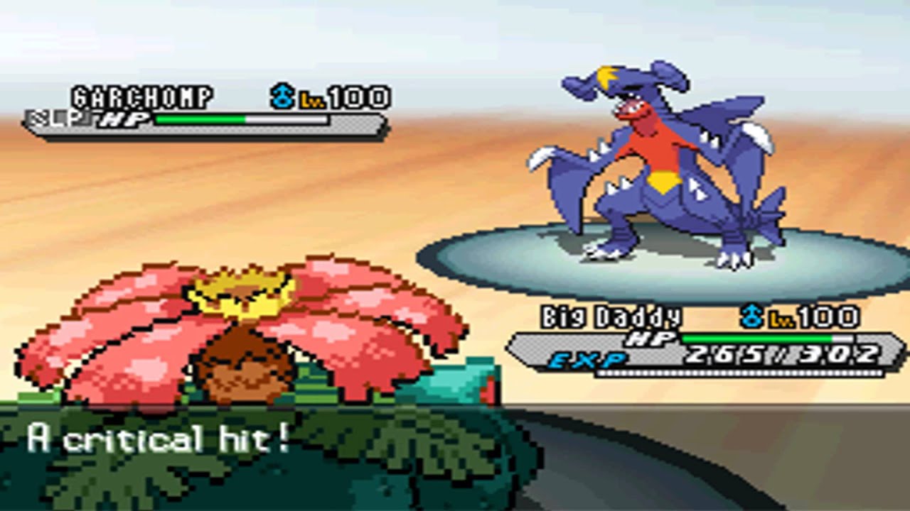

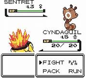
This of course, does not translate well to 3D. It forces the models to be not scaled because if Pokemon like Wailord and Eternatus were properly scaled, you'd struggle to see the Pokemon in the front. While I can excuse it on the 3DS due to aforementioned reasons above, it does not translate well on the Switch which has giant backgrounds and huge the Stadiums, yet the Pokemon are only a couple several feet apart from each other probably to retain this back view. It looks really bad because the Stadiums are huge and the space seems entirely wasted with the Pokemon being so close. The Stadium games had the camera angle that started depending on the size of the Pokemon and would also rotate depending throughout. SwSh also has camera angles that are dynamic, but they also revert to the back whenever an attack commences. Attacks in Battle Revolution also change perspective depending on the attack used, like Silver Wind, in here.
Of course this was the 3DS, which had a small screen and low resolution, so I could excuse them for not scaling properly.
Alolan Exeggutor is show off the screen despite being 35 ft while Wailord is 47 ft. Clear signs of favoritism.
Anyway, despite Pokemon being scaled properly in Let's Go, SwSh returns to the inaccurate scaling. I believe this is because of an art direction that ties GF back to the 2D sprite area, in which the Pokemon would be the from the back, with the opponent facing front, with both Pokemon focused on the camera angle at all times.
This of course, does not translate well to 3D. It forces the models to be not scaled because if Pokemon like Wailord and Eternatus were properly scaled, you'd struggle to see the Pokemon in the front. While I can excuse it on the 3DS due to aforementioned reasons above, it does not translate well on the Switch which has giant backgrounds and huge the Stadiums, yet the Pokemon are only a couple several feet apart from each other probably to retain this back view. It looks really bad because the Stadiums are huge and the space seems entirely wasted with the Pokemon being so close. The Stadium games had the camera angle that started depending on the size of the Pokemon and would also rotate depending throughout. SwSh also has camera angles that are dynamic, but they also revert to the back whenever an attack commences. Attacks in Battle Revolution also change perspective depending on the attack used, like Silver Wind, in here.
But if that were the case wouldn't Let's Go also be innacurately scalled? I thought this was reverted either out of time consrraints, or to accomadate the Dynamax mechanic increasing the size of models.Anyway, despite Pokemon being scaled properly in Let's Go, SwSh returns to the inaccurate scaling. I believe this is because of an art direction that ties GF back to the 2D sprite area, in which the Pokemon would be the from the back, with the opponent facing front, with both Pokemon focused on the camera angle at all times.
Honestly it's pretty difficult to tell *why* the two games went in opposite direction on the pokemon scaling.But if that were the case wouldn't Let's Go also be innacurately scalled? I thought this was reverted either out of time consrraints, or to accomadate the Dynamax mechanic increasing the size of models.
Maybe (personal guess) it could be because once featuring the entire pokedex (even just the 435 dexit survivors, without considering dlcs), you get even more massive size differences and some of those just wouldn't be workable.
Honestly, I think GF needs to go back and recheck the height and weight on all Pokemon and come to a solid agreement about the size & especially weight of Pokemon. Also, depending on the Pokemon, they should be able to swap out "height" with "length" or "wing span" so we better understand what the numbers means (maybe include multiple of these numbers where applicable). Also, for "weight" maybe instead of using raw numbers like they are doing now instead use a system where the numbers seen is squared so its easier to categorize.
Only thing I can think of for the sudden return to a lack of proper scaling could be the presence of Eternatus (which would be longer than even some Dynamaxed Pokémon) and Wailord.
Now, I'm aware that in spin-offs Wailord was portrayed with a proper scale (well, "proper", as I think it's long, but not tall) but that could be because of a different approach. Maybe Genius Sonority prioritizes making Pokémon look believable, and Game Freak just wants them to be visible... not that I agree with the latter, though.
Now, I'm aware that in spin-offs Wailord was portrayed with a proper scale (well, "proper", as I think it's long, but not tall) but that could be because of a different approach. Maybe Genius Sonority prioritizes making Pokémon look believable, and Game Freak just wants them to be visible... not that I agree with the latter, though.
Anyway, despite Pokemon being scaled properly in Let's Go, SwSh returns to the inaccurate scaling. I believe this is because of an art direction that ties GF back to the 2D sprite area, in which the Pokemon would be the from the back, with the opponent facing front, with both Pokemon focused on the camera angle at all times.
Not just that. Remember the gimmick.
The likely culprit for mons to not be scaled in-battle despite that not being a problem in LGPE is our favorite banned mechanic, Dynamax.
I did make sure to say "in-battle" because models are properly scaled in the overworld.
It's really all for a silly gimmick.
Yeah, you can't really dynamax a to-scale Wailord. It's a shame because it's really that kind of thing that sells the "next gen" experience instead of the "upscaled 3DS game on the switch" feel that a lot of people seem to get from swsh. PBR's 3D models were not nearly on the same level of quality but you can't deny that shit was cinematic.
They certainly seem to have proper scaling programmed into the game based on the overworld. I hope next game we can get there!
I did make sure to say "in-battle" because models are properly scaled in the overworld.
They certainly seem to have proper scaling programmed into the game based on the overworld. I hope next game we can get there!
According to Serebii the models themselves are to scale, so the "inaccurate" scaling in battle is evidently a deliberate choice, and one that was there in Let's Go, so it may not all be about dynamax. So it's not a matter of whether GameFreak "can" get there, but whether they want to. ...Might be best not to hold one's breath. :P
Yeah, you can't really dynamax a to-scale Wailord. It's a shame because it's really that kind of thing that sells the "next gen" experience instead of the "upscaled 3DS game on the switch" feel that a lot of people seem to get from swsh. PBR's 3D models were not nearly on the same level of quality but you can't deny that shit was cinematic.
They certainly seem to have proper scaling programmed into the game based on the overworld. I hope next game we can get there!
As for scaling D-Max Wailord... you don't need to make it much bigger than a G-Max tbh.
In fact, Wailord is the perfect candidate for a G-Max just to work around it.
Sinnoh is my favorite region. Most people say the characters suck, but I like the aesthetic of Cyrus being devoid of emotion so you can project him to be as misguided or as evil as you want him to be. Cynthia is just straight up awesome. Dawn/Lucas come off as trying really hard to be the best research assistant ever while still genuinely caring about the professor. Barry is so annoying you want to crush him in battle but not so mean you come out mad after the battle. Many of the gym leaders are involved in their towns apart from being the gym leader(eg. Roark being a miner, Gardenia gardening, Volkner fixing up his gym, etc.) And Professor Rowan staying out of your way and doing research is exactly how I think professors should be. I honestly like these characters better than any other generation. Feel free to debate how terrible my opinions are
Anyone else think pretty much all of the Pokemon Masters remixes are kinda crap? They all have such samey and bland instrumentation and often just spiral into something that doesn't sound anything like the original theme or features drawn-out references to other songs with only the most tangential relationship. Like, why does Zinnia's theme in particular spend the first minute of the song as the Hoenn trainer battle theme? And why does Guzma's go from an inferior version of the OG song to some unrelated dubstep track? Honest to god I think the Rainbow Rocket remixes Cyrus notwithstanding were on the whole better than these.
I don’t think they are terrible, though I definitely prefer the original versions. I wonder if this is another case of TPC being overprotective of the brand name. Other Nintendo Mobile games ( Fire Emblem Heroes, Animal Crossing: Pocket Camp, Mario Kart Tour, Dragalia Lost ) they all feature actual tracks from their core games in addition to new ones from the mobile games. Also worth helped develop ALL the Nintendo Mobile core games, usually as a co-developer. Unlike the others though DeNA was the primary developer of Masters, and since GF did not help make the game, TPC was afraid to license the rights for soundtracks in game.Anyone else think pretty much all of the Pokemon Masters remixes are kinda crap? They all have such samey and bland instrumentation and often just spiral into something that doesn't sound anything like the original theme or features drawn-out references to other songs with only the most tangential relationship. Like, why does Zinnia's theme in particular spend the first minute of the song as the Hoenn trainer battle theme? And why does Guzma's go from an inferior version of the OG song to some unrelated dubstep track? Honest to god I think the Rainbow Rocket remixes Cyrus notwithstanding were on the whole better than these.


