Pokemon Evolutions that disappointed you?

Interesting. Though I think the bigger issue for me apart from the line's progression is the fact that I just don't like Blaziken's design at all to be honest. Which is why even though Dewott to Samurott seems like an incongruous leap as well, I'm not nearly as disappointed since I think both designs are quite good in a vacuum.
I generally don't have an issue with a Pokemon's evolution being wildly different as long as I think it looks cool or good.

Dragonair -> Dragonite
Chespin -> Chesnaught
Magikarp/Feebas -> Gyarados/Milotic (although it's kinda the whole gimmick with these)
Shroomish -> Breloom
Dewott -> Samurott

All of these are Pokemon that I adore that don't really look like their earlier evolutions in a few ways, but I still like them because even if they look pretty different than their prevos, they still have good designs in my opinion. For example, I don't hate Greninja because it's different compared to Frogadier (even if I prefer Frogadier vastly). Same with Blaziken's line. And I certainly don't like Magmortar just because it looks similar enough to Magmar and an actual evolution of it!

Seriously I hate Magmortar. I can't believe that in Platinum, if you didn't pick Infernape, 1/3 of your Fire type options was Magmortar lmao

Dragonite is a good example. I like Dragonair and Dragonite despite them looking unrelated.

Politoed is a bad example. Politoed looks unrelated to Poliwhirl (I know they were going for the tadpole into frog thing but it's still quite jarring). But I have a problem with it because Politoed just looks silly to me compared to Poliwhirl, or Poliwrath for that matter:

:rs/poliwhirl: :rs/poliwrath: :rs/politoed:
That reminds me that Politoed is actually another Pokemon I really like despite not looking similar to it's prevo. I'm actually not that big a fan of Poliwrath to be honest
 
I don't know what happend here but
Pokémonsprite_431_Bank.png
Pokémonsprite_432_Bank.png

I already found this disappointing when I was a little lad. I really loved Glameow but Purugly was just such a hit in the face
 
Sugimori 613.pngSugimori 614.png
I don't even remember their name, but the first stage looks cute and fine. But the final form looks just stupid with that icicle beard. Also that head design I can't get used to it. The entire body shape looks like a triangle shame, a very unbalanced design. I would expect more build on the chest area.

Congrats, now I can't unsee that. That just completely ruined a design I thought was okay beforehand.

Beartic was never one of my favorite Gen 5 mons and certainly not one of my favorite Pokemon but this just ruins my perception of it.
 
I almost used Cubchoo on my Pokemon Shield team during my first playthrough because it was adorable, but I decided against it before it ever evolved or anything. I'm glad I did cause Beartic is pretty lame.
 
I think the triangle body, as well as the snot nose on Cubchoo and the beard, are all intended to reference icicles. But all 3 of those are elements of the design I hate, so clearly someone screwed up.
 
I think the triangle body, as well as the snot nose on Cubchoo and the beard, are all intended to reference icicles. But all 3 of those are elements of the design I hate, so clearly someone screwed up.
Ikr? It looks like the Snot became the Beard in the final design which makes the end design gross when you put in some thoughts on top of it...
 
View attachment 370341

I'm well aware that Wyrdeer hasn't dropped yet, and it might well be the best Pokemon ever. Stantler is a longstanding favourite of mine so I'm glad it's getting the regional evo treatment, and the design is really neat.
Wyrdeer might be the first good looking in design cross-gen evolution that I dislike just for its stats. It went from an average Normal Type that that so much potential from already high stats when it evolves to turn into a Pokemon with stat distribution of a gen 3 Pokemon: slow "bulky mixed attacker.
If it weren't for dexit, I doubt it would be even viable in competitive for NU. Normal/Psychic isn't even an appealing type and existed long ago, so I was kinda hoping they would do something interesting with it.
 
Oh never knew this thread existed. There is a lot of evolutions that i found weird, specially most of the gen 4 cross-gen ones (ironically I love all the LA and Gen 9 ones, except Fairgiraf who I'm just somehow neutral because it turned out to be fun to use) but none is close in terms of how much I dislike them than Rhyperior, who I already made once a rant about, and...Grumpig.

I dislike many others like Incineroar or Cinderace. But I at least can understand what wad the intent. I can't say that for Grumpig. They took a very iconic, unique and pretty cute design with a fun gimmick and a lot of personality (as well as disturbing Dex implications) and I guess someone was asked to make it as boring as possible, because they turned it into the mos generic pig mon ever- if it didn't evolve from Spoink, would anyone actually relate that design to pearls at all? It's just a smiling pig that is slighly dancing. I don't get why it keeps the spring tail either if it doesn't use it.

Rhyperior is terrible, but Rhydon may eventually get some kind of regional form that can get a better evolution. Spoink is not special or popular as far as I know, so it's probably going to be stuck like this forever instead of getting the split evo it deserves.
 
Ooh, this thread is a generation old and could do with some new entries. Having recently buddied this here 'mon in Pokémon Go, I'm starting to form an opinion on it and its evolution:

:sv/arctibax:

I came across an old post that said something along the lines of Arctibax being "the most Pokémon-like Pokémon in the new games". And I can see that well. It has a recognizable silhouette, a pleasant colour scheme, an expressive face and a neat sail on its back. The wrist blades give a nice splash of colour that match its eyes too. It's a great design with all the classic elements.

And then ... it evolves:

:sv/baxcalibur:

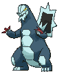
I feel that Baxcalibur's design is missing something. Those tiny eyes are completely dead - the pupils are barely visible, so the face has no expressiveness. From certain angles, the eyes look blank like those of a robot.

Another problem is that its head and tail tip are smooth, which makes it seem strangely naked. Especially from the bird's eye views in the various games' overworld, Baxcalibur head seems bald. It's even worse from behind. A little bit of a head crest or feature tends to frame in the face, which is why so many Pokémon have stuff going on atop their heads. Horns, ears, tufts of hair or little ridges make it so the face itself isn't pushed to the very edge of the design. Baxcalibur really shows how well this trick usually works, by omitting it. See for instance how the sail is a bit taller than Arctibax's head, above? Or that there are prominent eyebrows above the eyes? It all frames the eyes. Baxcalibur has none of that. As mentioned, something similar goes for its tail. It's just there.

Also, in the default pose, Baxcalibur's spinal sail is awkwardly hidden behind its body. and seems to be drooping to low to serve any useful purpose. Unlike Dragonite's wings or Tyranitar's back spikes, it sticks directly out behind from its back. I suppose the idea is for the sail to be a glaive head of sorts, but it's so awkwardly positioned. Baxcalibur needs to do a somersault to attack that way (see the depictions of Glaive Rush), but a theropod doing a somersault just gives the impression of stumbling over and over-rotating, since the sail is nowhere near the center of mass. And the sail is too flimsily attached to the back to credibly look like it'd hurt the opponent more than Baxcalibur itself when the hit connects. The poor 'mon would tear half its spine out if it hit just a little bit off-center.

But perhaps the worst is the upright pose. I guess the idea is that Baxcalibur is standing tall and intimidating. But somehow it combines perfectly with how the legs and shoulders are positioned just right to create the impression of ... a dude in a costume. Baxcalibur's arms attach to the body right where a dude in a costume would have his shoulders, and the arms have way too human proportions in terms of size, placement, and shape. The legs are a bit far apart, creating some sort of awkward waddle, but they are also exactly how a dude in a costume would position them to make room for the tail. The neck has plenty of space for a head inside it, peeking through semi-transparent fabric just above the topmost belly plate. The top of the head would be worn like some sort of hat. The sail is also mounted so it fits on straps attached to the dude's back. And the smooth curves of navy blue colour just scream "fabric stretched over rubber foam". It'd be an elaborate costume, for sure, but Baxcalibur looks just too much like one to be fully convincing. It certainly doesn't give quite the badass impression they were probably going for.

That being said, there is plenty of artwork where Baxcalibur looks a lot better. Leaning forward, its sail becomes more prominent and takes the role of the "outer edge" of the design. It also instantly becomes more animal-like when it isn't standing with its back vertically. There are also subtle changes in its depiction between artwork, such as the way its head connects to its spine. Baxcalibur needs to be reptilian, with its spine directly connecting to the back of the head. The upright pose makes it too humanoid. Contrast this and this picture, for instance. One is a dude in a costume awkwardly failing to make an intimidating pose, the other is a huge dinosaur that's coming to utterly destroy you. I also like the way it looks in this figurine. Somebody got the proper idea of what the sail was supposed to be like for that one. Whoever positioned the 3D model for the games clearly did not.
 
"Ooh, pop culture rehash" is...not the best idea. Bellibolt literally being a costume mascot in the same gen doesn't help, same for previous titan kaiju mons being more detailed in comparison
Baxcalibur just feels naked, and the other side art/anime trying to deviate from that is honestly valid

Koraidon has a similar issue where the wheels look dumb as fuck especially for movement, but improves considerably when posed more like a basking lizard or when they're hidden. This TCG art is ome of my favs for it

1754099054211.jpeg


One of my fav fan takes in RJ's painting where the wheel is reshaped to look more like a throat sack that inflates

https://arvalis.artstation.com/projects/qQaYOL

Vs this jank ass shit where its arms are awkwardly posed, wheels looking super detachable. Miraidon at least is a robot with booster jet legs, so it's less jarring
1754099253832.jpeg
 
Vs this jank ass shit where its arms are awkwardly posed, wheels looking super detachable. Miraidon at least is a robot with booster jet legs, so it's less jarring View attachment 760917

I remember word-for-word exactly what I started asking people when these two were revealed and the fanbase was split on which one looked cooler. And I quote: "So, are you going to go with the Digimon or the Skylander?"

The funny part is that we were once at the point where you wouldn't be able to tell which one is which if I said that back in, say, 2016. With the benefit of hindsight it doesn't help that a certain 2015 game was pretty much entirely focused on racing and the vehicle sections of the campaign, but that's beside the point. Koraidon, though, even if I still prefer Miraidon over it, I've warmed up to its design over time. The "wheels" not exactly being functional kind of adds some charm to it, I think? It feels much more tied to the design inspiration Cyclizar has from certain dinosaurs, which, yeah, that's to be expected for the Past Paradox Pokémon version, and most of the problems I do have with it really only stem from similarities it has to Groudon at this point, seeing as it already feels like a role reversed clone of another box art Legendary duo (those being the Unova dragons). I've never been the biggest fan of "clone characters" in any games, and while these two do set themselves apart with their Speed, being this weird amalgamation of Groudon, Reshiram, and Zamazenta never really sat well with me. It's just trying to do too much at once even if I like it more now than I did back in 2022-23. At least Miraidon was Terrain focused and didn't face that same kind of competition as a setter.
 
Maybe Palafin, all I got. Besides the dorm change, it looks the same basically. The form change is major and this the appearance makes some sense, but then you get the issue when compared to the better ursh.
 
Maybe Palafin, all I got. Besides the dorm change, it looks the same basically. The form change is major and this the appearance makes some sense, but then you get the issue when compared to the better ursh.
I'm going to go in the opposite direction and say that Palafin is disappointing for being too different from Finizen. The base form and prevo should have had the exact same stats. Have the heart be literally the only difference.
 
Back
Top