
@DougJustDoug: Your design is well thought out, and makes sense in terms of the typing (I actually thought about hydroelectric dams too, but didn't make the connection to beavers). Overall I say it's a very good concept. that being said, I personally just plain don't like the way it looks... that's all personal preference though. I'd like to see a version with strait teeth though, as that might help change my opinion. Supporting material would probably help too.

-
Smogon Premier League is here and the team collection is now available. Support your team!
-
Follow our Instagram!
-
The moderators of this forum can be found in the CAP forum staff directory.
-
Welcome to Smogon! Take a moment to read the Introduction to Smogon for a run-down on everything Smogon, and make sure you take some time to read the global rules.
-
Congrats to the winners of the 2025 Smog Awards!
You are using an out of date browser. It may not display this or other websites correctly.
You should upgrade or use an alternative browser.
You should upgrade or use an alternative browser.
CAP 10 CAP 10 - Art Submissions
- Thread starter beej
- Start date
- Status
- Not open for further replies.

My previous design got a little overlooked, so I updated it and re-did the shading:
What do you guys think, shadings not my strongpoint (in fact this is the first image I have ever shaded), so art suggestions would be welcome :)

What do you guys think, shadings not my strongpoint (in fact this is the first image I have ever shaded), so art suggestions would be welcome :)
@DougJustDoug: Keep the original color scheme. I see the similarities to Bibarel, but why couldn't this thing just be a Bibarel evo? All you'd have to do is give it bigger eyes and a less ferocious expression. If you don't want to do that, I think you should get rid of the giant buck teeth - instead, have it with its mouth slightly open, displaying a few normally sized ones. Right now, those chompers make it look a bit too offensive, and increase its similarity to Bibarel.

@DJD: Don't worry about it being a beaver. Isn't Bibarel's "flavour" supposed to be dumb (hence Simple and Unaware). This variation of the beaver is clearly much more industrious, hence the electric generation, and maybe just a result of evolving in a different way.
It's really an excellent design, I would like to see the tail "jazzed up" a bit though.
It's really an excellent design, I would like to see the tail "jazzed up" a bit though.

Aha...massive redo of the thing, made it bulkier, and, I suppose, more defensive as well, and made it more electricy
*pic*
I really like this one, don't give up on it. I would suggest adding some electric armor to the arms, perhaps causing bolts between the claws, and maybe turn the fins on his back into electricity. I think this is one of the better designs out there
Doug, I love the design. I think it's my new favorite of all the designs posted. And I don't think the similarities to Bibarel are very significant. It's about as similar to Bibarel as Toxicroak is to Politoed.
I would like to see what it would look like with straight teeth, though. With the curved-back ones, its head gets a kind of Walrus look to it. Also, the reddish color scheme looks pretty good, but I think it could also work with a more gray color scheme.
I would like to see what it would look like with straight teeth, though. With the curved-back ones, its head gets a kind of Walrus look to it. Also, the reddish color scheme looks pretty good, but I think it could also work with a more gray color scheme.

It looks more like a dragon or flying type than a water type, to be honest. I'd say tone down the fancy frills and focus more on making it look like a fish.My previous design got a little overlooked, so I updated it and re-did the shading:
http://i855.photobucket.com/albums/ab118/Chassles/CAP10Design2Pre-Shade.png
What do you guys think, shadings not my strongpoint (in fact this is the first image I have ever shaded), so art suggestions would be welcome :)


I removed the stripes on the antenna, and made it thinner close to the fish. Also added little ornaments on its skirt and a translucent light body. I'm pretty much set on that stuff. The only thing I'm not comfortable with is the body color. I followed a few people's suggestions on irc, and caved in and gave it a blue body. I don't really like it tbh, but eh. http://Also gave it a turquoise/seafoam green color but it was met with lukewarm receptionAlso gave it a turquoise/seafoam green color but it was met with lukewarm reception
sup dewds here is my idea:
so it's like, another electric fish thing because i am stupid and not creative
i tried to combine a bunch of stuff including:
a broken lightbulb
a fish skeleton like being electrocuted
a deep sea viperfish
im not very good at battling but i tried to like, make the design fit the job it does?
i guess it would work like remoraid or octillery, like it can just shoot all sorts of crap out of its mouth to counter-attack or whatever. i dunno if hes like tougher or has better attack or how that works though. i think his working name is flashlightfucker.
well, that's it i guess. please let me know what you think!
thanks
I like the color. Really, I think this design would work well, especially since the stat poll is looking like this Pokemon will lean more toward HP than Speed.http://i43.tinypic.com/2na1uuf.png
I removed the stripes on the antenna, and made it thinner close to the fish. Also added little ornaments on its skirt and a translucent light body. I'm pretty much set on that stuff. The only thing I'm not comfortable with is the body color. I followed a few people's suggestions on irc, and caved in and gave it a blue body. I don't really like it tbh, but eh. Also gave it a turquoise/seafoam green color but it was met with lukewarm reception
It'd be nice to see it in a more natural pose (with its eyes open and everything).
Sorry, but "fish skeleton" to me implies Ghost-type, and the color scheme looks more Rock than electric. I can tell you put some work into this and it looks really nice, but it doesn't really fit the bill. :(sup dewds here is my idea:
http://img.photobucket.com/albums/v232/highoctaneinterim/Pokeymans/Smogon/fishguy1C.png
so it's like, another electric fish thing because i am stupid and not creative
i tried to combine a bunch of stuff including:
a broken lightbulb
a fish skeleton like being electrocuted
a deep sea viperfish
I feel if you want to emphasize the water aspect, without going blue, you could try making the fish aspect more prominent.
The idea is very good!

Here's a very quick (and rubbish) drawing of my idea:

Worth developing further?
I know it will look a lot better when I colour it in, but it's just a line drawing for now.
It's a plug sort of thing with wires riding a waterspout.
Worth developing further?
I know it will look a lot better when I colour it in, but it's just a line drawing for now.
It's a plug sort of thing with wires riding a waterspout.

Wow Bucky, that's very cool! Your mudpuppy looks like it could totally be a utility counter. The only thing I think looks weird are the position of the feet, but that's just my opinion. Otherwise, yours, Cartoons' sea pixie, and DJD's zap-beaver are my favorites so far.
Cyzir, I feel like that blue is just a little dark for the concept, I still think it looks a little bit more like a Ghost-type than a Water-type. Maybe make the blue a little lighter, or you could make the fish a little more bright and bigger to accent the Water-typing. Your Anemoninja would have been awesome for this concept to, but overall I think your lanternfish is nice.
Cyzir, I feel like that blue is just a little dark for the concept, I still think it looks a little bit more like a Ghost-type than a Water-type. Maybe make the blue a little lighter, or you could make the fish a little more bright and bigger to accent the Water-typing. Your Anemoninja would have been awesome for this concept to, but overall I think your lanternfish is nice.

DjD: I really like your beaver design and the new color scheme, and those of you remarking on the beavers teeth, try googling "beaver skull": they don't really have straight teeth--they are not as curved as his concept, but they are not all that straight.
EDIT: Bucky, job well done, interesting and unique!
EDIT: Bucky, job well done, interesting and unique!

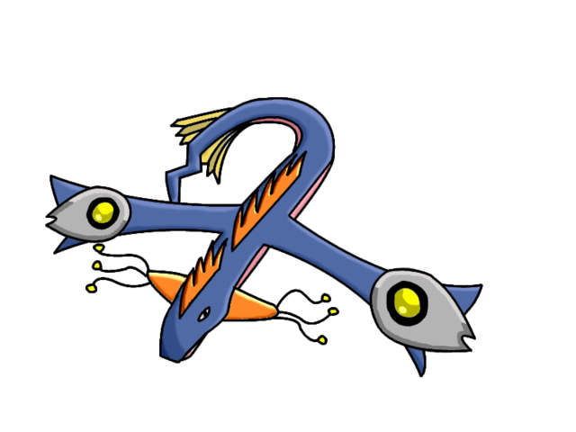
So I thought I'd give designing something another shot. I tried thinking of animals that live around/enjoy water as apposed to in it (since Water is the secondary type, not the Main one) and thought of a Water Buffalo (which is exaggerating their water relation a bit, but whatever). A Water Buffalo is large and bulky (which fits with the large HP CAP10 will have), and they charge in order to attack (which fits the Speed it will have).

It's horns acts as lighting rods. when struck by lightning it stores the energy in it's body, which it can then release back through it's horns for powerful attacks. they live in close proximity to rivers because they love to relax in the water.
It's horns acts as lighting rods. when struck by lightning it stores the energy in it's body, which it can then release back through it's horns for powerful attacks. they live in close proximity to rivers because they love to relax in the water.
Put a few pairs of legs on that thing and I think you may have something. I really like the coloring.

Final Submission
Final Submission
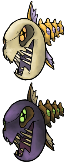
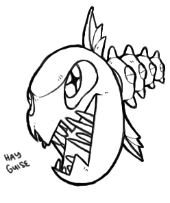
Hi guys, here is my entry

It's based on the plasma ball. Globmon can control the membrane of its watery cocoon through electrical impulses, allowing it to take on all sorts of shapes used for attacks. It's a rather curious and mischievous Pokemon that often mimics peoples behavior. Although it cannot live for very long outside of the water, the liquid surrounding it can break down food it engulfs and Globmon feeds by absorbing the nutrients through its skin. As Globmon is constantly burning energy by producing electricity it consumes ridiculous amounts of food, and so it adapted to feed off of pretty much anything, including the most dangerous of poisons.
Crappy supporting material of Globmon doing stuff yeah
Thanks a bunch to everyone who gave me criticism, I really appreciate the fact that people who I don't really know have taken the time out of their day to type a reply and help me out. The feedback I got was both insightful and completely accurate, so... cheers, guys!
Final Submission
Hi guys, here is my entry
It's based on the plasma ball. Globmon can control the membrane of its watery cocoon through electrical impulses, allowing it to take on all sorts of shapes used for attacks. It's a rather curious and mischievous Pokemon that often mimics peoples behavior. Although it cannot live for very long outside of the water, the liquid surrounding it can break down food it engulfs and Globmon feeds by absorbing the nutrients through its skin. As Globmon is constantly burning energy by producing electricity it consumes ridiculous amounts of food, and so it adapted to feed off of pretty much anything, including the most dangerous of poisons.
Crappy supporting material of Globmon doing stuff yeah
Thanks a bunch to everyone who gave me criticism, I really appreciate the fact that people who I don't really know have taken the time out of their day to type a reply and help me out. The feedback I got was both insightful and completely accurate, so... cheers, guys!
Great work everyone, so much creative energy.
Scampy, do you have a name for that thing? Your most recent version is fascinating to explore and I enjoy the colors very much. Most of the pieces done here are really coming together in terms of color, imo.
DjD's beaver is pretty wicked. The soft yellow is actually very preferable to me as it suggests electricity, but in a subtle way that detracts from the jagged edges; good touch. As for the fur, I'm sure there are other colors to explore, but the ones already posted work pretty well. I'd be interested in seeing a dull, pale color though.
Visheen-machine, most important suggestion I have for your design is to make it yours. You've done well with the perspective flipping idea of a reverse-angler, but you've lost ground with the color according to your posts. Take the criticism you find here with some salt (such a strange phrase) and make sure it appeals to you as much as it does to the community, perhaps more so towards your own preferences - heck, you're the artist, no?
Good luck to all the artwork, and I'm looking forward to seeing updates from Cartoons!

It's been a while since I've made a general feedback post here, and thus I have fallen behind. Shame on me...
@ Galactic Grunt: Ah, yes, I remember this fellow from before. I think I said something about him earlier too...
Anyways, I would have to say that that blue color doesn't look very good. Something about it is making me go "meh." Looking at the earlier color schemes, I'd say that I kinda see the aquamarine the most: if I am not mistaken, I envisioned that color when I saw your initial design. And, yes, back is beautiful. I'd say go with either one of those two color schemes.
@ Wyverii: Picking a polar bear as a play on polar... NOW I see where you got the idea. Should have been obvious to me... hindsight is twenty-twenty, I guess. Also, this design does not scream "water," so I think you've gotten what you were going for.
I personally would have prefered the metal that you had in the initial design, but I seem to be in the minority in that regard. Nonetheless, I do like the fluffy tail and, er, mane. The blue eyes look a lot better, too.
Personally, I think some supporting artwork will go a long way with this fellow: putting in the time to make some should bring this design a long way.
@ CyzirVisheen: A reverse angler fish? Why does that remind me of the Grand Fisher? Bleach references aside, I think the concept is really clever. From your artwork, it seems like the lantern body and the fish extension thereof seem to have two seperate brains if the picture with the fish biting the lantern's arm is anything to go by.
Since you seem to be fishing for comments in regards to the color of the body, I have a suggestion. Since you don't want to use blue, definately DO NOT use it as, ultimately, this is YOUR design. And I feel you: I don't like it either. Frankly speaking, I like the lavendar color you used. I also like the green as a second choice, but that may be just more due to the fact that green is my favorite color. The stripes on the antane make the design look more interesting, so you should consider keeping those on.
@ Doug-Just-Doug: I was wondering if you were sitting this one out as well. It looks more to me like you were hard at work brainstorming and desiging behind the scenes. God, I hate Bibarel's design so much: you have no idea how happy I am to see a better-looking beaver Pokemon. The design is kick-ass, to boot (no pun intended).
Your most recent, reddish brown color looks... okay. The original coloration was a lot better, even if it did match Bibarel's a little bit. Perhaps a darker version of the reddish brown might look better. Either way, as you are experimenting with different color schemes in order to get away from the "Bibarel-esque" coloration, I would have to say go with various tones of brown: it's not going to look any good with as anything other than brown.
Don't worry, though. I can't see much of a resemblence between your beaver Pokemon and Bibarel beyond the "well, duh, they're both BEAVERS" part. Your design looks more... agressive and battle-ready, whereas Bibarel looks like it doesn't have a damn thing in its noggin and just seems entirely unintellegent (whereas yours looks like it is has a fair bit of intellegence).
@ Rocket Grunt: You know, I actually had a similar idea floating around in my head to what you've got here. The only major difference was that the skeleton would have been made out of metal (as metal conducts electricity) if I had gone ahead with what was in my noggin. Yours, though, came out a lot better than what I would have come up with.
My only real suggestion for right now in regards to this fellow is that you ought to take the color of the head in the first color scheme in place of the head color in the second and leave the rest of the color scheme as is and see what you think of it. That purple head in the second color scheme just doen't jive, but the rest of the color scheme screams "perfect for this design."
---
Keep in mind that the designs that I am commenting on are not the only designs I like. All of the designs have some thought put into them, and I really like a lot of these. Paras Hilton's design remains my favorite, but I would have to say that CyzirVisheen's reverse angler fish design is a close second.
hey guys, my turn:

Basically starmie but electric and bulkier I guess. Big mouth in the middle for eating pokemon and the magnet up top/electric "pouches" on its body make up the electricity.
Looking at it again I'm not too sure I like the magnet up there, but we'll see what you guys say about the design.
MORE
Basically starmie but electric and bulkier I guess. Big mouth in the middle for eating pokemon and the magnet up top/electric "pouches" on its body make up the electricity.
Looking at it again I'm not too sure I like the magnet up there, but we'll see what you guys say about the design.
MORE
Even though I am usually strictly a spriter when it comes to CAP, I couldn't resist the urge to try my hand at coming up with an art design. My fakemons usually tend to be rather unoriginal, but here goes:

I wanted something reptilian but decidedly non-draconic, so I settled on an amphibian. The first thing that came to mind wehn incorporating electricity, was powercells of some sort, so I imagined them on its arms, charging electricity as it swims. (Looks rather vein-y and crappy from bad drawing and lack of color). My only concern is that this is rather similar to Swampert having those orange things on its arms. My other idea was to have them on its face, but that'd be messy and Pikachu-esque. Also looking for more non-cliched ways to incorporate electricity.
Either way, he looks like he could be reasonably fast and sport large HP, has arms for punching moves if those end up making the moveset, and could likely be adapted to whatever ability gets chosen, unless we pick one that kills any possible connection to flavor.
C/C greatly appreciated.
~Nyasu

(I feel terrible for making so many posts in the thread ;_;)
Thanks Midou and Sezja. I was too involved with trying to appease everyone I guess. I decided to take your words to heart and do things how I wanted to, but still kept in mind a few suggestions posted itc.

First off, I'll concede that the blue would look great on this design, but not on the main body. So i decided to alter the angler by making it the previous wip's color instead. In future pics the size of the fish will be bigger. Secondly, I readded the stripes on the antennae, but lowered the overall number. 3 is a magic number, after all~.
@Nyasu: Maybe add an electric sac on its stomach/chest area? Looks solid at any rate, and I would like to see it in color.
Thanks Midou and Sezja. I was too involved with trying to appease everyone I guess. I decided to take your words to heart and do things how I wanted to, but still kept in mind a few suggestions posted itc.
First off, I'll concede that the blue would look great on this design, but not on the main body. So i decided to alter the angler by making it the previous wip's color instead. In future pics the size of the fish will be bigger. Secondly, I readded the stripes on the antennae, but lowered the overall number. 3 is a magic number, after all~.
@Nyasu: Maybe add an electric sac on its stomach/chest area? Looks solid at any rate, and I would like to see it in color.
- Status
- Not open for further replies.