
here's a concept of mine, based on the jellyfish
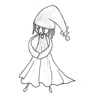
I'm currently working on the color. Critics please.
I'm currently working on the color. Critics please.

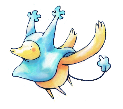


Sorry that this is being presented rather late, but the idea just barely came to mind earlier today. Anyways, I tried to create the concept of a ferrofluid pufferfish. In a sense, the ferrofluid would explain its electric temperament. Also, I imagine something rather bulky in appearance to accommodate the given 151 HP base stat. So yeah, all feedback is appreciated. :)
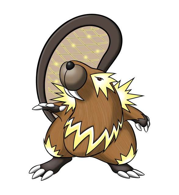
I experimented with a shorter, flatter version of the teeth on my hydroelectric beaver design. Here is the long and short version of the teeth side-by-side (click to view in full size):
I still prefer the longer teeth, because I think it makes the design a bit more offensive looking. But, the shorter teeth put the design more squarely in the classic beaver mold, which may be a better way to go.
Anyway, I'm curious which one is preferred by others.
http://i291.photobucket.com/albums/ll318/seanbostick/things2.jpg

Why do these things always seem to coincide with my exam period man, I dunno if I can get mine finished on time :7
Regirubber: It's a fitting animal to base your design on, but currently your entry is lacking an edge or something that sets it apart. I'd work on a hook that really grabs peoples attention. It seems that patterns on the back are the main way to go, and I see you have made a start, but the electric typing needs to be emphasised more I think. Maybe fit some more character in there too? I saw your art thread and your Gyarados, so I expect something super awesome don't hold out on me man


I dont like giving criticism but imo that looks WAY too much like Qwilfish.
Chaoscrippler, as another user stated, your design almost looks like a Qwilfish or an evolution of it, honestly.

Well I tried adding the fin to the tail in some sort of creative manner, but in the end it sort of ended up just a fin. But I still like the way it looks better than the previous bolt. He still looks electric-y enough to me, what with the generators and the circuits, let alone the color scheme.
Still taking any last-minute advice before editing my Final Submission.
~Nyasu
 http://img220.imageshack.us/i/diffs.jpg/
 The more I drew this the more I am falling in love with it..it has more personality than the gator thing, thats for sure!


