


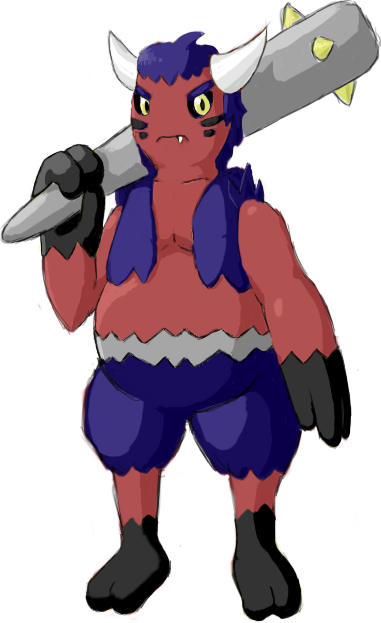
So far I really like Ylix's and DougJustDoug's designs. But that's not to say they're the only good ones! All of you did a fantastic job with the art here. Great work.


@Gun6, so far the design is looking pretty good, though if I were you I would consider changing the yellow on him. Making it black or something would make it look way darker.

Wow...there's a lot of new stuff that's been put out since I left...Very nice ideas guys.
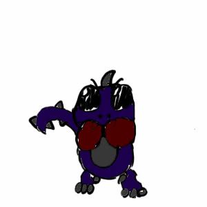
Well since a majority think that Rooster looks too similarly to Blaziken, (even more so when I colored it. SEE Here http://i121.photobucket.com/albums/o235/ckpmax1108/Untitled-3-1.jpg)...I went from avian to a more mammalian alternative....some pages ago, someone suggested a list of things that could be dark(can't remember who though...sorry)...the 'badger' one caught my eye...
So here we go again....tan ta ta ta.... Badger
I carried over a lot of ideas from Rooster to this guy, i.e. the tux (everybody loved it) and the body form.
So whaddya think?


I love the design and the faces on the boxing gloves! However, I personally don't like all the yellow - perhaps you could change the shoes and hair green or some other clownish color?


Caladblog: Your design reminds me why I was so scared of clowns when I was a kid! (Nowadays, I only find them slightly creepy.) As someone else already mentioned, green would work better on your design instead of the yellow. Some supporting material would be great for your guy!


