Agous - It is cute and stuff, but it does not really show fire that much. Also, what do those blue lumps on its back represent or add to the design. The yellow also confuses me :S However looking in your art thread, you have improved SO much, so keep working on your design.
Arkeis - Well, an original concept and done very well. It is a clever idea to combine a teapot with an elephant but I think you should work on the design a bit more. I know its just a WIP but I hope your next art looks even better :D
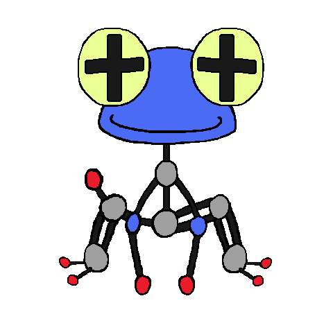
Birkal - Hmmm, I'm not sure whether I like this or not. It looks cute and stuff, but I feel... I don't really know what I don't like about it. Well, no-one else has this idea and if you develop it further I may like it more
Blue Frog - Lol, so cute :D The lobster looks a lot better, I recommend sticking at that and it is an interesting, original concept. Be careful not to make it too steel type though and maybe change the face a bit to make it look more lobstery. I think it will do well in the polls!
Bramblestein - Well your image was humongous, so it was hard to see what it was, but from what I could gather, it was a squirrel with a bowl on his back? I'm not really feeling this concept. The fire and water look too forced but if you want to continue with this design, go ahead. You may surprise me!
Chomz - Well this is a very unexplored, interesting idea but it looks a bit... idk, not that noticable. I get that its a WIP though. If i had a criticism, try and represent fire in a way other than just flames tacked on at the end.
Cretacerus - This could be the dark horse. I love the concept and I was going to do something similar myself but you pulled it off way better than I could.
However, try to make it look less rocky. I know this will be hard but I think you will be able to pull it off as it doesn't suggest fire type that much, other than the red parts (I know mine doesn't either - accidental pun lel)
CyzirVisheen - Yours is probably my favourite of them all so far. Please, PLEASE colour it! It's a really fascinating idea and it look great even as a sketch! Love it!
D4rk3r - Well tbh it looks too similar to Castform Sunny and the water type is really forced with just a single raindrop on its head. Try another idea in my opinion.
DHR-107 - Well I'm a bit torn on this one, I like the idea but I don't think the concept is evident enough through the art. Maybe making it more industrial while not making it too steel type would help, like adding pipes and stuff? IDK don't listen to me
Dracoyoshi8 - Wow you have so many different concepts but in my opinion stick with hammerhead. It is a good idea but I think the fire gill is a bit strange so take it off. Other than that, I'd like to see a fully coloured version.
elcheeso - Cute and simple, but a good idea. I like the blue beard one best, it looks like a waterfall, which really helps emphasise the water typing, while not being forced on like others have done. Like I said in IRC, make the hump more... humpy lol. But if you don't want to, it doesn't make that much of a difference, it would just look better in my opinion.
epicparker - Well, I get the idea, but it just looks a bit strange. I would probably take off the flames but I like how the red part merges into the blue part. Idk really
EpicUmbreon29 - Well, without your post, I didn't know what it was and that is a bad thing because you want it to be evident right away. The water looks a bit forced and the hydrothermic vents just look like they were plonked on top, but it is actually a good idea so if you continue with it, try to incorporate the types better into it.
Flame_Effigy -Hmm. In my honest opinion, I don't really like it because the fire and water just don't flow or work at all with the dreamcatcher. They just looked really forced. I think it would be better if you continued with another idea.
FlinchMachine - I think it has too much detail. I don't really get what that cloud is there for and there is no real representation of fire type there. So, I don't really think its a very good idea. Sorry to be brutal like that :(
Flummoxen - I like the idea but the design is very simple atm and looks even a bit steel type. I'd probably change the skin colour a bit to make it less steely but I do like the idea.
GhostlyTrio - Hmmm, the design kind of works and its cute and funny and fits both typings. However I would try to incorporate the fire type better. The necklace should be gone imo aswell.
GreatLiver - Go with the elephant imo, it has more potential and I don't know what the other one is. I can see the elephant as like a fire fighter and that is pretty cool.
GRs Cousin - Yeah, I suppose this could sort of work if you put a bit more emhasis on fire and water other than just chemical symbols and different colours
Gun6 - This is one of my favourite designs in the thread! It's just so cool. It shows off both typings and is a very unique way of representing the fire and water types. I love it! And I hope you don't change ideas :0
Harle - Umm its an okay design, it just doesn't stand out as much against the rest of the designs. It is a good idea and if you developed it into a more interesting design, it could change my opinion!
Harry.Buxton - This is actually a great fakemon! it looks interesting and no-one else has done it quite like you. Keep going, I can't wait to see further artwork from you.
hendrix96 - Sorry to say but the idea has been taken, although you take the idea in a completely different direction, emphasising a lot on the water type. I feel like this would have got more attention if you had posted it earlier and made the colours a bit brighter so it stood out. Oh well.
HollowRidley - Well. I don't really know what it is. Colour it and it may look different.
ilovekirby12 - Its an okay idea. Looks like Castform a bit but it shows off both typings well, I suppose
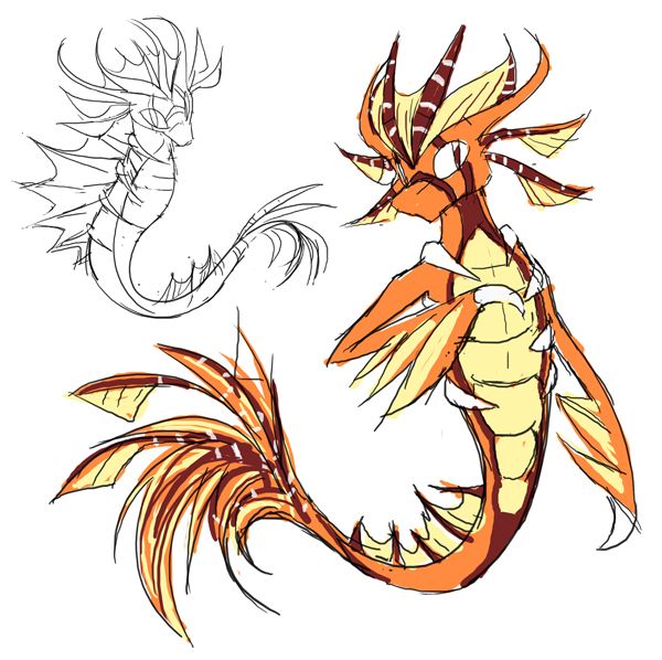
Kadew - I much prefer the eel to the axolotl, it flowed better and imo it worked, whereas the axolotl looks a bit weird. Maybe if it was all coloured in nicely in a nicer pose, I would have a different opinion
Knirp - go with the other clown fish, it looked better. Umm I don't really see the fire type if I'm honest so try to somehow make it more evident. (I did love your last CAP though)
Kyukon - Hi! Well, as I said on showdown, I do like the idea but the arms and the pose make it look a bit humpback and zombieish. That was what wa sbugging me, I finally figured it out! But in my opinion, it is a great design and I for one love it.
leafflare8097 - No, sorry, the types just seem way to forced for my liking. The bubbles and fire just don't work together on this design
macle - hehe love it
Magistrum - You know where I stand on this! I love both of them but if I had to choose... I can't choose, but between the blue flask and the Kappa. They are so cool! I know your gonna bomb the polls again :D
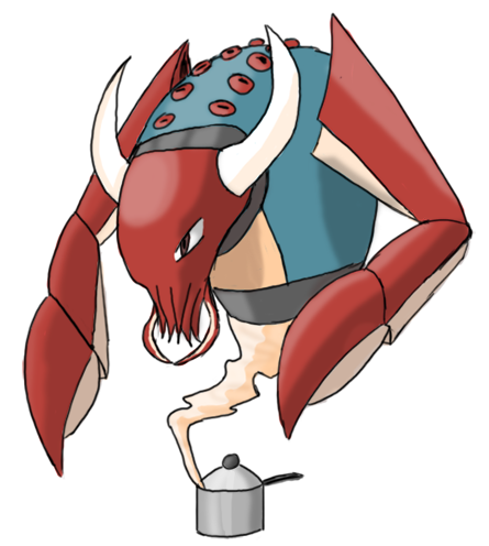
mcFlareon - Hi, I like the crab a lot and the jellyfish is cool too. I don't know which to pick so I'd develop all three and colour them if you have time and it might make it easier to choose
miririri - I love this design, personally, not much criticism i can give really.
Mos-Quitoxe - I do like this idea, but maybe make the colours more dim and not so clashy. They are too bright to be next to each other and make the pokemon look too bright.
Mr Spyda - Hmm it just looks like a watery Charmander, which is okay I guess. Try and make it stand out from the crowd a bit, think a more original idea
OU Master Caitlyn - I like the second one better, it shows off the typing decently as is an unexplored idea so far. Definately stick with it.
paintseagull - At the moment, it looks a bit plain and it is sad :( maybe try and incorporate something else into the design to make it more firey. But it will probably look better when coloured.
Panzer Jaeger - Well it is quite an interesting design, well thought out and stuff, but I am having trouble seeing either type. Nothing really stands out as water type or fire type atm. Maybe work on that
Petsinwinter - This is too steel type for my liking. Make it less like a boiler. I mean it is literally a boiler with a face
pkmn-taicho321 - Well atm, none of your designs strike me as interesting. I suppose with colour and bit of ifnetuning, the hot air balloon could be quite good. Yeah colouring it would definitely help :D
Precipice - This one is cool! Or should I say hot? Well anyway, it is a strong idea and looks good but I would maybe change the fins? they look a bit strange atm and also make sure to straighten out the front armour, its a bit wonkey. Actually, I do really like this one
ProfPuppyPunter - Well none of your designs look that much of either type. Probabaly colouring them would help a lot with that.
Quanyails - Hmmm, I would try and make the fire type and water type more evident rather than just colour? Try and incorporate them in some way that shows them off better?
Sgt.Moose - Well, its an okay idea but I don't think it is pulled off as good as it could be. Try and make the hose less tacked on, maybe as a tail that runs don its back and blends in with the body, and make the face a lips look more... like lips lol
SquirtleSquad626 - Well I do like this idea. It is drawn well and both typings are clear. Hope it looks as good coloured!
Sunfished - I do like this one but as I said on PS, try and make those tubes look more like vents
TheSteamPunk - Hmmm, I like the concept but I would try to emphasise the fire type more. But it's a pretty good idea!
TeamNormalizer - I do actually like this design a lot! I don't know why but I am just drawn to it. Hope it looks good coloured. Maybe change the face a bit
Tomohawku - Yeah I can see where this came from, but its not working for me. Sorry to be brutal but you know, I would probably do another concept.
TorterraX - Well, if you don't know what it is when you first see it, it generally means it is not that great of a concept. So I would either colour it and see if is batter or try another concept :(
User of Shadows I like this but I would probabaly reduce the amount of lava veins. They seem to overpower the rest of the design. I would maybe make it a bit more fish like too but thats up to you
Yilx - Love this a lot. I don't know why but it is beautifully drawn. Maybe make the fire type a little more evident?
Yveltal - I told you on IRC what I thought but I'll just say again that I like the idea but change the face a bit and get rid of the grassy stuff on its bum lol
Zephias Nope, I literally don't even know what it is and how it suggests fire or water. Rethink imo
ZirconSubway - This is cool, I guess, try and make it more firey but I like the concept