CAP 18 CAP 18 - Art Submissions

Status
Not open for further replies.
http://i.imgur.com/2gnF55F.png
psg edit: changed to link, filesize > 200kB

Redraw! I modified the design slightly x3

Supporting material! http://imgur.com/LjiFRF8

Now that I have some time, my thoughts on some of the others:

Arkeis: We had the same idea, but I like yours better :P It actually has some thought behind it, unlike my quickly drawn heffalump-thing.

Blue Frog: This is amazing xD I can't really think of anything else.

Cretacerus: One of my many ideas is really similar to the seahorse/dragon. I like it.

elcheeso: This is simply genius! I love the concept behind this. I like the blue-haired one more.

miririri: It's way too cute x3 I love the design!¨

Mr Spyda: I instantly thought of Maraquan Scorchio. Was I supposed to..? Anywho it's great X3

Here you go: http://imgur.com/rOUaPEX
After drinking lots of water, it uses it's inner fire to create steam which it uses to boost it's movements. It can scale five mountains in one day. When inactive, it blows the steam off it's horns.

I got the idea when I was playing Naruto. I noticed that the Five-Tails used steam, and, well, it's a goat, so then I drew this guy.
 
Last edited by a moderator:

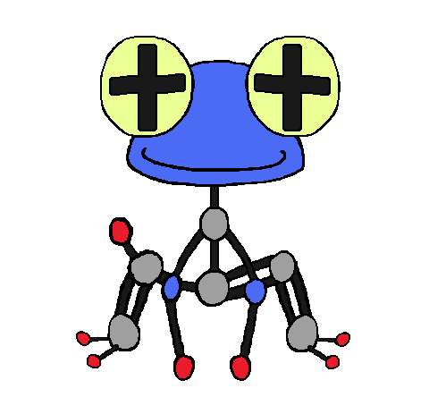
Rough-draft for my design for a Molecule Frog. Its design was made with scientific balance within a Lewis structure in mind, which is why one of its legs has a growth and a single-bond instead of two sets of double-bonds like his other leg. The supplementary art to come will show off the actual Lewis structure it's based on, its fire-abilities residing from his CO2 chest, and blasting jets of water from its hand via snapping off the hydrogen growth to create an H2O hand.

Edit: Now in color!
Edit #2: Science! Behold the skeleton of a Molecule Frog!
 
Last edited:

Rough-draft for my design for a Molecule Frog. Its design was made with scientific balance within a Lewis structure in mind, which is why one of its legs has a growth and a single-bond instead of two sets of double-bonds like his other leg. The supplementary art to come will show off the actual Lewis structure it's based on, its fire-abilities residing from his CO2 chest, and blasting jets of water from its hand via snapping off the hydrogen growth to create an H2O hand.

Edit: Now in color!
Oh gawd, that was so cleverly put together! It's creative, unique, fun, and mathematical scientifical! I'm really liking the concept behind your design. :heart:
 

DHR-107

Robot from the Future
is a Member of Senior Staffis a Community Contributoris a Smogon Discord Contributoris a Pokemon Researcheris a Smogon Media Contributor
Orange Islands
Eurgh, screw it.


Here. Have a Nuclear Whale loosely based on a Submarine but you are able to see the heat coming from the power core. I am horrible at art, so I can;t draw it, but I imagine the blow hole sprays Steam at high pressures. I'll probably fiddle with the rear fins/fluke/shading etc cause this is probably the first time ever I've made something I like enough to actually work on. I have thought about a cooling tower blowhole but I want to keep it simple.
 

I personally think the art works well with the pokemon's strategy. Bulky water types are able to switch into this pokemon with relative ease, however, the art of a stormy cloud suggests moves such as thunderbolt or volt switch which should lower it's checks. Additionally the main problem with the fire/water typing is it's weakness to ground moves, which is solved by the possibility to have levitate as potential ability, as this is a floating cloud/sun thing, which in turn makes it easier to switch in and out and a better core overall.

Need feedback and reviews! yes i am a noob at shading, but this concept is unique unlike the dozens of marine fire things. (Edit: D4rk3r had a similar idea but not the same :P)


Possible changes
  • Deleting the rain- I feel like it's unecessary
  • + sun holding on to cloud with a hand- Feels more pokemon like if It's like a sun-like creature riding the cloud.
 
Last edited:
Here are some rough sketches of a few ideas I had in mind.

The first one is based on an axolotl, and is actually a remake of one of my previous entries.
The tortoise-like creature on the right was inspired by hydrothermal vents and underwater volcanos.
Last one is a chinese dragon with some elements of a seahorse.
Choose the hydrothermal vent pokemon. No one else is doing that type of mon, so I think you should start with it... Though I do agree with Mos-Quitoxe that it does look a little too rocky. maybe lower the vents make the red glow from a little higher and add a bit more blue.
 

Blue Frog

It's lucidity. So clear!
is a Top Artist Alumnus
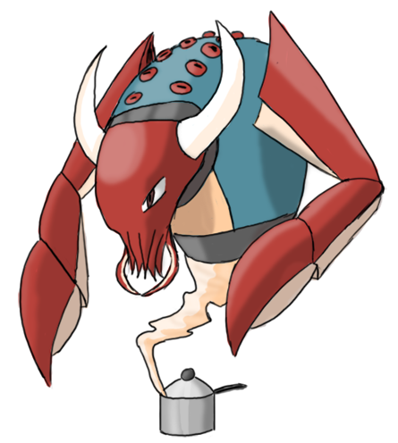
My only suggestion, ( Which you don't even need to implement) is that it be a lobster or be in some way involved with lobsters because, y'know, lobsters need to be boiled.
I actually loved this idea so I changed my design pretty drastically to implement it, but I think the concept flows quite a bit better anyway:

EDIT: Simplified head and added overflowing water, and altered pot design slightly with arm circles.

EDIT 2: Cleaned up a bit more.
 
Last edited:

Cretacerus

Survivor
is a Top Artist Alumnusis a Forum Moderator Alumnusis a Contributor Alumnusis a Top Smogon Media Contributor Alumnus
Reactions Contest Winner
Decided to go with hydrothermal vents :)

Base and colours were drastically changed to fit the theme better, and hopefully make it look less like a Rock type.
The white colour is typical for deep sea crabs, and the red claws and legs are ment to resemble tube worms, which gather around hydrothermal vents in vast numbers. The walls of the vent itself are largely made up of sulfides, giving them a yellowish tone.
 
So here's my art submission, not the final though.


It's still WIP for the mean time.
Color scheme may change in the mean time also.


The first one's a Flaming Lava Shark. I remembered a Lava Shark on Monster Hunter and that gave me an idea.

The next one's a
Slattern reference concept. (Slattern's from the movie Pacific Rim. Slattern's a level 5 Kaiju if you seen the movie.)
I add some fins on all of its feet and put a fire vent on its back. also put some fire on its mouth to look. I also edit the tail so that it looks like a fast swimmer that breaths fire. :3
 
Last edited:
Screen shot 2014-03-29 at 12.40.31 AM.png


Aha so yeah, first time having a go at this. glad i got apart of it for a fire/water because i've had this idea sitting around in my head for a while.

I apologise if its a little blurry but this is not the final design aha. It's just a WIP (kinda aha i mean, this isn't the Final Submission or the Main Design)


A little background about him; his body temperature is so high that the water boils at intense temperature, thus, evaporating out the end of the tubes. if he doesn't swim in water and refill his internal water tanks he will die.
 
Last edited:

Magistrum

DOITSU NO KAGAKU WA SEKAI ICHI
is a Top Artist Alumnus
Okay, an update that's long overdue ;_; thanks for the feedback given! I appreciate it.

Since stats and abilities weren't decided yet, in the meantime I tried to develop my concepts and trying out color schemes:

Image links to separate images:

I gave the Hot Spring Kappa a heroish vibe since going by movie canon, Lucario is the partner of Aaron the hero while Latias stars in Pokemon Heroes. I think my kappa looks good in a super sentai battle pose with lucario and latias lol. And I must say, having an R-G-B colored team looks good as a core.

I chose a blue-green scheme to give emphasis on the hot spring theme it's going with, along with a cinnabar-maroon hue for certain parts on its body to give a volcanic feel. To deviate from Torkoal's shell, I opted for a Haramaki (a japanese belly-warmer) design for the shell's underbelly, and used volcanic vent-lines for shell markings (I hope I could do a back art for this to give it a better view).

For my Flask Homunculus, I guess the core quirk I added was the forehead marking. Latias had an inverted triangle and lucario had a mask-like marking, so why not give the homunculus a marking too? :P

For the design, I removed the legs as to mcFlareon's suggestion and went on making it float in mid-air. Levitate precaution lel I tried to do 2 color schemes since I am not quite sure yet on the fire color I'm gonna pursue. Along with this, the transmutation circle markings also give either a lava or an oceanic scheme to support its typing cue. (Now looking at it again, the blue one seems more balanced in this regard, but idk)

As always, comments, critiques and criticisms are always welcome. :)
 
Last edited:
Magistrum , the Hot Spring Kappa has the perfect color scheme, as well as that heroish vibe! It's more of a teal than a green, but it's pretty close! If you want to go with the 'culus, try the blue flames. I recommend you go with the kappa, but it's your choice.
 
Okay, an update that's long overdue ;_; thanks for the feedback given! I appreciate it.

Since stats and abilities weren't decided yet, in the meantime I tried to develop my concepts and trying out color schemes:

Image links to separate images:

I gave the Hot Spring Kappa a heroish vibe since going by movie canon, Lucario is the partner of Aaron the hero while Latias stars in Pokemon Heroes. I think my kappa looks good in a super sentai battle pose with lucario and latias lol. And I must say, having an R-G-B colored team looks good as a core.

I chose a blue-green scheme to give emphasis on the hot spring theme it's going with, along with a cinnabar-maroon hue for certain parts on its body to give a volcanic feel. To deviate from Torkoal's shell, I opted for a Haramaki (a japanese belly-warmer) design for the shell's underbelly, and used volcanic vent-lines for shell markings (I hope I could do a back art for this to give it a better view).

For my Flask Homunculus, I guess the core quirk I added was the forehead marking. Latias had an inverted triangle and lucario had a mask-like marking, so why not give the homunculus a marking too? :P

For the design,removed the legs as to mcFlareon's suggestion and went on making it float in mid-air. Levitate precaution lel I tried to do 2 color schemes since I am not quite sure yet on the fire color I'm gonna pursue. Along with this, the transmutation circle markings also give either a lava or an oceanic scheme to support its typing cue. (Now looking at it again, the blue one seems more balanced in this regard, but idk)

As always, comments, critiques and criticisms are always welcome. :)
I think you did a splendid job on those, especially once color was added. I personally would think you should go with the Flask Homunculus, just because there is nothing similar to it so far, but I wouldn't want to force you into anything.
 
Magistrum I think you should go with Flask Homunculus because it is a unique design and it looks really good(though the other looks great too)
 
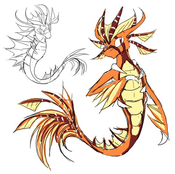
Edit: The yin-yang seahorse thing wasn't really going anywhere, so I'm gonna try this one instead. It's an amalgamation of lionfishes, seahorses, Charmanders, and a bit of the old myths about dragons being kings of sea and stuff.


The one of the top left is a less anthro-fied version, which I do like but feel doesn't quite distinguish itself enough from the Dragonair/Kingdra vein. I'm not all too satisfied with the colour scheme, too. I'll probably try tweaking in to make the Fire-typing less blatant.
 
Last edited:


Prokaryotes represent! So, here's my concept, finally. I know that there have been other artists who have incorporated hydrothermal vents, and I am in no way trying to copy them. I thought of this at the start of this thread, got it drawn a few days later, and just now could I put it into Paint and upload it (sorry, the original drawing was better, I still want to find a way to upload that).

My design incorporates hydrothermal vents, which I felt perfectly embodied the mixing of Fire and Water in a cohesive, beneficial way. I also had the idea to have a chemosynthetic bacteria as the base of the vents, as they thrive off of these vents at the bottom of the ocean and allow these environments to be habitable for other organisms as well. Also, I made the cytoplasm of the Pokemon look like the ocean to accent the water aspect of the Pokemon, with the scattered DNA (prokaryotes have no nuclei) appearing to be waves. The smoke exiting the hydrothermal vents of this Pokemon also makes it look like a ship powered by a furnace, which would also strengthen this art's connection between Fire and Water. Also, the Pokemon has red eyes to represent an hot spot of volcanic activity underneath the seafloor. On the Pokemon's vents one can see lava coming out of the Pokemon, representing how this Pokemon is especially geologically active (it doesn't have to be weak because it's a single cell). The Pokemon's cell membrane is brown simply because I felt that it tied the Pokemon together in the best way possible. (And the smoke is an integral part of its design).

All in all, please consider this design. I understand that I'm not very good with Paint, so I would appreciate if everyone looked past this factor. Besides, doesn't Pokemon need a prokaryotic based creature? We've had single celled ones like Solosis, but that was a eukaryote (it had a nucleus), so shouldn't we give representation to a group of organisms with literally none? Also, I believe this art could turn out especially nicely if we use 3D models in this process due to the rise of Generation VI.

This is a WIP design, and I would appreciate any feedback on how I could improve my design before the final submission.

(And thumbs up to my more artistic friend who helped me to draw what I based this image off of)
 
  • Like
Reactions: NWL
Magistrum, would you consider doing a blue body with the orange flame. The all orange design doesn't look quite enough like a water type, but I love the orange flames. Water and Fire are two types sorta at odds with each other, so a contrast in the color of the flames and the water flowing through the body may look good. It may not look great, but just a thought on what may make both types pop.
 
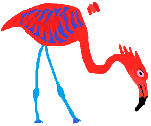
Wow. I really am gonna lose. Doesn't hurt to try, doesn't it?

I'm not giving any info or other references on this guy until I can hear what I have to do better! A quick description: based on a volcano, and island deities. Its body is an ever-changing swirl of smoke, embers, mist, and water droplets. The 'mask' and front talons are woodlike. The large swirl that can drift up from its back, and is always mist.

http://www.ezimba.com/work/140329C/ezimba13692374214000.png

paintseagull edit: image is too big, read the OP!
 
Last edited by a moderator:


I created the "Beast of the Broth" After starting with the thought of a Fire/Water Genie. After realizing we have perfectly good genies in the Incarnate Trio, I shifted over an Ushi Oni. The Ushi Oni is a Japanese Demon that is commonly described as a combination of Ox and Spider or Crab, with the Naruto version being a blend of Ox and Octopus. From this, I decided, rather than a steam-based Genie rising from a lamp I'd make the Ushi Oni emerge from a soup pot, A Demon born of a terrible chef's errors if you will.
 

Okay, little about my CAP. Based on underwater mines and puffer-fish (no-one dare say it looks like Qwilfish). Tried my best to replicate Sugimori style; hope i did well. Nothing else to say really so I will do some comments. If you are not here, your entry was not on the first post.

Agous - It is cute and stuff, but it does not really show fire that much. Also, what do those blue lumps on its back represent or add to the design. The yellow also confuses me :S However looking in your art thread, you have improved SO much, so keep working on your design.
Arkeis - Well, an original concept and done very well. It is a clever idea to combine a teapot with an elephant but I think you should work on the design a bit more. I know its just a WIP but I hope your next art looks even better :D
Birkal - Hmmm, I'm not sure whether I like this or not. It looks cute and stuff, but I feel... I don't really know what I don't like about it. Well, no-one else has this idea and if you develop it further I may like it more
Blue Frog - Lol, so cute :D The lobster looks a lot better, I recommend sticking at that and it is an interesting, original concept. Be careful not to make it too steel type though and maybe change the face a bit to make it look more lobstery. I think it will do well in the polls!
Bramblestein - Well your image was humongous, so it was hard to see what it was, but from what I could gather, it was a squirrel with a bowl on his back? I'm not really feeling this concept. The fire and water look too forced but if you want to continue with this design, go ahead. You may surprise me!
Chomz - Well this is a very unexplored, interesting idea but it looks a bit... idk, not that noticable. I get that its a WIP though. If i had a criticism, try and represent fire in a way other than just flames tacked on at the end.
Cretacerus - This could be the dark horse. I love the concept and I was going to do something similar myself but you pulled it off way better than I could. However, try to make it look less rocky. I know this will be hard but I think you will be able to pull it off as it doesn't suggest fire type that much, other than the red parts (I know mine doesn't either - accidental pun lel)
CyzirVisheen - Yours is probably my favourite of them all so far. Please, PLEASE colour it! It's a really fascinating idea and it look great even as a sketch! Love it!
D4rk3r - Well tbh it looks too similar to Castform Sunny and the water type is really forced with just a single raindrop on its head. Try another idea in my opinion.
DHR-107 - Well I'm a bit torn on this one, I like the idea but I don't think the concept is evident enough through the art. Maybe making it more industrial while not making it too steel type would help, like adding pipes and stuff? IDK don't listen to me
Dracoyoshi8 - Wow you have so many different concepts but in my opinion stick with hammerhead. It is a good idea but I think the fire gill is a bit strange so take it off. Other than that, I'd like to see a fully coloured version.
elcheeso - Cute and simple, but a good idea. I like the blue beard one best, it looks like a waterfall, which really helps emphasise the water typing, while not being forced on like others have done. Like I said in IRC, make the hump more... humpy lol. But if you don't want to, it doesn't make that much of a difference, it would just look better in my opinion.
epicparker - Well, I get the idea, but it just looks a bit strange. I would probably take off the flames but I like how the red part merges into the blue part. Idk really
EpicUmbreon29 - Well, without your post, I didn't know what it was and that is a bad thing because you want it to be evident right away. The water looks a bit forced and the hydrothermic vents just look like they were plonked on top, but it is actually a good idea so if you continue with it, try to incorporate the types better into it.
Flame_Effigy -Hmm. In my honest opinion, I don't really like it because the fire and water just don't flow or work at all with the dreamcatcher. They just looked really forced. I think it would be better if you continued with another idea.
FlinchMachine - I think it has too much detail. I don't really get what that cloud is there for and there is no real representation of fire type there. So, I don't really think its a very good idea. Sorry to be brutal like that :(
Flummoxen - I like the idea but the design is very simple atm and looks even a bit steel type. I'd probably change the skin colour a bit to make it less steely but I do like the idea.
GhostlyTrio - Hmmm, the design kind of works and its cute and funny and fits both typings. However I would try to incorporate the fire type better. The necklace should be gone imo aswell.
GreatLiver - Go with the elephant imo, it has more potential and I don't know what the other one is. I can see the elephant as like a fire fighter and that is pretty cool.
GRs Cousin - Yeah, I suppose this could sort of work if you put a bit more emhasis on fire and water other than just chemical symbols and different colours
Gun6 - This is one of my favourite designs in the thread! It's just so cool. It shows off both typings and is a very unique way of representing the fire and water types. I love it! And I hope you don't change ideas :0
Harle - Umm its an okay design, it just doesn't stand out as much against the rest of the designs. It is a good idea and if you developed it into a more interesting design, it could change my opinion!
Harry.Buxton - This is actually a great fakemon! it looks interesting and no-one else has done it quite like you. Keep going, I can't wait to see further artwork from you.
hendrix96 - Sorry to say but the idea has been taken, although you take the idea in a completely different direction, emphasising a lot on the water type. I feel like this would have got more attention if you had posted it earlier and made the colours a bit brighter so it stood out. Oh well.
HollowRidley - Well. I don't really know what it is. Colour it and it may look different.
ilovekirby12 - Its an okay idea. Looks like Castform a bit but it shows off both typings well, I suppose
Kadew - I much prefer the eel to the axolotl, it flowed better and imo it worked, whereas the axolotl looks a bit weird. Maybe if it was all coloured in nicely in a nicer pose, I would have a different opinion
Knirp - go with the other clown fish, it looked better. Umm I don't really see the fire type if I'm honest so try to somehow make it more evident. (I did love your last CAP though)
Kyukon - Hi! Well, as I said on showdown, I do like the idea but the arms and the pose make it look a bit humpback and zombieish. That was what wa sbugging me, I finally figured it out! But in my opinion, it is a great design and I for one love it.
leafflare8097 - No, sorry, the types just seem way to forced for my liking. The bubbles and fire just don't work together on this design
macle - hehe love it
Magistrum - You know where I stand on this! I love both of them but if I had to choose... I can't choose, but between the blue flask and the Kappa. They are so cool! I know your gonna bomb the polls again :D
mcFlareon - Hi, I like the crab a lot and the jellyfish is cool too. I don't know which to pick so I'd develop all three and colour them if you have time and it might make it easier to choose
miririri - I love this design, personally, not much criticism i can give really.
Mos-Quitoxe - I do like this idea, but maybe make the colours more dim and not so clashy. They are too bright to be next to each other and make the pokemon look too bright.
Mr Spyda - Hmm it just looks like a watery Charmander, which is okay I guess. Try and make it stand out from the crowd a bit, think a more original idea
OU Master Caitlyn - I like the second one better, it shows off the typing decently as is an unexplored idea so far. Definately stick with it.
paintseagull - At the moment, it looks a bit plain and it is sad :( maybe try and incorporate something else into the design to make it more firey. But it will probably look better when coloured.
Panzer Jaeger - Well it is quite an interesting design, well thought out and stuff, but I am having trouble seeing either type. Nothing really stands out as water type or fire type atm. Maybe work on that
Petsinwinter - This is too steel type for my liking. Make it less like a boiler. I mean it is literally a boiler with a face
pkmn-taicho321 - Well atm, none of your designs strike me as interesting. I suppose with colour and bit of ifnetuning, the hot air balloon could be quite good. Yeah colouring it would definitely help :D
Precipice - This one is cool! Or should I say hot? Well anyway, it is a strong idea and looks good but I would maybe change the fins? they look a bit strange atm and also make sure to straighten out the front armour, its a bit wonkey. Actually, I do really like this one
ProfPuppyPunter - Well none of your designs look that much of either type. Probabaly colouring them would help a lot with that.
Quanyails - Hmmm, I would try and make the fire type and water type more evident rather than just colour? Try and incorporate them in some way that shows them off better?
Sgt.Moose - Well, its an okay idea but I don't think it is pulled off as good as it could be. Try and make the hose less tacked on, maybe as a tail that runs don its back and blends in with the body, and make the face a lips look more... like lips lol
SquirtleSquad626 - Well I do like this idea. It is drawn well and both typings are clear. Hope it looks as good coloured!
Sunfished - I do like this one but as I said on PS, try and make those tubes look more like vents
TheSteamPunk - Hmmm, I like the concept but I would try to emphasise the fire type more. But it's a pretty good idea!
TeamNormalizer - I do actually like this design a lot! I don't know why but I am just drawn to it. Hope it looks good coloured. Maybe change the face a bit
Tomohawku - Yeah I can see where this came from, but its not working for me. Sorry to be brutal but you know, I would probably do another concept.
TorterraX - Well, if you don't know what it is when you first see it, it generally means it is not that great of a concept. So I would either colour it and see if is batter or try another concept :(
User of Shadows I like this but I would probabaly reduce the amount of lava veins. They seem to overpower the rest of the design. I would maybe make it a bit more fish like too but thats up to you
Yilx - Love this a lot. I don't know why but it is beautifully drawn. Maybe make the fire type a little more evident?
Yveltal - I told you on IRC what I thought but I'll just say again that I like the idea but change the face a bit and get rid of the grassy stuff on its bum lol
Zephias Nope, I literally don't even know what it is and how it suggests fire or water. Rethink imo
ZirconSubway - This is cool, I guess, try and make it more firey but I like the concept


I'm gonna post the rest of comments later; there's so many entries D: Sorry they got shorter and shorter. I was getting more and more bored :S

Chomz - This rethink is beautiful - love it
OldManDugan - That cauldron cat is fantastic. Good job
 
Last edited:
Status
Not open for further replies.

Users Who Are Viewing This Thread (Users: 1, Guests: 0)

Top