CAP 18 CAP 18 - Art Submissions

Status
Not open for further replies.

Quanyails

On sabbatical!
is a Top Artist Alumnusis a Community Leader Alumnusis a Community Contributor Alumnus


Chinese lion used Surf!

  • paintseagull: Haha, I started sketching Surf art, but then I thought it looked rather generic. >_>; So instead, here's the aftermath of the would-be two-parter. :P Thanks for inspiring me!
  • Doran Dragon: Your drawing is really inventive among fiery fish concepts, I must say. The colors certainly draw it toward Fire more than Poison. The fins help out the Water typing. Nicely done!
  • Cattail Prophet: Pretty nice drawing for one's first time! Great to see people trying art out! If the smoke is part of your design, remember to give it outlines. I thought your design was a hair drier at first, but the supporting art definitely helps with understanding the concept behind the design. I can see the design as Analytic, and it definitely looks specially-offensive with the blaster on its shell.
  • Chaos Wolf: Ah, you've gone with the blue body. Really nice supporting art, too. :) I love the ones for the different powders and liquids! :D How... flavorful.
  • Bummer: The design is neat, albeit a bit too simple for my tastes. o3o No pun intended. However, it's a nice contrast to some of the other(, perhaps overly-)detailed designs displayed in this thread. I wish your crab the best in the polls!
  • Gun6: I'm still not getting the design. Is it meant to be based off of a pun? A thermos-cat? o3o
  • miririri: Ah, I love what you did with the water drop tail/belly. :D Incorporates the water rather stylishly. The fiery-looking ear tufts are great, as are the patterns on its red body that imply Fire as a typing. Uniquely made design for a concept that would otherwise fall into predictability. :)
  • pkmn-taicho321: Yay, designs with personality. :D I'm still not seeing too much balloon, again, because the body doesn't seem swelled like one. It currently resembles a parachute more, in my opinion.
  • The TurtleLord: The first thing I thought of when I saw the drawing is 'Mudkip', and the second was 'Vaporeon' The ear-fins, eyes, and body shape all bear comparisons. If you want to continue with the design, do make sure to provide a contrast between your design and existing ones, with careful use of color, anatomy, style, etc. ouob
  • Lasagne: I believe explaining your concept is a first step toward responding properly to it. o3o Magical volcanic squid? Any reason for the star in the mouth or choice of colors?
  • Harry.Buxton: Nicely drawn! I love those watery tubes turning into steam, and the design overall integrates quite well. The only thing that bothers me--and it's a criticism of technicality, not design--are the feet. The left foot implies the toes stop and merge with the sole of the foot at a distance shorter than the right one. Foreshortening does not quite work that way, although I can't say that without declaring that I, too, struggle with it. X_x
  • Chomz: Fleebles, your art style's really clean and animated. You've got solid skill in the technical department. :) I'd go with the second linked pose, since it shows most of the information in its design.
  • BonzaiRob: Haha, the egg eyes amuse me. :) The design is an unorthdox combination of ideas, but you manage to make them work together quite well. I would like to see the noodle shell more animated. Pareidolia is the only thing making the drawing seem a bit alive to me.
  • Wobblebuns: Melting wax in general to me implies a slow design; an amorphous creature using a single pseudopod doesn't look like it could move quickly. On the other hand, what you've done by placing the creature in water and limiting the amount of wax makes the design less slow implicit (does that make sense?). Your design's pretty cute, to boot. :) The fiery 'candlesticks' are kinda out of place, now, though, unless they resembled antennae more.
  • Billy the Alrune: Oil was moderately prevalent as a concept during Mollux's design, so be wary of the implications that has for typing. That warning aside, though, I can imagine colors that would make the design fit Fire/Water completely. :) The tail looks a bit too inorganic, whereas the nice geometry of the body and head 'armor' work with the design. Perhaps the handle could be removed or reworked? As for colors, I like bottom-left, since the lack of red in top-right infer Fire less, and the gray bits in bottom-left don't contribute to the palette as well as orange or blue. Currently, the colors in general are a bit too saturated for my tastes. Might you just desaturate the tones a tad bit?
  • viiragon: Ah, nicely done. I admit that I didn't think of Ice-type, probably because of the juxtaposition of ice plates with fire burning underneath. Instead of hexagonal plates, maybe they could be round or teardrop shaped to signify water more than ice's crystal structure. o3o Not too necessary, though. I'd say your design looks aquatic enough.
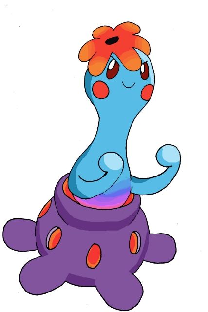
  • Yoshuriken: A flower? You're going to struggle pulling a Grass-type implication away from that concept (yes, yes, the Flabebe line is the exception). :/ The scorpion is less inclined toward the Grass-type, and they can be Analytic to start. ouob
  • Flame_Effigy: Ah, a bell. :) That works! I'm impressed with how far your design has come; the current iteration looks great! There are always little things I would prefer with others' designs (the hands and how they're attached to the body--maybe clouds there?), but really, that's minor compared to your entire composition, which stands out amidst other concepts and designs for this CAP. ouob
  • Kyukon: The design is fantastic, as you might know, but if I must criticize anything, it would be that I preferred the pose you had in a previous drawing. The position of the hands is just less interesting here than the previous one. :P No worries, though!
  • V4LOVER: Hmm, interesting shading, I must first say. It gives your design realism; that may not work well with Pokemon, being rather cartoonish in art style. I'm personally not as fond of it, although I understand your concept quite well. The octopus's volcanic and aquatic elements work together nicely; the mantle mantle is familiar to other designs, but the way you've drawn it makes it look really natural and integrated into the design. Could you outline your drawing more? That's a criterion in the rules for the image being slated. It might also help the style and integrating that into Pokemon.
  • ZirconSubway: Yay, shadows! :) They help give the creature form. I could see more, especially on the tail, since it's behind the body, but there's only a little cast shadow on it. Don't strain over minuta, though, if you don't want to. ouob Nicely done!
  • User of Shadows: Ah, don't say that. It's not about execution but idea concept foremost. I like those latter qualities in your design, and the colors in it are really nice; those volcanic veins contrast greatly and nicely with the aquatic blues. The design seems Analytic and specially-offensive, fitting the stats CAP's chosen so far. Let that work in your favor! :)
  • GRs Cousin: Is it just me, or is your image artifacted? Did you use a program to reduce the image to 256 colors for file size? It's a minor point, but it bothers me as an artist that the image has this reduction in quality.
 
Hello again! Sorry it's been so long since I've posted, I actually have been working on my design (which I'll just call dolphinmon for convenience sake), but I've been a bit busy so I haven't been able to do a formal drawing. And, well... I still haven't. But I do have a colored sketch!


Here it is! I know the fire looks AWFUL at the moment, but I promise it won't suck when I do my final submission. Anyways, the design hasn't really changed TOO much. I solved my dorsal fin crisis by adding a notch in the first ring. I may tweak the size of the dorsal fin a bit, since I think it may be too small when juxtaposed with the fire bursting from its sides. I also may end up removing the fire altogether from the back two rings, because it tends to make the design look cluttered. The color scheme may also change. I dunno, tell me what you guys think. I'd really appreciate some feedback, because I'm terrible at judging my own designs.

I feel dolphinmon has a lot of potential and matches well with the stats and ability chosen. If you haven't seen its anatomy/design inspiration stuffs, make sure you read my first post. Analytic works really well, since dolphins are always considered to be some of the most intelligent animals. The stats look like they match well too. CAP18 looks like it will have high speed and special attack, which dolphinmon's design allows (it can dash around at high speeds thanks to its rocket-like fire propulsion and can blow highly pressurized fire or water from its blowhole). High special defense also makes sense, since it seems that the most specially defensive Pokemon are the squishy, rubbery ones (and dolphins are indeed rubbery and arguably squishy). High defense, which I can't really argue for, is a possibility, but the spread that looks to be the current leader does not have defense too high.

I'll update the design with... well, better art when I get a chance, after hearing what people have to say about its color scheme and the size and/or existence of the ring fire. Let me know what you guys think!
 
Last edited:

Magistrum

DOITSU NO KAGAKU WA SEKAI ICHI
is a Top Artist Alumnus
Slight update: Since the ability analytic was decided along with an approximate 93-95 speed stat, I decided to move forward with the Flask Homunculus along with some modifications:

The body patterns seemed too thick from the last design so I opted for thinner lines with accents of jewel-like embeds inspired by the Philosopher's Stone, as another design element for the alchemy theme.

Analytic fits quite nicely as an ability, because a homunculus is a by-product of the pursuit of alchemic knowledge. The stats fit quite nicely too, since its overall form invokes specially-based pokemon akin to Rotom, Porygon2 or Porygon-Z, and looks defensive enough. Pokemon with speed stats between 90 and 95 are a gray area, as it does not actually mean the Pokemon looks speedy (See Magmar, Drapion, Poliwhirl).

I'll be coming up with the back art and/or supporting art a bit later :) As always, comments, critiques and criticisms are always welcome.

EDIT 4/15: Changed the face, removed the steam effect, removed the lighting effects on the blue lines and gave the body a bluish hue.
 
Last edited:
Final Submission


Dolphins, Sea Spirits, and Homunculi oh my! I have a feeling this post will be overshadowed by a bunch of others, plus I won't be able to get supporting art up until tomorrow, (or fix the tail shading, sorry Quanyails) but, oh well. This overall main design is pretty much done, and I am starting to get sorta nervous about due dates, so... I suppose I can edit some supporting things in soon. Regardless, here it is, Mantis Shrimp Beta 3.4.1, or whatever this is at this point!

Description/Design Things

This concept was originally inspired by the animal known as the Mantis Shrimp, which to quote wikipedia, the internet's utmost reliable source of information, "strike by rapidly unfolding and swinging their raptorial claws at the prey, and are capable of inflicting serious damage on victims significantly greater in size than themselves... This will produce a very small amount of light and high temperatures in the range of several thousand kelvins (a.k.a. HEAT) within the collapsing bubble, although both the light and high temperatures are too weak and short-lived to be detected without advanced scientific equipment." This ability to generate unbelievable quantities of heat with their attacks, is what first led me to decide on making a Fire/Water type concept around a Mantis Shrimp.

Supporting Art

As a brief indicator of progress, for those interested, the first design created can be found here, while the unshaded version of this Final Submission in question can be found both on pages 2 and 5, but also here. In addition, to kill two birds with one stone, (or three four for that matter) all supporting art can be found below:

Analytic, using Scald, and more!

Infiltrator, and... some other things!

-----

That's about all I have in regards to links and explanation, so... more supporting art soon? Until then, once again, every design on this thread so far has been great, and having to select individual designs when it comes to polls, is going to be very tough. Good luck to all, and to all a good mid-to-late afternoon!​
 
Last edited:

paintseagull

pink wingull
is a Top Artistis a Forum Moderator Alumnus
** Mod post **

Stats have been decided! I also forgot to post about our primary ability. So here they are:
Abilities: Analytic / ??
Stats: 100 HP / 45 Atk / 80 Def / 135 SpA / 100 SpD / 95 Spe

Now we just need Secondary Ability Discussion, 48 hours of polls, then after that art submissions will be open for 48 hours more. A mod will give a more specific warning once there is a timed warning for the end of Secondary Ability Discussion.

** End mod post **
 
Magistrum
I'm so glad you decided to go with the Homunculus, as it's definitely one of the best designs shown so far. I would like to say that the face looks a tad funny- something similar to the one you posted back on page 1 might look better in my opinion. And the color scheme, while bold, seems to conflict a bit much. The black really makes the overall design look saturated. Otherwise it looks fantastic~

paintseagull
Your fire hydrant dog is both incredibly clever and adorable, but I agree with earlier sentiments about it not looking quite "fully evolved". Still, if you leave it as-is it's really a strong contender for first.

Sorry I don't have time to voice my thoughts on everyone's submissions :[ good luck! and may the best design win!
 

Birkal

We have the technology.
is a Top Artistis a Top CAP Contributoris a Top Smogon Media Contributoris a Site Content Manager Alumnusis a Battle Simulator Admin Alumnusis a Senior Staff Member Alumnusis a Community Contributor Alumnus


Change of pace. It's a firefighter kangaroo! I got pretty lazy with the drawing tonight, so I didn't get to show off as many key features as I wanted. It can shoot water out of its fire hose tail for some impressive damage. Its pads are also holes that can shoot fire out of its paws and feet. This can be utilized for quick fire bursts (think Iron Man). I wanted to encompass something that fit our new stat spread. Kangaroos are pretty speedy, while its abilities to shoot both water and flames come with high special attack. Analytic also fits through its nature as a firefighter; it needs to analyze any give situation before responding properly (water vs fire application).

In terms of artistic design, I tried to pick colors that symbolized both types well, but neutral ones to tie it all together. Its limbs have the bright red of its head to symbolize the heat generated from those body parts. In contrast, its fur is wet and cool, much like the water it shoots out. The "hat" portion is derived from Honchkrow, which wears a gangster hat that is also part of its physique. The iconic firefighter helmet works its way in here, but I'm trying my best to mesh it into the overall head. Any feedback here is appreciated.

So, I need help. I drew chubby fish much earlier on in this thread. And while I still love that design, I just can't justify it having 95 base speed. It's true that some larger Pokemon are speedy (Purugly comes to mind), but I'm not sure if it will fly with you guys. Which design do you prefer? It's best to send me a message or contact me on IRC. Let me know!
 
Birkal:
Wow, that design looks really awesome. However, perhaps take out the hollow fire-spewing pads: they're sort of distracting, and I think the hose can already fill their purpose. The firefighter concept already gets the Fire-type across well enough if you're worried about the hose not looking Fire-type enough.
 
Final Submission


supporting artwork
http://imgur.com/jubG5Y8

-Sharktea is a small fish with vicious temper. when foes mock Sharktea for his size, sharktea boils with rage.Eyes flaming, sharktea blows his top and shooting out fire, steam, and boiling water onto foes!
-Sharktea loves company of smart and courageous allies, as long as they don't make fun of him or use him as their teapot.
-Sharktea has two distinct personalities, when not angry sharktea has a calm, cool, collective, and analytic personality studying his foes behind his slathered on smile, just waiting for there next move and predicting there pain(water). However when he is angered all reason and thought is replaced with pure fury and spite with fiery eyes full of intensity, he explodes with with an unstoppable rage; light screens, reflects, and subs are simply brushed aside as his raging attacks infiltrate his foe's defenses(fire).
-Sharktea is based off of a shark and a certain device that heats liquid. Blue adds a pinch more of water into the shark design and the excuse for flames adds more of a fire aspect to the teapot. The smoke makes sure everyone knows he's a teapot and not an elephant-shark thing, as it would always be on him, not like a move effect that would only be on him for a short time.

I added supporting artwork and made the smoke come out of the spout on sharktea, sadly, (at least for me) homework is going to prevent me from furthering the design anymore, so i'm sending this in as my final submission.
-peace
 
Last edited:
Final Submission


As far as my shading skills go, I would rate myself as... a novice. I've done it before, and managed to do it successfully with my image of a dark, more edgy looking version of Mew, as well as my first Rock Band inspired group picture of my OCs, but I gotten rusty afterward. It's also been a while since I used my colored pencils. I tried to shade as subtle as possible for the lighter areas then go all out for the darker areas. My judgement might be off. I also changed the tail a bit and fortified the line-work. It's more or less finished, but I might still find something I should change. Still open for suggestions.

How does my Pokemon work with Infiltrator? You wouldn't guess by its appearance, but he's actually very slippery. Working with slippery oil helps him slide along different terrain unpredictably, making his movements hard to judge. To make things more in his favor, he makes little noise from sliding around on his oil, making it easy for him to slip around. But how does he slip around and not leave tracks behind? He doesn't actually use the oil to slide, he covers his body in a thin layer of gas to make himself highly sleek, but very quiet. This ability allows him to infiltrate enemy defenses without notice through unpredictable movement. ...That sorta works, I guess.

One more thing: I'm not a great artist, so when going into contests like this, I try to make up for it with a strong idea. ...Wait, did I already say this?

Quanyails: Hmmmm... That could be problematic in my design. Still, to be fair it's different types oil. I'm not sure what Molluxe uses, but this design uses gasoline and offshore rigs for its inspiration. As for your design, I don't see fire in it outside its color.

Calad: Very cute, but the idea seems very similar, again, to Molluxe.

TeamNormalizer: Looks cute so far. Nothing jumps out at me in particular to nitpick at, which is a good thing.

Yilx: I know I said it before, but I'm not a big fan of humanoid designs, so I cannot rate this one effectively.

Magistrum: Very good! It looks legit and the idea is creative and makes sense. And yet... it still seems a bit familiar in CAP.

Dracoyoshi8: While cute, I do not see fire in the design.

Birkal: OMG, ADORABLE! It's a kangaroo! Big feet, fire-fighters cap, hose tail, I heart this idea. Still, the green fluff seems asymmetrical near his feet, and it looks kind of odd.

hendrix98: A cute idea. I can see it working. The smoke seems to come from behind the spout instead of through it, which does seem weird.
 
Last edited:
Final Submission

supporting artwork:

Some sketches:
http://i.imgur.com/HbNnIUT.png
Using some moves:
http://i.imgur.com/2CWeZp8.png
Version with steam and BUBBLES!:
http://i.imgur.com/XqXuvqy.png

Well..... That's quite drastic change, don't you think? :D
I really loved colors in my original design, so I mixed it with simpler look of the second design and slapped some vents!

I don't think I will change anything much as I really love this one.

It's a pokemon that lives deep in volcanic lakes. Cape on its back is used to collect heat from underwater volcanic vents. Thanks to that, it can defeat its enemies with boiling water, and sometimes fire. Basalt plates on its cape are used for defence and cape's isolaton.

(Thank you ZirconSubway for pointing what was wrong with my submission :D)
 
Last edited:
Final Submission


The fire urchin! It heats up its spines enough to boil the surrounding water. It usually hangs around underwater volcanic vents on the seabed. Since it's an Analytic, it lies in wait for its prey to come close enough for it to attack, though it can move fairly quickly if it needs to. Any comments are much appreciated!

EDIT: Cropped the image down to size and ensured a plain white background.
 
Last edited:
Final Submission


some supporting art, a justification of the speed and analytic
more supporting art, fire attacks and infiltrator

So this man o' war concept is two pokemon in one, think slowbro. The man o' war itself is an animal made of several others working as a community. one cant move and one cant feed, so they join together to supplement their weaknesses. The jelly guy on top is the water half of the pokemon, and the one that cant eat on its own, so it feeds by leeching. the jellyfish guy on bottom cant move, but it's tentacles catch and filter food into its mouth.
 
Last edited:
Just wanted to say this real quick, I will be adding/editing more to this post later in the form of comments and supporting art, just so as to not make this a wasted post. However, first off, to anyone who has posted a final submission, please check Quanyails's post on the first page with your art to make sure that your final submission is valid for entry, as almost half of the final submissions so far are illegal. And secondly, if it does say that your art is illegal, (this being partially in response to your question as well viiragon) re-read the OP for posting rules, please. It's most likely that you've incorporated (due to this CAP's typing) some sort of steam (cannot emphasize that enough) or other action affect that blends in with the background of your picture, or you don't happen to have a solid outline around your design. I realize that this may not be my place to say this, seeing as I am no moderator, much less a staff member, but this is something I happened to have caught onto awhile ago, and if you're extremely confused as of to why your design is illegal, hopefully this will help.

(Edit 4/15):

Supporting Art: The Phantom Mantis

Here it is finally, some supporting art. My Final Submission post should also be updated with this as well, as of writing this. Just some basic stuff involving how Mantisshrimpmon fits the analytic ability, uses Scald, and... synchronizes with Latias as part of the core. Comments soon to come!

(Edit 4/17):

Supporting Art 2: Return of the Shrimp

More supporting art, detailing how Infiltrator, (the recently selected Secondary ability) works with this this design as well as some... other stuff. Anyway, sadly things have really picked up, most everyone has released their final submissions by now, and this thread has moved to a new page, so, no comments after all methinks. My apologies to any counting on it, however I doubt there are any of you out there, and... good luck to everyone I guess? So you all at the polls soon!

(Edit 4/18):

This will be the last thing I post on this thread, I swear. However, as I haven't dabbled very much in forum work before recently, for the past while I've been trying to actually figure out how to use, or what service to use rather, when trying to obtain direct links to images for supporting art and such. I just solved this problem, meaning that all links to supporting art, in both this post and my final submission should be updated, and usable in the polls. That's about all, sorry for posting even more.
 
Last edited:
Did some experimenting with potential shiny colors for my nautilus. Here's what I came up with:
http://i.imgur.com/gtHDwz8.png
mod edit: inconsequential update, so this should be a link not a displayed image
Not entirely happy with how the green and purple turned out, but ah well.

Next on the agenda is going to be redrawing my previous supporting art to reflect the design alterations, and after that I'll be making my final submission post, barring any screwballs in the secondary ability poll. Discussion has been leaning towards Infiltrator, which I feel works well enough, but hey, anything could happen. Also hoping I've got enough outline on my smoke for it to be kosher now. Any outline thicker than that looked really dumb, but if it still doesn't meet standards I guess I'll just get rid of the smoke altogether.

Doran Dragon: Neat! A man o' war design was actually something I had considered doing. I'll have to wait for a more fleshed out drawing to make any real judgments, so instead I'll just ask: what exactly is the thing floating above its head supposed to be?
 
Last edited by a moderator:

paintseagull

pink wingull
is a Top Artistis a Forum Moderator Alumnus
** Mod post **

Secondary Ability Discussion will be ending very shortly and then we'll have about 48 hours of polls. Once we have our final ability decided, I'll post a final warning and this thread will have about another 48 hours before it closes!

As ZirconSubway points out, Quanyails has been flagging illegal submissions in her very helpful post at the beginning of the thread! Lots of people are using Steam, Fire and Water effects in their designs. Please be aware that, as stated in the rules, action or move effects that are not *inherently part of the pokemon's design* are not allowed. If you're not absolutely SURE that your smoke/steam/whatever is an unquestionable and essential design element, then you'd be best served by removing it. Outlining an effect doesn't make it not an effect. Though there are helpful people trying to point out to you if you've broken a rule, it is ultimately your responsibility and yours alone if you don't make the poll.

So, consider this your approximate four day warning! Happy drawing!!

** End mod post **
 
Last edited:

Yilx

Sad
is a Top Artist Alumnusis a Smogon Discord Contributor Alumnus
Final Submission


"It's not like I wanted to pivot for these two idiots or anything..."

The main theme I had in mind was "contrast", as that was what the typing Fire/Water implied. Trying to avoid Steam/Lava vent-based concepts, I decided to go with a Fire-Elemental Sea Angel. I decided to go with a Sea Angel as the base of my design as they had an adorable silhouette and it was during the "Deep Sea" creatures inital phase that everyone had on. It also fits the contrast between the typing Fire/Water very well, as the way it b behaves during feeding is quite drastic, to say the least. I was always a fan of the idea that the third fiddle to Luke (RIP) and Latias being an angry coach I thought would be a cute idea if it was a pint-sized Pokemon rather than a big one; it would bring out the contrast even better.

Part of the key to her "Fire/Water" contrast is the personality that I've tried to bring out in her pose; she has hints of being "Tsundere". I've tried to show her snarky personality better in the emotions in my supporting art, as well as the way she uses both her Fire and Water-based attacks.

I hope you like my design and good luck to everyone participating.

Supporting Art


"Lucario? OU?" / "Public Enemy" / Lava Plume / Scald and Flamethrower / Emotions 1 / Emotions 2 / Fake Out​
 
Last edited:
Final Submission


It's based on Vampyroteuthis infernalis, the "vampire squid from hell". The only thing left to do was emphasize the "hell" to fit its typing. The larger light-producing organs can produce flames when exposed to oxygen. Since it lives in abyssal waters it can only muster a cold glow. The photoreceptors on top of its head can function as an extra pair of rudimentary, motion-sensing eyes, which fits its Analytic ability.

Supporting Material


[1] A view from behind and its defensive stance with fire; [2] It can produce light from any point on its body; [3] A gathering.​
 
Final Submission

http://puu.sh/87cXm.jpg

Lava/Fire Sea Angel Girl. Simple things. Key to her "Fire/Water" contrast is the personality that I've tried to bring out in her pose; the very slightly "Tsundere" thing that people have going.

Supporting Art


"Lucario? OU?" / "Public Enemy" / Lava Plume / Scald and Flamethrower / Emotions 1 / Emotions 2 / Fake Out
I already loved this thing. Now that you said it's tsundere I don't think I'll be able to help voting for it.
 
Last edited by a moderator:
Final Submission


So yeah, I did not change anything from this after all (I almost forgot that CAP was a thing that exists).
 

Infiltrators gonna infiltrate.

Also, as far as my final submission goes, the steam is an important part of the design. That is the purpose of the siphon, and it is always letting steam out. Think of it kinda like Torkoal.


Quanyails: Interesting choice of design. As Billy said, there doesn't seem to be much of a fire element outside of its color.
Calad: I like this one, though it seems a bit similar to Gourgeist to me. Whatever it is, it looks good.
TeamNormalizer: Cool! What does it look like without the fire? Is it always being emitted? Also, the eye color seems like it would be better for the belly blue than the current one, just imo though.
Magistrum: Whoa, this one's quite the deviation from the general designs. I really like how it seems to fit the 95 speed stat, and shows both fire and water elements.
ZirconSubway: Haha, the mantis shrimp. I quite like it, though I couldn't tell what the tail was like until I saw the supporting art. Only thing I see with it is that CAP18 has a really low attack stat, and given that mantis shrimps generate that heat and such with a physical attack, it seems like its power would be concentrated in those.
Birkal: Wouldn't have expected this one. I can't seem to think of something to improve on in the design, except that you mentioned its wet fur but its ear fur (which I assume to be like the rest) is sticking straight up, which would come off as a bit odd with your description.
hendrix96: Nice! Might you want to make the design a bit more sharklike? Their fins are pointier, and you could possibly bend the handle on top to be more like a dorsal fin shape. Also, there isn't much of a fire element outside of the obvious steam and the fire design (decals?).
Billy the Alrune: Not too sure about this one. Could you draw a side view? The tail looks like just one nozzle, but from your description I get the feeling it's two. Color scheme looks a bit close together in saturation too.
viiragon: I get where you're going with this design, but it doesn't look as water-like as it could be. I see the vents that let out steam/bubbles/water, but the rest just seems like some sort of lava being.
The Steam Punk: Nice, but the eye colors bother me a bit. How can it use water attacks? Might you make some supporting art to help us visualize it?
Doran Dragon: Ooh, good concept. Though how does it use fire attacks? The top reminds me of Morpha from TLoZ.
Yilx: I understand the design. I don't have much to say, other than that it's interesting that you've got emotion sheets for yours. Good job!
Golurkyourself: Really like this one. (octopus/squid high-eight) Only problem would be that the fire element isn't too obvious. Other than that, I love it!
 
Last edited:
http://i.imgur.com/vrOZmrA.png
mod edit: minor update; changed to link

After learning that my submission was illegal, I made some modifications to it (and changed the image in my Final Submission post). I darkened the outline on the steam and am arguing that the steam is a crucial design element because it's intended to represent cat whiskers to tie in the two themes. Even if the steam whiskers are not always present, they're still an iconic part of the design much like the flames on Typhlosion or the smoke on Torkoal. Please let me know if my submission requires further change.
 
Last edited by a moderator:
Status
Not open for further replies.

Users Who Are Viewing This Thread (Users: 1, Guests: 0)

Top