So once more, I am drawn to the CAP section of Smogon rather than committing my time to the homework which I dearly need to complete. This project has fascinated me since my first visits to the forums, and I'm pleased to see such a bustling community hard at work.
However, if time is really running out for this project, as it seemed CyzerVisheen implied, then I find it imperative that I throw in my opinions as to what artwork I really like so far and artwork which I believe have potential but need an update, if you will.
First and foremost, I would like to give my critique on sucker_puncher's design. I really like this concept you have, simple and to the point with it. You incorporate the feminine aspect requested in previous posts, as well as foundations for the sketch move.
What I particularly like about your design is that I can see the different colors in which it would be portrayed in the actual games, similar to Spinda's unique designs. There are two things that I would like to point out which bother me in your drawing...
1) The head and face can use some work. While I can see that it has the capability to withdraw within it's bud and the obvious darkness shrouding the face, I still would like to see the face more... with more to it.
2) Add a bit more Ghost to the design. As Doug said, this type combination doesn't exactly scream of simplicity; in other words, making a perfect blend of Ghost and Grass is tricky, do to the obvious contradictions. However, I just don't quite grasp the Ghost part of this design, and would like to see more of it by your final submission.
Other designs which I would really like to see elaborated on are those of paintseagull (this one in particular, because I really liked this design and want to see it as developed as all these others have become), The Ticketmeister, TeraVolt, Birkal, and Asylum_Rhapsody. Those which are developed and and I really like are those of DougJustDoug, Wyverii, SoIheardyoulikeSENTRET, and Yilx. To everyone else who I haven't mentioned, keep at it and don't give up until the deadline is over!
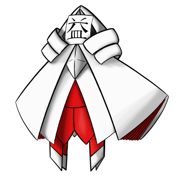
Before I close with this, I would like to add one last comment to all of the competitors. I notice a lot of mature and/or crowded elements in a lot of these drafts, even in those which I like the most. The last comment I would like to make is that Pokemon is a game made for young adults, teenagers, AND children. Even when creating a Pokemon specifically for the competitive scene, where no great amounts of little kids are expected to be found, I still think that this CAP should look as close to something from Nintendo as possible. I see weapons and blood incorporated into some of these designs, and while I may be proven wrong (and by all means don't hesitate to do so if you have any opinions contrary to this comment), I don't think Nintendo would incorporate such things into their artwork.
My point is this: Be as artistically creative as you can, but please try to remember what it is the final product is supposed to be. As other members have said, Pokemon are usually confined to simple, appealing packages acceptable for all ages. Please try to remain as true to this criterion as creatively possible.
Besides all that, good luck to everybody! Please excuse me while I try to complete some homework.