
-
Smogon Premier League is here and the team collection is now available. Support your team!
-
The moderators of this forum can be found in the CAP forum staff directory.
-
Welcome to Smogon! Take a moment to read the Introduction to Smogon for a run-down on everything Smogon, and make sure you take some time to read the global rules.
-
Congrats to the winners of the 2025 Smog Awards!
You are using an out of date browser. It may not display this or other websites correctly.
You should upgrade or use an alternative browser.
You should upgrade or use an alternative browser.
CAP 13 CAP 2 - Sprite Submissions
- Thread starter Rising_Dusk
- Start date
- Status
- Not open for further replies.


Oh noes! Not Aragorn!
I love your hands on CaP2 Aragorn, but the front arm feesl like its a bit choppy and maybe a bit lanky, and definitly longer than the other arm, but otherwise, a beautiful sprite like only you can do lol.
I love your hands on CaP2 Aragorn, but the front arm feesl like its a bit choppy and maybe a bit lanky, and definitly longer than the other arm, but otherwise, a beautiful sprite like only you can do lol.


Aragornbird: You did a nice job with the head; the sprite incorporates many of those details that are normally hard to fit in. One immediate problem I see is that your sprite takes up the entire length of the canvas; if it could be reduced in height, it might fit better with the other sprites. Another thing I'd like to point out is that the head looks detached from the body, presumably from its turned angle. Something should be reposed to make it more natural looking.
Hugely minor update for myself:

I moved the eyes down one pixel. :O
Another thing about my own sprite I noticed is that there are more thorns on that vine than Yilx's design. It's artistic license, yes, but should I keep it or make it more congruent with Yilx's original? (It's minor, I know. :/)
Hugely minor update for myself:
I moved the eyes down one pixel. :O
Another thing about my own sprite I noticed is that there are more thorns on that vine than Yilx's design. It's artistic license, yes, but should I keep it or make it more congruent with Yilx's original? (It's minor, I know. :/)
Hey quan, the bow in the back looks like it would be visible from the front, so perhaps edit it so that it is visible from the front. Also, the red in the shiny really blends in with the red of the teeth. What if you were to change either of those colors to something close like brownish or purple?


ICC, your sprite looks stellar now—simply stellar. It actually fits in really well with the sprites of the others you linked and fits perfectly well in the size that GF typically uses for Pokemon of CAP 2's stature. I think you've done an excellent job, handled criticism very well, and gotten the coloring to a good point despite your red-blindness. Cheers.
AB, she's huge! I mean, that's totally okay if it's what you want, but you should definitely consider shrinking her down so she's not using the entire vertical canvas. I know nothing forces you to do this, but consider that a big (9") and legendary Pokemon like Zekrom doesn't even take up the whole vertical canvas! Check the comparison:


You can just tell that something's off with the size of the left one.
Quan, I want you to think about where the light source is for your back sprites. What spherical and singular light source could possibly create the shadows that you have on the back of the dress? The answer is none! You've drawn it as though there are two light sources, so it looks very strange compared to other sprites. Check this:

See how much more of the back of the dress is dark than in yours? Try to see if you can't shade the back of her dress a lot more so that you fix the issue with light sources that you're having. Oh, and I agree with Doran's suggestion on the bow and coloration of the shiny. ;)
AB, she's huge! I mean, that's totally okay if it's what you want, but you should definitely consider shrinking her down so she's not using the entire vertical canvas. I know nothing forces you to do this, but consider that a big (9") and legendary Pokemon like Zekrom doesn't even take up the whole vertical canvas! Check the comparison:
You can just tell that something's off with the size of the left one.
Quan, I want you to think about where the light source is for your back sprites. What spherical and singular light source could possibly create the shadows that you have on the back of the dress? The answer is none! You've drawn it as though there are two light sources, so it looks very strange compared to other sprites. Check this:
See how much more of the back of the dress is dark than in yours? Try to see if you can't shade the back of her dress a lot more so that you fix the issue with light sources that you're having. Oh, and I agree with Doran's suggestion on the bow and coloration of the shiny. ;)
Oh man oh man oh man, ICC's sprite is just beautiful. I know I don't deserve to win against that at the moment... I guess it's time for some major edits on mine, and a backsprite. If ICC wins though, I'll be extremely happy. Top notch, man. Just a great sprite. I think my favorite part is how cel-shaded it is.
Your sprite is wonderful, ICC! There's not much work left, but what you want to improve, you must improve. For the rest, amazing job.
Aragornbird, I love your sprite, but it's too large. I suggest shrinking it down a little. It has a very good quality, though.
Quan, yes, the red of the Shiny clashes too much, so I suggest changing it. The shading on the backsprite is also a little confusing.
Keep it up, everyone!
Aragornbird, I love your sprite, but it's too large. I suggest shrinking it down a little. It has a very good quality, though.
Quan, yes, the red of the Shiny clashes too much, so I suggest changing it. The shading on the backsprite is also a little confusing.
Keep it up, everyone!
Oh, question. I may have missed this, but when are final submissions due?
There isn't a due date yet. We still have quite a few steps to get through in the rest of the CAP process before sprites must be submitted. I'll provide a 48 and 24 hour warning when we get to that point, though, and since I haven't yet, you can assume you've got a ways before that happens. Basically, don't worry about it.
Doran Dragon: I tried to make the bow visible from the front, although it looks un-prominent and confusing.

Just a quick update; I'll figure out the shading on the backsprite (should I just remove that dark shade on the dress?) and recoloring (the original has two similar shades of red) when I get more time.
Just a quick update; I'll figure out the shading on the backsprite (should I just remove that dark shade on the dress?) and recoloring (the original has two similar shades of red) when I get more time.


aragornbird: I love the pose and overall composition. As others have said, she's a bit big. In addition to scaling her down a bit, I would see if you could maybe provide a little more detail to the seam on her dress that runs up through the red eye. You might interpret there being no seam there, however, which is your artistic license. With her body turned away from the viewer slightly, you might be able to throw in one of the bow's loops emerging from the back at her waistline. Again, though, you might not be planning to add that detail. Otherwise, I can't really offer any other critiques, it looks great.
Ice-cold Claws: Sprite is looking excellent, definitely a contender for my vote. The only thing left that bothers my eye a bit is the vine. I just think it looks a bit bent where it curves in to meet her head. You seem to have enough room on the canvas to bump it out a bit more and give it a more rounded curve. The vine also appears to get larger in the middle, which is odd when that's the part that should recede backward into depth from the picture plane. As a result, the vine appears to be on the same plane as her head rather than looping backward to meet her waistline.
Quanyails: She still seems a bit like a mannequin. While I love the shape of the arms, when they're outstretched like that she seems to be a bit zombified. I might try relaxing them a bit and placing them at her sides, unless you plan to give them a more dynamic pose (like aragornbird's or ICC's). Otherwise, I think it looks good. You have one of the best vines—I like how it doesn't just protrude out vertically from her head, rather recedes immediately, drawing more attention to her face. On the backsprite, the outline of the vine where it emerges from her head is a bit thick/overstated. One more thing, I might try placing the bow (on the backsprite) a bit lower. It doesn't make sense for it to be that high, really.


Kept the bow, changed the shading for the backsprite. Not really satisfied with it. :/
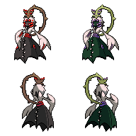
I'm trying to figure out how to edit the backsprite without going over 16 colors, even if that limit doesn't have to be adhered to. This is the current shiny (changed some reds to pinks, to get as close to the original shiny as possible while still having a bit of contrast between colors). It doesn't work, right?

closer...but no cigar. with the eyes and teeth being the smaller parts its less visable, so perhaps if you made the red dress darker?


Latest changes to sprite. Lots of changes large and small on this one. I don't think it's perfect and I'm going to have to have a good look at official gen 5 sprites to make sure I have the right shading.
Changes are:
Vine curls to avoid covering details. Ribbon/leaves has been altered to take advantage of the amount of free space by hanging down; also changed to red for better colour balance. Front altered to show changes.
Back arm raised so it doesn't clip across the dress. Pose feels a lot more balanced now.
Hem of dress changed in backsprite. Will probably need additional altering since the loops just don't feel right.
Eyes on dress even larger and the shirt closed off a bit.

AragornBird - I think your sprite is really good. I love the shading, except on her back arm; it looks really flat with just the 1 colour. However, the shading is fine everywhere else, and I just love your posing. Very nice.
Quanyails - I think the kind of shading you should put on her dress back is the exact same shading you've done on the back of her head, because I think that area is just absolutely amazing. If you want to follow Meddle's advice on her arms, just curving them would probably solve the problem, but I find the posing to be quite nice and not that zombified. I really like the dark red and pink combo you've got for your shiny sprite.
Ice-Cold Claws - You're very welcome, and I'll have to agree with what Rising Dusk said: your sprite truly is stellar. I'll also agree with what meddle said about the middle of the vine, but once you fix that, the sprite will be just infuckingcredible. Great job!

Quanyails, it looks spectacular, but one thing I would suggest would be to darken the dress on the front sprite a little...
All these sprites are really strong contenders!
All these sprites are really strong contenders!

ICC, I suggest that you use something other than tinypic to host your sprites.
Photobucket is very easy to set up, and allows for much more permanence than image hosting sites like tinypic and imageshack.
I'm only saying this because as of right now, no one is able to view your sprites as tinypic has stopped hosting them.
Photobucket is very easy to set up, and allows for much more permanence than image hosting sites like tinypic and imageshack.
I'm only saying this because as of right now, no one is able to view your sprites as tinypic has stopped hosting them.
Thanks so much, all of you. Like seriously.
Made necessary corrections as pointed out by meddle.
I just smoothened the vine curve instead of extending the height; R_D said a couple of pages back that
I suppose this will be my last post before my submission, since there probably aren't any errors left.
EDIT: @kingdra down there:
Right now I don't know how to fix the problem because I can't really see it myself. I'd like to know if others are seeing the same problem.
Oh, oops. Well here ya go.ICC, I suggest that you use something other than tinypic to host your sprites.
Photobucket is very easy to set up, and allows for much more permanence than image hosting sites like tinypic and imageshack.
I'm only saying this because as of right now, no one is able to view your sprites as tinypic has stopped hosting them.
Made necessary corrections as pointed out by meddle.
I just smoothened the vine curve instead of extending the height; R_D said a couple of pages back that
Yeah. And I kind of just made the vine thinner.R_D said:I think the vine might be a bit too long and might be taking up too much vertical height. It looks a lot longer and more imposing than I feel it should be.
I suppose this will be my last post before my submission, since there probably aren't any errors left.
EDIT: @kingdra down there:
Right now I don't know how to fix the problem because I can't really see it myself. I'd like to know if others are seeing the same problem.
Ice-cold Claws: Although I barely know anything about spriting, a glaring flaw that I immediately in your Shiny sprite is that the "thorns" on her hands are not as noticeable as the "thorns" on the non-shiny ones. It looks a little weird, and even renders her right arm's (our left) positioning a bit crazy. Right now it kind of looks normal because it is placed next to the non-shiny ones, but try looking at it individually and maybe you'll see the difference? But maybe that's just me? XD
Wyverii: I like the changes. Even the small tweak to the arms made them appear a lot less stiff. The only critique I can really offer now is that the back of the dress just doesn't appear all that convincing to me, given the way she's posed. I just don't think the back of the dress would ride up quite that high, despite her leaning forward a bit. It's minor, though.
Ice-cold Claws: Nice revision, ICC. My last nitpicks are that the vine seems a bit choppy now on the backsprite and that there's something a bit off where the vine meets her head (backsprite). Can't quite put my finger on it, though. I don't really agree with the above poster about the shiny sprite—the spikes on her “hands” stand out enough to me.
Quanyails: The shading on the back is a little more convincing now, but I'm still not sure why her entire left-backside wouldn't be completely in shadow, especially with the front sprite strongly suggesting that it would. The shadow should cast from her waistline to the floor, unless you really mean to give definition to what appear to be asscheeks (I don't think this is the case!). You may just be trying to give volume to her dress and to give definition to a seam which runs down the back of it, which is OK, it just suggests something else right now. It might look better if the shadow at the bottom of that backseam is just omitted. If light does indeed wrap around the back (as in the Gardevoir backsprite), I don't think there would be a shadow there anyway. Another thing that bothers my eye a bit is that the black outline has an unnecessary about of visual weight when given the overall color contrast. I might try something a bit less heavy-handed.
edit: Quanyails, I was looking at a previous version of the back sprite, but I think some of the comments still apply.

ICC
So I finally figured out what is was about your sprite that was bugging me so much, and it's that you used some anti-aliasing type of coloring to make the shading on her upper body all smooth.
The issues with this are that you shaded allll around the edges so it makes her look 3D.
The other problem with this is that you /only/ did it to her torso, and just normally shaded the rest of her body.
This just makes it stand out awkwardly.
If.other's prefer it this way, I suppose it's not a considerable problem, but you might want to look into it.
- Status
- Not open for further replies.