Elementalpenguin's sprite is still in the works! I'm working on the backsprite currently, and taking my time, since we have a lot of it. I've been going in every day looking at the sprite with a fresh eye and making very small changes to try and make it look marginally better. And then also the backsprite. It's still going to be entered! Thanks for the support.

-
Smogon Premier League is here and the team collection is now available. Support your team!
-
The moderators of this forum can be found in the CAP forum staff directory.
-
Welcome to Smogon! Take a moment to read the Introduction to Smogon for a run-down on everything Smogon, and make sure you take some time to read the global rules.
-
Congrats to the winners of the 2025 Smog Awards!
You are using an out of date browser. It may not display this or other websites correctly.
You should upgrade or use an alternative browser.
You should upgrade or use an alternative browser.
CAP 13 CAP 2 - Sprite Submissions
- Thread starter Rising_Dusk
- Start date
- Status
- Not open for further replies.


I really like the edit you made, Quan. She looked off a bit off balance before, and that's readily apparent now when comparing the old sprite to the new. That actually fixed some of the awkwardness with the arms as well, even though you made no direct edits to them. Nice work.


This is something like the 4th sprite I've ever made and the first attempt in at least a year or so, so I'm pretty damn pleased. I'd be the first to admit I like almost everyone else's better than mine, but I hope mine has at least a little to recommend. I tried going for a slightly different, more floaty, ethereal look, and as well as that remain relatively constrained in the size - I dislike moving out of the 80x80 box. I know I completely made up the thorn at the end of the vine, but hey, spriter's interpretation and I kinda liked it. Hopefully I'm not alone in that. I also wanted to emphasize the eye more - I do have one where the eye fits the art more closely, though, if anyone would prefer that.

Your sprite is promising, Deucalion2, and I would suggest to keep working on it with the time that's left. However, I think that you should take notice to this post by the TL on the first page...
While unique, your sprite's pose is probably going to have some issues with this. You seem like a good spriter, though, so I think you can figure it out.I'd like to remind everyone that BW sprites use neutral poses, and that action poses, or poses that intentionally obscure parts of the body, are really not in-line with what a CAP BW sprite must be.
It's neutral insofar as that it isn't performing an action, it's just on tilt, so I was hoping that's okay. I was more worried about obscuring due to the angle of the vine, so I could see that.
Any advice on the sprite itself? :)
Any advice on the sprite itself? :)


It's neutral insofar as that it isn't performing an action, it's just on tilt, so I was hoping that's okay. I was more worried about obscuring due to the angle of the vine, so I could see that.
Any advice on the sprite itself? :)
For starters, the proportions seem quite off; I'd suggest looking at the original art design for CAP2 and its supporting artwork for starters. Its vine connects in the back and the eyeballs blend with the dress. The arms look incredibly thin and it is tough to tell that they have teeth on the ends. The teeth on both the dress and the hood look a little too rounded right now, so sharpening those up would be a good idea.
Also, if you really intend to keep this "diving down" pose, then at least do something about the head. Check this out:

I simply flipped your image 180 degrees. The head looks upside down and awkward. I know you are trying to go for a diving pose with a looking up sort of feel, but the head would realistically be tilted downwards a bit more. Also, the opening in her "dress" would be facing downwards, wouldn't it? In your sprite, it looks like the scoop is on her back.
I personally would rather see a sprite from you standing upright! You seem like a good spriter naturally; so in the end, this is just my personal opinion. Do what you want! I hope this advice helped.
Also, as a note to all spriters, Wyverii is doing something awesome by having all of the "dissected" aspects of her sprites ready to go. As someone who dabbles in animation, I find myself much more pleased with submissions that have the parts of their CAP2 sprite accessible. From what I know of spriting, this isn't something terribly difficult to do, yet it can go a long way in helping an animator. Just food for thought! Loving many of the submissions so far; it will be a close battle!


Alright, an entirely new one with frontwards pose.

@Deucalion2
Well that's much more natural. I was skeptical whether that was something you would pursue or not. I don't know much on spriting but can you sharpen the vine-bow on her head? It looks a bit fluffy.
@elementalpenguin
Good to hear. Take your time until Dusk announces the deadline.
Well that's much more natural. I was skeptical whether that was something you would pursue or not. I don't know much on spriting but can you sharpen the vine-bow on her head? It looks a bit fluffy.
@elementalpenguin
Good to hear. Take your time until Dusk announces the deadline.
I come bearing updates.
First of all, some updates to my main sprite that I think really helped it out. Cleaner headdress, better shading in some areas like the arm, clearer arm thorns... yeah. Oh, I also made the gray lighter because I noticed it was a little flat with how dark it was and I liked the bright nature of Wyv and ICC's sprites.

Next, a backsprite. A preliminary one - not even a first draft, since the shading isn't done yet, not even on the outlines. But the outlines themselves are about done, so hopefully I can get some cc on that. Actually, no... some of the details are missing, like some aspects of the head, and the thorns on the headdress. Still, it's a good start.

I'll probably have a finished first draft tomorrow, and from there it'll just be tinkering and adding until I think I've made them as good as possible. I think I might try rounding the arms more so they look less like sheets of paper.
First of all, some updates to my main sprite that I think really helped it out. Cleaner headdress, better shading in some areas like the arm, clearer arm thorns... yeah. Oh, I also made the gray lighter because I noticed it was a little flat with how dark it was and I liked the bright nature of Wyv and ICC's sprites.
Next, a backsprite. A preliminary one - not even a first draft, since the shading isn't done yet, not even on the outlines. But the outlines themselves are about done, so hopefully I can get some cc on that. Actually, no... some of the details are missing, like some aspects of the head, and the thorns on the headdress. Still, it's a good start.
I'll probably have a finished first draft tomorrow, and from there it'll just be tinkering and adding until I think I've made them as good as possible. I think I might try rounding the arms more so they look less like sheets of paper.
Deucalion2 -- I like this sprite! With some more work and shading, it will definitely be a contender. The only thing I can think of is that she is a bit small. Don't make her too big, but expand her a little.
elementalpenguin -- I like your sprite! The back sprite looks like a WIP because it's a WIP, so I have confidence that it'll look great when done.
I have to agree with Darkhuaza517; this is getting close.
elementalpenguin -- I like your sprite! The back sprite looks like a WIP because it's a WIP, so I have confidence that it'll look great when done.
I have to agree with Darkhuaza517; this is getting close.
[*]All sprites (front and back) can have a maximum size of 96x96.
You could start by working with a larger canvas, Deucalion, since she's a bit on the small side right now.
Other changes I would consider:
- Give the vine a bit more clarity since it's a bit confusing to the viewer what exactly is going on behind her head. Widen the loop perhaps and add thorns to make it clear what the object is.
- You have a good start with the dress, but it feels a bit too rigid right now. I would consider letting it fall more naturally with less incisive upward angles. It's a bit like an umbrella currently.
- Give her head a slight turn so that she faces the opposing Pokemon head-on.
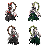
Super quick note to Ice-cold Claws, your final sprites have the following colour counts (including transparency):
Front normal: 25
Front shiny: 26
Back normal: 19
Back shiny: 19
Those colour counts are extremely high! In addition there really shouldn't be such a large difference between the front and back in terms of colour count. Though some of it may be artifacts you missed it seems the main culprit is AAing attempts in the white and outline areas that is artificially boosting the palette.


After investigating it myself, I totally agree with Wyv. You definitely should cut back to 16 (including black and transparency) on all of them if you can! That will help bring it even more in-line with other in-game sprites, since they all use only that many colors.
Aw, what the heck? I swear it was 16 the last time I counted. (well minus the transparency but ehh, 26!?) Must have skipped a bunch of blue-tinted greys with my color-blindness.
I'll try to fix it nevertheless, but may I ask how I can check the number of colors in a sprite? Google isn't helping me.
Thanks so much guys, and all you people out there sticking up for my sprite.
EDIT: Thinking logically, I only used 1 color for all the AA. If I eliminated the AA then that's just one subtracted from those huge numbers.
Therefore I think I know the problem. There must be plenty of shades of black from when I scanned my drawing and shrunk it. Silly me.
Correct me if I'm wrong.
EDIT AGAIN: I believe I am right. Upon trying to recolor the blacks I've spotted a couple different shades.
Oh and Wyverii, just wanted to point out something.
In your Final Submission front sprites:
Compare the shading of the regular and shiny.
It actually differs at the back of the the head. Is that intentional?

My two favorites at the moment are Wyverii's and ICC's. I'm not really much of a spriter so I wouldn't be much help in the criticism department.
Great job all you spriters!
Great job all you spriters!
i like ICC and ElementalPenguin's. wyverii's is good, but seems kind unnatural... i think..
@elementalpenguin, i think you should get rid of the highlight on the dress in ur backsprite. i think it would look better. looking great!
edit: theres also this awkward bumb on the left side of the dress on the backsprite. you sould get rid of that.
@elementalpenguin, i think you should get rid of the highlight on the dress in ur backsprite. i think it would look better. looking great!
edit: theres also this awkward bumb on the left side of the dress on the backsprite. you sould get rid of that.
So...the culprit was the extra shades of black.
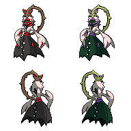
If I did everything right, now it should be:
Regular - 15 colors including transparency
Shiny - 16 colors including transparency
(Don't ask why shinies have more colors, it was a terrible mishap on my part.)
I still don't know how to calculate the colors in a sprite so I might be wrong here. Still, all the numbers should be at least under 20.
Help me check if you will!
And thanks to the two fellas above. :)

Because I haven't been around to follow the thread much over christmas and therefore kinda got lost with all the sprites, I've only got a little bit o' stuff to say.
DougJustDoug - the right arm in the back sprite is too straight, but the shading is beautiful now, especially on the upper body.
Quanyails - you may want to try extending the dress' shadow on the back sprite so that the dark parts spans the entire piece, but it looks exceptional as it is!
Deucalion2 - this sprite is much better than your previous. However, it is quite small and cluttered; Meddle offered a great suggestion you should try. Also, her straight arm looks too flat, and you may want to try curving it a bit. I love your pallet choice for her upper body, especially how the shading is just subtle enough to blend nicely but still be easily visible.
Keep up the good work guys!
ICC
Your sprites actually look much better with less colors. More natural or something close to that shadowed.
Your sprites actually look much better with less colors. More natural or something close to that shadowed.

I'm back. I will probably keep my final submission post, though. That said, great work on the part of ICC. They do look almost exactly like the game sprites, as others have said. I still think she shouldn't be portrayed as larger than Gardevoir, though.
Hello :)
I return with sprites, thoroughly checked and corrected by Wyverii!
15 colors each. Anyways R_D, I'm going to update my submission post in Page 6 with this sprite.
Mektar and Fire up there, thanks! But uh Mektar, mine's actually way smaller than Gardevoir if the vine isn't taken into account. In fact, I think you and I have the only sprites shorter than Gardevoir here.
Good to see! I'm also glad you followed the rules and edited your final submission rather than posting a new one. :P Cheers.


- Status
- Not open for further replies.