CAP 3 CAP 3 Art Submission Thread

Status
Not open for further replies.
You just gave me a King Kong image of the Gentle Giant holding a Pikachu in his hands while being shot at by airplanes.
Minus the airplanes and being on top of a tower, I had the exact same image in mind. Funny how that works.


This is my entry. I thought the chile pepper idea was awesome and took a bit of time to sketch out my vision. Done in pencil, then pen, then outlined in black sharpie, then finally colored in sharpie. Since chile peppers don't initially look very sturdy, I gave him a leafy poncho and chile-top sombrero. He is also in a very "wide" stance (if you'd even call that awkward position a stance). Desert roses for hands along with flower badge and spurs (those might be a bit much, dunno if I'd take them out) finish him up.

Chile pepper + wild west = Chile sheriff.
 
Thanks grawl, yeah it looks too physical but I might try to make a new desing that looks more special, and maybe spend more time drawing it.
 
there was talk awhile back about making this a solrock/lunatone esque mon.

well, what about woodman and gentle giant? they look close enough to be made easily of the same stock, and then it would allow for some very different options. i also think making counterparts would be good for the CAProject...

how do we all feel about this? it might need to go in a different thread, or there may need to be some different place to discuss. but i think it's valid. as more and more people are starting to participate, the possibilities are getting more and more varied. this is good, but it might mean we need to do a little sideways expansion...
 
First of, this is Create-A-Pokemon, like Mekkah pointed out.

Second, if we start making exceptions and not use the majority as a rule, this project won't work as well anymore. We're making a pokemon as a community and splitting up would only harm the creations.

And if people want a physical Fire/Grass or whatever that badly, they would've either voted for it when they could or vote for it in future CAP's
 
Just pointing out that almost everyone that spoke up about why they voted, was speaking up in favor of physical. Part of this is because it needed the support, but part of it is also because there was a lot more thought put into why physical is better for the metagame.
 
Don't get me wrong, I wanted to see him be physical too. I just don't think we should change the rules when we don't get what we want. For whatever reason.
 

DougJustDoug

Knows the great enthusiasms
is a Site Content Manageris a Top Artistis a Programmeris a Forum Moderatoris a Top CAP Contributoris a Battle Simulator Admin Alumnusis a Smogon Discord Contributor Alumnusis a Top Tiering Contributor Alumnusis an Administrator Alumnus
Moderator
If you want to propose a change to the CAP process, then take it to the process workshop thread. This thread is for art submissions.

I don't think that any of the artwork here should induce us to spawn an alternative pokemon creation. This project is a competitive pokemon project. Artwork is only loosely related to a pokemon's competitiveness. Artwork usually supports the inclusion/exclusion of certain moves, and perhaps supports the pokemon's build and style. But, there are exceptions all over the place. Technically, we could make the game sprite a big white dot, and it would be perfectly playable from a competitive standpoint.

But, good artwork and game sprites are cool, and we all love it. I am personally blown away by the quality of submissions in this thread. There's been more quality art contributed to this thread in the last three days, than I've seen posted in all the threads in Smeargle's Studio all year. The ability for the CAP project to inspire so much creative output in such a short period of time -- it's just incredible.

But, it doesn't change the fact that we are here to make a competitive Fire/Grass pokemon. We only need one sprite to do that. The metagame is not clamoring for two or three Fire/Grass pokes. If we need two or three, then later polls will reflect that, and perhaps all the unused designs will get a new lease on life. But, we don't need to make a bunch of alternate pokes or have alternate designs, just because many good designs are "going to waste".

I am an artist and I have spent a LOT of time making submissions for all three CAP projects. Some of my designs have garnered lots of praise by various members of the community. None of my submissions have won. That's fine with me. In the end, there is only one selected design, and that's the nature of the project. My designs are not being "wasted". Regardless of the CAP project, I maintain an art thread where I draw stuff and display it to the world. It's not part of any competition. I'm an artist, and artists like to display their artworks and receive feedback. In my opinion, the CAP Art threads are a wonderful opportunity for me to display my art to a large audience and get feedback. More people have probably looked at my Jack-O-Lantern over the last three days, than all of the pieces in my art thread all year. That's a huge "win" for me as an artist, even if my Jack-O-Lantern doesn't get selected.

I do like the idea of some permanent "gallery" of quality CAP designs. The artworks are just SO GOOD, I hate that they will be buried in necrothreads after the poll is concluded. Perhaps we can assemble an "art committee" that chooses the top designs from each project and they could be added to a "CAP Art Gallery" sticky in the CAP forum. This could be a "prize" for artists to submit quality artwork, even if there is only one winner. If we had such a sticky, I think it would likely get a lot of views.
 

Karrot

plant
is a Past WCoP Champion
Heh, you're right. I really like the idea of a CAP Design Gallery, too, where the project can permanently showcase the ingenious designs that this project has bred. It will do the artists a lot of good.
 
I am just here to show support for Elaqune's Gentle Giant, and Cartoons Deer...

Also I really like that wooden dragon. Can we use it for another CAP project by any chance?
 
Agreeing with the art gallery idea, these artworks are simply amazing and I'm really impressed by the ability and creativity of all the artists!

As for the Pokemon design, my favorite is probably the Tanuki that CyzirVisheen made. Elagune's art is also awesome and I like all of them (and I wouldn't change anything in the Gentle Giant or Woodman). Doug's Jack-o-Lantern is very interesting and really awesome, Fire/Grass with Ghost moves/Ability would work well.
 
Liking the second deer better, reminds me of a bulky fucker. Still liking woodman.

This is gonna be close.
 

DougJustDoug

Knows the great enthusiasms
is a Site Content Manageris a Top Artistis a Programmeris a Forum Moderatoris a Top CAP Contributoris a Battle Simulator Admin Alumnusis a Smogon Discord Contributor Alumnusis a Top Tiering Contributor Alumnusis an Administrator Alumnus
Moderator
BTW, I made my Jack-O-Lantern intentionally very scary. But I see it as "spooky scary" not "intimidating scary". What's the difference? "Spooky scary" could be the justification for an Ability that is the Special Attack-lowering equivalent to Intimidate. Perhaps the ability could even be called "Spooky" or "Eerie".

An ability like this has been mentioned A LOT on the CAP project, and I think it's just a matter of time before we do it. A Fire/Grass poke with obviously ghoulish overtones could be the perfect justification. It's also an alternative way to add to the defensiveness of the poke without blowing out the defensive stats. Just a thought.
 
DJD, your JOL Lends itself to Grass/Ghost rather then Grass/Fire. Nice art though *Hands DJD A Cookie*
 
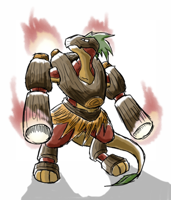
Haha, great to see all this feedback on my designs. I realized that a lot of the sentiment amongst you guys was that the Woodman design, as you guys have named it, looks more like a physical wall than anything else and wanted flamethrowers on the arms.

Here is my offering.


Any thoughts?


This is EPIC WIN, it looks absolutly amazing.
 
Ghost/Fire, Ghost/Grass, hell, you could really push it and do a few more Ghost/Grass/Fire combos.

But not Grass/Fire =\
 
Meh, People tend to take a Pokemon's appearance way to seriously when it comes to placing a typing on it. Some Pokemon appearance don't 100% match their typing or vice versa but really, it's all a matter of how you look at things and what features you believe definite a Pokemon of one typing to the next.
 
Not to be a total royal fuckwit, but can i have some examples? Most stuff directly relates with the image, and if not, it's explained by the dex entry.
 
Not to be a total royal fuckwit, but can i have some examples? Most stuff directly relates with the image, and if not, it's explained by the dex entry.
Well, Garchomp looks more like a shark (water) than a dragon.
Voltorb and Electrode... are colored balls.
Lucario is steel, yet looks to have nearly no metal on him.
Drifblim... is a blimp, doesn't seem very ghostly.
Quagsire doesn't seem very "ground".
Jynx looks more like a whore than ice.
Gengar = poison somehow?
Slowbro being psychic.
Exeggutor being psychic.
Lunatone and Solrock being psychic.
Metagross being Psychic.
Bronzong being Psychic.

And if you really wanted to, you could use the Pokedex to explain anything so that doesn't mean much.
 
Gengar is poison because of Gastly and Haunter (made of gasses). Most of the ones with psychic you can't really dispute because they basically gained supernatural powers.

Possibly a better comparison is with Pokemon such as Charizard. Why is it not a dragon type? It is a winged reptile with flame breath, after all. The reason is that a dragon is just what it looks like. It isn't as important for Charizard as its Flying or Fire types. Mind you, I'd help with his Stealth Rock problem...

But I do agree that typing is not entirely down to appearance. After all, JOL just looks ghostly. It is an exterior appearance. Conversly, it is a plant imbued with fire. The thing is, many animals have disguises. Some bugs look like leaves. Does that mean that they have anything further in common with them? Would a Pokemon version be any better with grass moves than normal ones?

The JOL's spooky appearance could be down to evolution as it may deter predators, perhaps.
 
Status
Not open for further replies.

Users Who Are Viewing This Thread (Users: 1, Guests: 0)

Top