
-
Follow our Instagram!
-
The moderators of this forum can be found in the CAP forum staff directory.
-
Welcome to Smogon! Take a moment to read the Introduction to Smogon for a run-down on everything Smogon, and make sure you take some time to read the global rules.
You are using an out of date browser. It may not display this or other websites correctly.
You should upgrade or use an alternative browser.
You should upgrade or use an alternative browser.
CAP 5 CAP 5 - Art Submissions
- Thread starter tennisace
- Start date
- Status
- Not open for further replies.


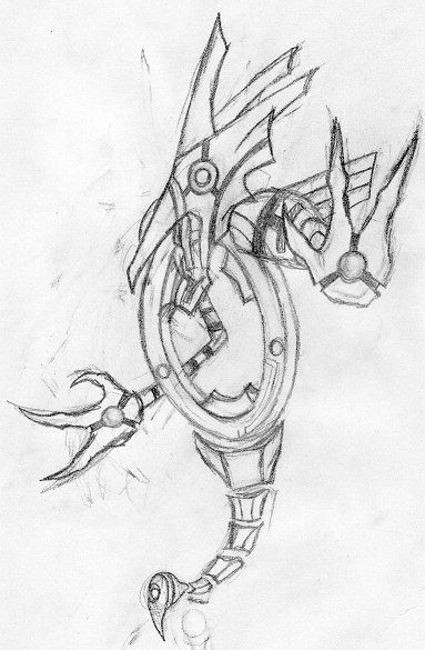
colored version coming soon
Looks like a rock/flying type. The fakemon has to look like a pure rock type. :o

Yeah, it doesn't have to fly, but your one is flying...

Personally Caladbolg, I liked when you had the pale scheme. I felt it added more to the actual character about it than just going with that coloring because it's rock. I like the mysterious like aura with the pale set. It's a great guy too. Also regids, he's got the most "pokemon" looking one here even if it does look like an eeveelution / Luxray combo
It is actually perched on the edge of a cliff but it didnt come out in the scan but i will make it visible in the final picYeah, it doesn't have to fly, but your one is flying...

Personally Caladbolg, I liked when you had the pale scheme. I felt it added more to the actual character about it than just going with that coloring because it's rock. I like the mysterious like aura with the pale set. It's a great guy too.
I know. It's difficult choose one... Maybe, the pale one can be the shiny form.
Please... vote.
XD
Which one?


I really think you should keep brown as the gray main color from the top one, but make the lines/designs on it brown, like on the second one.
And I also think that the first sphinx would be a candidate for your final submission.
Because the drawing is too badass to ignore, along with Caladbolg's sphinx and easter Island dude and yourdeadgrandad's evolutionary line pokes.
And I also think that the first sphinx would be a candidate for your final submission.
Does anyone not think that could be Regicrystal? Or RegiGrass?

Because the drawing is too badass to ignore, along with Caladbolg's sphinx and easter Island dude and yourdeadgrandad's evolutionary line pokes.


This one is really good, hope it gets some more attention
this is awesomeWell thought I'd have a go at this.
Was trying to get at the frail, speedy, special attacker everyone seems to want.
I think it can win
I really like Kopie's, but it would look much better colored.

I really like Kopie's, but it would look much better colored.
Lofty's Pwning Meteor showering Comet and Regi DS' Rock type Eeveelution are my favorites. :)
And Hey! Regi DS' Eeveelution can have Sand steam and Weather ball
for Brokenness! (+Sp. Def boost) :naughty:

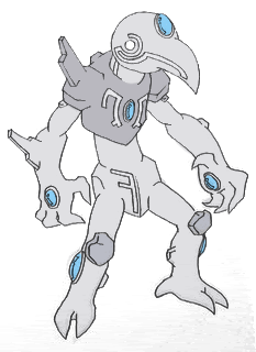
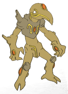
This is a really cool design, though it may be too foreign from the pokemon designs. Then again, as mentioned in previous CAPs, a lot of the recent pokemon designs are pretty fucking strange (Claydol? Solrock? A washing machine? Holy shit.) I guess being too human isn't a problem, since Gamefreak already has pokes like Mewtwo, Gardevoir, Lucario, Regirock (sort of), etc.(pale and brown things)
IMO brown fits the rock typing better
I wonder how it will look with pupils.
This is a really cool design, though it may be too foreign from the pokemon designs. Then again, as mentioned in previous CAPs, a lot of the recent pokemon designs are pretty fucking strange (Claydol? Solrock? A washing machine? Holy shit.) I guess being too human isn't a problem, since Gamefreak already has pokes like Mewtwo, Gardevoir, Lucario, Regirock (sort of), etc.
IMO brown fits the rock typing better
I wonder how it will look with pupils.
Hey thanks. Thats what I think.
Please, I need to choose one of my arts to submit. And I need your vote, of course. Which one?
-Easter Island Based Pokemon [Any color-scheme]
-Gargoyle Pokemon
-Sphinx Pokemon [First Design]
-Stalagmite Pokemon.
Hey thanks. Thats what I think.
Please, I need to choose one of my arts to submit. And I need your vote, of course. Which one?
-Easter Island Based Pokemon [Any color-scheme]
-Gargoyle Pokemon
-Sphinx Pokemon [First Design]
-Stalagmite Pokemon.
The Sphinx-Bird thing. It pwns if you color it. :)
If you pick it, it goes up with Regi DS' and Lofty's Designs. :P

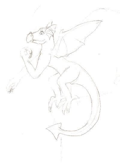
i would have posted this alot sooner, but the registration email didnt come through for awhile
here is the very rough outline for my creation:

give me ideas how to improve it pleaz

here is the very rough outline for my creation:
give me ideas how to improve it pleaz
i would have posted this alot sooner, but the registration email didnt come through for awhile
here is the very rough outline for my creation:
give me ideas how to improve it pleaz
It looks like a Floating golem that can make a huge dent in Blissey's Sp defense.
Make it more clear? I can barely see it.
- Status
- Not open for further replies.