CAP 5 Pre-Evo - Part 2 - Art Submissions

Status
Not open for further replies.
Aquakip!!
I welcome you to the forum :) And I hope you stick around for some time because I always enjoyed your presence (and you art is amazing).

Here is my design:
snakeysnakeysnakey
I thought it would be cool if I made the head look like and apple and the body like a branch. In that way they could let their head hang and pokemon will see it's apple-like head. When they want to take the apple, it can attack.
The design of the head looked way cooler in my head though... :p
Noobies, that body is PERFECT, but im not really liking the head. rather than an apple just have a regular head, I would like to see it with perhaps a seed head, or a splice of kadews or aquakips head onto it. too bad you cant actually do that

also, loving aquakip's, kadews and hollymon's design. so, good luck to everyone

I dont think there is a rule against this, since im not making this my submission, trying to keep it low key, and calling it fan art, I made a draw of hollymon's snake because i love it, looks like something i would design

http://imageshack.us/a/img33/1513/hollysnake.png
 

paintseagull

pink wingull
is a Top Artistis a Forum Moderator Alumnus

Here's a quick doodle I made a while ago, I think I'll do a polished version to submit. Currently planning to lengthen the body and make the seed-rattlesnake tail tip more simple (bigger and fewer seeds).

Some comments:
Quanyails: I don't mind the green body of the original but it did seem too light. Your newer one, as well as the bottom right in the extra colour scheme picture are my favourites. His attitude comes off as more serious than Malaconda's, which strikes me as odd for a prevo. I think some bigger innocent eyes would be more appropriate but... you know my biases :)

Aquakip: I really enjoy this, my only critique is that I don't really like the lighter tail-tip. The colour and the line that seems to imply some sort of faceting different from the body are distracting to me and take away from the rest of the design.

Kadew: It's great, love the flower :) I think his eyes could use some markings and maybe the highlighting on the head is a bit over-done.

Knickles: Similar to mine, so of course I like the simple stripe pattern! I think it would help if you could define his face shape because it is a very important part of Mala's design.

elcheeso: The colour scheme and design have a bit too much going on. If you are gonna add legs then I think you need to keep the rest of the design closer to Malaconda, otherwise they become too different. Varying elements might also be unified by having the same head shape.

Hollymon: I like the idea and colour scheme but I think you need to re-think the eye placement cause right now it looks wrong. Too low and too wide. A more dynamic (not 100% side view, not 100% front view) pose would be much better.

Mos: I want this to be my favourite but I think it needs some adjustments. Having the body coming out of the same side of the apple makes it look lopsided and makes the design unconvincing. His body should go straight through the apple. The detail where he is emerging from the apple looks weird, as if it's rocky. I think that sort of detail could be scrapped in favour of more of an apple shape or more detail on the apple itself. I think having the head coming out of the top of the apple and the body coming out of the back side of the apple, such that the body is facing straight on at all points, would work. Lengthening the body could also help with criticisms that it's too baby-like for a 2-stage evolution, but personally I don't really mind too much about that.

noobiess: I think this idea could work, but right now I think the head is too small and not properly apple shaped enough to evoke an apple strongly without knowing it's supposed to evolve into Malaconda. The head should flow better into the body. The colour of the head is also way too bright.
 
Quanyalis's design is my fave so far, though Aquakip and Kadew are not too far behind.

@Quanyalis: I have no clue why, but I like the original coloration the best. I think the best reasoning would be Mos-Quitoxe's reasoning for why he made his design bright green as well. Just saying. Also, I have another reason it could be biting its tail: so it keeps its body off the ground (seriously, it looks like if it let go of the tail the entire body would be dragging; I sorta like it though).
 

Blue Frog

It's lucidity. So clear!
is a Top Artist Alumnus
completely redid my design (well, not really): changed the color palette, the expressions, and the markings on its body. This is really sketchy and stuff; I will edit it with the feedback I—hopefully— get.

 
Quick sketchup entry! I'm still building my brush tools to make it look sick in Photoshop, I need another day.
Image

Since the official sprite for malaconda had two rows of spikes, I decided to use that as the excuse for the basic form to have legs. I had some biology ideas when I was making this, but I also wanted to keep in mind the Lucifel motif, so I drafted this with the following in mind:
After birth, it wears a part of it's eggshell for protection. It's surprisingly powerful leg muscles don't grow with the rest of its body, and will become useless and unable to carry its weight after it sheds enough. Some people believe that this Pokémon was born cursed.
Also, I wound up following some of the logic that other artists came up with when it comes to the tail. I'll have to think up a way to make it special now XP
 
Alright so I think something like this will be my final design, still screwing around with colours and such. Should be easy enough to tell, but the idea is that it hides its face and uses the happy apple pod to fool hapless pokemon into approaching, then it strikes. Basically like Malaconda, but slightly different so it can fit with prankster as well as infiltrator. I should note that the apple face is heavily inspired by Arbok, except happy.

 
god damn you people.

stop being such talented and creative artists.

you make it hard for the commonfolk to vote.

;n;

rock on, cap artists. you will never cease to amaze me. all of you. even if you don't win, or aren't the best at drawing. the clear effort put into these is really evident. a lot of 'em are super cute, and i definitely see a lot of fantastic contenders in this thread.
 
2nd batch of critique :)

Kadew: Dawwww I absolutely love it! You have a great idea going, and it manages to bare resemblance to Malaconda without being a carbon-copy. Your design is certainly a frontrunner, and it's easy to see why.. I love your adorably evil critter! (no I have nothing negative to say about it)

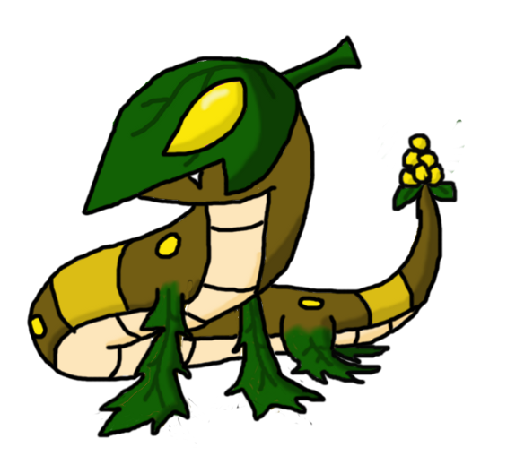
The Steam Punk: Ooh, interesting concept! I like the idea of having a leaf as its head, but I'm not really sure how it ties in with Malaconda :/ Your feet, whilst being mildly reptilian, look a bit odd in conjunction with your prevo's body, although I'm sure it can be worked on! I find the tail to be a little uninspired.. try thinking of something else to go on the tail to represent Malaconda a little more.

Knickles: As the others have said, the face is a little too flat. Furthermore, your prevo is a little uncreative in the sense that it bares so many similarities to Malaconda that it ends up looking too much like it. You need to find the right balance between looking too much like Malaconda and looking nothing like it. Of course, a lot of prevos do look like a smaller version of their evolution, but with all the competition going around in this thread, you need to seperate yourself out from the pack. However, I like the idea of berries on the tail, although it could be implemented a little better, and the one green stripe near the tail is a nice touch.

Hollymon: I like it! You have a nice element of cuteness whilst keeping true to Miniconda's dark typing. The leaf head doesn't relate to Malaconda, but you've given it enough resemblances that it ends up working. I love the idea of a giant apple seed, although it looks a little odd in your prevo's pose. I suggest reposing the whole thing and perhaps elongating its body? It seems a little short at the moment.

noobiess: Interesting...I'm a huge fan of the concept! Unlike others, I like how the head looks, although I know that's going against general consensus. The only thing I suggest improving is the positioning of the leaves adjacent to its head. I suggest moving them down its body a little bit, as in the current position it looks slightly weird more than anything else. Otherwise, good job! Also I like how your prevo gives leeway for this emoticon -> o3o

Blue Frog: Cute! Sadly, I'm not a fan of your design. The neck is so rigid that, when the face is added, looks more like a Llama or Camel than a snake. The colour scheme is an odd choice, mainly because your prevo has nothing in common with Malaconda. I feel like its dark typing is missing. This next point may be biased, as I am not a fan of feet on Malaconda's prevo, but I suggest removing the feet to get a better "flow" per se to your design.

Sgt.Moose: Very reminiscent of Mos-Quitoxe's :) I like the idea of it, especially that punk leaf blade as a haircut which represents the dark typing in an eccentric yet great wa, but I feel like this prevo is just stuck in an apple more than anything else. Show some neck coming out of the apple too, and not just the head. Furthermore, I am slightly puzzled as to why their is a stray dot on your prevo's tail...

paintseagull: Once again, it's cute, simple, brilliant work from you. You've managed to have a nice blend of cute and cheeky, and you've kept to Malaconda's design well. I won't comment on the tail because you said that you were changing it already, but you're certainly a frontrunner!

elcheeso: I like it a lot! The leaves on the head look odd however, as snakes don't have no outer ears. Other than that, good job!
 

Blue Frog

It's lucidity. So clear!
is a Top Artist Alumnus
I'm aware its probably not wise to keep changing my design, but I agree with Eagle4's comments and I've decided to yet again redesign by submission.


I really wanted to incorporate legs in my design, but I realized that it was too forced and thus decided to model this directly from Malaconda.
 
Here's an update. I went for a dynamic pose like suggested and also redid the eye to make it look better. I also think that this version is much more menacing and sneering and can fit with both abilities, prankster or infiltrator. Any comments are appreciated
Image
PS yes I know the belly is messed up but don't tell anyone, it's our little secret ;)
 
OK, I've made some changes and colored everything!

I changed its lizard-like legs into leaf appendages, and replaced the rather bare tail leaves with golden berries! Berries look more immature than apples in my opinion. I imagine this guy crawling around in the shadows swiftly following its target, which fits the Prankster and Infiltrator abilities.
Any changes to the color scheme needed? I tried to mimic Malaconda's colors to reflect the relationship.
 
Wow shanimanim, that looks a bit disturbing ... but I like it :)
I think it should look a bit more pokemon-like I think though.

I'm also fond of paintseagull's design. I really adore the face but I don't think the leaf on it's head matches too well.

For my design, I decided to change the shape of the head. I don't know if I should use the apple-head or a 'normal' head


Bughouse

Like ships in the night, you're passing me by
is a Site Content Manageris a Forum Moderator Alumnusis a CAP Contributor Alumnusis a Tiering Contributor Alumnusis a Contributor Alumnus
noobiess, I think this second head shape is much better. The pose is good, the shading is good, the head is better. But the colors need serious work. They just don't work for me at all. Also, I'd think about editing the uppermost leaf pair. The placing almost makes them seem like wings to me, kind of like Tropius'.
 
Shanimanim: That is incredible. The only problem I see is that its way too detailed for pokemon art. Cut back on some of the shading and define/eliminate some lines so that it'll be easier to interpret as a sprite. I'm mostly referring to the ridge on its head and the tiny spikes. Neither of those will translate into a sprite well, so refine those areas: define what you like, and throw out what you don't.
Other than that, I think the design looks like something that would have higher special attack than attack, but who cares? It's a very nice design.

noobiess: I like the new head shape, but the apple head looks too weird. Maybe it could work if the head color was darker, or if the body was lighter, but I think you should stick with the normal head color.
 

Brambane

protect the wetlands
is a Contributor Alumnus
having keyboard difficulties, can't type much. came on to say all the artwork in this thread is fantastic. due to the circumstances surrounding the final stage of the art poll, i can only view my design with disgust, shame and regret, but seeing so many excellent artists designing prevos for malaconda, in many ways i would have never thought of, is really incredible, so thank you
 

Quanyails

On sabbatical!
is a Top Artist Alumnusis a Community Leader Alumnusis a Community Contributor Alumnus
  • elcheeso: What an interesting detail you've made with the head leaves folding around to veil the snake's eyes. I love the sly expression on your pre-evo's face. :) You've reduced Malaconda's details well without transforming the design too radically or keeping it too close. It has an oddly adorable body shape. I'm personally not fond of the face on the fruit, though. There are pokemon that have face-like designs, but those use pareidolia more. More of those curves with fainter markings, perhaps, can make the berry look less contrived.
  • Hollymon: I like your idea! It's deceptive and fitting of a pre-evo in design. I wish that your lines were slightly sharper, though, since technical qualities are important in voter appeal. Make sure that your contours match up well. :)
  • senshidenshi: Ah, give art as a whole a little more practice until you submit a final design. Art isn't something that necessarily works on the first try. Your design has odd anatomy, but that can be remedied with sharper shapes or altered proportions. Once that has been sharpened, I'll give a more focused comment on the design itself.
  • noobiess: I agree that the snake has a great shape, and you have a nice color palette to go with it. I kinda liked cat-faced applehead. :P If you choose the first color palette, you kinda just make the pre-evolution a more standard-looking snake rather than the head be something indicative. I like the spots from the first design's head, though, if you could incorporate those.
  • Blue Frog: The first design was cute--reminded me of an inchworm with that long neck. :) The latest design, I'm not quite fond of, though that may because of the looser lines and flatter-looking appearance. Your last post's design is a tad contrived in my preference, as the green parts don't look too well integrated into the design. I think that if you add some perspective and/or blending between the green parts and body, they'll look more naturally added rather than something drawn on top of a figure.
  • Sgt.Moose: Ah, snakeapples! It would certainly work as a Malaconda pre-evolution, though I must wonder how it moves around. I suppose it can roll. The design works, though it's ordinary in my eyes. :/
  • paintseagull: I've told you my thoughts on the design on #cap. <3 It's adorable yet evil--just look at those cheeks and fangs! I'll be awaiting your refined version eagerly!
  • Yveltal: Ooh, I like the lineart on a technical level, first. :D How elegant your design is! The design as a whole works nicely both on its own and as a Malaconda pre-evolution. It's got a nice slickness to it that works just about perfectly with Malaconda. I do wonder if you could make the legs stiffer like jointed needles and make the ear-leaves more like leaves than ears?
  • The Steam Punk: I'm still not too fond if it; the leaf-hood just doesn't work with me. If I ignore that, the rest of the design is adequate and is suitable for a Malaconda pre-evolution. :) The floppy limbs well represent crawling on those legs before losing them, though, and that's a positive!
  • Shanimanim: Fascinating. o3o Oh, if this wasn't Pokemon, this would be a great picture to describe how Malacondas grow from apples(?). It's fascinatingly different as a pre-evolution, though I'd suggest a small change of style as to not put the design into uncanny valley. I like those underdeveloped features stemming from the apple; a fetus is quite comparable to the first stage of a multi-stage pokemon species.


Unfortunately I don't have a clue on how to redo the apple bulbs face without making it horribly creepy (which would go against the point of it having a face-like design in the first place), so for now this will probably be my finalised design.
 

Blue Frog

It's lucidity. So clear!
is a Top Artist Alumnus
Update, based off of Quanyails' feedback. Changed the grass to leaves and drew it in a new pose and style.


I'm not too sure about the markings on its body. Here it is without any markings and here it is with lots and lots of markings similar to Malaconda. I'd like to keep it simple since its a pre-evo, but also would like to make it look like its evolved form. I personally like the one without markings, but I would like other people's input as well.
 
I like Sgt. Moose's... sort of embryonic in appearance. Shanimanim's is a little overly freaky for me. Kadew's is cool too but looks too similar to Ekans.
 

DetroitLolcat

Maize and Blue Badge Set 2014-2017
is a Forum Moderator Alumnusis a CAP Contributor Alumnus
All entrants who wish to be included in the Art Poll must label their work as a Final Submission. Thank you for your participation.

Edit: a mod has suggested that 32 hours is too abrupt. Henceforth, the warning is now 45 hours and the poll will close at 10 AM CST on Saturday, June 15, 2013.

If this deadline is still too abrupt in your opinion, PM me, post in this thread, find me on IRC, or VM me. I'll be more than happy to extend it further if some people will be unable to submit their best work because of time constraints.
 
Final Submission


Just updated the artwork and design. I gave it a more dynamic pose, tried to make the eyes more...mischievous, fixed the tail end and made it a bit more like it will turn into an apple, idk, and made the body longer like a snake (instead of a worm which apparently it looked like).

EDIT: Took out the shadow. I didn't know I couldn't have one xD
 
Wow shanimanim, that looks a bit disturbing ... but I like it :)
I think it should look a bit more pokemon-like I think though.

I'm also fond of paintseagull's design. I really adore the face but I don't think the leaf on it's head matches too well.

For my design, I decided to change the shape of the head. I don't know if I should use the apple-head or a 'normal' head

I'd go with the brown head; the pale green really crashes with the colour scheme. Also maybe have slightly smaller leafs at the top of the neck; the current ones look a bit big in comparison to everything else.
 
Final Submission

Loving aquakip's design! It looks so much more snaking in that different pose. But you have to remove the shadow as you can only submit with a complete white background and we really don't want your brilliant design getting disqualified!

An noobiess, the green one looks best to me as the brown one misses the whole point of what you were going for and looks a bit odd. Also lots have already said this but lower or raise those two leaves behind its head as they look like wings! Unless that is what you were going for of course!

Anyway, I've edited the whole thing, thicker lines, more flowing body, redone the shadows and highlights and edited the leaf on the head so it looks more like my first design. Hope you like it! Also thanks paintseagull. I didn't realise it was over the 640 x 400 limit. Must of missed it on imageshack. I do like your design also paintseagull. I like the tail of seeds


Any comments appreciated but I don't think I'll be changing this much and I will be submitting this for final submission soon
 
Status
Not open for further replies.

Users Who Are Viewing This Thread (Users: 1, Guests: 0)

Top