CAP 8 CAP 8 - Part 9 - Art Poll 4

Which art should we use?


  • Total voters
    499
Status
Not open for further replies.
Oh wow, both are so good I don't even care who makes it.

Regardless, voted Cartoons.

It was assumed that the current was part of its design, and not a move effect. Charizard has a flame on its tail, and that is not a move effect. Or, for a better example, when charging attacks, Typhlosion and Blaziken have flames, but do not when at rest; the flames are still specific elements of their design.
You're totally right -- my mistake.
 

KoA

Sorry, I thought anteaters were real
is an Artist
dUN DUN DUN!

This is another CaP first. Whoever's design wins will be the first CaP artist to win twice with their design in CaP.

Both of you guys did a superb job and regardless of who gets my vote, I'm blown away by both of your designs equally. You two are among the finest artists on smogon and I consider you guys close friends of mine. Here's to hoping to see more work in many CaPs to come!
 
Wow. You guys weren't kidding when you said it'd be a close poll. At the time of this post, the poll has exactly 50 votes on each design.
I chose Cyzir, though I'm actually quite split.

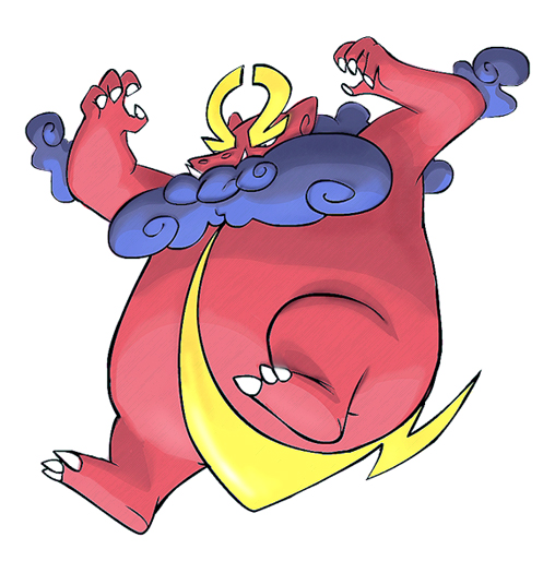
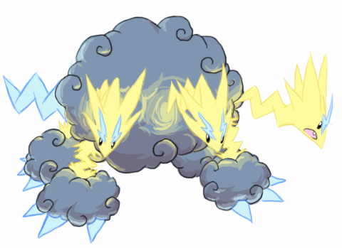
I think I'll support Cyzir here. Cyzir's design seems to fit the stat spread chosen a bit better. Cartoons' design seems like it's slightly more physical... And Cyzir's also definitely gives off that electric vibe more than Cartoons' does... And there's still the fact that Electric is the main typing, not Dragon. I guess I just think it should look either equally mixed, or more Electric-like than Dragon-like... And Cyzir's pulls that off nicely. If the tail wasn't thunderbolt shaped, Cartoons' probably wouldn't look much like an Electric type at all...
The two abilities chosen on it also fit a bit more on Cyzir's, I guess. I can see "Sheild Dust" coming out of the clouds, sheilding it's body. I guess Cartoon's can do the same thing, but the clouds are a lot more minor. They don't look lke they'd be able to generate anough dust to sheild the whole body... And really, Static, on a thundercloud? That's basically self-explanitory. And again, Cartoons' doesn't look like it would be having Static. Again, the main point the Static would probably come from, the clouds, seem too small.

Well, that's when I go more into it, at least.I could probably defend Cartoons' design just as much.
But, I guess, vote for Cyzir, guys! =P

Either way, congrats to both artists. You both have great designs! ^_^
I probably won't mind too much to whoever wins.
 
I shall abstain from voting. These two designs are both so great, I willl be 100% satasfied no matter who wins. It's just a shame they can't both win.
 

KoA

Sorry, I thought anteaters were real
is an Artist
With the way the polls are shaping up, that may well be the case haha.

I don't think I've ever seen such a close final poll...
 
I feel that cartoons as i have said before fits the role of a defensive bulky type the best out of all the submissions i also <3 the colour scheme.

Cyzir this is a really cool and innovative design but i just dont feel it suits the role of the brief so well.

Voted Cartoons

Hard vote. Sorry Cyzir.
 
Went for Cartoons!, and I gotta admit, this poll is close as hell, counting after my vote, the results are 138 for cartoons! 137 for Cyzir.

This time it was really hard to choose, but I feel Cartoons! design fits better for the stat bias, as it look bulky, yet powerful enough to pack a big punch, too bad they cant both win, still good luck to the 2 of you.

By the way, what will happen if the poll turns out to be a perfect draw?
 
If the vote turns out to be a draw then the one with the most votes from the last poll will win. In this case it would be Cartoons! submission. This already happened with the last Kitsunoh sprite poll.

Voted Cartoons! again. Don't think I need to say much. ;p
 
How does a picture "fit" a role anyway? Does a picture truly needs to fit it's role/stat spread? Is there even any benefits to doing such a thing?

I don't really know the answers to those question myself but quite frankly I'm curious to know myself. To me, I never quite understand the important of fitting a certain role or stat spread when choosing artwork. When entering a CAP art poll and deciding on who to vote on, I don't really think about how much a piece of artwork fits a certain stat spread and/or role because it shouldn't matter all too much. Things like how much creativity involved within the making of the picture and overall quality of said picture seem a bit more important than if it fit a certain thing, but then I'm only one person. Now I'm not saying that voting on artwork within CAP with that kind of criteria is flawed or anything as I'm merely speaking my mind on the situation. Now I do wondering if they're should be some kind of rule or guideline about this kind of thing to better enable newer CAP artist to success.
 
I feel that cartoons as i have said before fits the role of a defensive bulky type the best out of all the submissions i also <3 the colour scheme.

Cyzir this is a really cool and innovative design but i just dont feel it suits the role of the brief so well.

Voted Cartoons

Hard vote. Sorry Cyzir.
Oy vey, not again... sorry, but defining a "role" shouldn't be your basis on your vote in an art thread. Now if you like Cartoons's (is that even correct grammar?) design simply because you do, that's fine. But don't vote simply because "it's supposed to be defensive".

In actuality, and it's my opinion, Cyzir's does seem to fit the "bulky role" as well (look how fat its main body is).

Regardless, both of these submissions are here for a reason... they are both excellent creations and Cartoons and Cyzir should be proud of their work! I voted Cyzir and the poll is STILL a tie (142-142 after I voted). No offense to Cartoons, though... I'd be happy with his design too. But the three headed thunder dragon... I don't know, something about that made me vote for it...
 
Oy vey, not again... sorry, but defining a "role" shouldn't be your basis on your vote in an art thread. Now if you like Cartoons's (is that even correct grammar?) design simply because you do, that's fine. But don't vote simply because "it's supposed to be defensive".
Surely "role" should be taken into account when voting and other than saying subjectively i preferred this with a simple comment. I decided to provide a degree of reasoning as to why I voted on Cartoons. This is not the sole reason i voted for this but it should definitely be strongly considered when voting, im not gonna vote for a spindly thing as normally a pokemon's sprite strongly reflects their stats. I cant really think of one that doesn't.
 
Since this is so ridiculously close (at the time of posting this, they're tied at 145), what about maybe doing a Gastrodon thing and making both of them into the same CAP?
 
If the poll is tied at the end, then the winner would be Cartoons! cause he had more votes in the last poll.

Tiebreakers

In the case of a tie vote, the following tiebreakers will be used to determine a winner:

1) The number of votes received in the single most recent previous poll
2) The sum total of all votes accumulated in all previous polls
3) Topic leader choice
 

DougJustDoug

Knows the great enthusiasms
is a Site Content Manageris a Top Artistis a Programmeris a Forum Moderatoris a Top CAP Contributoris a Battle Simulator Admin Alumnusis a Smogon Discord Contributor Alumnusis a Top Tiering Contributor Alumnusis an Administrator Alumnus
Moderator
Stop this line of discussion. We're not implementing two different designs. There's one design winner, just like every other poll in CAP. If we made a CAP for every awesome design, we would have 30+ pokemon for CAP 8 alone -- because ALL the designs were awesome.
 

Korski

Distilled, 80 proof
is a CAP Contributoris a Forum Moderator Alumnus
Originally Posted by Fat Gothic Togekiss
How does a picture "fit" a role anyway? Does a picture truly needs to fit it's role/stat spread? Is there even any benefits to doing such a thing?

I don't really know the answers to those question myself but quite frankly I'm curious to know myself. To me, I never quite understand the important of fitting a certain role or stat spread when choosing artwork. When entering a CAP art poll and deciding on who to vote on, I don't really think about how much a piece of artwork fits a certain stat spread and/or role because it shouldn't matter all too much. Things like how much creativity involved within the making of the picture and overall quality of said picture seem a bit more important than if it fit a certain thing, but then I'm only one person. Now I'm not saying that voting on artwork within CAP with that kind of criteria is flawed or anything as I'm merely speaking my mind on the situation. Now I do wondering if they're should be some kind of rule or guideline about this kind of thing to better enable newer CAP artist to success.
There is a benefit: cohesiveness. Some people want it, others don't. I should know; I got into a heated battle over this in the second art poll. You were there. Some people, like myself, use that criteria when choosing artwork to represent the pokemon because I am of the opinion that the vast majority of pokemon look like their stats/abilities/moves are viable. I would say that a creative design that looks good and fits the spread is better than one that just looks good.

For example, if the artist took the time to incorporate the stats and abilities into the look of the design while still making it look professional, I would consider that well-thought out, fantastic art. I can see the other opinion, though, that it would limit the possible scope of the submissions. While I would have loved it if everybody submitted a 108/60/118/112/70/80/Shield Dust/Static-looking design so that the final art polls would be pure "I like the look of this one better" voting, I can totally see the other side to that argument and I respect that position.

Everyone's decision on the art poll is flavor. Everyone's reasoning behind their decision is their own. People who vote based on fitting a role/spread shouldn't ridicule people who don't and vice versa.

And I don't think there should be a rule limiting how people decide what they like in terms of artwork. That seems intrusive.

Originally Posted by Fat bpblu
Oy vey, not again... sorry, but defining a "role" shouldn't be your basis on your vote in an art thread. Now if you like Cartoons's (is that even correct grammar?) design simply because you do, that's fine. But don't vote simply because "it's supposed to be defensive".
Sorry, but there's no reason to criticize anyone's decision-making process just because they disagree with you.
 
And I don't think there should be a rule limiting how people decide what they like in terms of artwork. That seems intrusive.
You misunderstood my last statement. It wasn't a plan on how to limit a people's opinions or view, but more of a way to increase a new CAP artist's chances of winning an art poll. One way one could success is by studying your consumers/voters for a bit to see what make them tick. Once you figure out what the majority of voters go for when voting you could talior your submission to meet those demands but then again I believe artist are already doing that sort of thing.
 
Sometimes though tailoring your art to public demand makes it lose the original intent and feel of the piece. The artists know what they're doing and as for what fits the stats that's purely up to interpretation both by the viewer and artist. Sometimes we just want to break the mold and can you blame us for that? The most honest vote is one that goes for what they like rather then making up rules to place it into.

It might help if we had the time to do art last.
 
I want Cyvir's design to win. I like his design much more than Cartoons!. It's more creative and it just looks good, not saying that Cartoons! design isn't.

This is dam close.
 

little gk

competitive oosos player
is a Forum Moderator Alumnusis a Contributor Alumnusis a Battle Simulator Moderator Alumnus
Like doug said all the designs were awesome and now i can't stop from rooting for cartoons so cyzir can win his $50. Both designes are great and I'm excited to see who wins!
 
Both are great designs, but I had to go with Cyzir just because it looks more like it could have those abilities, and it looks way more like an Electric/Dragon. Cartoons!' looks more like a pure-dragon.
 

jrrrrrrr

wubwubwub
is a Forum Moderator Alumnusis a Tiering Contributor Alumnusis a Top Contributor Alumnusis a Battle Simulator Moderator Alumnus
Cartoons! drawing is way out of proportion, its too fat and it looks nothing like a dragon.

Cyzir's is more appropriate...it gives off a defensive feeling and it looks the part as well.
 
Status
Not open for further replies.

Users Who Are Viewing This Thread (Users: 1, Guests: 0)

Top