Kevin's Studio

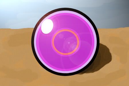
lifeorb.jpg


A Life Orb that was going to be in the Smog, but the article was never finished.
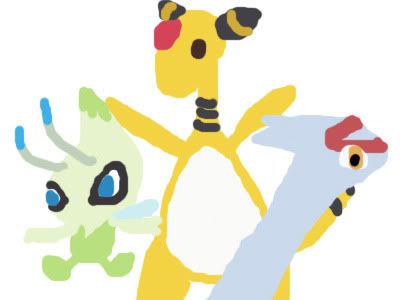
power-rankings.jpg


Here is a quicky I did for the Power Rankings article. Celebi is panamaxis, Ampharos is Earthworm, and Latias is Dark Lucario.
 
I never knew you drew! I really like the Darkrai/Blissey picture.

Also, I've been meaning to ask this since I first noticed the image in your signature: where did you get it?
 
New art for The Smog. Inspired by Jimbo. I don't want to say how long it took me because I don't even know the answer to that. I started it months ago and recently found it unfinished. Many hours with a mouse.

Wailord-1.png
 
Sporadic updates, but noticeable improvement. Good stuff, man. Nice detail on the crashing crystal waves in the Wailord pic.
 
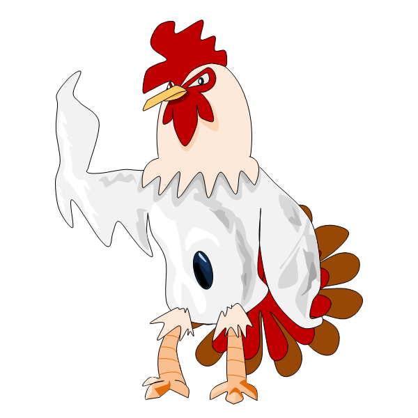
I'm drawing a new way now with the tools in Microsoft Office Word. I use the Curve and other preset tools and edit the points to make what I want. I get much cleaner lines than drawing with a mouse. I have tinkered with it in the past, but didn't realize its potential until I started making my CAP entry in it.

CAP1.png


This Pokemon is based on a rooster as I thought that would be an interesting choice of species for CAP 1 seeing as though they are used in cockfights. The original design started as a darker rooster with a muscular body, but when the stats were decided to be defensive and specially based, I decided to have thatreflect in the design more. It's body takes the shape of a hurricane. Hurricanes are most powerful around the walls of the eye, which indicates a sturdy body, and the outer bands of the storm, which allow it to fire off powerful special attacks.

I figured I would make this a quality bump so I decided to draw something fairly simple, but would still be complex enough to take some time.

Vanillite.png
 
Man, I prefer the smoother lines. The ice-cream Poke is pretty cute. Fancy drawing me an Articuno sometime? Would be a good challenge! =p
 
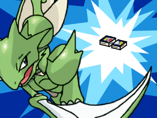
Dang you can do that much with Word's drawing tools? It looks great. I really like your old style as well, I like the scraggly look they have. Favorite of the stuff you've posted is the Scyther pic, you really have awesome poses going for your 'mons!
 
To be perfectly honest, I don't think your CAP submission measures up to the quality of your previous works. I've been working with the office drawing tools for yeeeaaaars, but you actually have genuine artistic talent, and your older style is quite good.
That said, the Ice Cream Cone looks extremely good (that was done with word too right?). Idk.. The rooster just looks somehow unproffessional to me.

On a side note, I've found PowerPoint to be better for this kind of drawing than Word. Idk about the latest version, but I've found that sometimes Word has a way of dicking around what you're trying to do. It's mostly identical; same autoshapes and options and stuff, but Word i've found does silly things sometimes.

edit: I don't know exactly how you go about your drawing in Office or otherwise, but another thing that may be worth trying: Draw a picture the way you normally would, then insert the picture into PowerPoint (or Word, whatever) then use the drawing tools to trace over the original artwork, while also touching it up, adding smoother lines etc. Unless you're already doing this of course, then continue...
 
Man, I prefer the smoother lines. The ice-cream Poke is pretty cute. Fancy drawing me an Articuno sometime? Would be a good challenge! =p
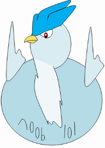
artilol-1.png


Couldn't resist. I will make you a real one some time soon. lol

To be perfectly honest, I don't think your CAP submission measures up to the quality of your previous works. I've been working with the office drawing tools for yeeeaaaars, but you actually have genuine artistic talent, and your older style is quite good.
That said, the Ice Cream Cone looks extremely good (that was done with word too right?). Idk.. The rooster just looks somehow unproffessional to me.

On a side note, I've found PowerPoint to be better for this kind of drawing than Word. Idk about the latest version, but I've found that sometimes Word has a way of dicking around what you're trying to do. It's mostly identical; same autoshapes and options and stuff, but Word i've found does silly things sometimes.

edit: I don't know exactly how you go about your drawing in Office or otherwise, but another thing that may be worth trying: Draw a picture the way you normally would, then insert the picture into PowerPoint (or Word, whatever) then use the drawing tools to trace over the original artwork, while also touching it up, adding smoother lines etc. Unless you're already doing this of course, then continue...

Yeah, the rooster didn't turn out the way I wanted. I wasn't going to scrap it so I just made something plausible to at least make a final submission. I haven't done a lot of design work, but I know I can do better than that. I was helping a friend make a Pokemon game back in the day. Maybe I will draw some of those Fakemons I designed.

The tools in PowerPoint and Word are close. The only difference I can really think of is that you can "animate" in PowerPoint with slide show. I have done some work in PowerPoint in the past. I made a James Bond gun barrel sequence for school a few years ago. The working space in Word is a little bit bigger, but that could just be my imagination.

I would have scanned/taken a picture of all the rooster sketches I made on paper, but I don't currently have a scanner set up so I had to go a different route. What you suggested is the ideal way for me to do it, though. Thanks for the feedback.
 
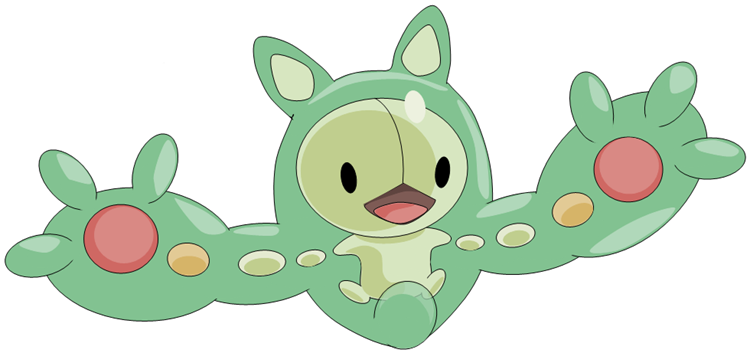
Quality double post here. I updated the OP of the thread to have links to all of the art I've posted here. I also made a Reuniclus submission to the Smogon front page contest.

Reuniclus.png
 
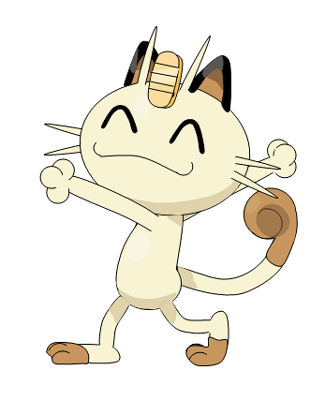
Thanks. I should be able to do a Meowth when I'm done with the rest of the contest entries and twash's Articuno, which is somewhat completed. Speaking of the contest, I just finished my blue one.

Jellicent.png
 
Back
Top