Let's talk about Pokémon designs

Now I really like Litleo, but I have to agree when examining it further the design looks a little odd. For one thing the art is in a weird position, and then in-game it's not very active and just stands there. I have to agree with Gabe and say that the design would be better with a little more fluffy (A la transition Lion King Hakuna Matata scene).

A bit of fluff like that could help distract from Litleo's large ears and googly eyes.
 
Color scheme, for me, is an important aspect of the pokemon's design. I really appreciate a color scheme that not only looks good but makes sense based on the pokemon's concept. For example, shiny Greninja is amazing to not only b/c the black looks good, it makes a lot of sense considering that its design is based on a ninja. The shiny color scheme really elevates the design.

On the other end, there's shiny Swirlix. Why does something based on cotton candy have a brown shiny? How often do we see brown cotton candy, if at all? The color scheme makes no sense and detracts from the design a bit for me. It would have made more sense for it to be blue, since that is often an alternate color of cotton candy.
 

DHR-107

Robot from the Future
is a Member of Senior Staffis a Community Contributoris a Smogon Discord Contributoris a Pokemon Researcheris a Smogon Media Contributor
Orange Islands
So, yeah, discussion. I must admit I don't usually like listing bullet points, but they are easy to address and gets the conversation rolling, so here's a few suggested topics to discuss. Don't feel obliged to respond to all of them, they are just suggestions:
  • What makes a good/bad Pokémon design to you?
  • Are there any Pokémon designs you like or dislike for specific reasons? Can you point out exactly what the designers did right/wrong?
  • How do other aspects of the Pokémon work with or against the design? Can movepool, abilities, lore or the design basis affect the way you view a Pokémon design? That is, can it ruin an otherwise good design, or remedy a bad one?
  • For a long time, we've been used to see Pokémon in sprites only, but now 3D models have entered the main series games (console games nonwithstanding). Do you think some Pokémon made this transition better or worse than others? Were Pokémon troubled by bad sprites finally justified when seen in glorious 3D? Or did the 3D transition reveal that the Pokémon only looked good in specific poses from specific angles?
  • Have you ever immediately liked/disliked a Pokémon when you first saw it, only to change your mind after seeing the Pokémon in a different pose/setting, or learning a new aspect of its lore or design background?
I'm not hugely sure what makes a good or bad design for me. There are some Pokemon whose designs just "work" and others that just... Don't. I'm a big fan of simpler designs over some of the very complex designs they started coming out with. I love the designs where the the base design asks you the question of "Where did they get the idea for that?". From each end of the spectrum, Parasect and Avalugg jump out at me for being interesting designs which get a little darker when you read into them (especially so in Parasect's case).

Trying to put aside battling ability and focus solely on the designs of the Pokemon, I'm not sure there are any which I actively dislike. The designs of even "bad" Pokemon are usually pretty good (Furret, Dustox etc). The only two designs which I actively hate off the top of my head are Lumineon and Purrloin. Both of them just look wrong to me. I can't really explain why. Lumineon's huge fins seem like they would actively get in the way of swimming, and Purrloin should not be standing on its back legs. On the other hand, I really like a lot of designs. As mentioned, Avalugg is one of my favourites (probably my favourite Gen 6 mon), but other stand outs include Sandile, Lanturn and Tropius. All those designs just work in the environments they are portrayed to live in.

Point number 3 is a big problem for me haha... I always end up comparing the designs across with their movepools. As I said before, disregarding those aspects I like a lot of designs, including them? There are a bunch which actively fall from grace. There are a few which pop upwards for me too, like Exploud (he's good, but the addition of a move like Boomburst gives him more character). Once again, I'll bring up my favourite butt monkey here and say Ledian. It's design in essence isn't bad, but the rest of that Pokemon IS bad.

I think in general the move to 3D helped out a lot of Pokemon. After seeing the great sprite work from the guys when Gen 6 first started up, I think that many of those designs translate backwards pretty well too. Cofagrigus and Ferrothorn both won hugely imo, while as someone mentioned earlier some of the Gen 1 designs were not so lucky.

On the final point, I don't think there is any Pokemon I immediately disliked. I was a bit iffy on Swirlix and its evolution, but they can hold their own in a very odd way. I don't really like how the evolution of Spritzee went either, I would have been mad happy with a Plague Doctor inspired evolution as opposed to what can only be described as a can can dancer.
 
DHR-107 Isn't Aromatisse still a plague doctor, despite what people somehow see from the Fairy? It has the avian mask covered in perfume, so it just superficially resembles a can can dancer. Other people were expecting Spritzee to turn into a flamingo-like bird before X and Y were released, so they seemed to have been disappointed with the idea of it being what seems to be a kiwi bird.
 
  • For a long time, we've been used to see Pokémon in sprites only, but now 3D models have entered the main series games (console games nonwithstanding). Do you think some Pokémon made this transition better or worse than others? Were Pokémon troubled by bad sprites finally justified when seen in glorious 3D? Or did the 3D transition reveal that the Pokémon only looked good in specific poses from specific angles?
I agree with anyone saying that the 3D sprites helped make a lot of Pokémon look better, and their battle animations often add to their personality (e.g. Porygon2 moving like a drinking bird, Porygon-Z twitching like mad, Magikarp flailing around helplessly, Archeops being a clumsy flier).
However, there are two 3D models which I think "ruined" the Pokémon: Xatu and Hitmontop. The former is an upright standing totem, and its horizontally flying 3D model just looks wrong - the latter was always presented as spinning around on its head, and while the "upright pose" may fit better to a Fighting type, I think it takes away what made Hitmontop so unique.


I´d also recommend Bogleech´s Pokémon review (though I´d warn anyone that he is somewhat biased toward the "ugly, disgusting" Pokémon like Garbodor and against "furry fuel" like Lucario).
http://www.bogleech.com/pokemon/parchive.html
 
Last edited:

DHR-107

Robot from the Future
is a Member of Senior Staffis a Community Contributoris a Smogon Discord Contributoris a Pokemon Researcheris a Smogon Media Contributor
Orange Islands
DHR-107 Isn't Aromatisse still a plague doctor, despite what people somehow see from the Fairy? It has the avian mask covered in perfume, so it just superficially resembles a can can dancer. Other people were expecting Spritzee to turn into a flamingo-like bird before X and Y were released, so they seemed to have been disappointed with the idea of it being what seems to be a kiwi bird.
What? No. It's nothing like a Plague Doctor. To me, all I see is the dancing girl and nothing else, it's so in your face it hurts really badly. No Plague Doctor should be showing its leg off like its flirting with you.


This would have worked for me perfectly, there are a bunch of other similar designs out there too.
The reason is it s plague doctor though is because of the smells I think. If I remember right they tried a large variety of "cures" for the plague, such as using tobacco to ward it off.


Although I need to agree, when I first saw it I immediately thought dancer Pokemon because of that leg.
 
Pivoting away from Aromatisse a bit...I think Suicune has a great design IMO. It's pretty simple (compared to something like Reshiram) yet somehow it still conveys a sense of enigma, and you can tell immediately that this Pokemon is a water type and can learn wind-flavored moves. In addition, I love the 3D model for Suicune. One of its animations is a head toss / shimmy, which fits it perfectly because the movement is so graceful and flowing.

There are downsides to the design. Reddit points out that the head ornament of Suicune could easily get caught while it's running (which I can't un-see now, unfortunately) and why don't the mane and the tails blow the same way? Where is the wind blowing from?

I've always liked Suicune myself, but I never realized how cumbersome its head ornament would be. I guess it's a stylized ice crystal or something like that. All 3 legendary dogs are cool in my book, though.

I also never noticed the wind inconsistency until now. It remembers me of an infamous Italian coin showing Columbus' caravels (the flags go backward while the wind blows forward into the sails). It was later corrected.


Maybe Suicune is able to create winds around itself to always look fabulous, logic notwithstanding?
 
I agree with anyone saying that the 3D sprites helped make a lot of Pokémon look better, and their battle animations often add to their personality (e.g. Porygon2 moving like a drinking bird, Porygon-Z twitching like mad, Magikarp flailing around helplessly, Archeops being a clumsy flier).
However, there are two 3D models which I think "ruined" the Pokémon: Xatu and Hitmontop. The former is an upright standing totem, and its horizontally flying 3D model just looks wrong - the latter was always presented as spinning around on its head, and while the "upright pose" may fit better to a Fighting type, I think it takes away what made Hitmontop so unique.


I´d also recommend Bogleech´s Pokémon review (though I´d warn anyone that he is somewhat biased toward the "ugly, disgusting" Pokémon like Garbodor and against "furry fuel" like Lucario).
http://www.bogleech.com/pokemon/parchive.html
Man, if only there was an easy way to find the Pokemon Stadium 3D models. Some of those were leaps and bounds better than the 3D models from the XY era. Xatu and Hitmontop were both redeemed there as Xatu is actually standing and Hitmontop is upside down. Another one that looked way better in Stadium was Skarmory. A previous poster said 3D models couldn't make Skarmory's wings work. Well skip to around 7:00 to see Skarm fluttering:
I think a lot of the Pokemon Stadium/Colosseum 3D models were a lot more lively than the current models (a LOT of the new ones just stand or hang there) and it makes me wonder why they just didn't retool Stadium's existing models.
 

DHR-107

Robot from the Future
is a Member of Senior Staffis a Community Contributoris a Smogon Discord Contributoris a Pokemon Researcheris a Smogon Media Contributor
Orange Islands
I think a lot of the Pokemon Stadium/Colosseum 3D models were a lot more lively than the current models (a LOT of the new ones just stand or hang there) and it makes me wonder why they just didn't retool Stadium's existing models.
Probably because a lot of the models were really naff. I don't think Jynx's model ever got updated even all the way into PBR so I am glad to have a brand new Jynx model. I think the other reason is there are far more Pokemon now than there was then. Granted a bunch of vertexes/colours/skins probably don't take that much space, but we have 3x as many Pokemon now as we did in Stadium2. A lot of the Stadium Pokemon work in the exact same way anyway, have a standard "standing" motion, a rarer "special" motion and then two attack motions.
 
Man, if only there was an easy way to find the Pokemon Stadium 3D models. Some of those were leaps and bounds better than the 3D models from the XY era. Xatu and Hitmontop were both redeemed there as Xatu is actually standing and Hitmontop is upside down.
Well, Xatu (and several others) is the fault of the Sky Battle Mandate for flying pokemon, since it does have some rather nice standing Amie model.


(although I personally find the Xatu-missle battle model hilariously bad. Helmsman! Launch the Xatorpedos!)

And if it weren't for Hitmontop's standby animation, we wouldn't have this:

But jokes aside, the XY animations really are a gigantic leap from Stadium, even if some of that effort leaked into areas other than the battle and standby models. Yeah, some older pokemon that weren't designed for 3D didn't make the transition well (gassy pokemon like Musharna and Torkoal) and some shiny models are so washed out you can't tell the difference anymore, but out of 700+ I'd say at least 85% are looking their best ever.
 
Wow, after seeing the Pokemon stadium models for the first time, I can honestly say that I like all the ones I saw significantly better than the 3DS models despite the lower definition. Game freak easily could have done much better on the 6th gen 3D versions in my opinion. In particular the Pokemon stadium versions weren't as static and emotionless.
 
I personally wouldn't mind, for Gen VI and if Sky Battles are kept, two idle animations for each Pokemon that can be selected... at least, for those that look awkward when they are flying all the time (The likes of Skarmory and Eelektross).
 
There are downsides to the design. Reddit points out that the head ornament of Suicune could easily get caught while it's running (which I can't un-see now, unfortunately) and why don't the mane and the tails blow the same way? Where is the wind blowing from?

It does blow the same way, just doesn't look that way because Suicune's mane is attached to the back of the head and its crest prevents the mane from being blown in its face.

Being a water pokemon, I imagine Suicune can probably liquify itself like Vaporeon to pass through things or at least liquify its crest. I imagine that it can control the density of the crest. Suicune seems like it has good motor control and a light body so I really don't see it having many problems running.
 
meowstic is my least favorite design. its blandly designed, has an uninspired palette and has no real-world counterpart (which can often redeem the worst of pokemon designs)
Pretty sure it's supposed to be a nekomata, like Espeon (tip: Japanese folklore explains a lot of seemingly random designs, like Mawile and Slowbro). Overall I find it kind of bland too (though nowhere near to the point of dislike), but at least its creepy ear-eyes help giving it some uniqueness and personality.

On the other end, there's shiny Swirlix. Why does something based on cotton candy have a brown shiny?
I've always thought it was supposed to resemble caramel, which like cotton candy is pretty much just heated sugar.
 
Last edited:
I'll give this a go.

  • What makes a good/bad Pokémon design to you?
I couldn't begin to start. First, I believe that ugly != bad. An ugly design can still be a great design; back in gen V (and even now) Garbodor got a lot of trash talk (heheh) for being ugly, and many translated their dislike as being "poorly designed". But idk if any other design would get the idea across more. It's a monster made of garbage. How beautiful do you expect it to get? It's goofy, and nonthreatening, and functions in the Poke-universe. You won't hear complaints from me about Garbodor. Similarly, scale of complexity != scale of quality. While I don't necessarily appreciate every Pokemon's design quirks (mega Garchomp's extraneous spikes, aurorus's ice crystals) and I don't always like the really simple designs (Persian), Pokemon on either end of the scale aren't automatically bad. (those qualities can play a part, but they're rarely gonna be the core reason behind a good or bad design.)

This is a working theory, but off the top of my head, if I wanted to quantify design I'd have to do it in terms of Concept, Execution, and Context. Each of those is pretty subjective, but IMO it helps to break it down.
  • Are there any Pokémon designs you like or dislike for specific reasons? Can you point out exactly what the designers did right/wrong?
I don't like the Genie trio as a whole. Not because of their human qualities, the world of Pokemon is varied and interesting and I see no reason why we can't have Pokemon that look more humanshape. Specifically I dislike them because they are carbon copies of each other, sans colour and a few features. [Execution]. ESPECIALLY since the BW sprites (their debuts) were ACTUALLY COPIED, pixel for pixel, before being changed in key areas. This offends me on a I-survived-the-great-Sonic-OC-apocalypse-of-2009 level. I also dislike them because they contributed pretty significantly to power creep, with few if any flaws and great attributes in battle, and flaws make a 'mon as much as their strengths do. Older trio or non-box legendaries don't tend to age as well saving meta-trends (Raikou) or new features (Raikou) and I much prefer it that way. (the opposite leads to last year's VGC.)

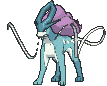
Separately, their formes do a lot to alleviate those reasons. Torn-T gets a pass for being really bloody interesting across the board, if not necessarily pretty. Thun-T isn't quite as good as Thun-I but is still pretty unique, and... fuck, I still can't like Landorus-T. Landorus is very clearly a tiger. A legendary tiger. Raikou is also a well-known legendary tiger and it looks badass, with a great balance of simple and complex features and raw character. Lando-T looks like Landorus molded into a tiger shape. It does, though. I have to fail it on [Context] and loosely [Concept], since it hasn't got enough in its visual design to claim a niche outside of tiger-that-floats, so it's forced into a battle it can't win versus Raikou, who has had longer to fill the niche and commits to it more. Also, it's a total douche in VGC and that plays a very significant part of my dislike for its design even outside of how it looks. Seriously, game devs, flaws. C'mon.

A few of the Pokemon I don't like "fail" for specific reasons. Unfezant, for [context] and [execution]. Conceptually, it's a bird, we need those in a new gen, and gen V kind of ran with the gen-1 expy thing so I don't mind it filling another land-based avian. And the gender difference is cool. Unfortunately, that is literally all it has going for it. It competes with every other regular bird in the series, of which there are many, and has zero redeeming qualities outside of the mask that it only wears *half* the time. Staraptor was designed to be intimidating, (helped by Intimidate of course) Swellow to be swift. They have clearly communicated quirks and niches, backed up by their abilities in battle. Unfezant... is a large bird? ....??????? Jeez. Yeah, definitely not a good design.

It's easier to define someone's ideas by what they don't like than what they do, and I can find things to like about 99.9% of every Pokemon, so I won't discuss the positives.

  • How do other aspects of the Pokémon work with or against the design? Can movepool, abilities, lore or the design basis affect the way you view a Pokémon design? That is, can it ruin an otherwise good design, or remedy a bad one?
Absolutely. See above for the in-battle parts. I view a Pokemon's abilities outside of its appearance as an important part of a design, since, well, it is part of how to design a Pokemon. They all come with a function, even if that function is "to be the butt of a joke/pretty lame." That's a valid function. Lore comes into this. [Concept] Honestly there's a lot of people who will choose favourites based purely on their appearances and then judge would-be Smogonites for having competitively viable favourites. But I'd imagine that those people haven't considered "not judging a book by its cover", no?

  • For a long time, we've been used to see Pokémon in sprites only, but now 3D models have entered the main series games (console games nonwithstanding). Do you think some Pokémon made this transition better or worse than others? Were Pokémon troubled by bad sprites finally justified when seen in glorious 3D? Or did the 3D transition reveal that the Pokémon only looked good in specific poses from specific angles?
It's hard to appreciate how flat Stunfisk is until you see it in 3D. It's flat. It's really, really flat.

Something I noticed while playing XY is that moving away from sprites lets GF mess around with Gradients. I don't think Aurorus would have been able to work as well pre Gen 6 as it does now. No complaints from me since this is pretty well covered by everyone else!

No but seriously get a load of how flat stunfisk is. So flat!

  • Have you ever immediately liked/disliked a Pokémon when you first saw it, only to change your mind after seeing the Pokémon in a different pose/setting, or learning a new aspect of its lore or design background?
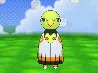
My gut reaction on seeing the starters was disappointment, but it probably always has been? Outside of gen 6 when I actually immediately liked all of the starters. It's a combination of factors. Litten... was a little fake-mon-y. Just in the sense of being a cat without any of the classic (or rather, common) starter features, e.g. large head and large anime eyes. E.G Fennekin. Not that a starter needs those, it was just an instinctive feeling based on prior patterns. Rowlet was just a total curveball for a starter. Grass owl? One that wasn't mostly green? Don't think anybody would have guessed that. But it really works as a design, I was just surprised at first. And Popplio... poor Popplio. In an alternate universe I'd totally really like it, but... [Context]. You can't see it and not immediately think of Oshawott, Samurott or the other assorted seal/sea lion Pokemon. Spheal did the whole ball-thing ages ago, and Samurott looks more like Popplio than Oshawott does, outside of the additional features. It suggests Shenanigans in the design department at Game Freak.

I actually like Samurott, so I'm not complaining, but it means either its evolution is going to deviate a lot, which is risky, or not do so enough and risk being eternally compared to Samurott [context again]. The clown/circus performer aspect suggests the former, which is risky in itself because Clowns are, uhh... contentious.

As a trio, and as of right now, I don't feel they mesh particularly well. Their colour palettes are pretty muted, but not in a particularly coherent way, which contributed to the reflexive dislike. But we'll see where that goes, and separately they're fine.
 

Cresselia~~

Junichi Masuda likes this!!
Man, if only there was an easy way to find the Pokemon Stadium 3D models. Some of those were leaps and bounds better than the 3D models from the XY era. Xatu and Hitmontop were both redeemed there as Xatu is actually standing and Hitmontop is upside down. Another one that looked way better in Stadium was Skarmory. A previous poster said 3D models couldn't make Skarmory's wings work. Well skip to around 7:00 to see Skarm fluttering:
I think a lot of the Pokemon Stadium/Colosseum 3D models were a lot more lively than the current models (a LOT of the new ones just stand or hang there) and it makes me wonder why they just didn't retool Stadium's existing models.
I preferred the movements in Stadium too.
I wish they'd use them instead.

Also: Fainting animations in Stadium were so great.
 
On the other end, there's shiny Swirlix. Why does something based on cotton candy have a brown shiny? How often do we see brown cotton candy, if at all? The color scheme makes no sense and detracts from the design a bit for me. It would have made more sense for it to be blue, since that is often an alternate color of cotton candy.
I thought Swirlix (and definitely its evolution Slurpuff) are amongst the best shinies. It turns into chocolate cherry fudge, it's fucking brilliant mate.
Gen 6 Shinies, in general, are leagues and bounds ahead of the dross of past gens. I'm actually excited about them now (and not simply due to their rarity).
 
Let me tell you all about what is indisputably the most ingenious design of all of the Pokemon:


Goomy may just be the best hit Game Freak is bestowed upon us to this day. Goomy is proof of both complexity and simplicity put into one. They designed Goomy so that you can instantly recognize that it is not only a blob, but also an easy-to-distinguish blob. With a more rounded and stout appearance, Goomy stands more proud and more tall than other blobs like the generic Grimer or the inferior Gulpin.

Goomy's features also really sell the design well. The antennae further decorate the blob shape so that it appears even prouder and more iconic than not just other blob Pokemon, but any Pokemon in general. You can tell it's a dragon type right away with the purple coloration. Purple reminds kids other iconic dragons like Spyro the Dragon or Barney the Dinosaur. Additionally, it matches the purple color that's used on the Dragon type icon in the Pokedex.

Even more amazing features about Goomy's incredible design are some of the even smaller details. The small, dotted eyes show that Goomy is a highly intelligent Pokemon due to how bold and striking the black dot-eyes are. Goomy's mouth is curled, which works well because it almost looks like a melting upper lip of sorts. These hide Goomy's dangerous, flesh piercing fangs so not as to intimidate the fragile children who play the game. The green cheeks are amazing for helping Goomy hide among swamp vegetation, which cleverly matches how real life animals also use camouflage as a means of protection.

The animation on its model is also spot-on. As it sways back and forth, opponents can never tell if it will continue to do so or if it will unleash an attack. This animation gives us a perfect demonstration of how a dangerous Goomy may act in battle or in the wild.

To summarize, Goomy's design is just amazing. Each feature was clearly painstakingly crafted to give us the perfect Pokemon design. I imagine Game Freak spent half of the development for X and Y just working on Goomy's design alone. The likes of Nidoking, Scizor, Deoxys, Garchomp, and other inferior Pokemon could definitely learn a thing or two from Goomy's amazing form.
 
  • What makes a good/bad Pokémon design to you?
A lot of elements. Color pallets, extra details, and overall what animal (or thing) they are. For instance, I love Flygon because he's a badass dragonfly. Literally a dragon. Literally a bug. Awesome. It also has to do with concept and Pokedex entries. For instance, using Flygon again, she sings in sandstorms like a siren and is never seen. Ever since seeing its Pokedex entry it has always been a magical design for me, and will never be forgotten. Impact and uniqueness are important, but as long as they're not unique for the sake of being unique. No designs that do that come to mind, but I'm sure there are some. I also think a certain layer of simplicity is important. Not that being complex is bad, and so can being too simple. But I think as far as color pallets and extraneous things on the Pokemon go (like spikes) it needs to be all purposeful, rather than "lets just have a layer of spikes going down its right side" or something.
  • Are there any Pokémon designs you like or dislike for specific reasons? Can you point out exactly what the designers did right/wrong?
Seviper. He has one of the best designs in my opinion. He's all black, and have those golden plates on top of his head and other parts of his body. He has the golden things that help him slither because snakes could actually use those but don't (uniqueness). He has giant fangs and a big forked tongue that make him wicked cool (not a necessarily unique concept, but when paired with the rest of him). Oh, and his tail is a freaking sword! He has a very particular aura to him, like maybe Persian royalty or something. I can't pinpoint it. His design has, and continues to, blow me away.
  • How do other aspects of the Pokémon work with or against the design? Can movepool, abilities, lore or the design basis affect the way you view a Pokémon design? That is, can it ruin an otherwise good design, or remedy a bad one?
Lets use Seviper again. Not only does he have a sword for a tail, he learns a move called Poison Tail, where his tail glows purple and he strikes. And it was originally a move only learned by him. In this case it's a good design being utilized. Also, Sceptile, who used to be the only guy who could learn Leaf Blade and use those blades on his arm. I think it can make a difference in remedying a bad design. In this case, I think Rhyperior is a good example. I laughed when I saw that dopey thing, but when I saw him use Rock Wrecker in the show where the rocks fly out of his palms until they form into a giant glowing rock, that made him a badass. I can't think of any good design ruined by a move, but I don't think it's possible. Or that it is possible, but just so incredibly unlikely.
  • For a long time, we've been used to see Pokémon in sprites only, but now 3D models have entered the main series games (console games nonwithstanding). Do you think some Pokémon made this transition better or worse than others? Were Pokémon troubled by bad sprites finally justified when seen in glorious 3D? Or did the 3D transition reveal that the Pokémon only looked good in specific poses from specific angles?
Yes! I've been saying this for a very long time. Pokemon has always worked better in 2D, which I think is why the show works so well. I think that a lot of Pokemon work much better in 2D, for instance: Seviper, Sceptile, and Flygon, three I already used.
Seviper now looks so dopey. His eyes are unfocused, and he's coiled in his original pose, but is just swaying there, where snakes (and especially him) get their ferociousness from being so precise, quick, and strong. In 2D he moves his tongue and tail, and his eye is focused on you. In 3D he looks drugged and weak.
Sceptile's eyes have the same problem, and you never realized how conflicting his proportions are. His arms and blades are actually really small and his lower body is kind of fat. When I draw him, I draw him a lot slimmer with some length added to the arms/blades and he looks so much better.
Flygon has the same issue. Big head, little neck, big butt. Flygon looks so much better in his stock pose/2D where she looks majestic and strong. Now she looks so off.

There are so many Pokemon that translate very poorly (looking at you, Aerodactyl...), but there's also a lot that translate into 3D better. But those Pokemon are from X/Y. Sylveon and Aurorus just to name a few. They were designed for the 3D game, so they look a lot better there then they'd look in a 2D sprite. They'd probably still work in 2D (I think any Pokemon design would), but because the 3D was intentional, they look amazing.
  • Have you ever immediately liked/disliked a Pokémon when you first saw it, only to change your mind after seeing the Pokémon in a different pose/setting, or learning a new aspect of its lore or design background?
With Litten its design is growing on me after seeing it do a certain pose in battle, so yes. But I actually find that I begin to dislike more Pokemon when seeing them more instead. I do always enjoy a Pokemon after knowing more about its lore, but I don't think its ever been enough for me to like a design I've previously disliked. It usually just makes me fall in love with a Pokemon I already really liked.

EDIT: And Ambiipom. Do I even need to describe it? Just a hideous and disgusting design. Takes the uniqueness of Aipom and tries to evolve it, but it failed miserably. I think Aipom needed the evolution, and its design makes sense for what Aipom is, but I think it just looks and is terrible. Nothing it does has been able to make me like it more, but I've gotten used to it.
 
Last edited:
Let me tell you all about what is indisputably the most ingenious design of all of the Pokemon:


To summarize, Goomy's design is just amazing. Each feature was clearly painstakingly crafted to give us the perfect Pokemon design. I imagine Game Freak spent half of the development for X and Y just working on Goomy's design alone. The likes of Nidoking, Scizor, Deoxys, Garchomp, and other inferior Pokemon could definitely learn a thing or two from Goomy's amazing form.
I agree with Scizor, Deoxys, and maybe Garchomp, but Nidoking is classic, man!
 
Is it wrong to say that I dislike the design of a Pokemon(s) because I dislike it's entire existence lol? The Pokemon(s) in question is the Chikorita line. I don't like anything about them. Their entire design irritates me. They are a starter that is worse then the route 1 trash you encounter. Their move pools is horribly shallow. They are a boring grass monotype. Their final strike is how they look. It's like a flower dinosaur with antennas on its head.
 
Is it wrong to say that I dislike the design of a Pokemon(s) because I dislike it's entire existence lol? The Pokemon(s) in question is the Chikorita line. I don't like anything about them. Their entire design irritates me. They are a starter that is worse then the route 1 trash you encounter. Their move pools is horribly shallow. They are a boring grass monotype. Their final strike is how they look. It's like a flower dinosaur with antennas on its head.
Nobody can tell you why to like or dislike a pokemon, it's your own opinion.

But that aside it's a little unfair to criticize the Chikorita line's shortcomings competitively/gameplay in a thread dedicated to critiquing how they look and animate. Maybe take this to the Unpopular Opinion thread?
 

Users Who Are Viewing This Thread (Users: 1, Guests: 0)

Top