After a few bumps and a lot of procrastinating here it is.
...yay
Here are the individual scores by judges, with comments and stuff:
bombrion didn't send in his scores, which is almost entirely my fault for not reminding him about it
but he says he doesn't have time for judging so he's fired
Here are the score totals:
The top 7 pieces are going to make it into voting so here's what you can vote for:
Next month will have the original composition for the voting thread, proper judging, and a more balanced voting method next month, I promise. Sorry for all the shortcomings or whatever.
...yay
Here are the individual scores by judges, with comments and stuff:
Nastyjungle
Artistic Skill: 10
Theme Execution: 8
Plus Points: 10
Comment: This is excellent, and you've grabbed some extra plus points for putting it in a circle. While this may not sound like much, it accentuates the curves and asserts the focus as the sunset. The B/W is a nice touch too. You have, however, dropped maybe a couple of points due to the muted colour scheme, but really I love your style so don't change that! Kinda contradictory but, eh...
suntt123
Artistic Skill: 7
Theme Execution: 9
Plus Points: 5
Comment: Another excellent piece, though there a few things that could be improved. First, the size is an issue - the two combatants are supposed to be the focus of the piece, but take up very little of the actual pic. They're also kind of off-centre. In a similar vein, I'd prefer the background to be more muted so as not to distract from the fight. However, I do really like this piece, especially the Samurott. The line art is clear, and the shading is nicely done.
Energy Storm
Artistic Skill: 6
Theme Execution: 10
Plus Points: 10
icepick
Artistic Skill: 10
Theme Execution: 10
Plus Points: 8
TEA_DEMON
Artistic Skill: 6
Theme Execution: 8
Plus Points: 6
wickdaggler
Artistic Skill: 9
Theme Execution: 9
Plus Points: 9
Precipice
Artistic Skill: 9
Theme Execution: 8
Plus Points: 9
TheMutant
Artistic Skill: 10
Theme Execution: 7
Plus Points: 9
Orugos
Artistic Skill: 10
Theme Execution: 8
Plus Points: 9
aragornbird
Artistic Skill: 10
Theme Execution: 9
Plus Points: 10
Artistic Skill: 10
Theme Execution: 8
Plus Points: 10
Comment: This is excellent, and you've grabbed some extra plus points for putting it in a circle. While this may not sound like much, it accentuates the curves and asserts the focus as the sunset. The B/W is a nice touch too. You have, however, dropped maybe a couple of points due to the muted colour scheme, but really I love your style so don't change that! Kinda contradictory but, eh...
suntt123
Artistic Skill: 7
Theme Execution: 9
Plus Points: 5
Comment: Another excellent piece, though there a few things that could be improved. First, the size is an issue - the two combatants are supposed to be the focus of the piece, but take up very little of the actual pic. They're also kind of off-centre. In a similar vein, I'd prefer the background to be more muted so as not to distract from the fight. However, I do really like this piece, especially the Samurott. The line art is clear, and the shading is nicely done.
Energy Storm
Artistic Skill: 6
Theme Execution: 10
Plus Points: 10
icepick
Artistic Skill: 10
Theme Execution: 10
Plus Points: 8
TEA_DEMON
Artistic Skill: 6
Theme Execution: 8
Plus Points: 6
wickdaggler
Artistic Skill: 9
Theme Execution: 9
Plus Points: 9
Precipice
Artistic Skill: 9
Theme Execution: 8
Plus Points: 9
TheMutant
Artistic Skill: 10
Theme Execution: 7
Plus Points: 9
Orugos
Artistic Skill: 10
Theme Execution: 8
Plus Points: 9
aragornbird
Artistic Skill: 10
Theme Execution: 9
Plus Points: 10
Nastyjungle
Artistic Skill: 10
Theme Execution: 8
Plus Points: 10
Comment: This is striking both in an illustrative and graphic design sense.
Suntt123
Artistic Skill: 6
Theme Execution: 6
Plus Points:4
Energy Storm
Artistic Skill: 8
Theme Execution: 4
Plus Points: 4
Icepick
Artistic Skill: 8
Theme Execution: 6
Plus Points: 8
Comment: The fact that this is an entire *scene* is particularly appealing about this piece. The parting of the waters and the introduction of yellow makes the piece more interesting and prevents the color from becoming simplistic and boring. Nice point of view; I can tell he considered foreground and background.
Tea_Demon
Artistic Skill: 4
Theme Execution: 4
Plus Points: 2
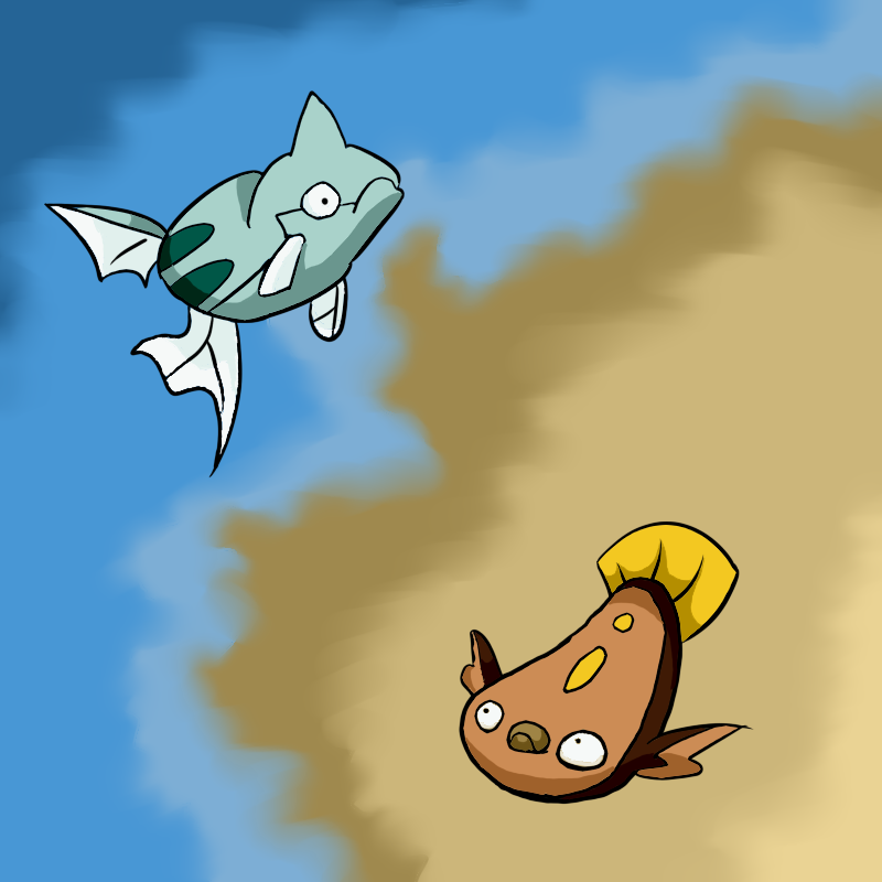
Comment: It's not relying on the 'two different types' method of showing contrast and it's cute! Unfortunately I don't actually even know what the 'Fusion Dance' is, but nonetheless I enjoy that you considered what they're doing than having the flat-out contrast.
wickdaggler
Artistic Skill: 4
Theme Execution: 4
Plus Points: 4
Comment: Clever use of shadow; I think this concept could have been pushed farther. The drawing is cute, though rough, much like Tea_Demon's. Again, though, I'm liking that you didn't go with the easy solution for fire vs water or something similar, not to mention you did good to leave out the 'split down the middle' composition.
Precipice
Artistic Skill: 4
Theme Execution: 4
Plus Points: 4
The_Mutant
Artistic Skill: 6
Theme Execution: 10
Plus Points: 8
Comment: Great narrative interpretation of the theme, with a nice composition which doesn't rely on a literal 'split'. This is very clever thinking and it stands apart from the other submissions in this aspect.
Orugos
Artistic Skill: 10
Theme Execution: 6
Plus Points: 8
Aragornbird
Artistic Skill: 8
Theme Execution: 8
Plus Points: 6
Dj Gopher
Artistic Skill: 3
Theme Execution: 1
Plus Points: 1
Artistic Skill: 10
Theme Execution: 8
Plus Points: 10
Comment: This is striking both in an illustrative and graphic design sense.
Suntt123
Artistic Skill: 6
Theme Execution: 6
Plus Points:4
Energy Storm
Artistic Skill: 8
Theme Execution: 4
Plus Points: 4
Icepick
Artistic Skill: 8
Theme Execution: 6
Plus Points: 8
Comment: The fact that this is an entire *scene* is particularly appealing about this piece. The parting of the waters and the introduction of yellow makes the piece more interesting and prevents the color from becoming simplistic and boring. Nice point of view; I can tell he considered foreground and background.
Tea_Demon
Artistic Skill: 4
Theme Execution: 4
Plus Points: 2
Comment: It's not relying on the 'two different types' method of showing contrast and it's cute! Unfortunately I don't actually even know what the 'Fusion Dance' is, but nonetheless I enjoy that you considered what they're doing than having the flat-out contrast.
wickdaggler
Artistic Skill: 4
Theme Execution: 4
Plus Points: 4
Comment: Clever use of shadow; I think this concept could have been pushed farther. The drawing is cute, though rough, much like Tea_Demon's. Again, though, I'm liking that you didn't go with the easy solution for fire vs water or something similar, not to mention you did good to leave out the 'split down the middle' composition.
Precipice
Artistic Skill: 4
Theme Execution: 4
Plus Points: 4
The_Mutant
Artistic Skill: 6
Theme Execution: 10
Plus Points: 8
Comment: Great narrative interpretation of the theme, with a nice composition which doesn't rely on a literal 'split'. This is very clever thinking and it stands apart from the other submissions in this aspect.
Orugos
Artistic Skill: 10
Theme Execution: 6
Plus Points: 8
Aragornbird
Artistic Skill: 8
Theme Execution: 8
Plus Points: 6
Dj Gopher
Artistic Skill: 3
Theme Execution: 1
Plus Points: 1
Aragornbird
Artistic Skill: 9
Theme Execution: 10
Plus Points: 9
This piece was one of my favorites this month. The hard work that went into it is quickly made apparent when viewing the pieces, which are very high in detail. The background is quite pretty as well, but one thing that seemed to somewhat throw me off was the lining on reshiram and Zekrom. In some parts of their body they seem very smooth and the shading is very precise. Turning away from their faces, most notably in their lower half of their bodies, the over all style seems to become more jagged, giving those areas a sort of rushed feel. Aside from that, color choice was very nice, and the theme does really shine through, being one of the only pieces that I could guess the theme from.
Orugos
Artistic Skill: 9.5
Theme Execution: 6.5
Plus Points (for creativity in concept): 8.5
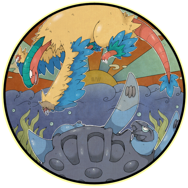
This piece was definitely among the top tiers for the month. The artistic style and pose for both Tropius and Lapras are very unique and the water effect on the sky was very pretty. One thing that I kept drawing to was Lapras's eye, which seemed a little out of place and stylistically different from the rest of the piece. Despite it's beautiful coloring and poses, it didn't really seem to prove its theme as well as others did.
Artistic Skill: 9
Theme Execution: 10
Plus Points: 9
This piece was one of my favorites this month. The hard work that went into it is quickly made apparent when viewing the pieces, which are very high in detail. The background is quite pretty as well, but one thing that seemed to somewhat throw me off was the lining on reshiram and Zekrom. In some parts of their body they seem very smooth and the shading is very precise. Turning away from their faces, most notably in their lower half of their bodies, the over all style seems to become more jagged, giving those areas a sort of rushed feel. Aside from that, color choice was very nice, and the theme does really shine through, being one of the only pieces that I could guess the theme from.
Orugos
Artistic Skill: 9.5
Theme Execution: 6.5
Plus Points (for creativity in concept): 8.5
This piece was definitely among the top tiers for the month. The artistic style and pose for both Tropius and Lapras are very unique and the water effect on the sky was very pretty. One thing that I kept drawing to was Lapras's eye, which seemed a little out of place and stylistically different from the rest of the piece. Despite it's beautiful coloring and poses, it didn't really seem to prove its theme as well as others did.
bombrion didn't send in his scores, which is almost entirely my fault for not reminding him about it
but he says he doesn't have time for judging so he's fired
Here are the score totals:
Nastyjungle
28.6
Suntt123
15.6
Energy Storm
22
Icepick
26.3
wickdaggler
33
Precipice
32
Orugos
24.6
Aragornbird
26. 3
-5 = 21.3
Dj Gopher
10
TEA_DEMON
11.3
TheMutant
31
28.6
Suntt123
15.6
Energy Storm
22
Icepick
26.3
wickdaggler
33
Precipice
32
Orugos
24.6
Aragornbird
26. 3
-5 = 21.3
Dj Gopher
10
TEA_DEMON
11.3
TheMutant
31
The top 7 pieces are going to make it into voting so here's what you can vote for:
Nastyjungle
Energy Storm
Icepick

wickdaggler

Precipice

Orugos

Aragornbird

TheMutant

Energy Storm
Icepick
wickdaggler
Precipice
Orugos
Aragornbird
TheMutant
Next month will have the original composition for the voting thread, proper judging, and a more balanced voting method next month, I promise. Sorry for all the shortcomings or whatever.