I'm probably not going to finish that Honchkrow pic, so unless I make a final submission just consider me out of this one.

-
Check out the relaunch of our general collection, with classic designs and new ones by our very own Pissog!
-
Welcome to Smeargle's Studio! Please be sure to review the studio rules. Feel also free to check out our hub to learn more about this place!Welcome to Smogon! Take a moment to read the Introduction to Smogon for a run-down on everything Smogon, and make sure you take some time to read the global rules.You are using an out of date browser. It may not display this or other websites correctly.
You should upgrade or use an alternative browser.Monthly Art Contest 3!!!
- Thread starter Bucky
- Start date
I've been wanting to draw Zekrom since the first time I saw him, but his difficult design has made me put it off again and again... and now this contest has given me reason to draw him. XD
WIP, obviously. GRRR LOOKIT THOSE MUSCLES. (Also, I just realized that this is 1000x1000. I am fully aware of the 800x800 limit, which my final picture will follow... if this is an issue for WIPs, just let me know!)
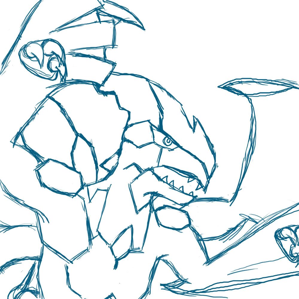 That's looking good so far Sanglunaria, however I think the face needs more expression for such a dynamic pose; at the moment it looks a bit blank. I'd recommend moving the iris/pupil of the eye closer to the edge of the face to make it look as if the eye is focused on something. I feel as if the pose shows Zekrom about to rip something apart, but that kind of anger isn't shown on the face.
Also Doran Dragon, considering Yilx was restricted to official 5th gen Pokemon, I'd say Fakemon aren't allowed, but ultimately it's up to Bucky I guess.@MofoAmbulance: It looks great! Just darken the reds a little bit and especially the edges in the background to put more emphasis on the contrast.
@Wickdaggler: Of course! All of the judges can add their critique whenever they wish. I can't wait to see your entry! But Haunter's the cooliest.
@DoranDragon: No fakemon. Only official Pokeymans, including 5th gen leaks. Maybe that can be a theme for the next contest!
@Sanglunaria: Ooooo!!! Looks cool, I can't wait to see the finished piece! The size restraints are only for the final submission.
@BinarySolo: ):damn, that completely kills the entry i would want to put in, but oh well :) it woulda been red and green.is it gengar or koffing?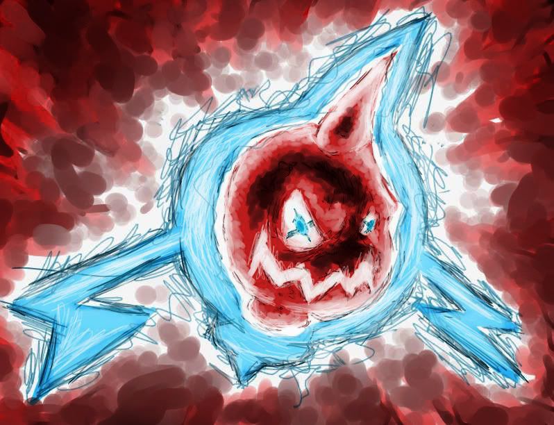
Better, Bucky?now thats what I call Rotorage :pI think what Bucky was trying to say is this:
@MofoAmbulance: That's a pretty fantastic piece. Not only does it provide a contrast between red and blue, dark eges vs. a white center, but it also makes use of scribbled lines and smooth blotches. I don't know if this was intentional or not, but that is what really sells this piece for me. It has a very rough scribbled feel to it, which although not initially pleasing to the eye, does have a unique feel that grows on me every passing second I look at it.
@Az, er, Swaggersaurus: That thing is inspired. I have no idea what the ****s going on... but I love it. Especially the evil grin on it's face.
As for the style and presentation, I love the backround and color choices. It's very disorienting seeing the bright shades of green and yellow against the purple blotch. Having Gengar take up the entirity of the center seems like a good design choice to me, and it focuses attention to the center, along with the "hole" in it's chest. This is part of why it's so disorienting: Your eye wants to dart to the brighter colors, but is attracted by this big beautiful purple dump in the middle. As always I love your sketchy, of the block random style, which, combined with the time you put into it makes it a great piece.
A bit of beef I have with it is the green and yellow in the center. It gives it a look of {[<>]} where it should just be {[]} if you get what I mean... (I'm horrible at explaining I know).
also
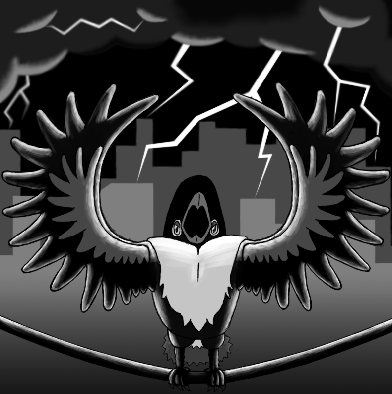
SEO: I'm in love with your painting. Mere hints of Giritina's form are given, and we are left to interpret alot for ourselves. This combined with the gritty textures you have seemed to create, the upwards movement of the piece, and the use of positive space in the middle with Giritina's body encircling it is a perfect example of contrast. The overall effect of the piece gives of an aura of mystery, and defiantly shows your professionalism as an artist: you've created such a great mood here.I initially had trouble with the shading, but I think it's pretty decent. Also, I re-did the head and fixed up the tail. I'm happy with most of it, but the clouds don't look right to me.
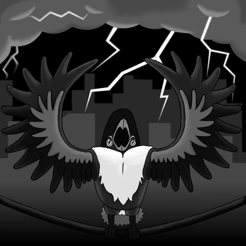
I think I'll blur the outlines of the clouds a bit. Any suggestions before I make my final submission?@BinarySolo: Since the lightning is right behind Honchkrow (that's what it looks like anyway), I think you should add stronger highlights around Honchkrow's figure. That would also help with the contrast theme, I think, because right now it looks fairly grayscale to me.I initially had trouble with the shading, but I think it's pretty decent. Also, I re-did the head and fixed up the tail. I'm happy with most of it, but the clouds don't look right to me.
I think I'll blur the outlines of the clouds a bit. Any suggestions before I make my final submission?
AVVY PLEASE!Thanks Sanglunaria. I see what you mean about the lighting; I'll brighten that up, especially around the wings.
@ KidX: No problem, I'll use the Final Submission to make it though. Would you like it cropped to a particular area, or scaled down, or both?
Edit: I ended up also changing the contrast and brightness of the entire picture, so it fits better with the theme now!
FINAL SUBMISSION
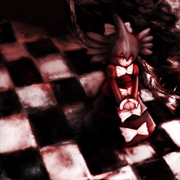
 @Yilx: Excellent work! It looks really great and I love the feel of it, it's awesome! The only thing is can you bring the red hues down a bit further into the front so that there's not so much pure white? Other than that, great work.
@BinarySolo: Pure awesome-sauce. That is all.
@SEO: I love the concept, and the style is fantastic! But your color pallet has to be a bit more limited to two colors only (you have black, red, and yellow). Maybe you could make the background and wings a dark shade of red or something.Sorry for my inactivity! I was on vacation for a bit longer than I thought! :D I'll have those comments done before tonight.
To all of you, great work! This will be difficult to judge, for sure!
Also, Swaggersaurus, is Gengar using Shadow Ball? It looks very cool, but I'm not a huge fan of the straight-edged circled layers around the Shadow Ball. It looks a bit... I don't know, like it was just generated with whatever effects you selected on your program.
I hope that helps. I just woke up. XDJust a little reminder, contest deadline is in 3 days!
There's no way I'll be able to finish this on time... I wish I had gotten my new computer earlier.
I'm gonna try to submit something next time, though.
Edit: SEO does have a few to many colors, however that isn't total reason to take them out of judging: they'll get marked down on the execution points... @Yilx: Excellent work! It looks really great and I love the feel of it, it's awesome! The only thing is can you bring the red hues down a bit further into the front so that there's not so much pure white? Other than that, great work.
Alright... that's done. Edited my first and second posts.Just a little reminder, contest deadline is in 3 days!
I thought it was the 22nd? o_o That's what the first post says, anyway. (I really hope it's the 22nd lol.)