Something that bothers me everytime I play Pokemon Emeralds battle frontier
View attachment 322471
I really don't like the Blastoise sprite in this game. It looks like a kid put something inside it's cheeks and opens its mouth.
Compare that to FRLG sprite. It's not as noticable. Also the way Blastoise poses feels more intimidating.
View attachment 322472
I really love the sprite from DPP and am glad BW and B2W2 animated it.
View attachment 322473
What I don't like is probably the worst sprite I have seen from Blastoise
View attachment 322474
Yeah, that one is terribe too, but I mean this one actually:
View attachment 322475
It looks like a fat kid instead of a large blue turtle with cannons on it's shell.
Yellow looks like Tierno's Blastoise busting a dance move
Also
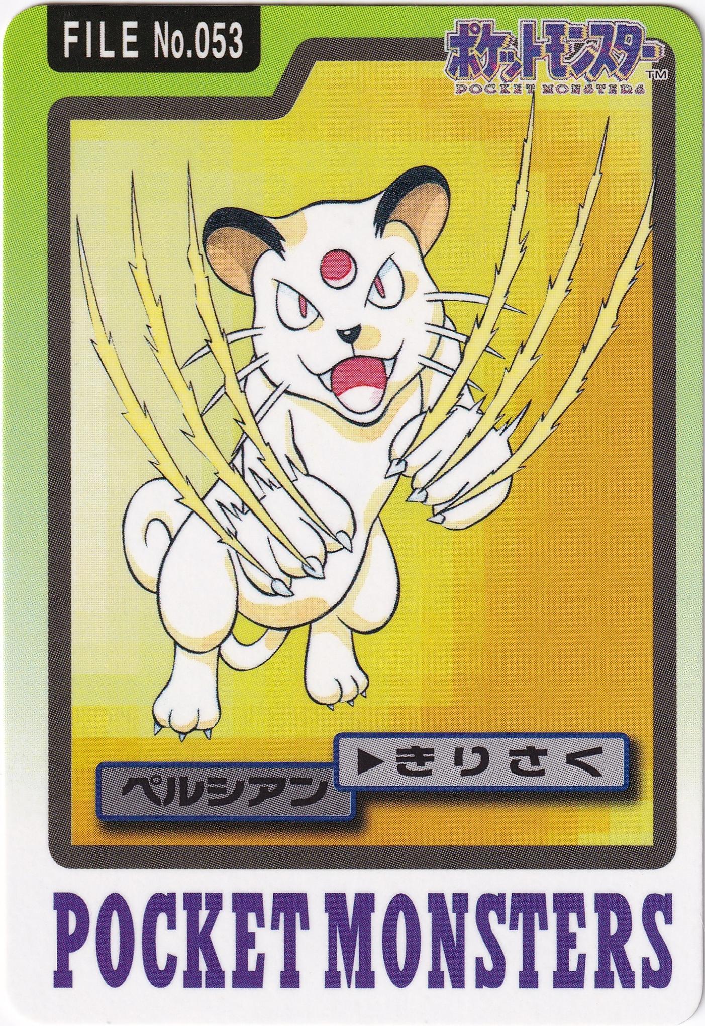
Personally not a fan of this pose of...moving claws like some cat. You're a golem! And of course they picked this one for the gen 5 games.
Last edited: