-
Smogon Premier League is here and the team collection is now available. Support your team!
-
Welcome to Smeargle's Studio! Please be sure to review the studio rules. Feel also free to check out our hub to learn more about this place!Welcome to Smogon! Take a moment to read the Introduction to Smogon for a run-down on everything Smogon, and make sure you take some time to read the global rules.Congrats to the winners of the 2025 Smog Awards!You are using an out of date browser. It may not display this or other websites correctly.
You should upgrade or use an alternative browser.Zracknel's logo thread
- Thread starter Zracknel
- Start date
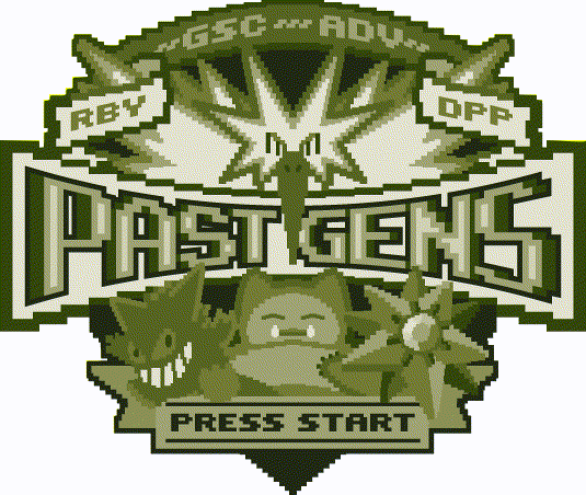
Your logos are fantastic! The past gen one is amazing oohhhh myyyyy This is awesome!!! Can't imagine how much time and effort you spent for it!! Thanks!! :DD
and that Gengar is cute!! lol! :) Press Start is a nice touch too! This is really unique and different from what you normally do!New SPL team:
The Smog Frogs

Avatars:[02:26] <LonelyNess> WE DIDN'T CHOOSE THE FROG LIFE ZRACKNEL
[02:26] <LonelyNess> THE FROG LIFE CHOSE US


Signatures:


Special thanks to NastyJungle for some last minute color stuff!

good joob, uh frogs. the original gangsters
 New SPL logo: the Cryonicles

Hard to believe it has been close to three years since I did the first cryogonals logo
If you are curious why the team's mascot is not cryogonal, please direct inquiries to the cryonicles' management
Avatar:

Signatures:


A few extra signatures/avatars for this team (and others) as soon as I can finish them!!!damn zracknel that's absolutely beautiful, can cong get one of those?
Thank you!
I feel like I owe it to you guys... the classiest are definitely on my short list for a revamp, haha...
Novaray said:beautiful work zracknel, really like the font as well ~.~
thanks man :)
just in case anyone was curious, the base typeface is Outage from the Lost Type co-op. I made three changes to the type-- elongated the letterforms, added the bevel, and squared off some of the rounded diagonal edges
I am glad you like it! As always, Zracknel continues to churn out quality work. Great stuff, man.
 That past gen logo is absolutely ridiculous. You just keep raising the bar.
 We would absolutely love an upgrade, as we have probably the oldest standing logo
If you do make a revamp, may I suggest a Persian with a cigar and a champagne glass?
Awesome work man, totally amazing