
I thought the smog WAS the tail, like Raikou, when I first saw it, and I like it that way instead of its actual tail.Jesus...all the changes/suggestion towards the imp are slowly destroying him ;_;. Personally I thought it looked okay with just brown eyes. I do have to ask, if you removed it's imp tail and replaced it with just the smog it would work out. I don't truly know because I like it the way it was.

-
The moderators of this forum can be found in the CAP forum staff directory.
-
Welcome to Smogon! Take a moment to read the Introduction to Smogon for a run-down on everything Smogon, and make sure you take some time to read the global rules.
-
Congrats to the winners of the 2023 Smog Awards!
CAP 4 CAP 4 - Art Submission Thread
- Thread starter Sunday
- Start date
- Status
- Not open for further replies.

I completely agree. I'm not a big fan of the lavender one, but that's the color most Poison types are. But I figured I'd let everyone else see it and let them judge.I prefer the original imp with the brown in its cloud, because the imp's body color matches the main color of the smog cloud. The second imp's body color really stands out a little too much for me, though it looks quite a bit less like a dark-type.
I think a stripe might really mess with it, personally. I'll consider something though... Maybe add a stomach patch of brown or something.I do like the third color scheme a lot, though I agree that it would be best to make it more dominantly poison-typed. It would always be a possibility to add brown streaks to the original imp's body, though I question how well that would look.
Hahahaha... oh Jesus Christ, what have I gotten myself into? lolI really like this design. Looks like a Gaara Imp. Only issue now is that it looks too much like a ground poke and not enough like poison. Perhaps you could try sticking the green eyes back on it now that the aura is clearly ground.
This better?

I feel like I need a poll to figure out which one to send on to the real poll... lol

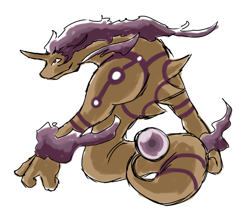
Please explain to me why my picture doesnt look like a pokemon in your eyes?That... is very cool. Not many other submissions get both the typing or the stats that are being thrown around. This does. And it's mystical touch let's it fit in with many of the moves we're talking about. Awesome job!
As for the others, I really don't think Maniac's Gila design looks like it could have the move pool that we're looking at. That doesn't look like Wish, Tailwind, Encore, or Rapidspin are appropriate, which is the entire point.
Salamenceslasher's is closer. The move pool I think is more viable with it, but I don't think it looks like a Pokemon. It's too busy. Definitely a fun design, but I don't think it works.
As for your point that it looks like Jirachi or Celebi, I'm going to have to say that most Fairy egg group members look that way. Togetic, Pikachu, Clefairy, Azumarill, Castform, etc. If you look at them completely unbiased, and put them next to Celebi or Jirachi, just visually, they all look like they could have the same stats. We know in reality that they don't, and thus perceive them differently, but design-wise? They could be the same. This is out of that same line. The Fairy egg group is, as far as I'm concerned, necessary for this Pokemon because it's the one with all the moves we want him to have, and we can't honestly just stick them all in his level-up list. That would be rediculous. So some of them have to come in through breeding.
As for your color scheme complaint, I can't dissagree. I think the dark purple looks the best, but how about these?
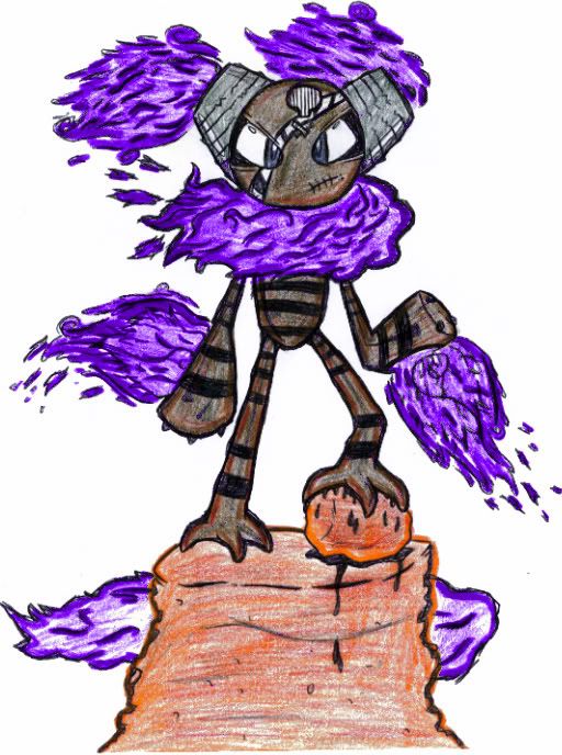
This first one is the darker color scheme with the original smog that I had, before I even showed you guys. I changed the smog personally because I didn't want anyone to start associated him with Sandstream, but if his types aren't coming through enough, maybe this will help a bit.
Original Imp:

This next one is, hopefully, for those that see him as being a Dark type do to the dark purple. This color scheme was ripped straight from Arbok.
Stereotypically Poison Imp:

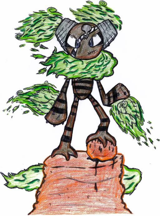
Finally this last one is going the opposite way. While Number 2 went Poison, this one goes Sand. I personally think he should look Poison dominant because it's the main type, but if you guys like this one best, I really don't mind. And if nothing else, it could be used as the Shiny form.
Steretypically Ground Imp:


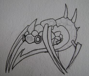
If you look closely at the picture, you see a thin tail in front of the smog cloud.I thought the smog WAS the tail, like Raikou, when I first saw it, and I like it that way instead of its actual tail.


Wish and other moves of that sort can be made to act as if they are formed or used through the "mystic" gems i placed on it, thats primarly their purpose. As for Encore I don't even know what is an asthetic requirement for learning Encore since many things get it, from Victreebell to Shuckle so i don't see that being much of a problem. I can't disagree with you about Tail Wind as i don't see it getting it. However it's not like it has to have every Utility move so I don't see why that couldn't be excluded if my design gets picked.As for the others, I really don't think Maniac's Gila design looks like it could have the move pool that we're looking at. That doesn't look like Wish, Tailwind, Encore, or Rapidspin are appropriate, which is the entire point.
Members of the Fairy Egg group may look a certain way but they at least have some attributes that make them look like specific types wheter it may be through physical appearence or colour. The rocks in the initial picture just don't seem like enough to make me think that pokemon could be a ground type at first glance.As for your point that it looks like Jirachi or Celebi, I'm going to have to say that most Fairy egg group members look that way. Togetic, Pikachu, Clefairy, Azumarill, Castform, etc. If you look at them completely unbiased, and put them next to Celebi or Jirachi, just visually, they all look like they could have the same stats. We know in reality that they don't, and thus perceive them differently, but design-wise? They could be the same. This is out of that same line.
Steretypically Ground Imp:
I like this color scheme the most but I think the Poison Type can be emphasized more in the Smog while letting the Ground type be emphasized in the Body of the pokemon itself. Also just a little nitpick, I don't actually like the fangs it has, it doesn't seem like it needs them to be honest. Would you mind if i took a crack at drawing your design? as I actually like it and I wonder what another version would look like.

since the theme is poison/ground, i decided to make my third spriting contest poison/ground themed. im sure you guys can get some ideas off of some of the entries, right?
Yes. Your point? :PIf you look closely at the picture, you see a thin tail in front of the smog cloud.
To be honest, I agree entirely. I liked the normal green eyed one when it was lightened up. However, my suggestions have been to appease the ground typing. Still my favorite submission though.Jesus...all the changes/suggestion towards the imp are slowly destroying him ;_;. Personally I thought it looked okay with just brown eyes. I do have to ask, if you removed it's imp tail and replaced it with just the smog it would work out. I don't truly know because I like it the way it was.

I threw together a design as well
Wanted it to look fast and poisonous, front legs fused together like some form of barrier, spikes for spikes and a long tail....

Wanted it to look fast and poisonous, front legs fused together like some form of barrier, spikes for spikes and a long tail....
salamenceslasher, you have my vote. i would change the green to purple, though. actually, that version looks more like a shiney color 0-o.
Um, looked what i learned how to do lol. personally i like this color better but im always up for suggestions
Jesus...all the changes/suggestion towards the imp are slowly destroying him ;_;. Personally I thought it looked okay with just brown eyes. I do have to ask, if you removed it's imp tail and replaced it with just the smog it would work out. I don't truly know because I like it the way it was.
Alrighty then. I was originally thinking he was just constantly surrounded by the smog (hence the smoggy look to the very VERY first image), but turning it into his tail works too.I thought the smog WAS the tail, like Raikou, when I first saw it, and I like it that way instead of its actual tail.
Brown-eyed, tailless Original Imp:

I didn't mean any offense. If you honestly want my opinion, let's look at it:Please explain to me why my picture doesnt look like a pokemon in your eyes?
It just looks to me like, well, fan art. It's overly busy, with fanboyish elements like the exotic colored toxic flame (and no matter what color). It has a kinda hodge podge collection of elements: the firey stuff, the bird like legs, whatever contraptions are coming out of it's head. As a concept, I don't think it flows.
I just don't think it would fit with the real Pokemon very well, which is what I would think we want to do.
Again, I mean no offense.
Does Victreebell get it? I normally associate Encore with the cutesy Pokemon, like Wynaut, Pichu, and the rest. You know, Pokemon that would giggle and then say "Do it again, DO IT AGAIN!" That's the asthetic for Encore that I was talking about. My bad.Wish and other moves of that sort can be made to act as if they are formed or used through the "mystic" gems i placed on it, thats primarly their purpose. As for Encore I don't even know what is an asthetic requirement for learning Encore since many things get it, from Victreebell to Shuckle so i don't see that being much of a problem. I can't disagree with you about Tail Wind as i don't see it getting it. However it's not like it has to have every Utility move so I don't see why that couldn't be excluded if my design gets picked.
Please, feel free to go at it. I personally like the fangs now, but they're really not that important to me. I don't care much about them, so whatever the general population wants with that.I like this color scheme the most but I think the Poison Type can be emphasized more in the Smog while letting the Ground type be emphasized in the Body of the pokemon itself. Also just a little nitpick, I don't actually like the fangs it has, it doesn't seem like it needs them to be honest. Would you mind if i took a crack at drawing your design? as I actually like it and I wonder what another version would look like.
The Original dark purple Imp with the bright green eyes was my favorite as well. But like yourself, I'm more than willing to manipulate it to appease the ground typing.To be honest, I agree entirely. I liked the normal green eyed one when it was lightened up. However, my suggestions have been to appease the ground typing. Still my favorite submission though.

Thanks, I really appreciate it.that imp is not being destroyed slowly!! every instance i've seen of it is totally viable. it's win.
Guys, I really need a general consensus on the Imp. There are a ton of issues people are pulling me in a ton of different directions for.
Color Scheme:
Body: Dark Purple vs. Lavender vs. Tan
Eyes: Bright Green vs. Tan vs. Purple
Body:
Mouth: Fangs vs. No Fangs
Tail: Demon Tail vs. No Demon Tail/Smog Tail
I'm assuming everyone likes the mixed Sand/Smog cloud because I haven't heard anyone say otherwise.
I like this smog imp the best. It has the ground feel I was looking for and I prefer the green eyes. The smog being its tail is a good idea, too. A poll might be a good idea since there are so many.
I feel like I need a poll to figure out which one to send on to the real poll... lol
Edit: Dark Purple, Green Eyes, Smog Tail or No Tail. I don't really care about the fangs one way or the other.
that would be the same as saying that your drawling isnt a pokemon because you have smog coming out of no where and it happns to follow ur pokemon. No offense of course but if you wanna know how i got these elements, then ill tell you =) the feet are just attributes to its ground exterior and the things comin out of it head are its ears which are nuclear reactors, or did you not read the information i typed when i first posted my poke...no offense=)Alrighty then. I was originally thinking he was just constantly surrounded by the smog (hence the smoggy look to the very VERY first image), but turning it into his tail works too.
Brown-eyed, tailless Original Imp:

I didn't mean any offense. If you honestly want my opinion, let's look at it:

It just looks to me like, well, fan art. It's overly busy, with fanboyish elements like the exotic colored toxic flame (and no matter what color). It has a kinda hodge podge collection of elements: the firey stuff, the bird like legs, whatever contraptions are coming out of it's head. As a concept, I don't think it flows.
I just don't think it would fit with the real Pokemon very well, which is what I would think we want to do.
Again, I mean no offense.
Does Victreebell get it? I normally associate Encore with the cutesy Pokemon, like Wynaut, Pichu, and the rest. You know, Pokemon that would giggle and then say "Do it again, DO IT AGAIN!" That's the asthetic for Encore that I was talking about. My bad.
Please, feel free to go at it. I personally like the fangs now, but they're really not that important to me. I don't care much about them, so whatever the general population wants with that.
The Original dark purple Imp with the bright green eyes was my favorite as well. But like yourself, I'm more than willing to manipulate it to appease the ground typing.


There are a few hyperactive posters in this thread that need to chill out. I'm all for active discussion, but a lot of posts in this thread are superfluous crap. There are over 300 posts in this thread, yet there are very few submissions or reasoned critiques of submissions. Those of you that are replying to every single post and nuance -- cut it out.
Also, to the non-artists that are posting "ideas" with the hopes that someone will draw it -- post your idea and be done with it. The likelihood that an artist will actually do something with your idea is slim-to-none. Most decent artists are pretty creative on their own, and like to do their own thing. But, there is a chance that an artist may be inspired by your idea, so go ahead and post it. But don't keep spamming the same idea throughout the thread. It's annoying.
There's some really nice stuff posted in this thread. Unfortunately, the hyperactive kids and wannabe-artists are shitting up the thread so badly that the good art and good commentary is buried.

You've already heard my opinion on the body color. As far as the eyes go, I feel that the acid green color sticks out far too much. While it does support the poison type, I feel the brown eyes mesh better with the brown/purple cloud. I like the fangs because they give the imp a sort of devilish quality, which works well with the Poison concept. Finally, I don't particularly care either way about the tail, because you can barely tell it's there anyway.Thanks, I really appreciate it.
Guys, I really need a general consensus on the Imp. There are a ton of issues people are pulling me in a ton of different directions for.
Color Scheme:
Body: Dark Purple vs. Lavender vs. Tan
Eyes: Bright Green vs. Tan vs. Purple
Body:
Mouth: Fangs vs. No Fangs
Tail: Demon Tail vs. No Demon Tail/Smog Tail
I'm assuming everyone likes the mixed Sand/Smog cloud because I haven't heard anyone say otherwise.
Personal opinion: Purple, green, fangs, tail, and no dust
However, to appease the ground typing, I realize the dust at least is necessary, maybe with brown eyes.
Mentioning this as well: keep the original around, I think if this wins it would make a phenominal shiny sprite. So, it would be like this:
Normal: Purple, brown, fangs, tail, dust
Shiny: Purple, green, fangs, tail, smogdust
Body: Dark Purple.
Eyes: Bright Green.
Mouth: Fangs.
Tail: No demon tail. Use the smog as a tail.
Eyes: Bright Green.
Mouth: Fangs.
Tail: No demon tail. Use the smog as a tail.


Just make the first one shiny and the second one normal Elagune.
i might consider entering. what i was thinking of doing is something like muk, but with sand kinda of mixed in, and more solid body parts.
i also got an idea from one of the entries to my contest, http://youtube.com/watch?v=kw5nw8hEOUo
thats the entry.
i was thiking of some creature partially submerged in the ground, who processes the minerals under itself and turns it into poison, although, i don't know how i would pull it off considering my inexperience with scratched pictures.
I love the color scheme on the first one. I think it looks absolutely fantastic. But I'm worried you'll run into the same problem I've had with mine - it won't look Ground enough, whereas the second one is much more Ground. Especially since, while I know it's supposed to be a Naga-like creature, it kinda looks like a Genie, and thus I always assume it's floating.Speaking of which, I made two colour variations on my picture.
I'm not sure which one to stay with, however. Although I'm more fond of the colour scheme on the first one, the body designs look better on the second. I'll leave it up to you guys to help.
The suggestion of just keeping the first one for Shiny might be a good one.
- Status
- Not open for further replies.