
-
The moderators of this forum can be found in the CAP forum staff directory.
-
Welcome to Smogon! Take a moment to read the Introduction to Smogon for a run-down on everything Smogon, and make sure you take some time to read the global rules.
-
Congrats to the winners of the 2023 Smog Awards!
CAP 12 CAP 1 - Art Submissions
- Thread starter reachzero
- Start date
- Status
- Not open for further replies.


chomzloh, I really like your design. It looks really cool, and fits the stat spread perfectly. However, I don't really like the white as a primary color. I think if you switched up the red and the white, it would look great!
Final Submission
Main Design:
Supporting Material:
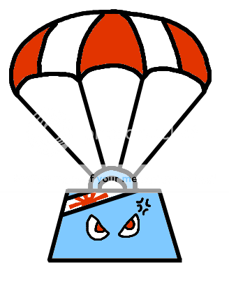
My name for it: Crushute
Flavortext: Crushute weigh 5 tons. They are born wearing Headbands and Parachutes. The Headbands allow them to lower their body weight at will. Coupled with the Parachute, this allows them to soar on updrafts. Normally, they attack by landing on top of things at mach speeds. However, if one of their items is taken, they go berserk and blast everything in sight with powerful energy beams from their eyes. Females are Gray in color.
Main Design:

Supporting Material:
My name for it: Crushute
Flavortext: Crushute weigh 5 tons. They are born wearing Headbands and Parachutes. The Headbands allow them to lower their body weight at will. Coupled with the Parachute, this allows them to soar on updrafts. Normally, they attack by landing on top of things at mach speeds. However, if one of their items is taken, they go berserk and blast everything in sight with powerful energy beams from their eyes. Females are Gray in color.
How does it get in the air in the first place?
Oh and Chomzloh, you've got my Vote, that looks sick :)
Oh and Chomzloh, you've got my Vote, that looks sick :)

Final Submission
Main Design:

Supporting Material:

I unfortunatly don't have time to redraw the supporting material, so it differs a little from the final design, but you get the idea.
Best of luck to everyone!
Main Design:

Supporting Material:

I unfortunatly don't have time to redraw the supporting material, so it differs a little from the final design, but you get the idea.
Best of luck to everyone!

Oh. My. God. Best design ever!!!!!!!!!!!!!!!http://www.smogon.com/forums/picture.php?albumid=414&pictureid=6913
Edit: I just saw the new pose, and I am in love! The green looks awesome, using as my avatar now.

OMG WTF IS THAT?!
I told you my art skills were quite *ahem* lacking.
http://i1238.photobucket.com/albums/ff493/EnergyStorm/CAP1.png
Supporting material because someone asked for the underside of my submission. It's using Aura Sphere by the way.
I told you my art skills were quite *ahem* lacking.
http://i1238.photobucket.com/albums/ff493/EnergyStorm/CAP1.png
Supporting material because someone asked for the underside of my submission. It's using Aura Sphere by the way.

Final Submission
Main Design:
Supporting Material:
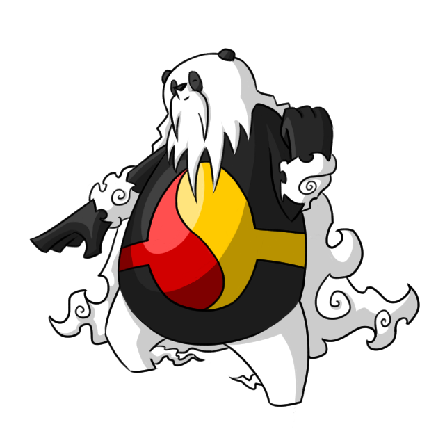
This Pokemon is based on a martial arts grandmaster and has a grandfatherly personality to match. Its center section is styled after a Yin-Yang belt and symbolizes balance. Its strategy for dispatching opponents is similar to Judo which uses the momentum of ones opponent to gain the upper hand in combat. However, this panda can also be intimidating as all teachers can be:http://i782.photobucket.com/albums/yy101/SentretLover/bamboomblastPNG.png?t=1300562401
Pandamon would inhabit cloud forests and tall mountains. These pokemon are known to float through the air suspended only by what appears to be a cloud-like mane of hair and the clouds gathered around their wrists and trailing off their feet. Throughout the year, the color of this pokemon's midriff changes with the season: http://i782.photobucket.com/albums/yy101/SentretLover/YinYangSeasonsPNG.png?t=1300562690
An example of spring coloration:http://i782.photobucket.com/albums/yy101/SentretLover/BamboomYinYanggreenPNG-2.png?t=1300562846
http://i782.photobucket.com/albums/yy101/SentretLover/bamboomSketchesPNG.png?t=1300562431
Red/Yellow vs Green/White:
Now see, let me explain my reasoning on the chosen final submission color scheme. This was a very tough decision to make but I am confident in my choice. First, I looked at the two side by side and thought, "How am I to know that this is a fighting pokemon without knowing any of its backstory? Well, assuming that I don't know its backstory, I would first guess that it's flying because of the clouds. Next, I would guess it's green so that must mean it's grass! Well wait, It's a large round mammal, it could be normal too. Goodness knows we don't need another normal/flying pokemon." So I decided that the red/yellow color scheme was better for the pokemon overall. I think it solidly puts it in the realm of fighting rather than grass. Also, the red and yellow coloring brings out the oriental origins of this pokemon!
Also
Main Design:

Supporting Material:
This Pokemon is based on a martial arts grandmaster and has a grandfatherly personality to match. Its center section is styled after a Yin-Yang belt and symbolizes balance. Its strategy for dispatching opponents is similar to Judo which uses the momentum of ones opponent to gain the upper hand in combat. However, this panda can also be intimidating as all teachers can be:http://i782.photobucket.com/albums/yy101/SentretLover/bamboomblastPNG.png?t=1300562401
Pandamon would inhabit cloud forests and tall mountains. These pokemon are known to float through the air suspended only by what appears to be a cloud-like mane of hair and the clouds gathered around their wrists and trailing off their feet. Throughout the year, the color of this pokemon's midriff changes with the season: http://i782.photobucket.com/albums/yy101/SentretLover/YinYangSeasonsPNG.png?t=1300562690
An example of spring coloration:http://i782.photobucket.com/albums/yy101/SentretLover/BamboomYinYanggreenPNG-2.png?t=1300562846
http://i782.photobucket.com/albums/yy101/SentretLover/bamboomSketchesPNG.png?t=1300562431
Red/Yellow vs Green/White:
Now see, let me explain my reasoning on the chosen final submission color scheme. This was a very tough decision to make but I am confident in my choice. First, I looked at the two side by side and thought, "How am I to know that this is a fighting pokemon without knowing any of its backstory? Well, assuming that I don't know its backstory, I would first guess that it's flying because of the clouds. Next, I would guess it's green so that must mean it's grass! Well wait, It's a large round mammal, it could be normal too. Goodness knows we don't need another normal/flying pokemon." So I decided that the red/yellow color scheme was better for the pokemon overall. I think it solidly puts it in the realm of fighting rather than grass. Also, the red and yellow coloring brings out the oriental origins of this pokemon!
Also
I'd like to say that you are pretty much all good. It's hard to see the fighting, but it's a Flying primary, so I think it's pretty much good as is.pkmn-taicho 321: I was hoping for some feedback before I made the design final. Especially around the colours, seeing as I wasn't sure what colour to make the design. :)
Final Entry
So yeah, this is now finished. I know it is hard to see the fighting type (thanks for helping mentioning that to me pkmn-taicho321) but I felt that I wanted to do a bird design, and try not to do a mash up of the two types that have been done so well by the other people on the forum. :S The element that I did try to use to resemble the fighting typing was the wing mask over the head. It is designed to (hopefully) resemble one of those masks that Zorro wears in the films. I kind of thought that a more graceful type of fighting was needed when coupled with a flying typing.
So anyway here is my Final Entry/Main Design

Image Size [640x640]
Maskird(I'm terrible at names :S)
These Pokemon originally didn't have the feather masks, but as they grow older, their faces start to become misshapen, and so they grow a desire to cover them up. They do this by stealing the feathers of other birds that they meet. This means that the feather masks on their faces aren't always orange, but can be almost any other colour, with other common varieties being grey and blue. However, very rarely is there more than one colour of feather in the masks, although this is only a matter of pride. The masks also resemble the fights that they have fought. The more fights that a bird has won, the more feathers that will make up the masks, and the bigger the masks become. Over time, the feather mask actually becomes physically attached to the face of the Pokemon, and is impossible to remove. They aren't particularly strong physical fighters, and their battles tend to be fought with gusts of wind formed by their wings slashing through the air, or a strong bundle of fighting energy (i.e. Aura Sphere) being blasted at the opponent. When using these specially based moves, the mask begins to glow.
Supporting Material:
Aura Sphere
3D Model (bit rubbish but hey-hoh :))
I hope you like it! :)


Final Submission
Main Design

Supporting Material
Uncompressed Main Design
Flight
Back View
Sitting Down
Original Concept
Main Design

Supporting Material
Uncompressed Main Design
Flight
Back View
Sitting Down
Original Concept


Final Submission
Welp, I finally found a color scheme with puppetmon I'm happy with. This was one of my quirkiest and charming CaP esigns yet I think and I must say, it was really fun!

Back Story:
There was a young girl in a little village. All of her friends were trainers, and her parents forbade her from having a pokemon of her own. To fill the void in her heart, and to "fit in", she constructed her own puppet, and believed it to be a pokemon. Showing off her creation to the village, she was met with only insults and badgering from the town, they even went so far as to use the puppet as training practice for their own pokemon.
Overcome by shame and heartbroken that she's been scorned by the village, the girl fell into terrible illness. With the last of her life leaving her, she clutched her pokemon and whispered to it "You will always be real to me.. And you were the best friend I've ever had..." After uttering her final sentence, she passed...
The doll, lying motionless in her arms, suddenly was carried by a great updraft and consumed by whirlwinds. The mystifying air brought movement and emotion to the toy, giving it new life. The young child may have perished moments sooner, but she began life anew as her precious doll, now living up to her dreams of it being a real Pokemon.
Determined more than ever to flaunt her status as a pokemon, she sets out doing various acts of mischief while commanding the same whirlwind force that gave her new life.
Yeah, kinda a more depressing retelling of the pinocchio legend, but I like it.
Supporting art:
Original draft
modified arms
Intimidate
I will update this final submission with more supporting art later on after work, if time allows. :) But as of now, I'm happy with him.

Final Submission
Main Design:

I didnt have time to make any supporting material. I hope my Mothai design does well, I really like how it came out!
Main Design:

I didnt have time to make any supporting material. I hope my Mothai design does well, I really like how it came out!

Here's some supporting material for my fighter kite, just to kind of get a feel for the design:
http://img135.imageshack.us/img135/6306/kitesupportingmaterial.png
and here's another support picture:
and locomotion, etc.
http://ticketmeister.deviantart.com/#/d3c0rc1
http://img135.imageshack.us/img135/6306/kitesupportingmaterial.png
and here's another support picture:
and locomotion, etc.
http://ticketmeister.deviantart.com/#/d3c0rc1


chomzloh, I would really really love the one on the right if the plates or scales or w/e on the head were still gold. Other than that it's incredible.


KoA, I have to say that your design is amazing. I never saw it until now and that backstory, man, pretty original to me. I gotta say though, my favorite is your original draft, but the current version is still terrific. I like how just by looking at it, I can somewhat see it reflecting the concept's stat spread (though you didn't base your design off that obviously).
I find it kind of amusing how I can completely change art styles in a few hours.
Here's yet another pose for the Flying Fail Whale. I don't know how you guys interpret Intimidate, but if I saw that thing circling above me, I'd run to the nearest bomb shelter and stay in there for a week.

http://i1238.photobucket.com/albums/ff493/EnergyStorm/Intimidate.png
^I couldn't help drawing that.
Edit: Doing this doesn't break the 640x640 pixel rule, does it? Thanks!


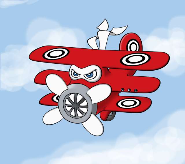
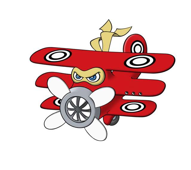
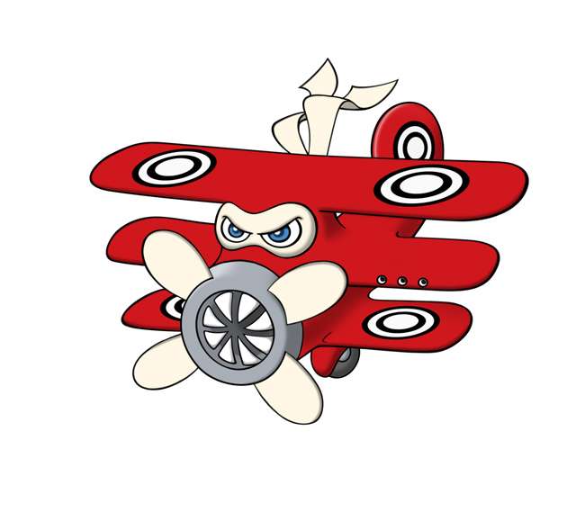
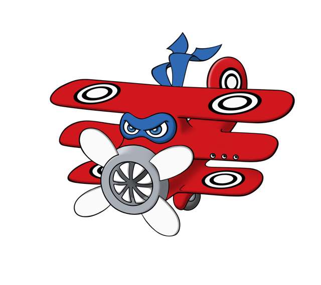
I wanted to post some various color tests I did with my fighter plane design. I realize some people aren't crazy about the white accents I am using on the pic. I happen to really like the white, but I did try out a variety of other colors. I thought all the other colors looked out of place, or just didn't fit with the "Red Baron" theme (the Red Baron's plane was red and white). So, here's a few test images I created along the way to play around with colors.
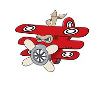
I wanted to show the current red and white color scheme placed on a colorful background. I think the white accents may look a bit odd on the standard CAP submission background, which must be pure white per the CAP art submission rules. But, ingame sprites are shown against battle backgrounds with colors, and white-colored pokemon look pretty cool ingame IMO. So, here's the fighter plane flying amongst the clouds of the Unova sky:
Here are several alternate accent colors I messed around with (click thumbnails for the full pic):
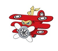

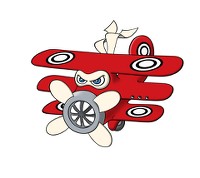
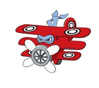
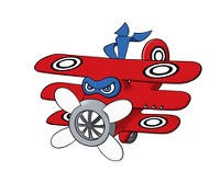
At that point, I stopped trying to find colors that worked, because I really felt they all looked "off" for whatever reason. So, I went with the white. It's clean, crisp, and is reminiscent of the colors of a basic Pokeball, which is kinda the de facto ingame logo for the game. If, after looking at the colors above, and considering the theme I am pursuing here, you think another color would work better -- I'm all ears.
Lastly, I thought I'd throw in this little color tidbit pic. It's the cheeky coloring I would use for the shiny of this pokemon. I call it the "Newsreel Shiny".
(click for the full size picture)
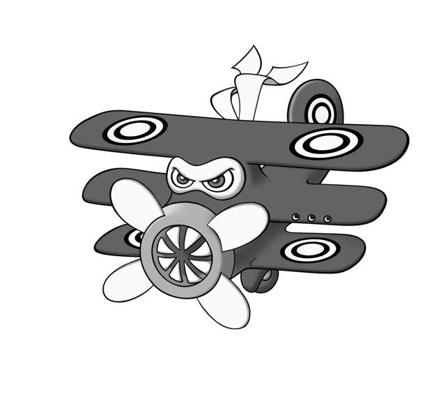
It's pure grayscale, meant to evoke the imagery of old-timey black and white photographs and newsreels. Since this pokemon is based on a WW1 ace fighter pilot and classic fighter planes, I think it would be cool if the shiny played on that. I know Nintendo doesn't do that sort of thing, but this is CAP, so why not have fun with it?
I wanted to show the current red and white color scheme placed on a colorful background. I think the white accents may look a bit odd on the standard CAP submission background, which must be pure white per the CAP art submission rules. But, ingame sprites are shown against battle backgrounds with colors, and white-colored pokemon look pretty cool ingame IMO. So, here's the fighter plane flying amongst the clouds of the Unova sky:

Here are several alternate accent colors I messed around with (click thumbnails for the full pic):


At that point, I stopped trying to find colors that worked, because I really felt they all looked "off" for whatever reason. So, I went with the white. It's clean, crisp, and is reminiscent of the colors of a basic Pokeball, which is kinda the de facto ingame logo for the game. If, after looking at the colors above, and considering the theme I am pursuing here, you think another color would work better -- I'm all ears.
Lastly, I thought I'd throw in this little color tidbit pic. It's the cheeky coloring I would use for the shiny of this pokemon. I call it the "Newsreel Shiny".
(click for the full size picture)

It's pure grayscale, meant to evoke the imagery of old-timey black and white photographs and newsreels. Since this pokemon is based on a WW1 ace fighter pilot and classic fighter planes, I think it would be cool if the shiny played on that. I know Nintendo doesn't do that sort of thing, but this is CAP, so why not have fun with it?
I really love your design energy, but with the smoke and coloring, it feels almost fire flying instead.
- Status
- Not open for further replies.