He needs pupils with a -_- look. But otherwise thats great.

-
Welcome to Smeargle's Studio! Please be sure to review the studio rules. Feel also free to check out our hub to learn more about this place!Welcome to Smogon! Take a moment to read the Introduction to Smogon for a run-down on everything Smogon, and make sure you take some time to read the global rules.You are using an out of date browser. It may not display this or other websites correctly.
You should upgrade or use an alternative browser.Smeargle's Studio General Thread: Spriting and Banners go here!
- Thread starter Alchemator
- Start date
- Status
- Not open for further replies.
hmmm yeah. but my second sprite just looks incomplete to me.
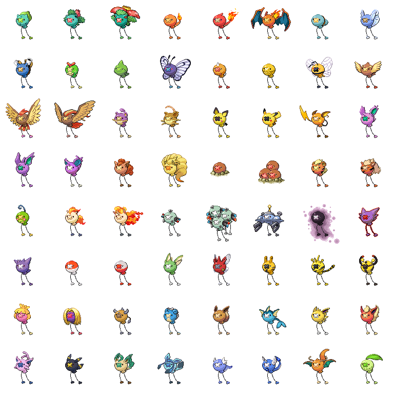
EDIT: can anyone figure out which poke i got the gyara's colours from?the one who gets it right gets a COOKIE!!
here's the pic again

ALSO here is a Crobat recolour

A heracross.

the hera loooks wierd i know. i think i need a lighter colour for the shadows
C+c PLEASE!
please C+c This.probs being impatient but W/E.i dont want it to get ignored..hmmm yeah. but my second sprite just looks incomplete to me.
EDIT: can anyone figure out which poke i got the gyara's colours from?the one who gets it right gets a COOKIE!!
here's the pic again
ALSO here is a Crobat recolour
A heracross.
the hera loooks wierd i know. i think i need a lighter colour for the shadows
C+c PLEASE!
also here is a fully scratched robowoman. its a WIP.

so any advice to finish of the lines well?and get to colouring?done in CS5

A FURRET!!!!!!!!!!hmmm yeah. but my second sprite just looks incomplete to me.
EDIT: can anyone figure out which poke i got the gyara's colours from?the one who gets it right gets a COOKIE!!
here's the pic again
ALSO here is a Crobat recolour
A heracross.
the hera loooks wierd i know. i think i need a lighter colour for the shadows
C+c PLEASE!
man, thats a hard challenge, but i'm going to say jolteon.
also the heracross is just awesome! the like, third bug-steel type.shiney gengar YOUR RIGHT! baking your cookies!!also how is my FIRST EVER EVER EVER incomplete scratch?that robot girl.probably shit i know. max scratching i do is a hand or a tail.an, enraged rampardos. also, i find it IMPOSSIBLE to recolor celebi, whats up with that guy?

and here's my made up desert lizard pokemon,

pokemon used,
Rhyperior: mouth
Scizor: color
slowpoke: tail
arbok: tail
tyranitar: feet
swampert: fin
i'll post his learnset somewhere else, so keep an eye out.
EDIT: nice scratch, i've never done one, i should tryits the first full scratch i ever did lol.its not all that hard tbh.but then...mine's not all that good.in fact its NOT good.celebi's OK to recolour. he has enough colours and shit. if your having a problem just keep a mew/vixtini sprite or something next to it, and refer.its the first full scratch i ever did lol.its not all that hard tbh.but then...mine's not all that good.in fact its NOT good.celebi's OK to recolour. he has enough colours and shit. if your having a problem just keep a mew/vixtini sprite or something next to it, and refer.
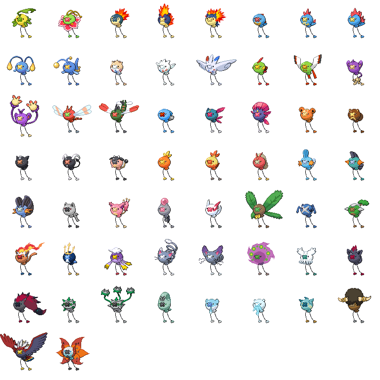
ok, i'll try that. still loving that metalic heracrossK, just a quick post with my new 'loons since I'm too depressed to continue with any "serious" art. Enjoy, etc.


I want a empoleeloon..... and an inferloon....That lizard thing is so cool. There is one problem, though: The places where all the parts connects looks... WEIRD, I guess. I don't know how to describe it, or how to make it better, though... Maybe ask a better spriter, lol. I think it has something to do with the shading...
hmm... i don't see what you mean, zoomed in it looked excellent.
there is a small spec under the back part of the fin, making it look bad, i didn't notice anything else.
try looking at it diferently, its a digging desert iguana, that builds sand on its skin, boosting its defense and endurance. the fin and the legs are the only connecting spots, the tail is covered by sand back there, and the mouth is basically part of the body. and by better spriter you mean you? lol, i've been doing this for a while, just haven't been uploading them.
if you think you could make a better default sprite for this thing go ahead, i made up the pokemon before the sprite, so basically the sprite is maching the moveset/concept instead of the other way around.
and, without further ado, Cleanse Order/super heal order

EDIT: whoops, forgot about this,
 LOL.hudson bees.LOLOLOL.
that gastomb is not the best tbh.you need to enlarge the halo a bit more toward the tomb.the pose too looks rather awkward. if your up for some scratching then try ti repose it,or just copy flip/ rescratch the tomb.BTW your monster lizard needs some fixing, the shadings of tje different parts dont match.the fin should NOT be illuminated that much.quite a few parts have the light source confusion problem.hmm... i don't see what you mean, zoomed in it looked excellent.
there is a small spec under the back part of the fin, making it look bad, i didn't notice anything else.
try looking at it diferently, its a digging desert iguana, that builds sand on its skin, boosting its defense and endurance. the fin and the legs are the only connecting spots, the tail is covered by sand back there, and the mouth is basically part of the body. and by better spriter you mean you? lol, i've been doing this for a while, just haven't been uploading them.
if you think you could make a better default sprite for this thing go ahead, i made up the pokemon before the sprite, so basically the sprite is maching the moveset/concept instead of the other way around.
He's saying it's a good concept but poor execution, and he's pretty much spot on. He wasn't trying to imply he's some sort of spriting expert either, he was talking about other people. The snarkiness really isn't necessary unless you mistakenly put up your sprites on a public forum instead of a forum whose only population is you. Basically there are problems with both the shading and the way you've connected all the pieces, along with quite a few general cleanup issues.
Shading: There's none on the body, and that's the main problem in the piece. Basically it makes the whole thing look kind of sloppy, like the fin/head/tail and legs are connected with a flat piece of paper or something. The legs are fine, ditto with the shading on the tail, but the head and fin also have problems.
You've removed too many bits of rhyperiors head, so now it sort of looks more like a large mouth than a head, not least because there aren't any visible eyes. I'm assuming that black dot on the head you can see when you zoom in is meant to be the eye, but what a picture looks like zoomed in is irrelevant because it's meant to be seen at its regular size.
The fin, on the other hand, is shaded from the wrong angle, for the most part. The light source for pokemon sprites is always at the top left, which wouldn't result in the kind of flat shading you have.
Connections: This is mostly just a problem with the head and fin. Basically, even if you were intending that the pokemon has no eyes, there's no neck or anything defining the head from the body. You haven't completely removed the jaw parts, so I'm assuming it's not just meant to be a non-closing mouth attached to the body... but if you're going to have a closing jaw, it needs some more definition/seperation than you have.
The fin just has the issue of not having any definiton of where it begins or where it connects to the paper-like body. Assuming you wanted it to look vaguely similar to a dimetrodon (which I'm sure was the inspiration for it), there should be a visible difference between the thin sail and the round/stocky body.
Clean up: The head has a lot of random bits and pieces that don't really add anything to the picture that should be removed. That random black dot, the barely visible remnants of what I think is rhyperior's eye, and that black line on the top of the head should be the same colour of black as the rest of the picture. I think you used 0/0/0 by accident, the other black is 16/16/16 and noticably greyer. Also there's what I think would be a cheek on the head that doesn't go with the shading, I'd remove it or tidy up the highlights to its right.
The fin is all over the place, lots of random horizontal lines for no obvious reason. I'm guessing the fin is supposed to look pizza like, with all the lines roughly coming together around the middle, but there are random lines jotting out to the sides and breaking the look off. There's one in the middle of the fin and also one to the right of that. The shading on the bottom right part of the fin is just distracting, it doesn't seem to belong there... and there's another one of those 0/0/0 black lines there.
Last off (I think), the tail has a few pinkish/purple outlines that probably should've been coloured over, and the sand on the end of the tail should probably be removed, since it just looks like it's floating there. I don't think the tail could hold sand in place in that position. I did my own version of the fakemon to show you what I think it should look more like in terms of shading etc. It was pretty quickly thrown together so it's not the best (I'm pretty sure the shading on the sail is fucked), but meh.

Anyway, that's what I think. I'm normally nicer about my C&C but you were being a bit douchey so you get my standard mode of criticism. Enjoy~
@abhi: The recolours look good, though I agree on the heracross, that grey does seem a bit dark. The furret probably needs slightly darker outlines, as well.
As for the scratch... I'm pretty awful at scratching so I can't help a lot, but I think the main problem is that she's facing us front on and it looks a bit... artificial? Probably the wrong word to use for a robot, but meh. I'd turn her a little so she's facing slightly left or right. Also, the diamonds on the body look a bit unusual, along with the arms. I guess they just look too much like random shapes than part of a creature, if that makes sense? It's kinda hard to describe since it is meant to be a robot and therefore pretty angular, but I guess it's hard to tell exactly how they're going to connect parts of the body. I'd recommend putting them at a different angle so they're not completely looking like 2d shapes. On a less critical note, though, the bottom of the body seems to be shaping up nicely.
@Romeert: Looking good, though the white highlighting seems a bit distracting, especially on the tail.
C&C ftl. Finally getting to the shit I wanted to post, here are more 'loons! I'll need some help choosing between these braviarys. I think they both look kind of fucked (probably going to need to scratch that left wing), but meh. Opinions?


Edit: Also taking 'loon requests.Cheers, Firesong! Though I do think I was being kinda douchey, it wasn't something I was looking to avoid like I do with most of my other C&C, since he was pretty rude with his response earlier (imo). Not that he has to take anyones advice, but it just oozed arrogance... which is generally a bad place to start. Also, I'm not really going through serious RL issues, just being emo mostly, lol. I'm not cut out for dealing with religious-themed drama. I appreciate the sentiment, though!there's just too much going on in the second one.BRAAAAIIIIIIIIIN OVEEEEEEEEERLOOOOOOOAD. but no seriously,there IS too much going on. though considering what you set yourself, its very well executed.that toucan looks hilarious.perhaps a bit more contrast on the body?just raise all the parameters a notch or so.for some areas.its hard to distinguish at the moment. had to clean up and remove a lot of posts on this page
please people be civil to each other@elcheeso: No way, Artifloono is totally better. And more Gen 4 Pokes? If you're still taking requests, how 'bout Spirifloon and Abomafloon? Oh, and for a non Gen 4, I totally wanna see a Jirafloon. And you really should figure out what pokemon I'm requesting.
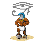
On an unrelated note, for those who stalk the WSC, you know a mythology theme was suggested for the future. Bored, I decided to take on this challenge, ripping something from Percy Jackson on the way. Thus I present to you...

The ever popular (not really)The Battle of the Labyrinth monster: Kelli the empousai. I went with a red dress instead of a cheerleader's outfit because... it's beyond me actually. It just looked a lot better. That right leg (our left) is really bothering me, though. It's supposed to be like bronze, but right now I'm kinda getting a "clay" vibe. Suggestions?
FYI: an empousai is a servant of Hectate, where vampires originated from. Chalk white with fangs (that I could figure out how to do), they have a donkey's hoof on one leg and the other leg is made of bronze. And hair that's on fire.- Status
- Not open for further replies.