-
Check out the relaunch of our general collection, with classic designs and new ones by our very own Pissog!
-
Welcome to Smeargle's Studio! Please be sure to review the studio rules. Feel also free to check out our hub to learn more about this place!Welcome to Smogon! Take a moment to read the Introduction to Smogon for a run-down on everything Smogon, and make sure you take some time to read the global rules.You are using an out of date browser. It may not display this or other websites correctly.
You should upgrade or use an alternative browser.nj art
- Thread starter Nastyjungle
- Start date
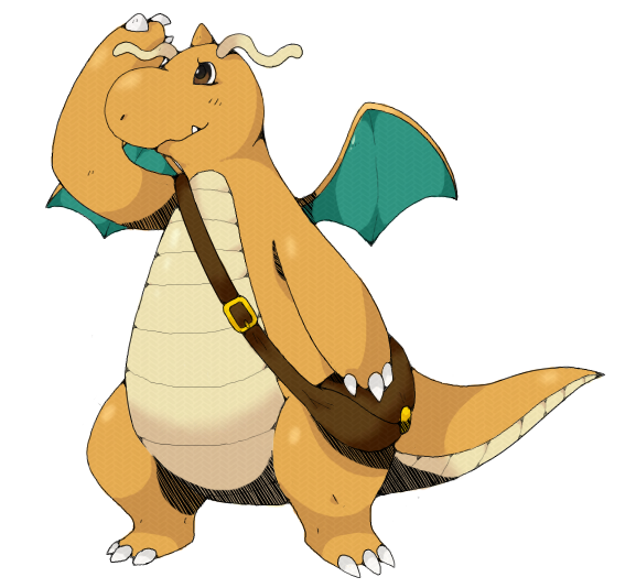
thanks a heap Nasty =D hes adorable <3for .Rain.

 You cease to amaze me Nasty, the best part about your art is that there are so many different styles! I don't know which one to expect when I check your thread for new art. And is there anything I can call you besides Nasty? It sounds nasty :p
Hehe, Nasty is fine, I'm pretty used to being called it.
And thanks a bunch!
Oh, and since I've gotten a few questions or comments regarding how I do things, here's a poor man's tutorial that I threw together for you guys. Hope you find it helpful/informing.
Tutorial
Step 1: Base Sketch
Step 2: Sketch
Step 3: Lineart


 Step 4: Base Colors
Step 5: Shadows and highlights
 Step 6: Final touches


Phew! Hope it helped/shed a little light on how I do things!Nice tutorial. I don't have photoshop, so I found it interesting.
The Crimgan is great! I don't like its normal colors that much, but the shiny colors are better; they make it seem Grass/Dragon, which I like very much. Leaf wings and orange thorns. And then there's Bachuru, of course ^_^This would have been so useful when I still had a working tablet/iScribble (even though that only has 3 layers :B).
Also, heck yeah, Rhapsody. Has my request been lost in the mail? I was about to say again, but last time you were working on it so... :D
There's no particular rush, I was just curious.
The way you incorporate texture is very interesting, and now I know how you get your lines so smooth! Thanks for posting that tutorial :)
Has my request been lost in the mail? I was about to say again, but last time you were working on it so... :D
There's no particular rush, I was just curious.
The way you incorporate texture is very interesting, and now I know how you get your lines so smooth! Thanks for posting that tutorial :)
Yes it has definitely been lost, I don't recall a request put in by you.
Go ahead and repost and I'll get on it. for stellar
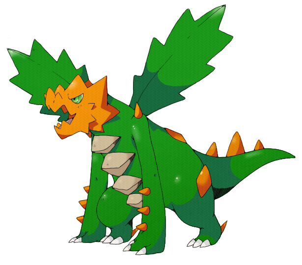
lol shiny kurimugan looks like a christmas tree :Pbaby. Electric. SPIDDDDAAARR~.
Your style is so cute! I love your regular stuff, too!
Will do ;)
Don't Smogon while drunk, it only ends badly.
lineart for Kevin Garrett's burungeru
color coming soon

 bossungeruLooks awesome so far, can't wait for it to be finished as usual!
Kevin Garrett's burungeru
bossungeruLooks awesome so far, can't wait for it to be finished as usual!
Kevin Garrett's burungeru

 That is so cool. Thanks.Dammit since you posted the tutorial all I can see is tire tracks...
awesome stuff though, I love the Spider.
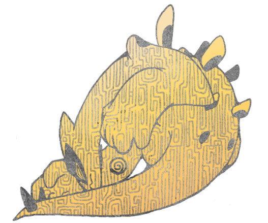
part of a wip
i prefer ho-oh but i drew lugia first anyways
 whoooooooa.
that texture reminds me of unown or something and it looks so pretty asdfghskja
If Ho-Oh is better then I'm gonna explode with glee soon.
yeah i pretty much texture raped this one
i didn't even actually draw with the real brush, just the texture, i feel so cheap
Edit: Oh and also, I will mostly be working to finish all of my smog art before I finish any more requests. Thanks for the patience.