
-
Check out the relaunch of our general collection, with classic designs and new ones by our very own Pissog!
-
The moderators of this forum can be found in the CAP forum staff directory.
-
Welcome to Smogon! Take a moment to read the Introduction to Smogon for a run-down on everything Smogon, and make sure you take some time to read the global rules.
You are using an out of date browser. It may not display this or other websites correctly.
You should upgrade or use an alternative browser.
You should upgrade or use an alternative browser.
CAP 12 CAP 1 - Art Submissions
- Thread starter reachzero
- Start date
- Status
- Not open for further replies.


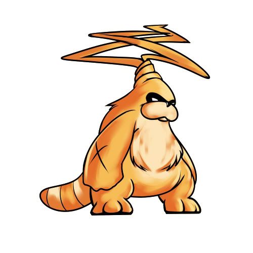


Yilx, I think that beaver looks pretty badass. I would make the ear-propellers a little bit larger though, and maybe add a little more color.

Yeah perhaps a revised color scheme, and maybe a bit more emphasis on the "propellers" (maybe showing it lifting in the air?) would help it out some. But it's a good design altogether.
Welp, I am throwing another design in the ring. This came in a sudden burst of inspiration due to someone saying something about incorporating a tornado or whirlwind into the design. So given that, I made me an Arabian Bandit Whirlwind Demon! :D
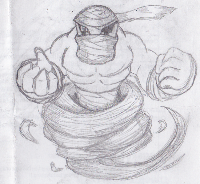
Yeah, It looks strikingingly Genie-ish, but that comes with the territory of the lower body whirlwind lol. I'm pleased with this personally, though I'm stuck between either going for this or the Gargoyle now..
(Also ignore the one eye thing, I just messed up the other one and it'll be fixed.)
Welp, I am throwing another design in the ring. This came in a sudden burst of inspiration due to someone saying something about incorporating a tornado or whirlwind into the design. So given that, I made me an Arabian Bandit Whirlwind Demon! :D
Yeah, It looks strikingingly Genie-ish, but that comes with the territory of the lower body whirlwind lol. I'm pleased with this personally, though I'm stuck between either going for this or the Gargoyle now..
(Also ignore the one eye thing, I just messed up the other one and it'll be fixed.)
KoA: If you ask me, I think it looks cooler as a one-eyed badass cyclone beast...!
Here's my third draft for valkyiremon. Looks more gender neutral now, too...
[Don't quote images]
This is my favourite one because it can match perfectly with the Stats that it looks like it will have: shows some Speed while not super fast, good physical bulk, looks like it has good SpA...

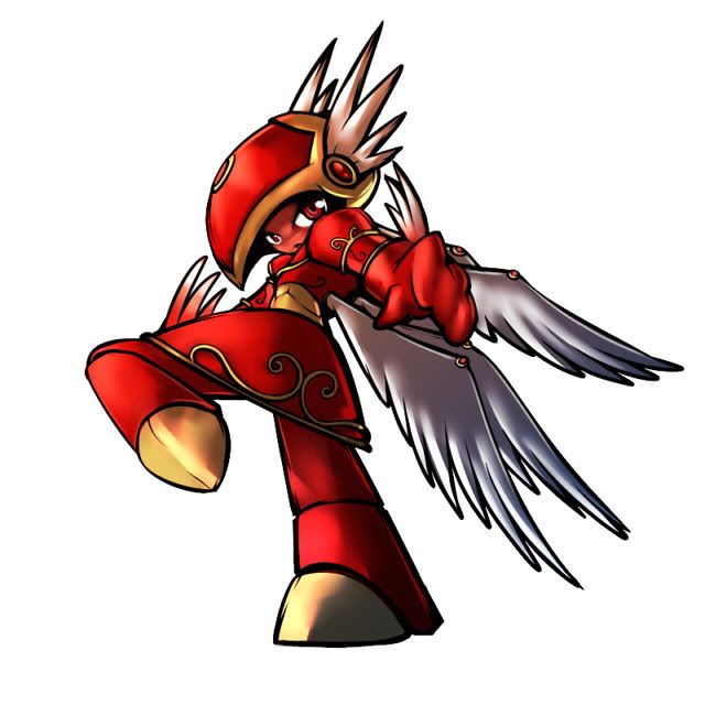
Ylix: One of the problems I have with yours is it looks very Steel/Flying. I can't help but think of it as a character from a Megaman X game.

Here's the latest draft of the flying panda!
Notable changes:
Feet without clouds
Hair, beard, and Fu man Shu mustache
Back to the black coloring. I like it better too.
No bamboo.
Yin-Yang belly design.
It's based on a martial arts sensei! I feel it fits both typings well because pandas live in cloud forests and are Asian as are senseis. The digital one is the newest edition just so you know. Do you like it with or without the mouth? Thank you guys for all the comments!
NastyJungle Yours is amazing! It looks like a gargoyle to me which is awesome.
Fatecrashers You son of a mongoose, that UFO design is beyond genius! My favorite so far in the thread!
Yilx I can't figure out quite what's going on with the legs in the valkarie one :P I like it though!

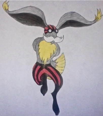
New version of the parachute rabbit idea.
Now it's based on old daredevils or circus performers from the 19th century or so, you can tell because of the mustache :)
Sorry for the low quality photo guys and gals.
-Sentret Im liking the more flying type appearance.
-Yilx I love the idea of the valkyrie but honestly the pose confuses me as well.
Keep up the awesomeness everyone!

Sentret I'm loving that Panda more and more. The slight changes you have made are great, and it's overall a unique and brilliant concept. The yin-yang belly design is a neat touch, and out of the mouth and no mouth, I personally prefer with the mouth. "Pinpang" is just a great concept and you've executed it amazingly!


Fleshing out

WIP colour scheme for now, this is the traditional colour scheme for Ziz (from what I have seen), so I was just using that until I found something better. I'll probably use less bright colours eventually.
Since pencil and traditional media aren't an option for me any more, I did this one purely on MSPaint. I tried to make the pose more dynamic. The biggest problem at the moment, I think, is that it looks quite a bit like Suicune. Oh, and I also hate drawing quadrupeds, so maybe I'll put it on its hind legs at some point.
Comments?
Oh and @Yilx: Absolutely adore the Valkyrie. Not sure what it is about it, but I just like it for some reason. But yeah, the leg pose is a bit odd.

http://i52.tinypic.com/sdirh2.png
first off, i say valkyrie, 3 other people do it without even telling me what's wrong with mine? what? sorry if that seemed troll-ish, i just want feedback, i don't even care if it's negative.
okay, some new sketches. with a redesign of my old entry, less humanoid if that was the deal.
first off, i say valkyrie, 3 other people do it without even telling me what's wrong with mine? what? sorry if that seemed troll-ish, i just want feedback, i don't even care if it's negative.
okay, some new sketches. with a redesign of my old entry, less humanoid if that was the deal.

http://i782.photobucket.com/albums/yy101/SentretLover/bamboomflyingPNG1.png?t=1299861779
More flying panda artwork, this time actually flying. Do you guys prefer the brown to the black of the previous version? Feed backs?!
Awesome concept, it looks really fun! I personally prefer the brown version. The green on the belly mixes better with it. But black is nice too, although the green yin yang looks kinda forced. I hope you can make your final submission in a flying pose too.
gave mine some color and a more interesting pose
http://fc02.deviantart.net/fs70/f/2011/070/e/6/cap_supporting_art_by_nastyjungle-d3bebs5.png
I adore this concept! As it stands, many of the stat pool submission gear towards average speed and high HP, so this would look great on that.
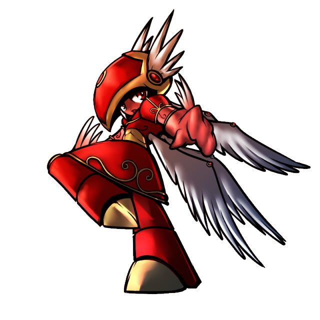
http://img.photobucket.com/albums/v407/Yilx/rasser.jpg
I much prefer this guy and love the Mario-reference ;) It might be nice to see how it flies, though.
Your Valkyrie, while lovely, is going to remain human-like looking unless you change her entire frame. Humanshaped pokémon often still have certain awkward features about their body-structure, like hitmonchan, or are more geared towards anthro's, like lucario, distracting from similarities to humans. Even the machop-line has its ways to stay away. To reach these sorta effects, I feel you need a major overhaul, which I don't think is worth the effort given you already have another awesome concept to work with.


I don't think there's anything wrong with Yilx's design. One of the things I like most about CAP is that Gamefreak isn't creative enough to come up with some of the stuff we do, and as such, I don't see much reason to try and emulate their palette. I'm fine with his Pokemon looking somewhat human as long as the design works on a fundamental level.
I will agree with the criticisms regarding the pose, though, it's not quite definitive. Give us a clear picture of what this CAP's design is about: fun, happy, intimidating, serious, mysterious? I can't tell what's going on by looking at the one you have now.
I will agree with the criticisms regarding the pose, though, it's not quite definitive. Give us a clear picture of what this CAP's design is about: fun, happy, intimidating, serious, mysterious? I can't tell what's going on by looking at the one you have now.

Toying with a different Robin Hood-inspired design:

Struck me afterwards there are no attacks that really involve or could even imply arrows. Oh well.
Yilx: HNNNNNNNG DAT VALKYRIE. All of my money. Take it.
Struck me afterwards there are no attacks that really involve or could even imply arrows. Oh well.
Yilx: HNNNNNNNG DAT VALKYRIE. All of my money. Take it.

So many amazing submissions. It's going to take a million polls to pick a winner from this lot.
My favorite is hands-down SoIheardyoulikeSentret's kung fu panda. It matches the stat limits perfectly and fits the typing extremely well now that you've increased the amount of clouds. I personally think you should keep the bamboo on the head. The color and detail really adds to the piece. I don't think it creates any confusion as to it being a Grass type. I like the most current design but I think you should add back the bamboo and maybe bring back the clouds around the ankles. I picture him sitting in a meditation like pose floating in a cloud. Also want to add that I loved the flying pose (he looks so chill) and the yin yang pattern belt.
Other designs I really liked were Cartoons!, Elagune, and Calad. I feel like they seem more like a fast physical based mon, though. Also, Nastyjungle's thing is amazing. I love your art style.
@Ylix: Your Valkyrie is insanely good but I think it's a little too detailed to look like it's a natural organism. It looks human because it looks like it's wearing armor with artistic design. Your propeller ear guy looks like it could be really good with some work though.
This is something living creatures have to deal with every day! A lion has to use it's jaws to bring down gazelle. If the gazelle lands a good kick on it's jaw that lion could die because with a broken jaw it can't catch any food! Every part of your body is delicate and needs protecting. I agree with you on designs that look like they're martial-artist plus wings, though. A mon wouldn't want that extra drag. I think Calad's design does a good job of having wings that don't look like they'd slow the mon down or be too fragile to fight with.
My favorite is hands-down SoIheardyoulikeSentret's kung fu panda. It matches the stat limits perfectly and fits the typing extremely well now that you've increased the amount of clouds. I personally think you should keep the bamboo on the head. The color and detail really adds to the piece. I don't think it creates any confusion as to it being a Grass type. I like the most current design but I think you should add back the bamboo and maybe bring back the clouds around the ankles. I picture him sitting in a meditation like pose floating in a cloud. Also want to add that I loved the flying pose (he looks so chill) and the yin yang pattern belt.
Other designs I really liked were Cartoons!, Elagune, and Calad. I feel like they seem more like a fast physical based mon, though. Also, Nastyjungle's thing is amazing. I love your art style.
@Ylix: Your Valkyrie is insanely good but I think it's a little too detailed to look like it's a natural organism. It looks human because it looks like it's wearing armor with artistic design. Your propeller ear guy looks like it could be really good with some work though.
Chou Toshio said:As someone who does a lot of martial arts I can't help but imagine it that way (Fighting-type is "Kakutou", or literally "Martial Arts" in Japanese). Thinking of martial arts, would you go into a fight with giant fluffy things stuck to your back to slow you down, drag, weigh you down and give the enemy plenty of things to grab?
Hell no.
As a Flying type, would you go into a fight using your precious and delicate wings as limbs you intend to do striking attacks with or block harsh enemy attacks with?
Hell no.
This is something living creatures have to deal with every day! A lion has to use it's jaws to bring down gazelle. If the gazelle lands a good kick on it's jaw that lion could die because with a broken jaw it can't catch any food! Every part of your body is delicate and needs protecting. I agree with you on designs that look like they're martial-artist plus wings, though. A mon wouldn't want that extra drag. I think Calad's design does a good job of having wings that don't look like they'd slow the mon down or be too fragile to fight with.
Alright here is a rough sketch of my design.
The type was chosen as flying / fighting so I did a little google search on "fighting bird" and got.. COCKFIGHTING.
So here it is.
It's supposed to be a Rooster, but I guess I kinda got some other bird added in and now I have this!
I tried to subtly tie some fighting elements into the over all design such as the stance of the 'mon but with the tail it's a drawn to resemble.. well you tell me if you can figure it out!
I'm still working on it, and I have a change or two I wanna make the the wings, such as making the ends of the feathers line up in a line instead of stepped like they are but yes here it is!
http://www.iaza.com/work/110313C/iaza15029380719100.jpg
[size rules]

This is my Pegsicorn. Half Pegasus half Unicorn. I'm too tired to go too in depth, but I thought the best think to do with this design was to keep the wing minimalistic. If you disagree I can certainly make them look a little more... wing-y
No, your design is just fine. I'm actually glad you took such a creative approach to this CAP and made a quadruped with minimal wing design instead of an obvious bird. I wouldn't even mind if it had no wings at all, as the cloud mane is a decent enough representation of its Flying attribute. Take your approach and run with it.


http://img.photobucket.com/albums/v407/Yilx/rasser.jpg
Maybe I should go with this one after all, but... I need to work on it more...
I think this thing is really awesome.
Anyway, the flying frog concept completed:


For me I got two main ideas for this new CAPmon.
The first one is kind of a more of a typical bird design. When I saw that the CAP would be based on momentum, I incorporated features that I thought would fit that. To me, momentum=speed=strong legs. For this guy, I wante to focus on the fact that it has very strong legs and would be focusing on powerful kick attacks to do damage. Although it is a bird and a flying-type, the emphasis is not at all on the wings. If anything, they are only used to have it hover while it bashes an opponents skull in with kicks. Also, it has RX-78 Gundam face.

For the second guy, I wanted to go for a more abstract idea. I thought, "Birds and wings are kind of overdone. What else can I do to convey flying." Then I remembered astro boy and was like "ROCKET BOOTS". Overall, this guy is supposed to give off the retro superhero mecha/robot/megazord/etc vibe, while at the same time, not seeming TOO mechanical. It possesses huge thrusters for flight and two arm cannons for offense. For now, the CAP stats tend to be very special-offensive and relatively weak physically, with the cannons being able to fulfill the aspect. There's not much you can do physically with giant cannons for hands short of bonking the enemy with it. Overall I'm liking this guy a little more.

Thoughts?
The first one is kind of a more of a typical bird design. When I saw that the CAP would be based on momentum, I incorporated features that I thought would fit that. To me, momentum=speed=strong legs. For this guy, I wante to focus on the fact that it has very strong legs and would be focusing on powerful kick attacks to do damage. Although it is a bird and a flying-type, the emphasis is not at all on the wings. If anything, they are only used to have it hover while it bashes an opponents skull in with kicks. Also, it has RX-78 Gundam face.
For the second guy, I wanted to go for a more abstract idea. I thought, "Birds and wings are kind of overdone. What else can I do to convey flying." Then I remembered astro boy and was like "ROCKET BOOTS". Overall, this guy is supposed to give off the retro superhero mecha/robot/megazord/etc vibe, while at the same time, not seeming TOO mechanical. It possesses huge thrusters for flight and two arm cannons for offense. For now, the CAP stats tend to be very special-offensive and relatively weak physically, with the cannons being able to fulfill the aspect. There's not much you can do physically with giant cannons for hands short of bonking the enemy with it. Overall I'm liking this guy a little more.
Thoughts?
That's a little better, actually. Any chance you can just make the color of mini-wings on the head and the arms consistent with the ones on the back? Like, make them all either red-tinted white or completely white. Asymmetry works in certain pieces, I understand, but I think this one needs its consistency.
I'm a bad artist, but oh well, here it is:

The thing about the design is his wings, they rotate a full 360 degrees and the edges can be folded into fists/hands, they also function as literal walls when need be, that, and I can't help but make a poke cute in some way.
I hope it's acceptable what with it being drawn on a paper with lines and all, his color is primarily white, so the drawing isn't too misleading from his coloring.
Also, this would've been a perfect time for cascavian to come around instead of during CAP6: http://www.smogon.com/cap/gallery/past/cap06 (the 4th place one)
I should make it nicer with color (or get rid of the lines I should say) and whatnot
also, biologically, the small stature and big wings allow it to be fast, the wings becoming hands/fists let it hit hard and whatnot, the small stature lets it hide behind it's own wings
- Status
- Not open for further replies.