CAP 14 CAP 3 - Art Submissions

Status
Not open for further replies.
I've been trying to take the squid in a different direction, and this is what I've come up so far.


The pokemon fills things like bottles and trash with a flammable gas, and launches it at opponents and prey to poison them or burn them.
 
hello all. I am a new user. I have been stalking CAP since the very first time, and now I decided to post.

Anyway, DJD's Hazmutt and Mos' lava cone snail grows on me. The two are my favorite so far.

I just have to say something with Hazmutt. I think the flame is off with the tail. It does not go well with the rest of the design in my opinion. Why not try putting it on another place, like the neck or paws? A fire-collar [thin one] is I think enough to convey the fire-typish feeling.

For mos, snail is awesome. :)
 
Final Submission

Final Submission


Description

This submission is based upon fire coral. It is aquatic without being a Water-type, similar to Stunfisk, and aligning it with the Dry Skin ability. I realise some people have worried that it doesn't look "Poison-type" enough, but it is based on fire coral: Fire coral IS poisonous, and my design goes a step further to include stinging tentacles and sludge cannons - I feel like the Poison bases are adequately covered. ^_^ This Pokemon has a firm, flexible shell over most of its body, extending into coral-like arms that can spit poison or shoot flames. It has venomous tentacles that it also uses to absorb its food, and it can pull these back into its body as depicted in Supp1 below. These tentacles are fragile, and can tear off, but regrow quickly. It has a special mechanism that allows it to emit flames underwater even at very high-pressure depths. If it does not have occasional contact with water it can dry out and in emergencies it can absorb moisture from the air, desiccating the nearby landscape in the process.

Supporting Art

Supp1 - Bulked up by retracted tentacles
Supp2 - Sludge Bomb on Luvdisc!
Supp3 - Flamethrower on Petilil! (slightly older design, but it's still exactly how this Pokemon would use Flamethrower)
Supp4 - Deep underwater with a Corsola and some Finneon
Supp5 - Brighter, more friendly Corsola scene
Supp6 - Preying upon a Mantyke
Supp7 - Base image for the Mantyke scene
Supp8 - Failed attempt at Sugimori-esque art
Supp9 - Eruption and Dry Skin
 

Quanyails

On sabbatical!
is a Top Artist Alumnusis a Community Leader Alumnusis a Community Contributor Alumnus
I was suggested to try a fiery mane on my snake, and I've conjured this up:

'twas reluctant to make this, as, well, I've drawn enough from the fiery snakes I know, and this just furthers one of those comparisons. :/ I wasn't sure how an entire loop would work around the oil snake, so I just had it coming from the back.

It'd be some attempt at Sugimori's style if it weren't for my two-pixel thick outlines. I don't have the patience (ironically) to do something more complicated.

Personally, I think the mane detracts from the sharpness of the head, and, unless I get a wave of positive comments, I'll discard it.

Comments:
  • Fatecrashers: The thing on top of the head now just looks placed there rather than with any specific meaning. Some more incorporation will make it less arbitrary. The design certainly looks cute and plays the two typings well, though. :)
  • YourFavoriteEgyptian: Weeell, I still see Fire/Grass and a bit of Pyroak in the overall design. The fire plates are a good idea, but the green gradient does say grass to me. Less plant-based poison, more combusted smoke?
  • nov: Luminescent. I think the head is quite a bit of the attention compared to the rather simple body. Anything you can add to make it more united?
  • Calad: On an artistic note, you've got nice lines and shading in that piece. :) The design looks like it's stumbling. It's nice nonetheless.
  • Pokescrub: Could that image be a little more clearer and more defined?
  • DougJustDoug: Hrm... Well, the tail fire should go. Of course, that leaves the question of how to improve your design. Orbiting electron-flames! Nah, that's just a whimsical thought. Maybe fireballs where the eyes would go or something, I dunno, if you don't want the entire top to be slightly simmering.
  • Doran Dragon: I see. I do think your explanation for Dry Skin is a bit, well, tangent, you've done a nice job bringing those colors together. I now wonder if the monotony'll be too 'normal' for pokemon. :/
  • chuckeroo777: Well, are you noticing these comments? Take some artistic skills into effect rather than counting entirely on the design.
  • Leethoof: Hrm... No, those vents still say that it's metallic to me. Maybe less rectangular angles, like Heatran and its round blobs?
  • CyzirVisheen: Huzzah for an update! You've got a great style and fitting pokemon for the typing. Very stylized, indeed, and very pokemon-esque. Don't worry if it's standard in colors; it's fine to me.
  • Cretacerus: Not much of a change, so not much of a comment.
  • noobiess: AHEM. But yeah, interesting colors, though a standard (not that that's bad) pattern. I ignored having a hood on my snake because of Arbok's presence, so just be aware of that in your design.
  • BlueConcept: Well, I liked the lava lamp, though the squid is still good for displaying both types! That purplish color does wonders for your overall theme.
  • tea_and_blues: Still too eldritch for me, unfortunately.
 
DOUGJUSTDOGJUSTDOUG

i had an idea for your fire problems!

Why not go with some reference to Ameterasu from Ookami? like, fire prayer beads or a fire shield thingie?

@KoA: I love your design, its cool, its cute, and it certainly works. Though i gotta say, i miss your original sludge golem :/
 

KoA

Sorry, I thought anteaters were real
is an Artist
Tidied up the lines and finalized slugfrog's design and colors. He cleans up nicely, eh?


We also got some more concept art here. I remembered someone early on asking how the slugfrog swam with its oil-filled belly. Well frankly, the fluid inside is a large part of its ability to swim! By mixing it in different ways, it can alter its buoancy at will, allowing for adept swimming. All in all though, he loves nothing more than to rest idly in the water on his back!


Some other pieces of art here show him in different poses, as also requested by others:

Back angle of the slugfrog
How Fire attacks are carried out
Using its nostrils, this pokemon can execute a variety of smoke-themed attacks

Not only do slugfrogs enjoy roaming the land, they also enjoy friends!


This was more or less a shoutout to my favorite designs in this thread. I hope the respective artists don't mind my usage of their 'mons. :c


This may be about the last of the work Ipump into slugfrog, I'm quite content with the design as a whole, despite it being rather simplistic (something I never do!) I'll hear what the community thinks and if it'sall good, I'll submit it for real.


Also Doug, I'm not feeling the flame either :C I feel as if it's just...there on the tail. Perhaps try the flames either along the back or make it into a fiery mane of sorts?
 
Doug, I really think your Hazmutt was perfect from its conception in this thread. I still believe a few poses of it breathing some fire (or somesuch) would sort things out a lot better than any additions.
 
DougJustDoug - I have to say, the design is already pretty good, but the lack of Fire-type signification is a little bothersome. The tacked on flame does have potential though. Have you tried making it a green fire? Also, have you experimented with making the bone structure more orange in tint?

KoA - I love the design, and it works perfectly with the typing, but I just can't help but feel like it just looks like something that would be RU. I'm not sure why. That's by no means an insult, it just means it might face a little bias in the voting imo.

Quanyalis - Holy crap, yes. Before I didn't take too much notice to your design, but the flame really helps to bring out the best of it for some reason. Aside from improving the artwork quality in general, I don't think you can do anything to the design to make it any better than it already is.

tea and blues - I really like the design, and the supplementary art is just breathtaking, but I can't help but feel like the Poison-typing isn't exhibited enough. It sooner makes me think that it's a Fire-Water type, which would be perfect if that's what we were going for. Maybe it's a little too late to say now due to it being your final submission, but if you decide to edit it more, I'd recommend pointier tentacles or something to help portray the Poison-typing just a little better.
 

Deck Knight

Blast Off At The Speed Of Light! That's Right!
is a Forum Moderator Alumnusis a Top CAP Contributor Alumnusis a Top Smogon Media Contributor Alumnus
I don't usually comment on art this late, but let me just say I love a lot of these designs. Slugfrog, the Axolotl, the oil snake, and the Fire Coral / Anemone designs (among others) are great.

DougJustDoug: Rather than a flaming tail, why not try a flaming collar? It enhances the dog imagery and you can make it more of a natural feature kind of like Typhlosion's mane or Emboar's beard. At the tail it looks a little tacked on, but if the flame were closer to the neck it could emphasize that part of the imagery rather than feeling too "extra." If pulled off correctly it can achieve a very powerful effect while being a fairly understated part of the design.
 
In reference to DougJustDoug's Hazmutt looking too much like Reunculus;

When I first saw Lapras I thought it was related to Gyarados. I also thought Onix should have been related to Geodude and Graveler over Golem. I am sure there are more instances where GF has implemented similar design concepts across separate evolutionary trees.

I think the Hazmutt design caries the idea of radiation easily while not appearing busy or chaotic. The green is the perfect color to convey this. I think by putting fire into the design you distract from the radioactiveness of the Mon and thus the whole concept.
 

LouisCyphre

heralds disaster.
is a Forum Moderatoris a Community Contributor


King of the Lava! I'd like to imagine CAP3 is avoiding the edges of the pool to keep off of Earth Power.

The name "Smallfryer" comes to mind with this, but that's probably not the best name.

Judging by the thread I should probably have some sort of Hazmutt fanart prepared soon. Hmm.
 
In KOA's combination post, going off of Doug's backstory, Hazmutt is slowly killing all of them with radiation. So apparently slugfrog is a masochist, and Hazmutt is basically pulling a Dr. Manhattan.
 

Bughouse

Like ships in the night, you're passing me by
is a Site Content Manageris a Forum Moderator Alumnusis a CAP Contributor Alumnusis a Tiering Contributor Alumnusis a Contributor Alumnus
LouisCyphre, I love your design in it's simplicity in conveying the concept of Fire and Poison. Yes a little water-type fishiness is unfortunately going to be implied no matter what, but it can be avoided somewhat. Remember that Stunfisk is another fish without Water typing.

I don't know if it can beat out the options that seem to be more popular, but I wish yours the best of luck.
 

Cretacerus

Survivor
is a Top Artist Alumnusis a Forum Moderator Alumnusis a Contributor Alumnusis a Top Smogon Media Contributor Alumnus
Reactions Contest Winner
I would like to see some newer designs from KenZomg's gas snake or Phazon's teapot-saurus, because those concepts really have potential!

Doug: Maybe you could try a glowing nuclear mushroom cloud instead of the flame, though it might be difficult to implement into the design. But looking at the flame on the tail in must inevitably think of some kind of explosion

DoranDragon: Great color composition! As for the design: i would make it look more cartoonish, for example by giving it a (slightly) brighter red and increasing the size of its paws

Leethoof: Giving it tentacles instead of the feet would increase the similarity to a kraken, while having the two longer arms (which act as chimneys) still go well with the physiology

Bugmaniacbob: cant help it but youre design reminds me of some rabbit-rat-animal (probably because of zangoose >_<). Giving it a visible neck could help it look more lizard-like
 
Howdy y'all! This is me first post on Smogon and I wanna throw my thoughts on some of the admissions that really stand out to me:

CyzirVisheen: I just adore your manticore ^.^ You had a well-thought out reasoning behind everything you did with it, it's design is simple and unique, and you can tell what it is based on while still not being just a copypasta fantasy monster. Your beastie truly resembles a Pokemon, showcases the two types well, and looks like something straight out of Game Freak. I applaud you, good sir.

Quanyails: If your snake wins, it sure would be refreshing to see a cool-looking snake in OU instead of hanging out with Arbok and Seviper down in NU. Honestly, I was skeptical about your idea at first but he's really grown on me, and I really like the oil-tail. If you'd like some advice though, I would lose the fiery mane, as it makes him look less sleek streamline. Not to mention that he looks intimidating enough without his head being on fire, but other then that great job! *Hearty thump on the back.*

Meddle: Your cauldron has come quite a ways. Personally, I feel that you should differentiate between the pot itself and the goop living inside. Just because Game Freak hasn't made two separate mons count as one guy doesn't mean that it's a bad idea, though I would agree on tweaking the monster inside it a bit. Other then that, it's a creative idea, and I tip my hat to you.

Mos-Quitoxe: Okay, your idea is awesome, just sayin'. I'm not sure if this is intentional, but I really like how his body looks like it's leaking out of the lamp-shell. He has a creative, simple design that showcases both types extremely well. Not only that, but he looks so silly! I would probably use him all the time out of the sheer adorableness he possesses. I'd offer you advice on how to improve it, but I find the design flawless. Good luck!

Azul: I really like your concept, I really do. Volcanoes and tube worms? Smurf yeah! Not only that, but he looks pretty awesome as well, now that you took out the lava pouring out from him. My one issue is that he looks like he showcases water and rock better then he does fire and poison...but that's just my opinion, and I hope to see this guy go places, I think he's got some potential.

Aragornbird: I want to talk about your gila monster, but first let me give a shout out to that camel. He is much to similar to camerupt for my taste, but I love what you did with the ears. *Squee* But back to business. A gila monster fits this CAP almost to a T. They are a striking red/orange,(Fire-typing) are one of only two venomous lizard species, (Poison-typing) they live in the desert (Dry Skin) and are oh-so pudgy, which would fit the roll of bulky-mon should it come to that. My problem is that there is nothing really...special about that design. It literally just looks like a gila monster standing on two legs and colored purple. I'd like to see you work more on the gila monster, as I think you were onto something.

Birkal: Okay, your design is hilarious, in the good way. He looks the the short wise old master from a cheesy kung fu movie, and the burning venom of a poison dart frog is perfect for this typing, a lot better then poison/fighting! (Glares at Toxicroak) I also really like his blowpipe staff, and would love to see him sipping tea with Medicham or Mienshao. Kudos to you, and your beautiful frog.

Yilx: Okay, your guy looks cool...really cool. As in, I worry that my computer will burst into flames due to the sheer level of badass that is currently occupying my screen. If it was just a contest to see who looked the coolest, he would have my vote many times over. Unfortunately, there are some things that I cannot overlook. His design just....doesn't look like a Pokemon to me. I don't see how a sun-god/ golem fits the poison-type, and the sludge body looks like it was added as an afterthought to fit poison, not to mention that it does not look like something that would have dry skin. It just looks to much like a Digimon for my taste. But maybe I'm being to harsh. Although it won't get my vote, I wouldn't be sad to see it win because lets face it; he looks awesome.

Calad: I'm going to be a bit blunt; great idea, flawless concept, but awkward design. He looks a bit too much like a sick Snorlax with a thermometer rammed up his pooper. Maybe if you make him less rotund? I like the idea for a sickmon, not to mention he fits the typing well, but when I see him I can't imagine anything but a sick Snorlax. Don't give up on this idea though, I think you were onto something.

DJD: It's hard to say anything bad about Hazzmutt, it really is. He just looks so damn cute and happy, and radiation fits the bill for poison/fire flawlessly. He even has a name! However, as mentioned before in this thread, he looks much to similar to Reuniclus for my liking. Personally, I would rather see that cigarette thing you posted earlier win, but I understand the sad truth that Game Freak would never touch such an idea.

Thorchild: This little ball of tentacled B'AWWWW defiantly gets a gold star from me. Take what I keep saying about clever designs and showcasing the type and apply it to your little guy. I'm pretty impressed that you decided to make him a cutemon, as I noticed most of the population on here prefers giant murder deathbeasts, so I think your design is refreshing, and I can totally see it fist-bumping other good cutemons like Jirachi and Blissey. Good luck!

Tea and Blues: A coral based Pokemon? That's awesome! (Corsola is not a Pokemon. It is a pink pile of poo disguised as a Pokemon.) I have heard tales of the painful sting of fire coral, and believe it is a beautiful representation of this CAP concept.
Neat design, and awesome concept....that'll do Tea, that'll do.

I also wanna applaud all of you art contributors this thread. All the designs are so cool, that it pains me to know that there can only be one winner. Good luck all of you, you did a wonderful job :)
 
Not only do slugfrogs enjoy roaming the land, they also enjoy friends!

Yeah . . . I've never felt BAD not picking pokés before. I'd add Fevermon to that mix, but, yeah, Toxic Sun Golem, Hazzmutt, Lava-Lamp cone snail, Fevermon and Oil slug-frog all really REALLY look like they could actually be pokémon, and, I must admit, I am rather attached to all of them :(


(oops, forgot the fire coral.... yeah it looks like it could be one too)
 
Hey, I've been trying different colour palettes on my mon. Any suggestions?


To be honest, I don't like any of them. Purlpe one screams poison but not fire, and the red one is too Charmeleon-ish. Good color ideas are very welcome!!

Oh, and also here is Nuclearmon fallout edition:

http://i46.tinypic.com/111s381.jpg

He is a a very unstable fellow who is about to explode all the time, you can see his skin cracking. I guess that would make sense with dry skin. Does he look too much like steel/electric/dragon/dark type? Of course he does. Not sure what to do about that either.

And now let's go to the feedback.

Quanyalis: Not any suggestions, really. Your snake is already a total badass.
tea and blues: Same thing. I really like how yours turned out.
KoA: Cute and cool, nice combo. Not much to add, since it's already very good. Congrats!
DougJustDoug: You managed to pull out a mon with a lot of personality without even giving him a face! That's very cool. But in order to give it the fire-type vibe, I think a good idea would be to take a characteristic element of dogs and make it fire, rather than forcing that flaming tail. Maybe a fire collar? Or ears? I'm sure you can pull something off.
noobiess: That's a nice kobra. I see how the typing is not forced at all. But I think maybe it needs something to differenciate from the bunch of snake shaped poisson types. Not sure how, though. Your call.
Cretacerus: Your axolotl is looking grat! I'd love to see more of it.
CyzirVisheen: What I like about yours is that it's nott an obvious fire-type, not an obvious poison-type and not a literal manticore. You can still see those three concepts blending perfectly in your mon. I can't wait to see some supplementary art.
Fatecrashers: I like that anemone, but in my opinion the pose is kind of akward.
Ylx: I liked the golem better than the one you picked, but that's just me. Mainly because of that sludge tail. I don't know how to say it, but that sludge makes me think of a grimer-ditto consistency, which would, like, stick on the floor and stuff. But still a very god and original concept.
BlueConcept: If you ask me, I like the gas mask-gloves squid more than the molotov thrower, but the last one's got very very nice colors. Have you thought about mixing both (Gas mask squid (maybe making the gloves and mask less obvious) with bottle-guy color would kick ass)
 

YourFavoriteEgyptian

Banned deucer.
I love coming here every day and seeing all the neat designs. You are all doing well at finding different, innovative ways in branching out the concept of a Poison/Fire pokemon.

DougJustDoug: HAZMUTT has been glowing on me, and I would have to say that the lime green must stay. I never really noticed the tongue too much, but after others have brought it to attention, I would really like to perhaps see other ways of going about it. I would also like to second the idea of bones with a color scheme somewhere between grey and black, which I feel would really drive home the design. Hazard-sign yellow is also a good idea for the shiny sprite.

YourFavoriteEgyptian: Welcome to smogon~! I think you were on the right track with your concept, but the idea of different fungus and mold growing on it really contradict our lava-bathing friend. Not only that, but pokemon tend to be of a smaller size than we would picture, so it having Amoongus on its back would make it very large, which I feel would not be the way to go (even if it is a dinosaur). Since volcanic vents tend to have toxic gases anyway, perhaps it would be better to rework the plates on its back into alternating mini-volcanoes/vents?

Leethoof: It is tough to find a way to make it appear less Steel-like, but I think you did a good job. The head fins make the entire design reminiscent of a squid, which is something I personally like. It kind of makes me imagine a squid-like creature that could "swim" through air because the gases from within make it less dense than air, but I suppose for such a concept the ability of the pokemon would have to be levitate.

Mos-Quitoxe: Honestly, although the competition has been getting fierce with several new, amazing concepts, your idea and design is still my favorite. I must say that I worry people will not make the connection between a cone snail and its very poisonous physiology, however.
Thnx for the suggestions Doc. Here's what I came up with. I also put it into the computer for a better view of what is going on. Instead of moss or fungus, it is sludge like the kind Muk is made of. I also edited the colors. I thought that the yellow made it look too mush like an electric type.

As always, Constructive criticism is Welcome!
 
Tin, have you tried doing hazard stripes? you could go with orange and grey chevrons on the body, while doing a darker grey for the chest. As it stands though, the fire tail needs to remain fire-coloured; the green and purple variants just look ugly.
 

Asylum_Rhapsody

Guest
Can you name a few final evolutions that have "cute" faces?
In my totally subjective opinion*:
Butterfree, Raichu, Clefable, Wigglytuff, Vileplume, Slowbro, Dewgong, Vaporeon, Flareon, Dragonite, Meganium, Furret, Lanturn, Ampharos, Bellossom, Azumarill, Politoed, Jumpluff, Quagsire, Espeon, Blissey, Beautifly, Delcatty, Altaria, Chimecho, Cherrim, Togekiss, Leafeon, Whimsicott, Lilligant, Cinccino, and Reuniclus.
And that's just Pokemon that actually have evolutionary relatives, which CAP3 may not. We haven't decided yet.

*Except for Whimsicott. That thing is objectively adorable. It's a scientifically proven fact.
 
My next update will include up to three spikes and a tongue and be otherwise no different, so it's not really worth waiting the 5 minutes to open flash if I'm only going to use it for 30 seconds. So, feedback!

OurYavouriteFegyptian - I'm liking where you're going (a lot more than your first version), but I have a feeling there's a bit too much complexity going on. I think if you reduced the bumpiness of the medium-purple a lot and removed either the flame spikes or the volcanoes (I love the volcanoes) it would look a lot less cluttered.

Tin - I like the purple one the most. I think maybe if you either flopped the colours on that one around or made the green part grey, it would look closer to what'd be best to aim for.

Yanquails - I think it's cute, but I'll agree that it was just as awesome without the fire mane. Though I do like how it manages to not look like Volvagia or Solar Flare Dragon.

Blea and Tues - I really love the pose and feel that it's almost a caricature of itself. I like how it feels like it isn't any more water than it is any other type, but that may be because the tentacles remind me of cigarettes in a way that doesn't emphasize it at all, so I can feel the poison and fire symbolism without that being the main theme.

ClueBoncept - I'm not quite sure if people will interpret the cocktail as a prop, which I think isn't aloud, but I certainly do, so I'd suggest probably making it more integrated with the concept, or at least feel more natural. I also would like to see that scarfmaskthing turned into a ninja mask.

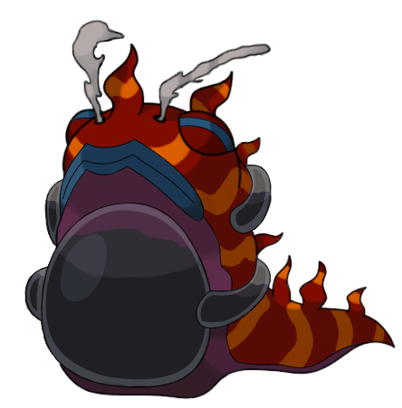
JougDustDoug - I'll agree with both Hedgehawg that the flame seems too tacked on where it is, and with Sinister that you could possibly make it look more radioactive with blackish bones. However, if you really need a fail-safe, maybe you could just slap the radioactive or atomic symbol on its chest or as a dog collar tag.

Noobiess - I can understand Quanyails' (I think it was) concern about the similarities to Arbok based on the species, but I think you've got a fair enough amount different that I don't feel it's too close. I do love the jewels and eye markings.

cretacerus said:
I think i fell in love with youre concept
*gigantic smile*
But seriously dude, thanks. And your design looks awesome too! I think this has been the second time I haven't found anything wrong with your design.

Yilx -


VyzirCisheen - I really like the mood you've set with that colouring and lighting, but the mane is really bugging me. The redness of it distracts me from his face. That's my only problem.

HeetLoof - It's better. It's less steel. But I don't know, something still doesn't make its typing feel that clear. I'd also suggest desaturating its colour so that it can be more easily differentiated from the goop it's spilling.

Ruckechoo - I'm sorry, but I'm really not feeling the typing at all. It'll probably be more obvious with colour, but the outline is entirely water or water/dark.

Droran Dagon - I like this colour scheme a lot better! It would be way cool if you made the snake's stripe pattern continue into the lion's back half, just to make it feel flowier.

Scrokepub - I think that's really cool. I can feel the poison despite the possibility of it implying dark. I think you may also want to show a bit of face in there.

Dising_Rusk - In response to your comment, thank you! That's exactly what needed to be said, and I couldn't figure out how to say it! Also, I think you should submit a design.

Calad - Okay, that sketch with ferrothorn is so fucking cute.

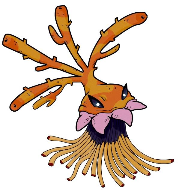
CrateFashion - Loving how this anemone is turning out. So cute. I feel like I should say that it doesn't imply fire typing but I somehow feel like I can see it despite that. It may be the fact that I know its typing, so consult someone else on the matter.

MLaRF - You and me should totally do a collab sometime!
 
Status
Not open for further replies.

Users Who Are Viewing This Thread (Users: 1, Guests: 0)

Top