CAP 13 CAP 2 - Sprite Submissions

Status
Not open for further replies.
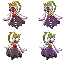
Ok, so that wasn't going to be my last post before the submission.
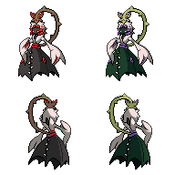
So I played around with the stuff meddle pointed out (funny you always seem to capture the parts I feel least confident about).

I didn't know how to make the vine less choppy because it didn't appear that way to me. But I still added a pixel or two there. I hope it looks very slightly better.
Where the vine connects to the flower, yeah I think I know what you're on. But because I can't quite put my finger on it myself, I just added one or two black pixels.
Also I made the backsprite's dress curve more smoothly. (Can't believe I missed that one.)

But boom, out comes magic who points out what I dreaded the most!
In my defense Absol (and probably a handful others I forgot about) used the anti-aliasing.
As to why it's not uniform, well I figured a kimono had to look smooth in contrast with a monster dress/monster vine. Oh and it's not just the torso, it's there on the head and wherever there is grey.
I did experiment with making the whole sprite anti-aliased but it made my eyes bleed (sprite was too dark on one side, too light on the other), so, not posting it.
Like magic said though, I would like opinions on this matter. Does it look too odd/awkward?
 
Kingdra22's issue a page back is because currently we're viewing the sprites on a white background. In-game and in-simulator there will be numerous different background colors that will blend better/worse/whatever with all sprites. That's just how it is, and I don't think it's an issue with the sprite.

I'll be honest, I didn't think twice about the AA because, as you noted, other in-game sprites do it (and typically with similar colors). It's also, you know, an optical illusion, so it's really tough to notice. I think it looks fine, and has in-game precedent with similar colors and textures; that should be enough.
 

canno

formerly The Reptile
Alright, so after not posting for a good while, I have finally brought an update on my sprites. (Yay)


Brightened up the red on the original, and hopefully got rid of the cluster on the face. Also, made the blue on the shiny not as painful to look at.

But the main reason I haven't posted in a while is because of...


...these. God, I hate back sprites. ><" I feel like they aren't very good, mainly because I think they might be too bright for a back sprites. Anyways, C+C.
 
ICC
Yeah ahaha, I think the real issue was is that I was following this thread solely on my phone, but when I looked at it on a desktop for the first time, the 3D problem I found originally is not actually that bad, if even noticeable at all.
Sorry!
Otherwise the sprite looks great, good luck!
 

Quanyails

On sabbatical!
is a Top Artist Alumnusis a Community Leader Alumnusis a Community Contributor Alumnus

My main concern with removing the shadows from the dress of the backsprite is that it looks too plain. Perhaps simplicity is necessary for them.

meddle, I'd say the outlines are fair enough for B/W standards; I apply lighter colors for lighter parts, but nothing too bright that makes it look overly saturated.

Something about the arms is still off.
 

Arkeis

(づ。◕‿‿◕。)づ
is a Top Artist Alumnusis a Community Leader Alumnus
Well, it's changed a lot. Not just the size, but a whole bunch of details. What do you think?


Old -------------------New
 

Quanyails

On sabbatical!
is a Top Artist Alumnusis a Community Leader Alumnusis a Community Contributor Alumnus
aragornbird: Smaller. Better. Looks more natural. Nice. The vine looks a bit out of place, since it's all the way left, and the pose is close to the front; could it be turned so that it's more to the right? Additionally, the dress looks like a tent. :P It's those ridges at the edges, really. The right side of the dress looks a bit bulged; perhaps you're trying to fit the right eye inside the dress? I dunno. Curve it a little more?
 

DougJustDoug

Knows the great enthusiasms
is a Site Content Manageris a Top Artistis a Programmeris a Forum Moderatoris a Top CAP Contributoris a Battle Simulator Admin Alumnusis a Smogon Discord Contributor Alumnusis a Top Tiering Contributor Alumnusis an Administrator Alumnus
Moderator
Update of my current progress on sprites. I've gotten started on the back sprite, as you can see:


I'm pretty happy with the front sprite now. I am far from happy with many aspects of my back sprite, but I've progressed enough with it that I'd like to hear what others think before continuing on with it. Comments welcome.
 
Aragornbird's smaller design is my favorite so far. I'd love to see it made into a GIF animation.

Update of my current progress on sprites. I've gotten started on the back sprite, as you can see:


I'm pretty happy with the front sprite now. I am far from happy with many aspects of my back sprite, but I've progressed enough with it that I'd like to hear what others think before continuing on with it. Comments welcome.
I don't know, the shading just doesn't seem to look very gen V-too much dithering and too highlighted an outline. I'd personally go for a shading style more akin to some of the other entries, as the shading just doesn't look very much like a sprite I'd see in-game in B/W. Other than that, though, the power is excellent. I'd like to see it with simpler shading before I pass judgment, though.
 
Shiny colors!!!


EDIT: newer versions


which one do you think looks the best? personally I really like the newer ones, specifically the middle one

feedback please
 
I actually don't like any of them, steam! The first coloration looks the best, but unfortunately looks almost identical to Wyv's shiny color scheme. The two pink options look very strange with their pink. Shinies aren't about being shocking or crazy, they're about complementary alternate color schemes. That's why I would've picked A had it not been nearly identical to another spriter's choices. I'd suggest that you try some other things out!
 
DougjustDoug - Holy crap! Those look amazing. Now my favorites are tied between yours and quanyails. I really like how you decided to give more detail to the face and plant unlike other entries that focused on the dress.
 

meddle

boomer user
is a Forum Moderator Alumnusis a Battle Simulator Moderator Alumnus
Quanyails: I think the back of the dress works now. If it bothers you that it feels plain, maybe try and extend the tails of her bow down past her waistline, or try adding in teeth on the backseam of the dress (as another spriter has interpreted). It doesn't bother me being empty, though. For me, what's off about the arms is still how they're raised like that. She looks as if she's about to accept a hug. I would just try giving her arms a more dynamic pose, bending an elbow, resting one at her side, something to suggest a bit of personality and/or movement (but not necessarily an “action” pose). Also, I never commented about this, but I really like how you gave her the impression of having sleeves, I don't think any of the other spriters have done this.

Aragornbird: I like the new size. I think some of the thorns lost their sharpness in the process, however, so now they seem to resemble little nubs. That's really my only critique and I wouldn't change anything else. Just the backsprite now.
 
Final Submission

Final Submission:


Since there's no more useful feedback incoming from the thread on this particular sprite it's about time to just submit its final. This doesn't mean there won't be additional edits to it in future but I feel that continuing to post will just clog the thread up and distract critique for the more unfinished sprites.

Final edits are finally fixing the hem of the dress on backsprite and altering the shading on the backsprite to account for a high light source that official sprites tend to have. Originally edited to have the far arm and more of the dress on backsprite lighted but felt that artistic impression here was more important than accuracy.

All in all I feel that I've made a submission that is both fairly fancy while still feeling true to the feel of the game sprites. It keeps the majority of simplistic and bold shading found in gen 5 and is large enough to show off the numerous details of the design in full. In addition it fits perfectly well against backgrounds of all colours. I'm pretty happy with it and how it's developed.

I do have part sheets for front and back prepared for both sprites in case this wins and again encourage all participants to make their own so any animators will have a better time getting around concealed parts. This isn't a requirement or anything, just something that would be nice to do. Thank you.
 
A most excellent job, Wyverii. You're a strong contender and have come quite a ways in spriting CaP2. What you point out about the shading, you're right.
 
@Aragorn: It looks good smaller, but theres one teensy little detail that I feel really needs to be mentioned. The vine looks extremely akward especially with the head turned and the vine all the way to the left it looks really strained. You need to move the vine so that it doesnt look like its being twisted...
 
If I may, let me throw in a small token here. I really like Wyverii's sprite's back vine; she took a much more natural approach to it than I seem to see on most other spriters' attempts; in other words, she made it look like an S rather than a C.

Also, to The Reptile. You have a good sprite going there, but don't the arms look a bit long and stretched? That's just my opinion of something to double-check, if you think it's fine just keep it as it is.
 
what purple cant said goes along with what i said. While Wyverii's head and body were facing different directions, she figured that it would look most natural for the vine to move with the contours of the movement. With a sprite like Quan's, the pose works with a straight S curve. Aragorn needs his sprite to have an S curving vine for it to look more natural. Admittedly,I need to add some curve to the vine of my sprite, which I'll do on my own.
 
Final Submission

No foot-long explanation here, I'll let the sprites do the talking.

But I would like to add this for size/proportion/color comparison.

Whether it fits in or not, I'll leave that to the voters' opinions.

To all other spriters, good luck and I hope we have a good competition!
 
Congratulations, Ice. You've managed to make a stellar sprite by accepting and using the critique you've been given.
 

Quanyails

On sabbatical!
is a Top Artist Alumnusis a Community Leader Alumnusis a Community Contributor Alumnus

Okay, radical departure from my last update. I was comparing my sprite to those of 5th generation sprites, and noticed how many of them leaned forward; or rather, not lean back. Thus, I made a bunch of edits that make my sprites appear that way. Top are the original sprites, bottom are the edited ones.

Also shrunk the sprite a bit, since I felt the dress was a bit large.
 
These are really good submissions and all, but what happened to Elementalpenguin's sprite? I really liked that one. It seemed really natural.
 
I've gotta say that Wyverii's is my favourite. It is a cool, unique pose but it doesn't lose any clarity when it comes to the finer details of the design. I'm a huge fan.
 
Status
Not open for further replies.

Users Who Are Viewing This Thread (Users: 1, Guests: 0)

Top