CAP 22 CAP 22 - Part 11 - Sprite Submissions

Status
Not open for further replies.
WIP


Last one before I call it a final sub, hopefully. Adjusted the left arm position, made the head narrower and shortened the "ears", simplified the "skirt" on the female, and (finally) added shiny sprites! Since this thing has warm colors normally I thought it'd be neat to have the shiny be entirely in cool colors instead.

Feedback is much appreciated as always!

EDIT: ThePsychoBear How's this?

Sunfished Oooh, neat! Maybe make the skirt on your female with ragged edges to match the male? And since everyone's putting designs on the backs of their sprites to make them more interesting (including me) maybe you could try the same too.
 
Last edited:
WIP 3

I added the female forms.
Also some feedback.

Falchion, I think your design is far to beefy and bulky and much to stiff.
I'd slim it down a bit and make it look a little more limp... as it is a pillow after all.

Sunfished, the problem with this one is the shading makes it look like it's just a cardboard cutout instead of a pillow, additionally the eye star thing looks a bit too blunt.

Morghulis, I'd make the colors a little more vibrant, like instead of using grey for shading, use a pale pink, or yellow, it makes it look much nicer in my opinion.

DatHeatmor, it looks a little too stiff, and it's head is shaped weird.

That is all.
 

DJTHED

Amateur 3D Animator
is a Top Artist
May or may not final sub with a form difference though, because it might just be more work for the modelers with no real incentive other than being a contender for creepy camera shots.
I wouldn't be too concerned about that. I'm pretty sure an extra form that has a minor variation wouldn't take up too much extra time in the 3D modeling process!
 

Sunfished

fisch
is a Top Artistis a Community Contributoris a Forum Moderator Alumnus
Sunfished, the problem with this one is the shading makes it look like it's just a cardboard cutout instead of a pillow, additionally the eye star thing looks a bit too blunt.
I don't think the shading is a problem, for a few reasons I'll list below. For everyone, I think it's good to read on it too since many of the sprites in this thread don't conform to the bw style of sprites, which ends up making them look of another origin.

First, the basis for the design is based on a dakimakura, or an anime body pillow. **I heavily recommend not googling that**. These types of pillows are known to be flat, not curved around the edges like most pillows are. Here's a hopefully sfw example so you don't have to google:

As you can see, they're pretty flat. But either way, being flat or not is more of an interpretation for the design, so if you see it as rounded then go for it. It's just how I see my own.

Now, for why I shaded it like that leads up to my second reason. **BW style sprites never shade to the extreme**. In fact, let's use sudowoodo as an example:

Doesn't the shading look familiar? Despite it being cylindrical in shape, it shades with simplicity, rather than force-conveying it's round. BW sprites do this everywhere, since the style was meant to be easily animated with the Gen 5 engine. Having too much shading elements ends up causing a ton of problems such as clipping, and in general won't fit easily with all the moving parts. Whether or not this sprite will be animated, it's good to stick to the shading style so it fits well with the other sprites.

As feedback, I think everyone did a clever job at thinking up shiny colors and gender differences. However, you should look at focusing on cleaning up the line art and at least giving bw shading a shot, since the style is a major player in making it look authentic!
 
Final Submission

I took a gander at using B&W shading and it looks nice so this is my final sub.

As more feedback.
Falchion, it looks much nicer.
Sunfished, the shading makes sense with explanation, but I'd still make the eye thing pointier.

Edit: Just one thing to note, I am way more experienced in making sprites in RSE style as I only taught myself how to do sprite art because of my want to do a pokemon emerald rom hack.
 
Last edited:
Final Submission


Tried adding gender differences with the floral pattern on the back of the female based on a private suggestion, but they were too small to be visible. Ah well. Anyway, fixed up the shading of the main body (only two colors now and not three) and adjusted the sprites so they all line up perfectly.

Woo, this was fun! I'm happy that I was able to finish the sprites ahead of time this time around. Good luck to everyone for the sprite contest!

EDIT: Scaled down dem sprites as per QxC4eva's advice. They're now almost exactly the size of Sudowoodo's sprites in BW. Kinda messed up the floral pattern a little, but eh.
EDIT 2: Scaled them back up a little! They looked small by CAP standards; I think this should be the proper size now.
EDIT 3: Okay, hopefully this should be the last LAST edit XD. Fixed the flower pattern on the back (made it smaller, neater, and less freeform) and patched up the outline on the front sprite's lower left foot. Whew! Hope this is legal now~ :)

You can find the original (larger) final sprites here, and the smaller second-draft sprites here!
 
Last edited:
Just passing by to drop off my sprite of CAP22:

Just wanted to put it out here, so I could make some changes if need.
Hopefully will find the time to make the back sprite too!

Ps: the gender difference-skirt looks really nice!
 

QxC4eva

is an Artistis a Forum Moderatoris a Community Contributor
Moderator
Integer Mova- never seen you spriting before, what a surprise! I think your back sprites look more polished than the front ones though. To me the front ones head looks trimmed off on his right (our left) side, making the sleeve below look a bit longer than it should. If you're not seeing that, maybe flip the sprite horizontally to reset your eyes? :) The shiny blue color looks a bit dark and saturated but maybe that's just me :P Great work though!

Falchion- that's a veeeerrrryyy big sprite~ Might help to do a side by side compare with some other gen 5 sprites, like right now yours is as big as Kyurem W and Zekrom! The shading makes it look a bit "glossy" as well I suggest getting the brightest shade to cover more area so the shading gradient don't look as gradual, if you get what I mean. Ah nm, just noticed you fixed it in your update! :P Loving your interpretation for the female sprite!

Take Azelfie- nice legs! XD I'd probably make that smaller though.

FellFromtheSky- I think the arms on your sprite looks a bit fragile and skinny for a fighting type. Not really fond of the dotted crease lines either I think they look like pixel artifacts to me, maybe just have it continuous and make it fade out instead? Other than that the shading looks good and I like the pattern you put on his back (kinda reminds me of Voodoom :P)

Morghulis- yours is my personal favorite so far, very solid work and I can't really spot anything worth to critique on! Awesome shiny colors too I think it gives off the aroma veil feel :D For your non-shiny I think the colors look a bit dull, maybe up the overall contrast or saturation a bit?

Sunfished- the face on your sprite looks a bit unnatural to me, it actually reminds me of the buttons you see on a gamepad controller! XD I think maybe try widening the middle of the star or at least making the edges a bit sharper? Not really fond of the skirt on the female, it seems too neatly cut out and idk.....just looks a bit off style to me. I really like the roundness on the hands though, won't mind a hug :D X(

DatHeatmor- not much I can say really, it looks good so far. I just think your outline colors might be varying a bit too much. Umm yeah :P Would be nice to see your backsprite as well!

ThePsychoBear- I think your outlines for the non-shiny is slightly too dark, especially the patterns on his hands. Maybe try some fainter outlines and see how that looks? The patch on the back can probably use some faint outlines as well, so you don't have different colors next to each other without a line. I think the shiny color scheme is a bit iffy btw, it looks a bit like an ice type for some reason. XD Try if having a less saturated blue makes it any better? Everything else looks good :)

noobiess- looking great! I really like the face on yours, it's probably the silliest looking one so far imo. The dithering for the hands matches the gen 5 style too. Please have time to make the back... :|
 
noobiess- looking great! I really like the face on yours, it's probably the silliest looking one so far imo. The dithering for the hands matches the gen 5 style too. Please have time to make the back... :|
Thanks! I had more spare time today then expected so I went for the back sprite:


Ps: the dithering was actually more a wink at "pillowshading" (or dithering)... But glad it worked out good then ^^


EDIT:
Did some minor edits + added the shiny version

Like with previous CAP, I just changed the hue with GIMP and altered the colors a bit.

I will make a final submission soon if no comments come.
 
Last edited:

HeaLnDeaL

Let's Keep Fighting
is an Artistis a Forum Moderator Alumnusis a CAP Contributor Alumnus
Final Submission


--- --- ---
Background Test


Size Test


So I had some free time yesterday and today, and this is what I have so far.

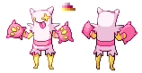
Pose: While the official art is great for concept art, I feel that having the arms wide open creates several minor issues for a sprite. It creates the feeling that the mon is about to hug its opponent rather than fight it, and for the backsprite it creates some difficult foreshortening of the arms that is rather difficult to pull off, and I noticed a lot of sprites here struggling with that. So, I sketched out Kerfluffle with pencil and paper to get a pose that I thought could work. I really wanted the front sprite to show one cushion with the fingers facing the viewer and the other with the back facing the viewer, since I think showing one of each view gives more complete information to the viewer and helps emphasize the boxing-glove like feel of the pillows/cushions. Both arms are raised upwards, rather than outwards since I felt that made the boxing vibe stronger and minimized the perception of a hug; these sprites will be used *in battle* so I felt a pose that was indicative of being read to fight was more appropriate than hugging.

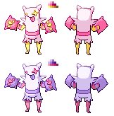
Shiny: I'm not sure if I'll keep my shiny, but I wanted to play with something that no one else has done yet. While the generic blue to pink swap works, I just didn't want to limit myself to that right away. Maybe it's just me, but the I sort of like the idea of a white/black split between normal and shiny... Though I am worried if the dark shiny makes the fairy-vibe diminish. Feel free to let me know if you like the shiny or not.

Size: I think that the majority of the sprites in this thread are simply way too big (though as I say this, I'm just noticing that thankfully the biggest sprite here got drastically resized). Many of the sprites here dwarf the likes of voodoom and other fighting types. My sprite sits at 70 pixels tall and I think that might even be a bit big. Going notable over 70 pixels is a bad idea I think as it makes the mon much larger than what sunfished intended it to be. Now, you all have artistic license, and you can ignore this is you want to, but this is just my take.

Also, I highly encourage all spriters to test their sprites against colored backgrounds. I have provided a template if you guys want to test using actual parts of showdown backgrounds. Right now, I see some really cool sprites that I fear have outlines too light and that won't show up very well against some of the showdown backgrounds.

Feel free to give advice or yell at me if you want me to change things about my sprite. I'm not 100% sure if I'll final sub, depends on if I have enough time to polish things up.

EDIT 1: Made the shiny a bit lighter and some pixel pushing here and there.

EDIT 2: Made the spikey sleeves a bit shorter, made the arms a bit thicker, did some general pixel pushing, and marked as Final Sub.

EDIT 3: Changed the color of my shiny (went with purple gloves) and slightly lessened the pinkness of the white parts on the non-shiny.
 
Last edited:
WIP


Changed the coloring a little bit to make it seem more pink! Also may try scaling mine down a little as it is one of the bigger ones but we'll see if I have the time.
 
My only criticism right now is that I think Kerfluffle is looking a bit too pink on a lot of sprites. The base pillow colour is still white, right? Using pink for the shading is fine, of course.
 

boxofkangaroos

this is the day of the expanding man
My only criticism right now is that I think Kerfluffle is looking a bit too pink on a lot of sprites. The base pillow colour is still white, right? Using pink for the shading is fine, of course.
The base pillow color is light pink.


It's technically a light pink color, but Caaethil 's point is valid I think. Most of the sprites in this thread are using different shades of pink for the linework and shading on the main bulk of the pillow, and while that looks visually appealing and is fine, it does contradict Sunfished's art a little bit. The white-looking parts of the pillow are still a solid object, but with a color closer to white. Most of the sprites with pink linework sort of give the impression that the pillow's color is pink, and there's just a really harsh light shining on it's surface that makes it look whitewashed, that's how I see it anyway.

That having been said, the sprites that do use pink linework and shading still look very nice, so that criticism's only there for any spriters that have got the free time and want to mess around with color choice a little more, hopefully that helps for anyone whose goal that is.
 

DougJustDoug

Knows the great enthusiasms
is a Site Content Manageris a Top Artistis a Programmeris a Forum Moderatoris a Top CAP Contributoris a Battle Simulator Admin Alumnusis a Smogon Discord Contributor Alumnusis a Top Tiering Contributor Alumnusis an Administrator Alumnus
Moderator
Keep in mind that there is no "right" or "wrong" answer when it comes to the color of the pillow or the shading -- regardless of the actual colors used in Sunfished's design. It's all up to the spriters to decide what they think looks best. After that, it's up to the community to pick what they thinks looks best, in terms of voting for sprites.

If people want to comment in this thread as to what they think looks best, that's fine. But do not comment under the assumption that there is an objective determination that the base pillow color is white or pink. You can say that you prefer pink or you prefer white, but not that it *is* pink or it *is* white. Yeah, if some spriter made the base sprite green or whatever, then they are almost certainly taking artistic license too far, and there might be cause for correction. But that's a pretty ridiculous extreme, and not the case at all here.

Sunfished did not do any shading on his design, and I think that is one of the more charming elements of it -- the simplicity and all. So perhaps the light pink is a nod to a white pillow with pink shading, or maybe it's actually a pink pillow. Even if Sunfished himself comments in this thread with his actual intent in the design -- it STILL doesn't matter. Sprites are based on the winning design, and that's all. It's up to each spriter to make their own interpretation.
 

Mintly

formerly Spook
is an Artist
FINAL SUBMISSION
upload_2016-9-9_23-4-24.png
WELP! IM DONE! Backsprite took SUPER long ;-;, the only thing im iffy about is the fingers, but eh.
 
WIP

So I made the sprite smaller, so it's now 73 pixels square. Resizing is hard! This is probs my last WIP other than touchups

Edit: Oh also HeaLnDeaL I think the shading on your backsprite is coming from the wrong angle. Pretty sure that generally the light source is the top-front-right of the sprite. I may be wrong tho
 
Last edited:

Sunfished

fisch
is a Top Artistis a Community Contributoris a Forum Moderator Alumnus
Final Submission

Got kind of busy with other things, so I'm final subbing what I have to far.
Left is male, right is female.
 
Last edited:
WIP


Although I didn't have many opportunities to work this time, I still wanted to submit something. I tend to favor dynamic sprites, so I wanted to shape mine into some sort of a fighting stance. Given that the design heavily parodies Street Fighter, I decided to give it a corruption of a traditional fighting pose that you'd see in an 80's arcade game.

I'm far from finished, as I have issues with some of the shading, symmetry (I don't even have claws on the back Sprite's right hand), proportions, and the majority of how the shoulders look, but I figured that what I have so far is a decent enough start to be posted.
 
I have to say that S0L1D G0LD's sprite looks like the streetest fighter among the CAPs. Note: I'm naming every Kerfluffle I use on Showdown "Dan Hibiki" if I decide to participate in the play test.

I also enjoy how Sunfished rendered his own design into a sprite. However, it still looks like it wants to hug the opponent until they hit fatigue, rather than accept an authentic challenge.
 
Final Submission


Now with a Male:Female variation. I liked the idea of a skirt for the female Kerfluffle, so I made one of those, but at a longer length to accommodate the pose I had worked with. The Female Shiny sprite was fun for me to make; I don't usually get to work with brighter colors in my sprites, so this was a treat. Plus, the blue and gold (and white, I suppose) pair nicely on this mon, at least in my eyes. There's not really much more I can add at this moment (but I will jabber on in an edit/looking back post), so barring a last moment QC this will be good enough as my final product. General QC since my last post includes making the head symmetric, a better shape for the wacky eye, and a revamp on the shoulder pads (and the backsprite claws, of course).
 
I know that was your final sub, and i really like the blue of the female shiny, but I'm not a fan of the "skirt", if that is what it's meant to be. The colour isn't enough to make me like that design, sorry!
 
I know that was your final sub, and i really like the blue of the female shiny, but I'm not a fan of the "skirt", if that is what it's meant to be. The colour isn't enough to make me like that design, sorry!
I'm going to assume that you were talking to me. I'm not completely happy with it either, but I didn't have any more time to sprite, so I had to work with what I had sketched. To each his own, though.
 
Status
Not open for further replies.

Users Who Are Viewing This Thread (Users: 1, Guests: 0)

Top