I could certainly work with this! Sorry that I didn't get anything to you sooner GK, I was busy all day.Wow, thanks a lot Penguino! :) I haven't thought of much else to make it more "electricky" and to alter that picture is really up to pkmn-taicho321. But in the meantime I altered my picture, while I'm making a new one that has a different color as well as some aspects taken from the one pkmn-taicho did (for example the eyes and tail).
I wanted to put it up before I got into the shading or into drawing a new picture and pose altogether so I could get some opinions, and possibly help get pkmn-taicho321 some opinions, if he wants to change it as well. :)
for comparison you can look up to see my latest: ^^^
Or look at the awesome one done by pkmn-taicho321: http://i257.photobucket.com/albums/hh223/jurassicskin/gks-1.jpg
Or My similar but slightly different older version: http://i257.photobucket.com/albums/hh223/jurassicskin/IMG-2-1colourstriped2.jpg
Or the super old and orginal version: http://i257.photobucket.com/albums/hh223/jurassicskin/7.jpg
Let me know what you liked the best of each and I'll make changes accordingly, or if you have a completely new idea let me know about it.
Thanks.

-
The moderators of this forum can be found in the CAP forum staff directory.
-
Welcome to Smogon! Take a moment to read the Introduction to Smogon for a run-down on everything Smogon, and make sure you take some time to read the global rules.
-
Congrats to the winners of the 2023 Smog Awards!
CAP 8 CAP 8 - Art Submissions
- Thread starter CyzirVisheen
- Start date
- Status
- Not open for further replies.

caladbolg~ needs to color in his submissions soon, or else my vote is going to go with regids.

Pretty sure Calad said he was out of the contest =/

Alright so here are two different color schemes for my CaP submissions, could I please get at least a little feedback. This concept is basically a bulky four legged dragon with electric accents on its body. The colors are sort of centered around the basic blue and yellow colors that electric types are centered around. I also have a yellow and red shiny color scheme but thats coming up.


So there they are, any feedback would be great. Thanks!!!


So there they are, any feedback would be great. Thanks!!!

No problem pkmn-Taicho321, besides your just doing me a favor, your not under any type of obligation. :P Also, it gave me time to work on my shading:
What do you think?
Edit: Thank god for the burn and dodge tool because I suck at shading.
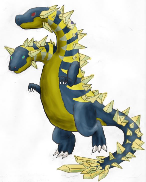
Also: Try #2, http://i257.photobucket.com/albums/hh223/jurassicskin/NewStyle1ShadedTry2.jpg
They look very similar but are different.
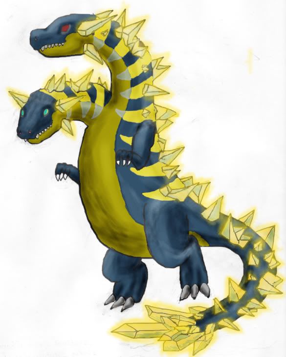
Or, that Electric glow I like to add to the crystals: http://i257.photobucket.com/albums/hh223/jurassicskin/NewStyle1ShadedTry3.jpg
And now with teeth!: http://i257.photobucket.com/albums/hh223/jurassicskin/NewStyle1ShadedTry4-1.jpg
The last one is my personal favorite.

What do you think?
Edit: Thank god for the burn and dodge tool because I suck at shading.
Also: Try #2, http://i257.photobucket.com/albums/hh223/jurassicskin/NewStyle1ShadedTry2.jpg
They look very similar but are different.
Or, that Electric glow I like to add to the crystals: http://i257.photobucket.com/albums/hh223/jurassicskin/NewStyle1ShadedTry3.jpg
And now with teeth!: http://i257.photobucket.com/albums/hh223/jurassicskin/NewStyle1ShadedTry4-1.jpg
The last one is my personal favorite.

Very nice, GK.


I've scrapped the old idea (didn't develop it much anyway) and have a new one. This one fits the build biases that have been voted (defensive and special). It looks bulky, without looking like it can bash in heads, since most of the spreads currently have low Attack scores.
Still using paint, I really need to get my hands on something better : /

I realized too late that the black lines are too thick. I'll update that along with some other details later.
Still using paint, I really need to get my hands on something better : /

I realized too late that the black lines are too thick. I'll update that along with some other details later.

The airbrush tool is also good for shading, sometimes. Make the color a bit darker/lighter, and it works like a charm. Stops you from making shades too light or too dark, as the maximum lightness/darkness is the color you chose.No problem pkmn-Taicho321, besides your just doing me a favor, your not under any type of obligation. :P Also, it gave me time to work on my shading:
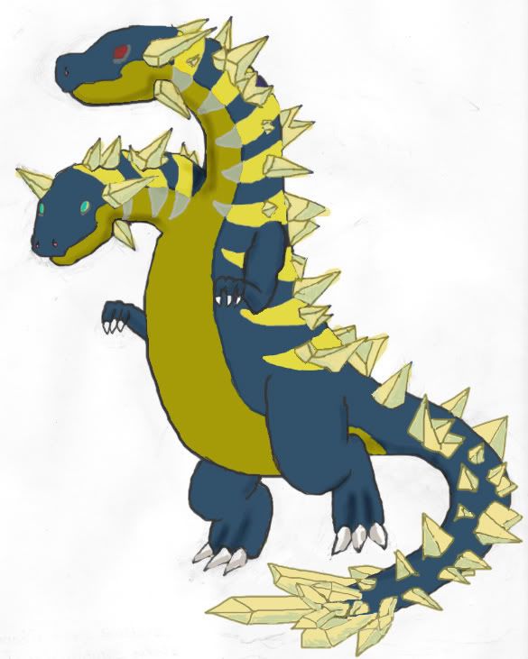
http://i257.photobucket.com/albums/hh223/jurassicskin/NewStyle1ShadedTry1.jpg
What do you think?
Edit: Thank god for the burn and dodge tool because I suck at shading.
Also: Try #2, http://i257.photobucket.com/albums/hh223/jurassicskin/NewStyle1ShadedTry2.jpg
They look very similar but are different.
Or, that Electric glow I like to add to the crystals: http://i257.photobucket.com/albums/hh223/jurassicskin/NewStyle1ShadedTry3.jpg
The Electric glow almost makes the design IMO. It looks awesome with the glow, and almost lacks the electric feel somewhat without it...
I completely love what you did with the Crystals, in spacing and size, but... There are three crystals on the "nice" head and three on the "evil" head that seem quite out of place...
I personally think maybe you could attempt reducing them in size a bit...? Eh. Just my opinion...
Also, the "nice" head's jaw looks a bit awkward... Maybe you could try opening it (be it slightly hanging open, or raging) to show the teeth from the past artwork? I liked the mouths, personally. =P
Sorry, but it looks a bit frail to me...I've scrapped the old idea (didn't develop it much anyway) and have a new one. This one fits the build biases that have been voted (defensive and special). It looks bulky, without looking like it can bash in heads, since most of the spreads currently have low Attack scores.
Still using paint, I really need to get my hands on something better : /
http://i71.photobucket.com/albums/i159/scoopapa/serpentine.jpg
I realized too late that the black lines are too thick. I'll update that along with some other details later.
The wings give it a "large" appearance, but also seem thin.
It seems slim, like a snake or something...
...And it also seems a bit plain...
Thanks m190049! I have the crystals on the head because of the inspiration I took from the dinosaur Ankylosaurus I also did a new design with teeth and the electric glow. I like it the best so far, here it is:
Also, m190049, you might want to reduce the images in your quote posts to links since I believe they are too large for a single post.

Also, m190049, you might want to reduce the images in your quote posts to links since I believe they are too large for a single post.
Ahhh. I see the relation. Hm... In that case, I think you could actually add the fourth prong sticking out of the lower head. looks like it'd be able to fit there without being hidden... Without the fourth prong, the head looks like it's not symmetrical... Which led to the awkwardness from before....Thanks m190049! I have the crystals on the head because of the inspiration I took from the dinosaur Ankylosaurus I also did a new design with teeth and the electric glow. I like it the best so far, here it is: http://i257.photobucket.com/albums/hh223/jurassicskin/NewStyle1ShadedTry4-1.jpg
Also, m190049, you might want to reduce the images in your quote posts to links since I believe they are too large for a single post.
Also... If you look at the upper head, you can see a "crease", showing it's nose. But the lower one's head looks kind of "flat" for some reason... It makes the nose look almost like an alligator's. ...Sorta.
Oh, and I'm liking the teeth. =P
And the crystal at the end of the tail looks amazing as well.
Links? And so I shall.


Haha, that glow really makes the design stand out GK. However, and this is directed to all artists who expect to use a similar glow effect, make sure you give the glow an outline on your final submission pieces:
It doesn't have to be black either, just a darker color to make it stick out.Any 2D full color digital or traditional media may be used, so long as it contains a distinguishable outline on the subject in contrast to the background. 3D media are not allowed.


Thanks for letting me know Cyzir! I'll make sure to do that, especially for my final piece. Also, how is the work coming along on that electric raptor?Haha, that glow really makes the design stand out GK. However, and this is directed to all artists who expect to use a similar glow effect, make sure you give the glow an outline on your final submission pieces:
It doesn't have to be black either, just a darker color to make it stick out.
@ Fenix: Still looking good, but that back leg area, around the claf is still bugging me.
@ Scoopapa: Wow, very good for paint (and yes you should probably try something other than paint) you've got a good chance for going for a cool Wyvern look, unless that's what you've been going for originally.


I'm a sucker for good arts, yours looks pretty darn good. Now tied w/Cartoons!' and KoA's submissions.


This is actually really good, maybe a different idea for the knee, it looks kind of like an eye (?) or something to me. Just a suggestion, but this is one of my favorites.
here i coloured it

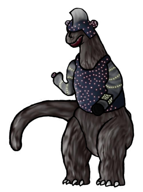
Awesome job Yilx, I'm really glad you decided to work on colouring it! :) I knew it would be a competitive piece. I personally like the "eyeball looking knees" but the real eyes themselves seem too big to me, would you be able to work on making them smaller and possibly more menacing? Also, the electricity from the battery-like parts on the fakemons body is really cool, but would you be able to lower the opacity a tad, because it covers up what they actually looks like.
@ Jhnonny: I agree, there have been so many great submissions so far that it's almost going to be disappointing when only one of them wins this CaP.
@ Jhnonny: I agree, there have been so many great submissions so far that it's almost going to be disappointing when only one of them wins this CaP.
well i finished my assignment and I had the time so why not?Awesome job Yilx, I'm really glad you decided to work on colouring it! :) I knew it would be a competitive piece. I personally like the "eyeball looking knees" but the real eyes themselves seem too big to me, would you be able to work on making them smaller and possibly more menacing? Also, the electricity from the battery-like parts on the fakemons body is really cool, but would you be able to lower the opacity a tad, because it covers up what they actually looks like.
@ Jhnonny: I agree, there have been so many great submissions so far that it's almost going to be disappointing when only one of them wins this CaP.
Yeah I wanted to do some kind of electrodes for the knees but a crazy idea struck my mind to make them more like eyeballs instead so it ended up like this.
Well I kinda tweaked it so here;

OMG Yilx !
Perfect !
You got my vote.
Perfect !
You got my vote.
@ Yilx: That's totally awesome and completely exceeds my expectations. I'm glad you found the time to do it, and I'm glad I prodded you for it. The head looks awesome and the hands are my favorite part.


@Yilx - Nice artwork. However, if you plan for that to be your main design, you need to observe this submission requirement:
To all artists - The "outline rule" applies to most of the "glow effects" being used in other designs, and needs to be fixed for final submissions. I noticed CyzirVisheen pointed this out to one artist earlier, but it needs to be mentioned to everyone, since several people have been doing this sort of thing.
Also, while I'm discussing design guidelines, there were questions earlier about the following art rule, so I may as well take this opportunity to explain it in more detail.
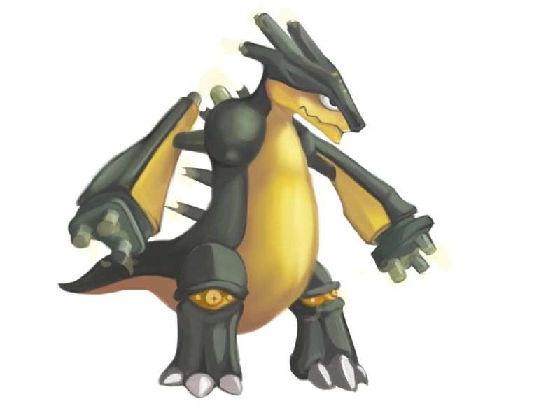
So, to use actual submissions in CAP 8 for examples -- Wyverii's design has sparks jumping between the horns on her pokemon. That would not be considered a move effect. Ditto for the spark on my design's tail. Those are part of the pokemon's base design, much like the fire on the tails of Charizard or Magmar. Note that both Wyverii and I put distinguishable outlines around the edges of our sparks, to ensure it also conforms to the "outline rule" mentioned above.
I think the lightning shooting out of the fingertips of Cartoons' last picture, is probably a "move effect". However, I don't think that is Cartoons' final submission, since he normally makes lots of supporting art, move studies, and alternate poses for his designs. Even if it is intended to be his main design, the little sparks can be easily erased, and not significantly affect the overall impact of the picture. Cartoons has done many CAP designs, and is quite experienced in the community. I'm sure he'll have a legal design in his final submission. That's why I have not mentioned anything up until now. However, someone else pointed it out earlier, so I felt it deserved some explanation. So, to be clear -- do not make final submissions of pokemon shooting lightning bolts or any other overt move effects of that sort.
When "energy effects" become a bigger part of the pokemon designs (like some of the glow effects used in some CAP 8 designs) -- then it gets a bit harder to judge. In the game sprites, there are a few examples of pokemon that have "field effects" around their bodies. Koffing is surrounded with smoke, Gastly is enveloped in a ghostly haze, Moltres and Rapidash are both entombed in flame. So, many CAP artists like to wrap their designs in a "glow" of some sort.
I personally think it's a cheap artistic cliche, struggling to squeeze a little extra "coolness" into an otherwise bland design, so I usually roll my eyes a bit when I see it -- but that's just my personal artistic opinion. I've been accused of using cheap artistic cliches as well -- so "to each their own", I guess. As a matter of CAP artistic policy -- glow effects are perfectly legal, as long as they follow the aforementioned outline rule.
Unfortunately, many people that add glow effects to their designs, are typically just using a generic blur effect in their graphics program. Such graphic effects rarely conform to the outline rule. For this reason, many inexperienced CAP artists have mistakenly gotten the impression that glowing effects are against the rules. They are not. It just seems that way, because most people that add this kind of visual sugar to their images, are usually inexperienced CAP artists that have just discovered the Blur Tool in Photoshop and think it makes their design look "omgz kewl!!11". So they post their effect, and it is promptly deemed illegal. But, it's not the cheap glow effect that is illegal -- it's the inexact rendering of the glow effect that makes it illegal.
BTW, you can use blurry effects on the interior of your picture -- so long as the elements of your picture are surrounded by a distinguishable outline. If you don't understand how this statement is consistent with the previous statement -- then I suggest you avoid blurs and gradient effects altogether. Just draw lineart, and leave it at that. Many CAP voters prefer clean lineart anyway, so you'll probably be doing yourself a favor in the polls.
Your current rendering does not have a distinguishable outline. If that picture is intended to be part of your Supporting Material, then ignore this. With Supporting Material, just about any art form is acceptable. However, a Main Design has specific guidelines listed in the OP of this thread."Any 2D full color digital or traditional media may be used, so long as it contains a distinguishable outline on the subject in contrast to the background. 3D media are not allowed."
To all artists - The "outline rule" applies to most of the "glow effects" being used in other designs, and needs to be fixed for final submissions. I noticed CyzirVisheen pointed this out to one artist earlier, but it needs to be mentioned to everyone, since several people have been doing this sort of thing.
Also, while I'm discussing design guidelines, there were questions earlier about the following art rule, so I may as well take this opportunity to explain it in more detail.
The restriction on "move effects" is hard to define on some designs, but you generally know it when you see it. For example, the fire at the end of Charizard's tail is not considered a "move effect". However, if someone drew a design showing Charizard breathing a stream of fire out of its mouth -- that would be considered a move effect."No props, action effects, move effects, or additional objects can be rendered on or around the pokemon. If a prop is part of the pokemon's basic design (ie Farfetch'd Stick), then it is acceptable. A basic rule of thumb is -- anything that would not be appropriate in a game sprite, should not be included in the Main Design."
So, to use actual submissions in CAP 8 for examples -- Wyverii's design has sparks jumping between the horns on her pokemon. That would not be considered a move effect. Ditto for the spark on my design's tail. Those are part of the pokemon's base design, much like the fire on the tails of Charizard or Magmar. Note that both Wyverii and I put distinguishable outlines around the edges of our sparks, to ensure it also conforms to the "outline rule" mentioned above.
I think the lightning shooting out of the fingertips of Cartoons' last picture, is probably a "move effect". However, I don't think that is Cartoons' final submission, since he normally makes lots of supporting art, move studies, and alternate poses for his designs. Even if it is intended to be his main design, the little sparks can be easily erased, and not significantly affect the overall impact of the picture. Cartoons has done many CAP designs, and is quite experienced in the community. I'm sure he'll have a legal design in his final submission. That's why I have not mentioned anything up until now. However, someone else pointed it out earlier, so I felt it deserved some explanation. So, to be clear -- do not make final submissions of pokemon shooting lightning bolts or any other overt move effects of that sort.
When "energy effects" become a bigger part of the pokemon designs (like some of the glow effects used in some CAP 8 designs) -- then it gets a bit harder to judge. In the game sprites, there are a few examples of pokemon that have "field effects" around their bodies. Koffing is surrounded with smoke, Gastly is enveloped in a ghostly haze, Moltres and Rapidash are both entombed in flame. So, many CAP artists like to wrap their designs in a "glow" of some sort.
I personally think it's a cheap artistic cliche, struggling to squeeze a little extra "coolness" into an otherwise bland design, so I usually roll my eyes a bit when I see it -- but that's just my personal artistic opinion. I've been accused of using cheap artistic cliches as well -- so "to each their own", I guess. As a matter of CAP artistic policy -- glow effects are perfectly legal, as long as they follow the aforementioned outline rule.
Unfortunately, many people that add glow effects to their designs, are typically just using a generic blur effect in their graphics program. Such graphic effects rarely conform to the outline rule. For this reason, many inexperienced CAP artists have mistakenly gotten the impression that glowing effects are against the rules. They are not. It just seems that way, because most people that add this kind of visual sugar to their images, are usually inexperienced CAP artists that have just discovered the Blur Tool in Photoshop and think it makes their design look "omgz kewl!!11". So they post their effect, and it is promptly deemed illegal. But, it's not the cheap glow effect that is illegal -- it's the inexact rendering of the glow effect that makes it illegal.
BTW, you can use blurry effects on the interior of your picture -- so long as the elements of your picture are surrounded by a distinguishable outline. If you don't understand how this statement is consistent with the previous statement -- then I suggest you avoid blurs and gradient effects altogether. Just draw lineart, and leave it at that. Many CAP voters prefer clean lineart anyway, so you'll probably be doing yourself a favor in the polls.
- Status
- Not open for further replies.