
-
The moderators of this forum can be found in the CAP forum staff directory.
-
Welcome to Smogon! Take a moment to read the Introduction to Smogon for a run-down on everything Smogon, and make sure you take some time to read the global rules.
-
Congrats to the winners of the 2023 Smog Awards!
CAP 8 CAP 8 - Part 15a - Sprite Submissions
- Thread starter CyzirVisheen
- Start date
- Status
- Not open for further replies.


Spriters have the artistic license to manipulate the original art however they please.
True. I like doug's take on it. It just isn't my favorite

The purpose of thegamers post wasn't to say that Doug's sprite is breaking the rules Darkie, it was saying that he felt it was too drastic a change from the original artwork for him to vote for it.

...First draft.
Coloring this beast was a lot easier than making the damn lineart. *_* I know that my cloud texturing isn't as good as some other people's but I love the way the heads game out. Crits appreciated!
Shinies verrry subject to change. I just threw down the first colors that came to mind. =P

Coloring this beast was a lot easier than making the damn lineart. *_* I know that my cloud texturing isn't as good as some other people's but I love the way the heads game out. Crits appreciated!
Shinies verrry subject to change. I just threw down the first colors that came to mind. =P
The middle head kinda looks like it's distracted, other than that, it's my favourite one so far ;_;


Great job to everyone, but my favorite ones so far are Doug's (badass) and Clawed Nyasu's (beautiful).
Both did a great job, and whatever people say, Doug's Shiny sprite is totally wonderful!
Both did a great job, and whatever people say, Doug's Shiny sprite is totally wonderful!

Yay procrastination!

Instead of working on a final paper I did a backsprite. I'm not to sure on the shading (will probably redo it all), but the lineart was easier than I anticpated.
Instead of working on a final paper I did a backsprite. I'm not to sure on the shading (will probably redo it all), but the lineart was easier than I anticpated.

Beautiful sprites, Nyasu! I think they might need a bit more of a darker, bolder outline in some areas, but these sprites are wonderful.

Actually... On the back sprite. The middle face is bugging me. The cheek's shading looks strange when the mouth is open like that...
If there's no more objections i'll be making this my final submission.

Personally, I think it looks like the mouth doesn't really need to be there on the back sprite. It looks out of place.
If you look, the middle-shade on the spike (the one closest to it's mouth) seemingly ends abruptly. Compare that spikes on the other two heads...
It looks awkward... I tried tinkering with it on Paint (and removed the mouth) and it looked better IMO...


Yes, I took some artistic license with the design. That was not an accident. I mentioned it in my first post of my sprite. I didn't actually sit down and say "Let's see how much I can change up Cyzir's original design" -- it just turned out somewhat stylized. I realize the look of my sprite will not appeal to everyone, but it IS the direction I intentionally took.Doug, I know you're trying to make the Pokemon more Dragon-like, but I'd suggest sticking with what the art's purpose is. The art makes the Pokemon both cute and powerful and you're making it solely based on looking powerful. I see no cuteness. I haven't talked about CaP a lot, but IF I could sprite, I'd stay within the lines of the art, not overlook anything.

This looks really cool and has tons of potential. The only criticisms I have are that the front-right paw is turned too far inward (it looks pigeon-toed), and the cloud could be a bit lighter gray. The positioning of the heads is stellar, though (although the middle one could be looking at whatever the other two are looking at, so that it looks more intimidating).Originally Posted by Fat Clawed Nyasu

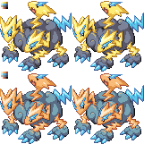
Man am I glad I didn't leave, otherwise I wouldn't have finished up these little gems. <3


Complete sheet for convenience
Did some major facelifting. Raised the furthest head up and changed its direction as well as repositioned the other heads a bit too. Also fixed shading on the cloud and fixed up the glow effect on the body. Palettes and everything is all finalized and this is the final version of my sprites. Man, I'm exhausted...
Editing my Final submission post now.

THis is exactly the favoritism that should be absent from this sort of project. I cant believe you even posted this.I wish KoA's color-work was as good as wyverii's

KoA, those are very nice, but a little fuzzy.

I had a feeling I would like this sprite....First draft.
Coloring this beast was a lot easier than making the damn lineart. *_* I know that my cloud texturing isn't as good as some other people's but I love the way the heads game out. Crits appreciated!
Shinies verrry subject to change. I just threw down the first colors that came to mind. =P

You are my new favorite! This is exactly what I was thinking the sprite should look like when I saw the art. There is maybe something about the shading of the cloud that I find odd, but I cannot really put my finger on it... nevertheless, it does not bother me so much; this is what I am voting for!

KoA, you've stolen my heart with these. I absolutely adore how you did the cloud body in the front sprite, we understand its a cloud, but it still doesn't go to an extreme (swirls and stuff). There is still a bit left in this thread, but it's not too far off to say you have my vote.

All he's saying is that he prefers Wyveriis coloring to KoA's =/THis is exactly the favoritism that should be absent from this sort of project. I cant believe you even posted this.

@Lostmyth: Those designs look pretty cool, but they only have 2 legs...
@Dragonzrule: I really love that action pose, it looks so cool. The only thing is that the head on the right is where the legs are, so it looks a bit weird there. The leftmost head looks fine to me.
@Agentlym: Very nice design. The colors and the glow of the toes are just perfect. But, like Dragonzrule, the far right head seems to be spazzing out a bit lol. The pose and camera angle do a good job of displaying everything, well done.
EDIT: wow sorry i just commented on the posts on the first page without realising that there are now 11 pages... so my comments are really old and you can ignore them =\. Im about to update this post with comments on more recent submissions though.
EDIT: Alright some comments on some more recent submissions...
@DarthVader317 - That's a really nice backsprite. looking forward to seeing the front one
@KoA - The lineart is fine but the colours just don't seem quite right...
@Clawed Nyasu - Wow those things are excellent! It makes the whole pokemon design more appealing to me than the original submission =]
Alright, I've been working on sketching a backsprite pose, and this is what I've got so far.
http://img269.imageshack.us/img269/4762/cap8b.png
This should be a lot easier than the front sprite was, as far as getting a lineart down, but I have a feeling that texturing the clouds will break me. Here goes!

EDIT: Lineart with basic coloring. Time to blitz through this!
http://img269.imageshack.us/img269/4762/cap8b.png
This should be a lot easier than the front sprite was, as far as getting a lineart down, but I have a feeling that texturing the clouds will break me. Here goes!

EDIT: Lineart with basic coloring. Time to blitz through this!
The middle head still looks off; still, great job! You just turned your submission into one of the top contenders :)Man am I glad I didn't leave, otherwise I wouldn't have finished up these little gems. <3
Complete sheet for convenience
Did some major facelifting. Raised the furthest head up and changed its direction as well as repositioned the other heads a bit too. Also fixed shading on the cloud and fixed up the glow effect on the body. Palettes and everything is all finalized and this is the final version of my sprites. Man, I'm exhausted...
Editing my Final submission post now.


I know I'm a little on the late side but here's mine sans shading. Comments?
Edit: Added a Shiny. Thought I'd go for the cotton candy look.
- Status
- Not open for further replies.