Domoz's Art of Dubious Quailty

I'll start off with a hello, how do you do. I'm Domoz, and I'm pretty new to Smogon. I fancy myself an artist sometimes.

Here is, from oldest to newest, some of the pokemon stuff I've done.
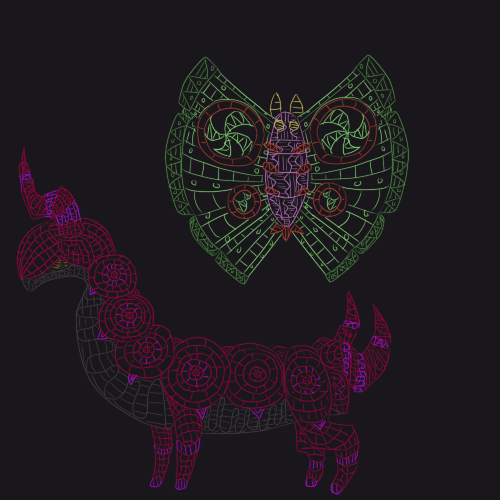

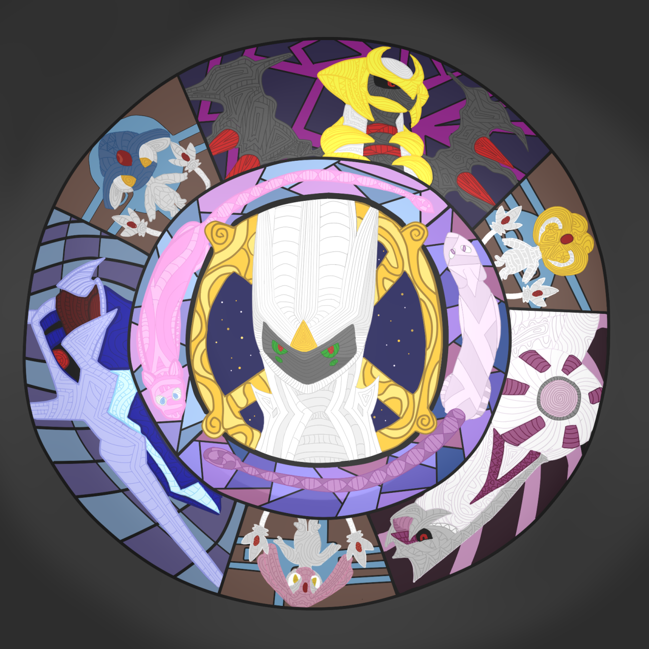
If pokemon were stained glass. It's been a while, but I still enjoy drawing in this style from time to time.
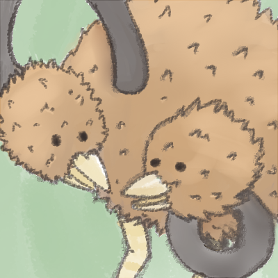


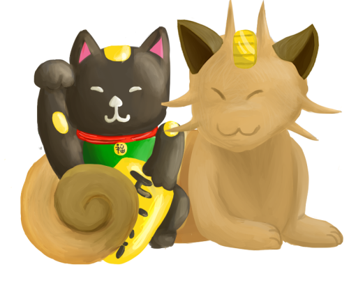
This one is pretty old and was mostly an experiment with texture.


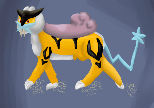
Not much to say here, just a little Raikou doodle done for someone on tumblr.


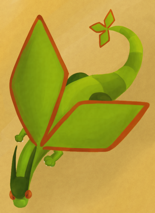
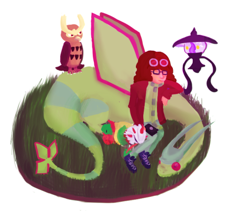
More little guys for tumblr. The fact that I forgot Tropius' banana really bothers me now that I've noticed....
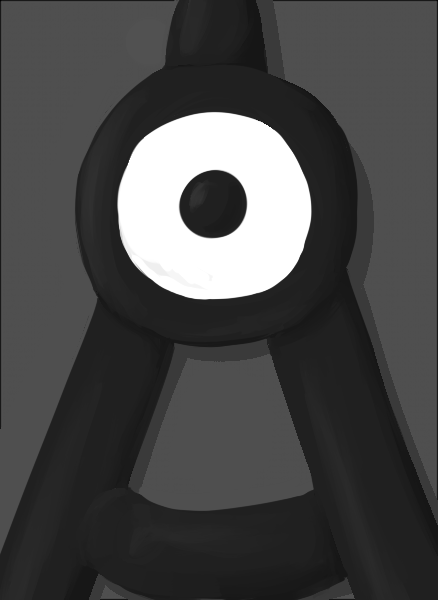


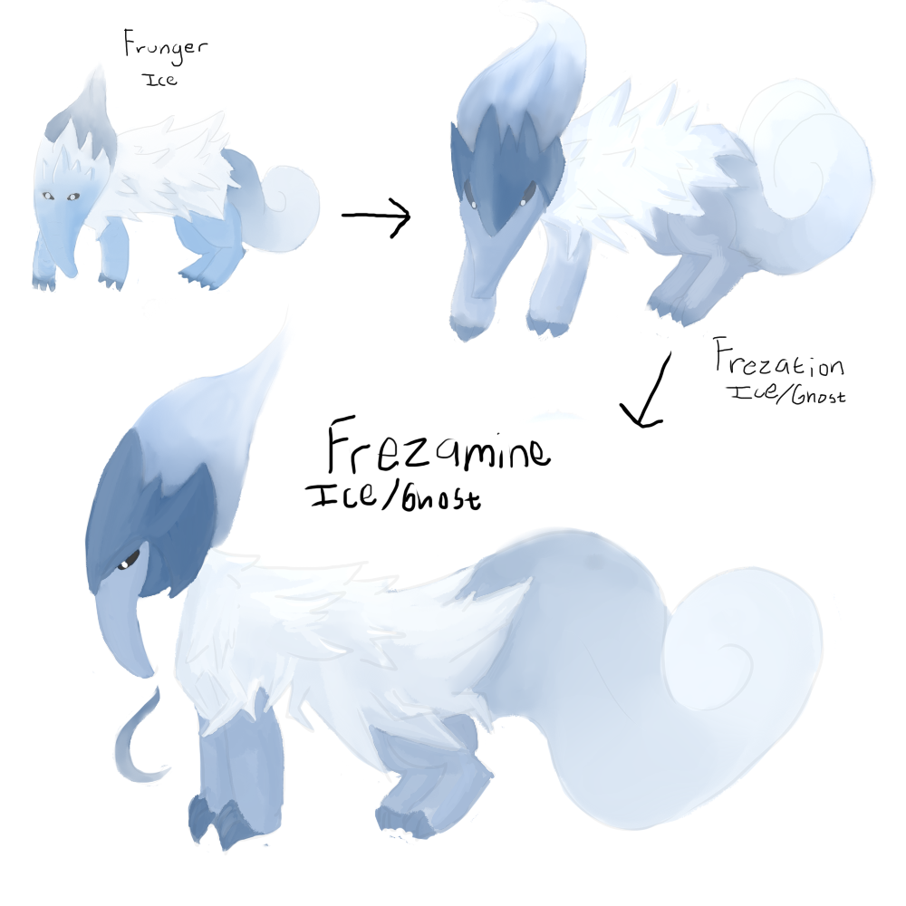
Entered this into the art contest for minimalism earlier today. What's more minimal than an unknown, after all?
 
You've got some good stuff here, your colours and shading are all good, and its clear you can produce some decent stuff when you want too.

Be careful of putting in effects for the sake of it though, Raikou is already an alright drawing - the little electrical bolts by his feel just look out of place and tacky. I'd suggest using a proper lightning brush from deviantart or really spending a lot of time painting the bolts, rather than just using a pencil tool as this looks cheap.

You've also shown with your doodles that you can create a variety of poses - good. Now the next step up I'd suggest is trying to work in some texture. You could try and make bisharp look more metallic for example, use sharper more defined lighting etc. Or try adding some fur to your other drawings, either using a fure brush or just by shading.

Keep it up.
 
I'll be the first to admit that I can't really tell when something's tacky or not (Although I can't say the picture would be similar if I ever drew Raikou again- that picture is four months old and I like to think I've improved since then)

Texture wise, I totally agree! I definitely have issues with shading and everything looks like it's made of the same material because of it.

Thank you for the advice!


paintseagull

pink wingull
is a Top Artistis a Forum Moderator Alumnus
Hey, welcome, awesome stuff so far! i love that you experiment with lots of styles. One thing you might wanna try next is an experiment with contrast - both contrasting colours and contrasting lightness and darkness - I can see the contrasting colours already in the "Theoretical RL team" picture. Can't wait to see more!!
 
Taking into account all the critique I've gotten I've tried to make things with a bit more texture and clearer lighting. It's hard to do things differently, though. I always tend to want to blend colors together more (I tried to stop myself). Let it be known that there was an attempt.


Besides all the great advice I've gotten so far I also know I need to work on backgrounds, too. (Or draw them at all)


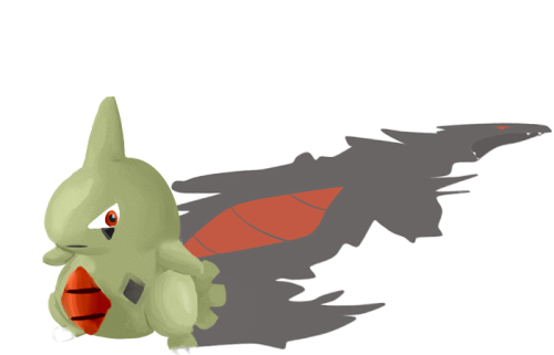
LOVE this. Nicely drawn, really cool idea. The shading on Lavitar's belly is a bit off, making it look flat. The shadow adds really good perspective, already showing some massive improvement, keep it up!

Although I'd still suggest downloading some more brushes, they really help with texture. Try looking for some fur ones.
 

Andrew

beep boop
is a Top Artist Alumnus
I know it's your oldest, but I really love the stained glass style you did with the scolipede and dusclops, and the wing fans lol. Alos the Flygon is pretty cool and minimalistic, looks like he's flying over a desert. Keep it up! :D
 
^^this
Love the first ones and I think the larvitar/tyranitar is an amazing idea, but alas I must agree that the larvitar looks a bit fat
 
I dunno, larvitar has gotta be pretty dang chubby after it eats a whole mountain... (but yes I see what you're saying)

RE: Getting new brushes- I have plenty of brushes... I just never use them haha. I think that you're right in that branching out the brushes themselves will help. The bigger issue that I mentioned before is that no matter what brush I use I always want to blend the colors together so it looks more like a gradient/smoother (I do this when I paint with real paint, too). It's just a habit I'm gonna need to break, I guess.

Speaking of that old style of mine, I've slowly been piecing something together that's kind of reminiscent.


Also I've seen people posting art that's not just pokemon around here, too?
I do that sometimes, too.
 
A bump with proof that I"m still living and still working on this monster.

This WIP doesn't really show everything I've done, since the circles with some of the 2nd and 3rd gen lengends aren't shown at all.
But I'm alive! And busy! But slowly and surely making progress on this thing.

The colors all seem a bit much, but I've messed up and it's a bit to late to change them at this point...
 

Pocket

be the upgraded version of me
is a Site Content Manager Alumnusis a Team Rater Alumnusis a Community Leader Alumnusis a Community Contributor Alumnusis a Tiering Contributor Alumnusis a Top Contributor Alumnus
whoa, that's darn epic! I can appreciate the substantial detail that went into this thing. Looking forward to see the final product, although you would've fooled me if you called this the complete work.
 

Magistrum

DOITSU NO KAGAKU WA SEKAI ICHI
is a Top Artist Alumnus
ANYONE who likes flygon gets a luvdisc from me. (^ω^)b

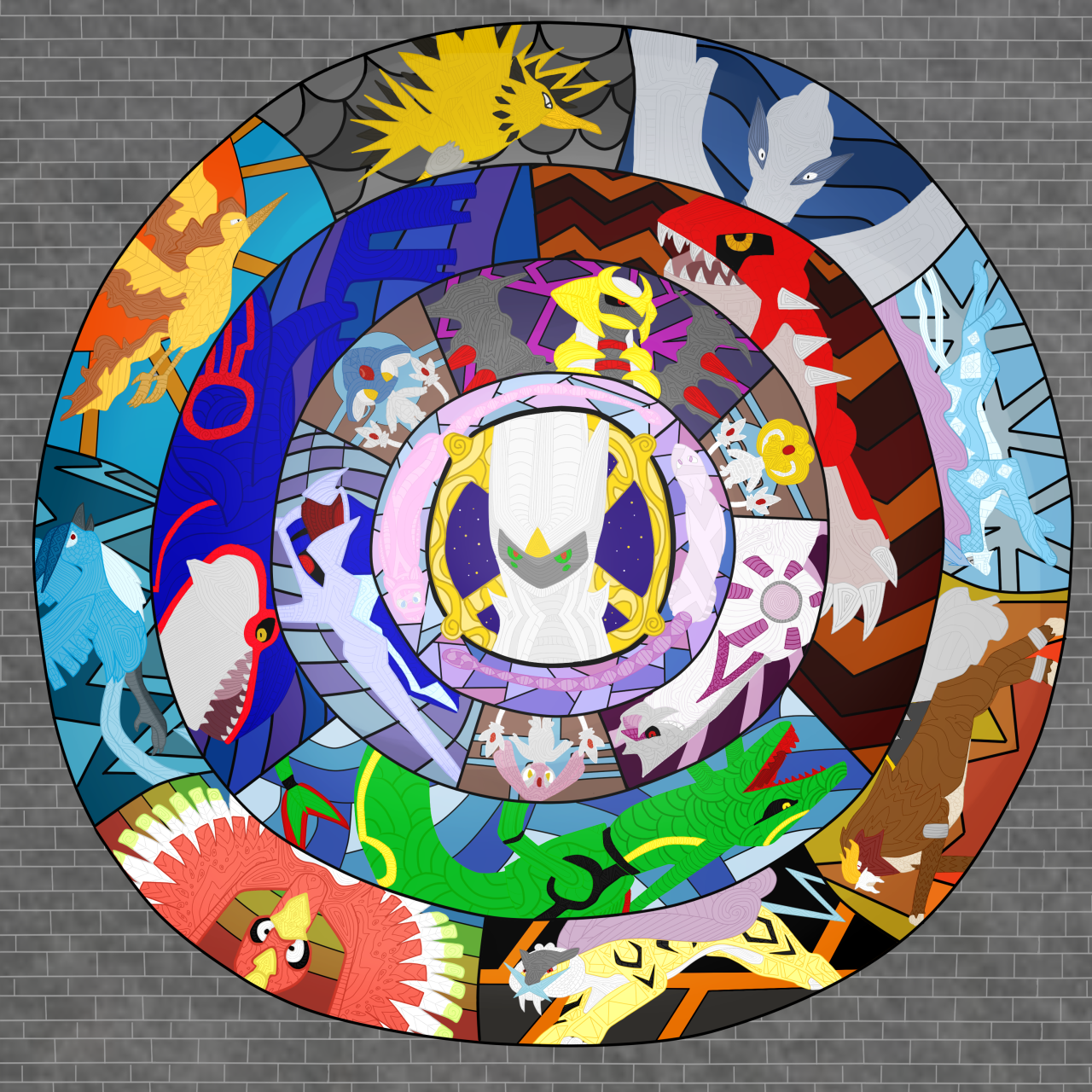
That aside, your art style intrigues me. I have a question though... who are those two pokemon encircling arceus? I initially thought it was mew or buizel or watchog but I can't seem to put my finger on it since this is a mandala of Gen IV legends...
 
@: Magistrum: Thank you! The two around Archeus are Mew and Mewtwo. Hopefully it makes more sense in the finished product:

And there's a version you can zoom in on on anipan, too. There's reasoning why I picked some pokemon to go in and left others out, I swear it.


This took nearly 3 weeks to do on and off and I kind of hate looking at it now, haha. I would redo all the colors, if I had the patience. But I'm done tinkering with it so you can see what I decided to end with.
 
I love it! Very creative and nicely done. I think it's cool each pokemon has a different pattern on it. It would make an awesome stained glass!
 
Well stained glass whats kind of the style I was going for! Although a lot of the patterns would be nearly impossible to cut into glass.

I promise i used d different brush. It was supposed to give it a watercolor effect and I made it look the same as I always do. Whoops :X
 

Users Who Are Viewing This Thread (Users: 1, Guests: 0)

Top