Reserving 7 of diamonds. Porygon.

-
Welcome to Smeargle's Studio! Please be sure to review the studio rules. Feel also free to check out our hub to learn more about this place!Welcome to Smogon! Take a moment to read the Introduction to Smogon for a run-down on everything Smogon, and make sure you take some time to read the global rules.Congrats to the winners of the 2023 Smog Awards!
★ Smeargle Card Project
- Thread starter icepick
- Start date

7 of diamonds has already been reservedReserving 7 of diamonds. Porygon.Alright, finished my card of Jack of Hearts but I can't decide which is better:


The squiggles, I feel, make the card less empty, and work well with the whole color scheme.Alright, finished my card of Jack of Hearts but I can't decide which is better:
 Whilst I feel the squiggles do make the card less empty, to me they look slightly immature at the moment. Like something a kid would do just to fill it out a bit. Maybe you could just make the Scrafty slightly bigger? Or just neaten up the squiggles a bit.
Great project btw guys! I'm not an artist so I obviously can't contribute but I would totally buy these. Is there a set date to have these done by? Even if there isn't I'd still get mine done within a reasonable time frame, but a deadline does help me work a bit faster, so I'm curious.
Either way I should have mine done here within a few day's time. Very sorry for the delay.Can I do the 7 of Hearts with a Luvdisc? Thanks for the advice Kirby and Corkscrew, I really appreciate it!
Instead of squiggles, I just went with lines (and imo, they do look neater than squiggles):

i don't know whether it's intended or not, but i'm a little bothered by the asymmetrical appearance of the margins and the letters. you should try to make the border have an even spacing on all four sides and the letters be similar in size. the symmetry is just a trademark of standard playing cards so i think it'll look better that way.Instead of squiggles, I just went with lines (and imo, they do look neater than squiggles):
the other nitpick i have is that the card has too much negative space. it's just too much of that one flat color; you could try experimenting with backgrounds a bit. it doesn't really have to be elaborate or anything. it could be simplistic; some examples in this thread are veiva's and bummer's. veiva just used a simple pattern that just uses slightly different shades and doesn't detract from the whole piece at all; no sweat. bummer's is quite different, but all he did was draw silhouettes and add shadows to make up a majority of his background.
looks good otherwise though; the scrafty is nice.Thanks for the advice ium!
I guess I'm done now:

Hope the spiral helps with filling in the negative space.I'll take the 8 of diamonds, using Skarmory.
oh neat. that dusclops looks menacing, haha. you should probably try to have the mist on its hands exude some kind of purple light on dusclops. that'd be a nice light source to establish so that the piece isn't entirely just a bunch of grays.Oops, I lied about using Exeggutor for Four of Clubs and decided to go with Dusclops instead:

What ium said. And you should uh, put a white border around the 4Clubs since the top one is invisible.Oops, I lied about using Exeggutor for Four of Clubs and decided to go with Dusclops instead:
Imgur is being a dick tonight so I'll try and get the full-size version up soon.Allright. King of Spades is done.
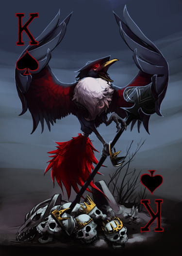
http://fc04.deviantart.net/fs71/f/2013/013/6/9/kospades__with_suit_by_phycofox-d5rfdqk.png <- Big version.
Also have a version without the suit letters in case we need to normalize them.Ughhhh I forgot that Sketchbook Express doesn't save layers when you exit, so I'm going to redo that Dusclops card over. Felt like it could've been a little better anyways, lolCan't stand seeing a Q not filled in so I'm going snatch the Queen of Clubs with uhhhh...this is a hard one...Gothitelle I guess.I'm still working on Cofagrigus, but the process I'm using (due to a lack of skill with computer tools alone) takes a long time; it goes something like this:
1: Draw the card and scan it.
2: Make outlines using paintbrush tool.
3: Add proper color.
4: Add proper shading and minor details.
Repeat 2-4 for every part of the card (Cofagrigus, Yamask eyes, walls, floor, shadow background).
5: Resize it.
6: Make proper-sized suit.
Even though I reduced the size of the original drawing (which was much larger than the required size), it is still taking quite a while.Finally done!

Users Who Are Viewing This Thread (Users: 1, Guests: 0)
- ... and 1 more.