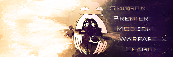
just reiterating thisI'm looking to make a MW2 league here in Smogon and I was hoping for a nice custom banner with some pokemon (any really) wearing a gas mask and holding and assualt rifle with Koffing behind him spewing gases with the words Smogon Premier Modern Warfare 2 League.

-
Welcome to Smeargle's Studio! Please be sure to review the studio rules. Feel also free to check out our hub to learn more about this place!Welcome to Smogon! Take a moment to read the Introduction to Smogon for a run-down on everything Smogon, and make sure you take some time to read the global rules.Congrats to the winners of the 2023 Smog Awards!
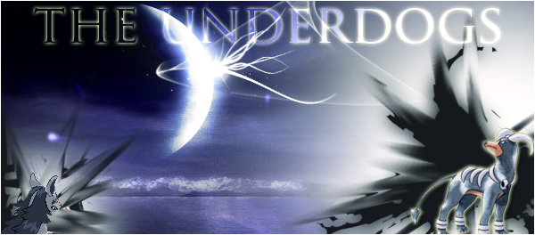
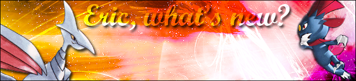
Smeargle's Studio General Thread: Spriting and Banners go here!
- Thread starter Alchemator
- Start date
- Status
- Not open for further replies.
Working on it, I'll edit when I'm donejust reiterating this
An old school twist on the trainer cards. I personally like the Gameboy color sprites a lot more. =DOk. Thank you to who answered my question. I'm requested a signature. It should have text that says "MrAbyss" in a readable font. That's really up to you and what you think looks best. Then I would like These images placed to whatever you think looks best. And then the background should be a red-black color scheme.
http://www.vn-net.org/wp-content/uploads/2009/07/ragna.jpg
http://i556.photobucket.com/albums/ss2/Mekiwates/Hazama.jpg
(remove the foot in this one :P)
http://balancebox.files.wordpress.com/2009/07/5067366.jpg
(if the girl only can't be removed from it's backgroud use...)
http://www.vn-net.org/wp-content/uploads/2009/07/rachel-alucard.jpg
order does not matter and thank you :)Hmm...I've been here for a week or two, but I just can't seem to find an avatar that matches the mood I want to convey.
What I've got in mind is something along the lines of a heavily damaged Lucario soldiering on against impossible odds. Ever since the death of my dad a month ago, money has become extremely tight, so sorry, no commission seekers. :(Party for krillowatt! Uh is this thread or a different one a good place to ask to get Badges done? Really need some badges done for something, so would like to know if anyone's interested
Hmm, wasn't exactly what I was looking for. Thanks anyways but I think I'll try making it myself.
Working on it, I'll edit when I'm done
Edit: failed to remember why I had put this request here in the first place... I'm terrible at drawing anything inorganic...
So if someone can make me a banner that would be great, but I'm looking for something more along the lines of vector art, with the "Smogon Premier Modern Warfare 2 League" in nicely stylized words underneath a pokemon (I've decided I'm really digging the idea of electivire getting some love for this) holding an assault rifle from the game, wearing a gas mask, with Koffing behind him spewing gases. "Smogon Premier Modern Warfare 2 League" should have a Camo pattern or something.Ah, I'm new to this part of the site, but the name "Smeargle's Studio" was incredibly catchy, so I clicked, (;
Here's some of my work:
I did this today;
________________________
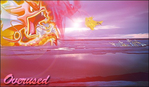
Overused Banner:
Overused Banner #2:

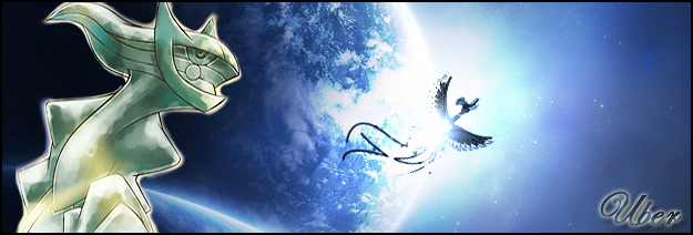
Ubers Banner:
(Personal Favorite banner I've made:
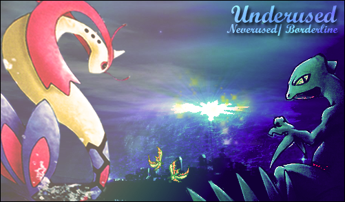
Underused Banner:
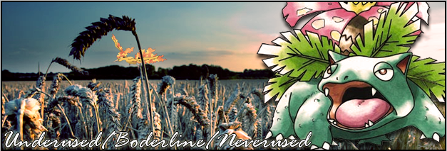
Underused Banner #2:
A title banner I made for someone:
Another title banner I made for someone else:
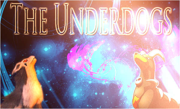
Same title as previous banner but different art:
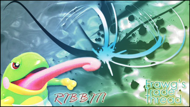
A banner I made for my thread:
Also, I like drawing, lol,
What do you guys think? :nerd:
That's much better, except there's still no depth. Try creating a new layer->apply image (in the image tab)->setting the layer to soft light. Or, applying image then using the burn and dodge tool to create lighting by burning the dark parts and dodging the light parts. Lastly, you could try using some simple smudging by pasting in your render, messing with the smudge settings, and putting that layer behind your actual render.
Thanks so much for you critique.That's much better, except there's still no depth. Try creating a new layer->apply image (in the image tab)->setting the layer to soft light. Or, applying image then using the burn and dodge tool to create lighting by burning the dark parts and dodging the light parts. Lastly, you could try using some simple smudging by pasting in your render, messing with the smudge settings, and putting that layer behind your actual render.
God, I love your banners you made. Especially the Feraligatr. The way it's shaded matches perfectly with the background.
Did you set it to monochrome, and then did you mess with the colors?Smudging Banner
I don't know if you'll be able to view it, but following those instructions will help you immensely.
Thanks a lot for that great tut.!Smudging Banner
I don't know if you'll be able to view it, but following those instructions will help you immensely.
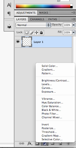
Ok time to practice now. Hopefully I'll be able to create something along the lines of that. :nerd:He used a gradient map to set those colors.
Ericc, you can also create depth by blurring the background bit, and then sharpening the focal. You want the render to be the main focus of the sig, not the background. Therefore, you shouldn't have your focal only cover a small area of the sig. This also applies to text. Don't make your text too ostentatious, because it would take too much attention away from the main focal.
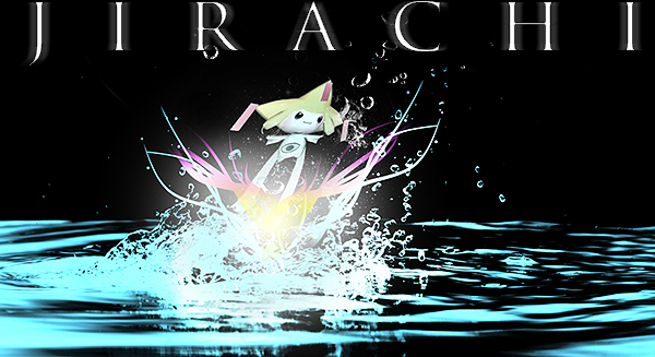
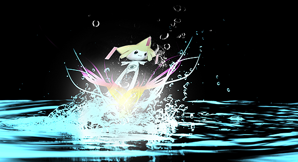
I did a quick edit of yours, and as you can see, you see the jirachi almost immediately, which is what you want. Of course,there are still things that could be improved with this sig, but I didn't have the proper layers needed to do anything about it..
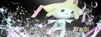
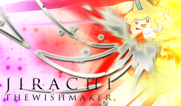
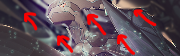
Also, flow. your jirachi banner doesn't flow, and It would look better if there was flow. To illustrate what I mean, I drew some helpful red arrows:
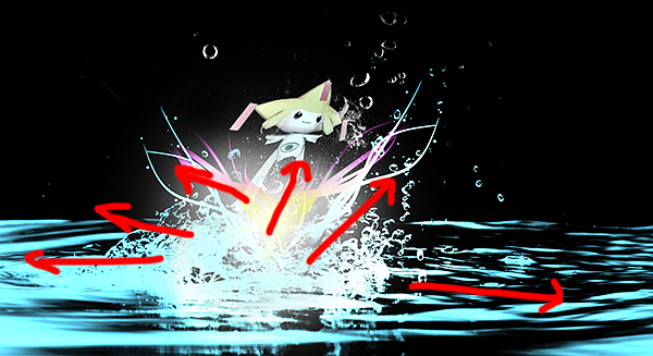
As you can see, the zekrom banner all flows up towards to the upper left. The jirachi one, on the other hand, goes in every which direction, when it should be towards the upper right. With that said, its not bad to have the banner flowing in two opposite directions, but as a rule of thumb for beginners, its easier to just have one direction.
Hope this helped!Ok Edlittle, I sort of followed the tutorial, but got lost at step 9, lol,
So I improvised and got this.
Sorry for the lack of neck on Latios, I went ahead and used this picture and the trainer guy's on his neck, xD
Well, here's the picture. It's ready to just have some text added onto it.
If anyone wants to use this, feel free :)
 Great job! You're getting a sense of blending into the background and depth. I would suggest adding a light source. It seems like there is a light coming from the top right of the picture, so using a 300px soft brush with white on a new layer, and setting it to soft light would add a sense of light. Also, if you got confused the whole gradient map thing is a little confusing, but I added in a picture to show you where it is.
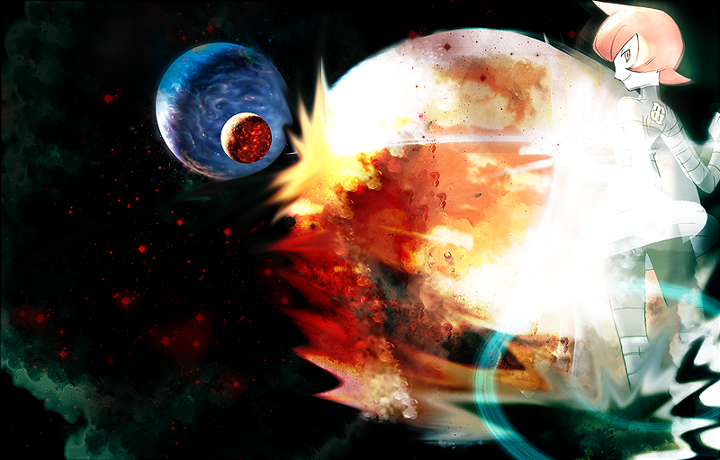
Phew, I haven't produced anything in forever. However, seeing the final evo in user Shinxe's fire javelina evolution line inspired me to break out those scratching skills again.
Credit goes to Shinxe, of course, for the design. You should really check out his art thread if you haven't already.
Enjoy.I'd like to see more scratch from you!Reindeer
Male
Female
Fish 1

Fish 2

Fish 3

- Status
- Not open for further replies.
Users Who Are Viewing This Thread (Users: 1, Guests: 3)
- ... and 1 more.